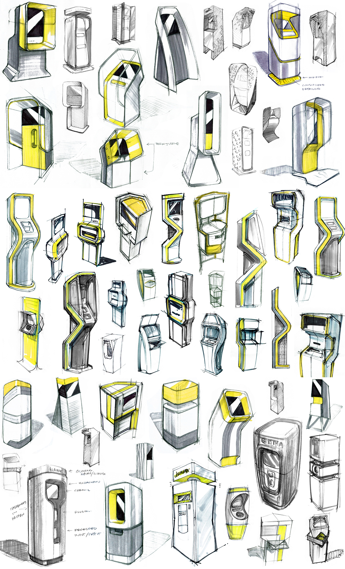

Pensar's task was to develop a premium banking kiosk that delivers an intuitive user experience.
Here are a few of our design considerations:
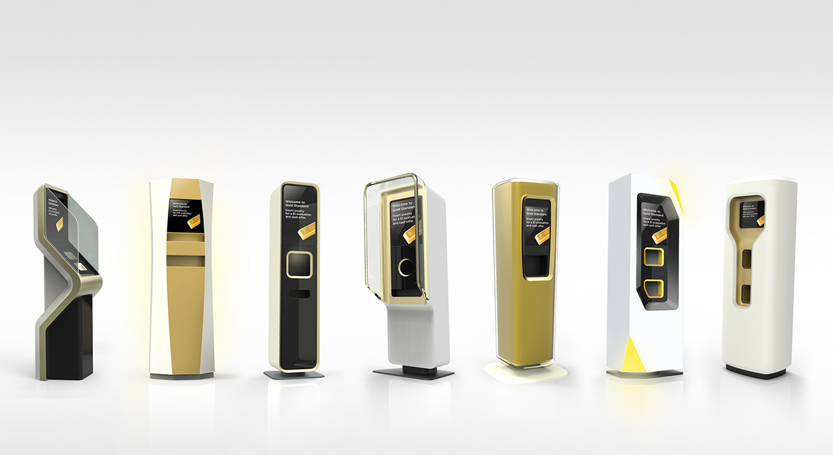
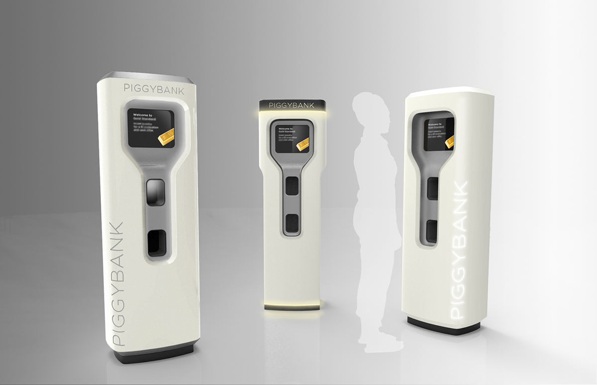
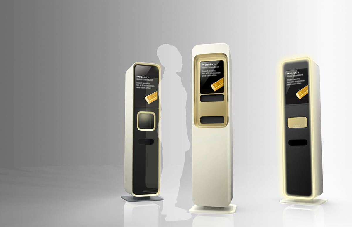
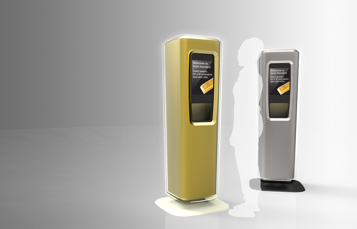
SOPHISTICATION
The client asked us to cut through the clutter of the big box retail environment. Instead of trying to over-power the user with garish graphics or colors, we decided to use lighting elements and an eye-level screen to bring people in.
SIMPLICITY
Once we've engaged our audience, the UI flow options are intuitive and neatly organized to provide comfort and a sense of control. This is also reflected by the decision to forgo any ten-key keypad.
WOMEN-FOCUSED
The form statement is intended to evoke vault-like security, but with softer features that make it more approachable. The colors and finishes are decidedly upscale, more reminiscent of the spa or cosmetics counter than the bank.
