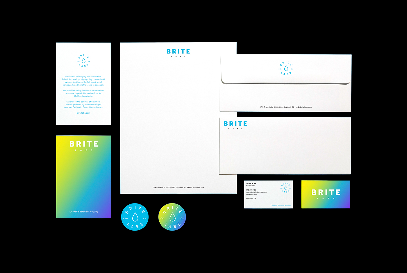
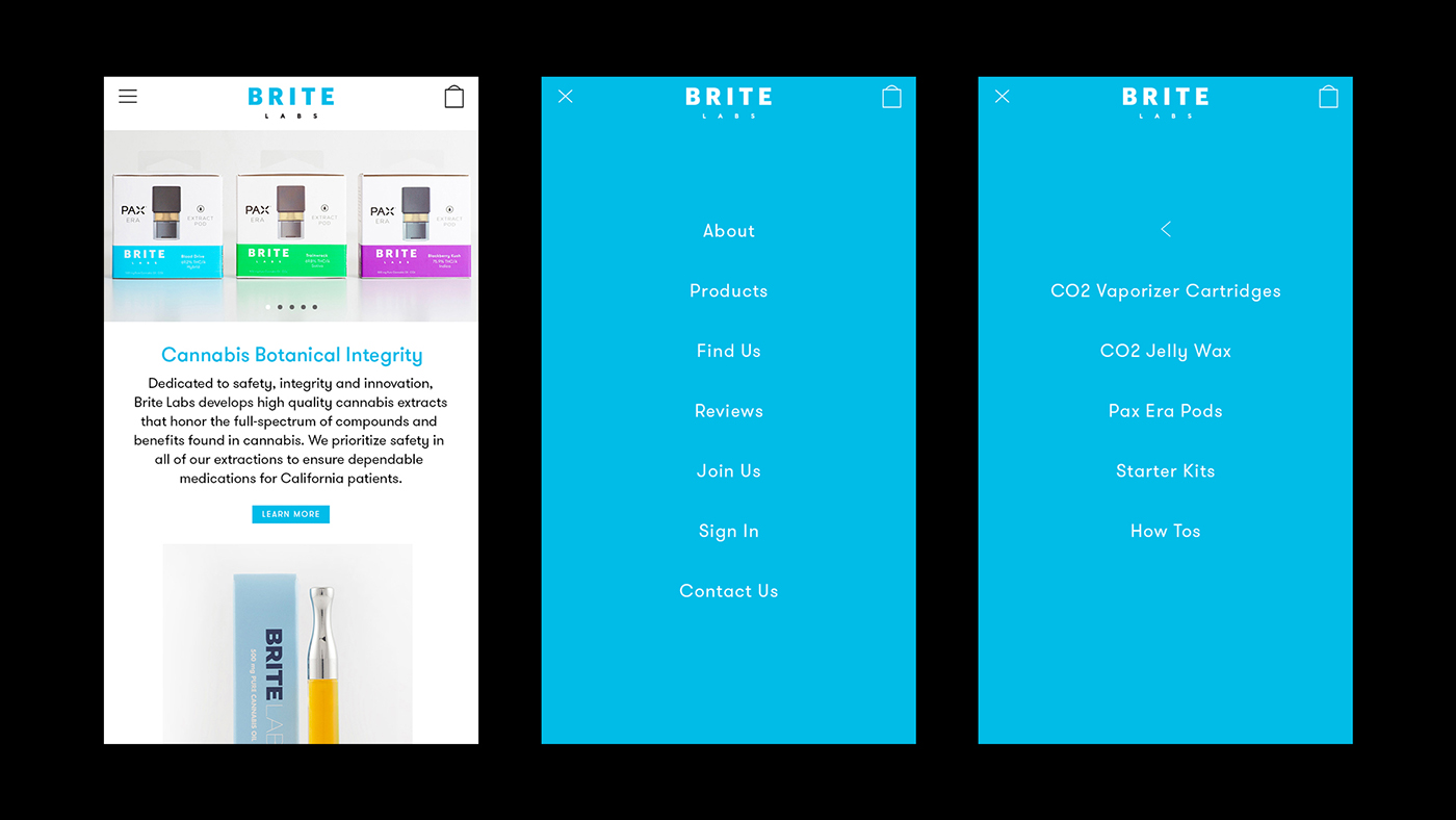
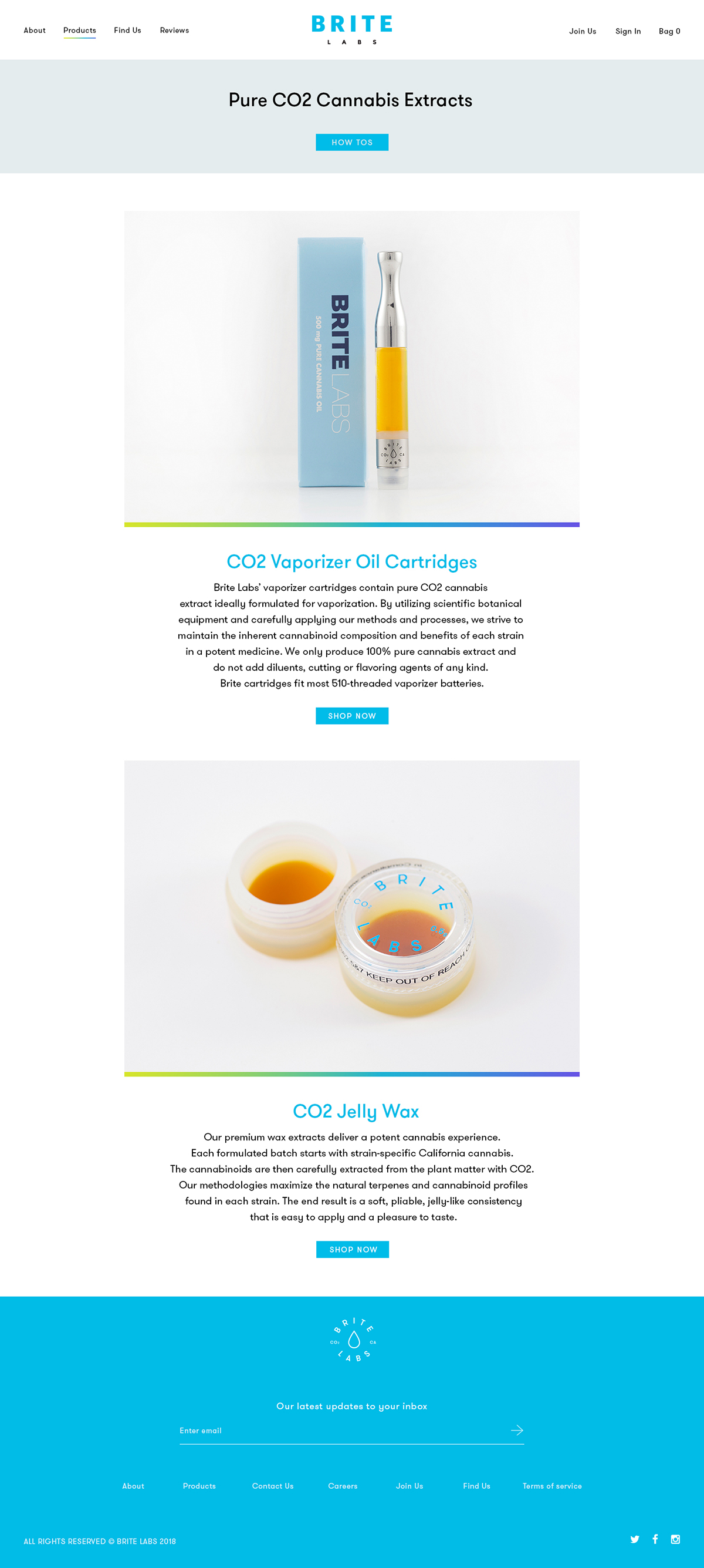
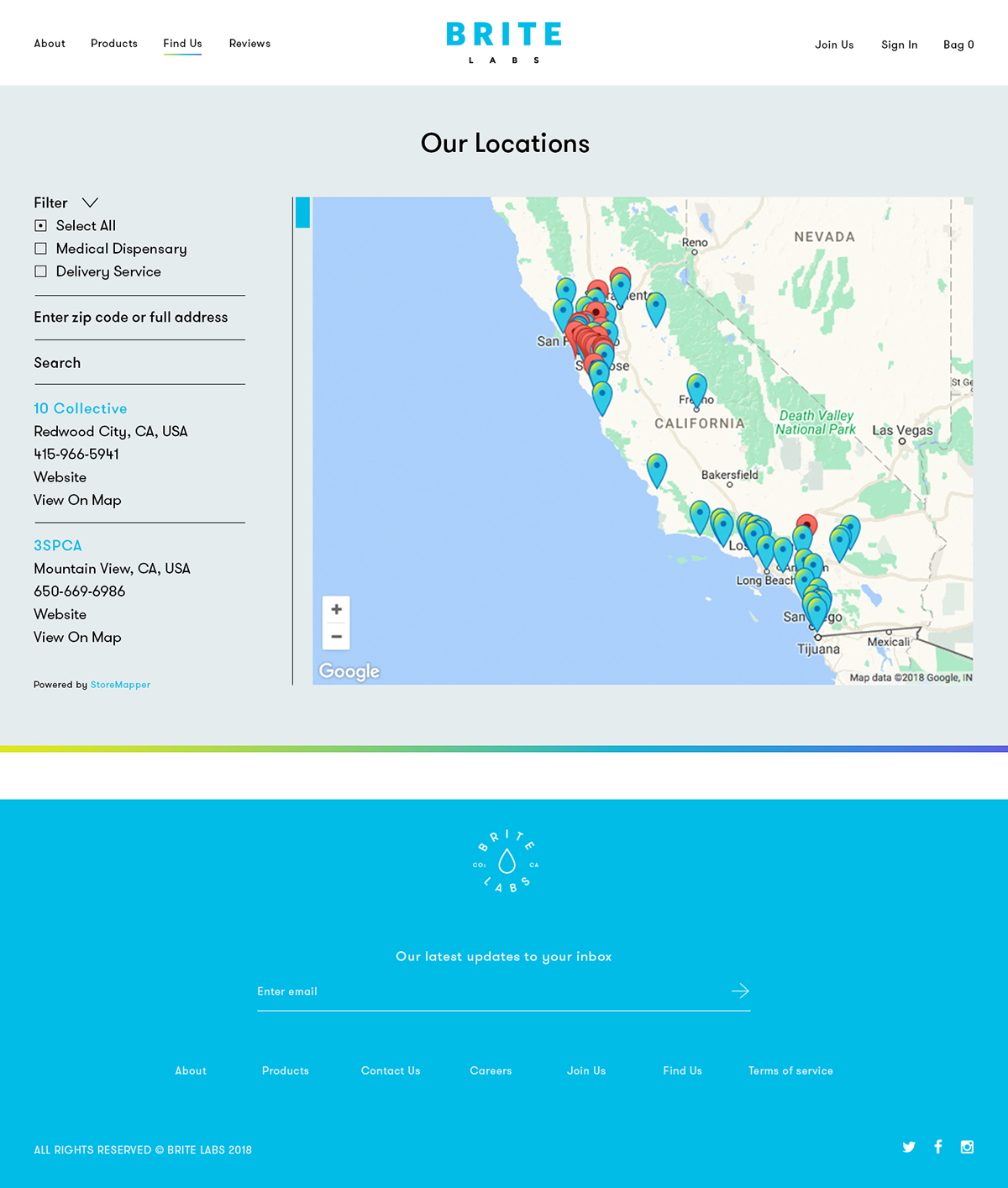
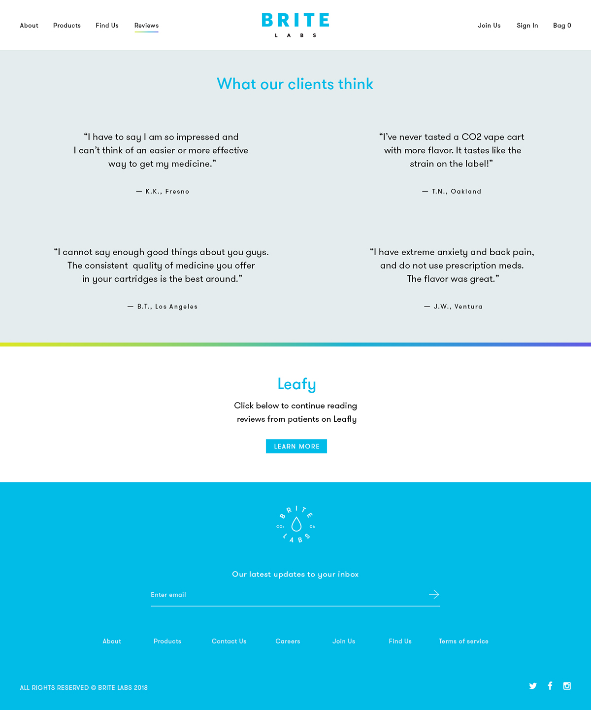
Visual identity for BRITE Labs—a California-based medical collective developing the purest quality cannabis extracts while prioritizing safety to ensure dependable medications for its patients. The brand needed a re-design and re-definition of its tone of voice in order to stand out among its growing number of competitors.
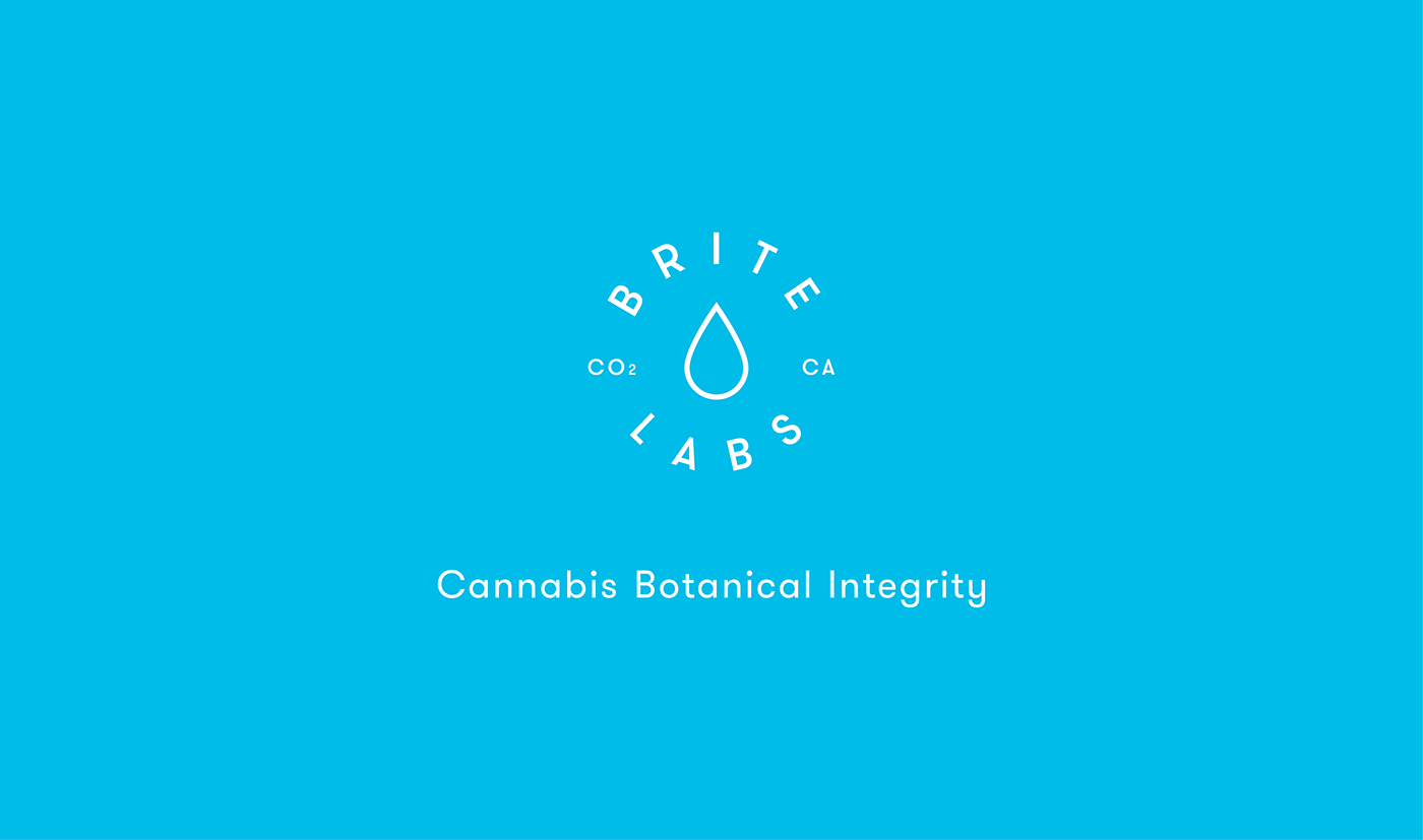
Referencing BRITE Lab’s product offering based on each cannabis strain (indica, sativa, hybrid and CBD),
Referencing BRITE Lab’s product offering based on each cannabis strain (indica, sativa, hybrid and CBD),
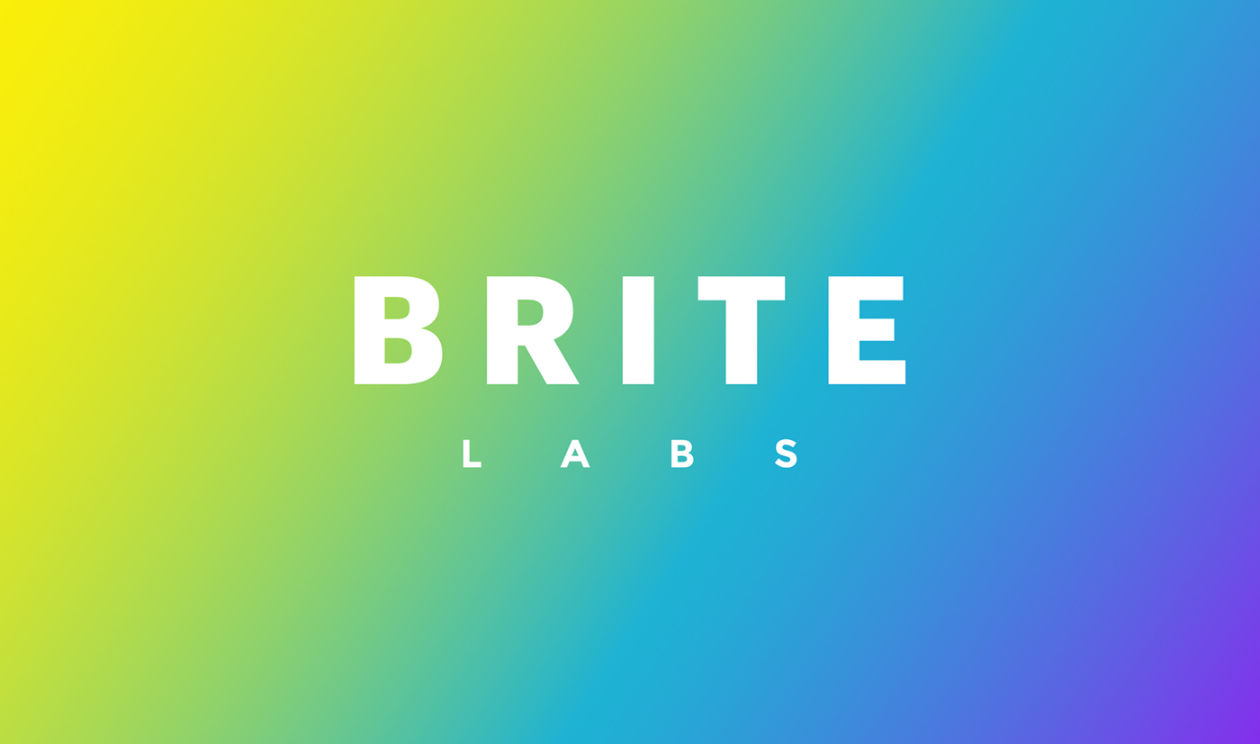
I developed a visual system based on gradients, encompassing its flavor variety. This concept is expressed visually through a chromatic gradient, applied across the entire new identity and harmoniously integrated
with the logo, secondary mark, and typographic system.
I wanted to create a visual identity that stands out from the crafty, west-coast look that cannabis products are normally associated with. The aim was to position BRITE Labs as a vibrant, modern, medical company and with a lifestyle feel. The result is a visual expression of the brand that perfectly matches its name: BRITE Labs.
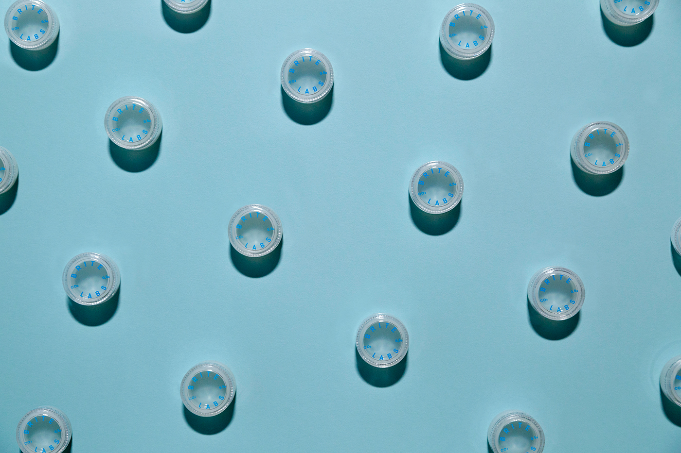
From concept to print production, I led and followed the entire design process, which included several print, packaging and digital touchpoints. The brand product and website is set to launch in Spring 2018.
with the logo, secondary mark, and typographic system.
I wanted to create a visual identity that stands out from the crafty, west-coast look that cannabis products are normally associated with. The aim was to position BRITE Labs as a vibrant, modern, medical company and with a lifestyle feel. The result is a visual expression of the brand that perfectly matches its name: BRITE Labs.
From concept to print production, I led and followed the entire design process, which included several print, packaging and digital touchpoints. The brand product and website is set to launch in Spring 2018.


CREDITS
ROLE: GRAPHIC DESIGN, CREATIVE DIRECTION
CLIENT: BRITE LABS
STYLING PHOTOGRAPHY: RUDOLF COSTIN


