FORM
2nd year University branding identity project for architecture firm
2nd year University branding identity project for architecture firm
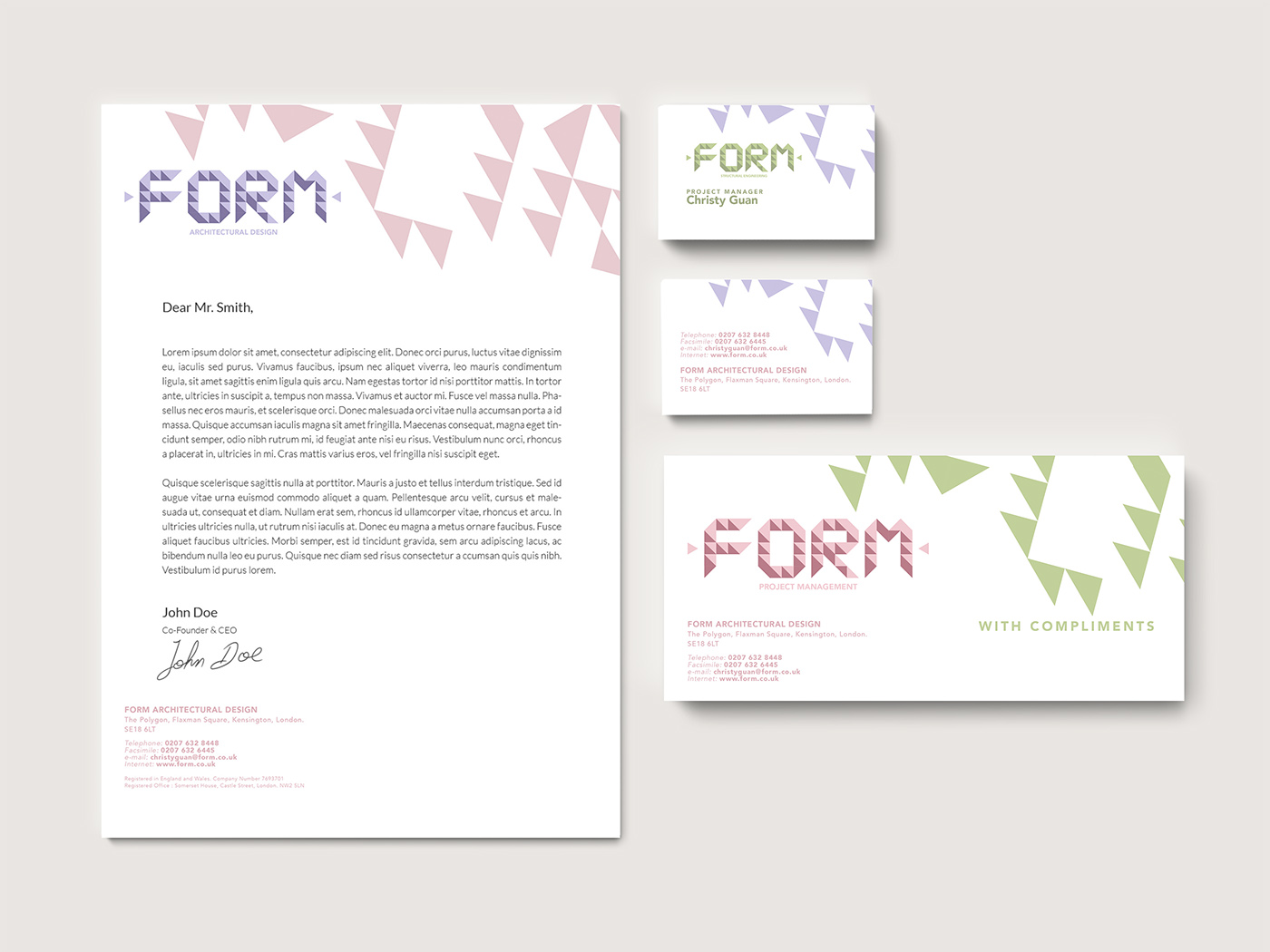
We were asked to design a versatile identity for this new, modern company, which has 3 divisions: Architecture Design, Structural Engineering and Project Management.
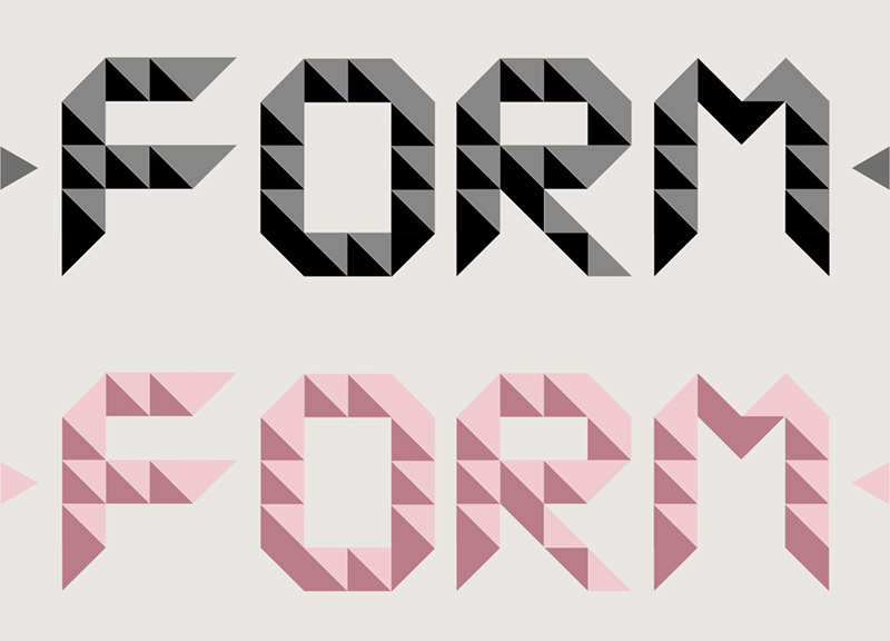
The logo must be flexible enough to be used for any of the divisions, and both in full and single colour. I was inspired by the geometric shapes of diamond and used only triangles to create the letters.
Each division was assigned with a different colour for their logos. They were bright, energetic and teamed up with triangular parts of the main logo to stand out from the dull impression of architecture firms = no fun; at the same time incorporating colour from another division to add variety, but not too much to maintain their professionalism.