

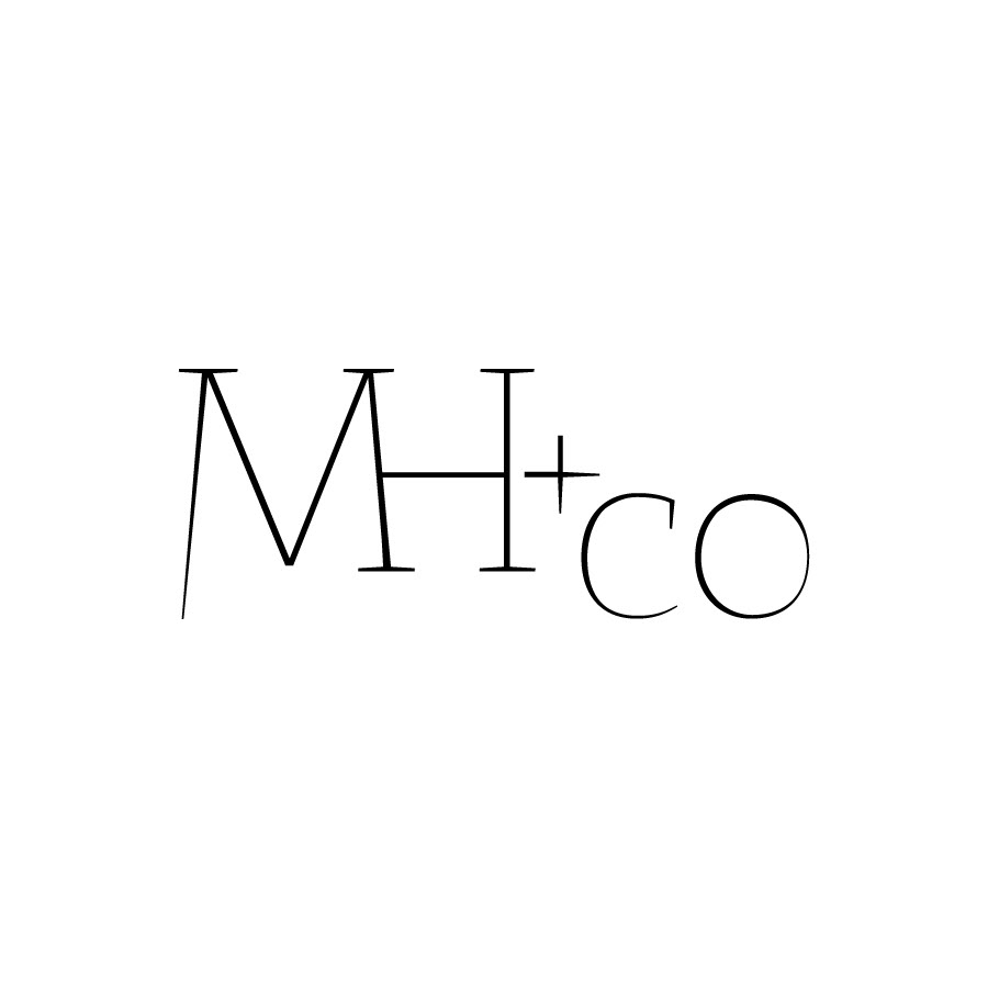
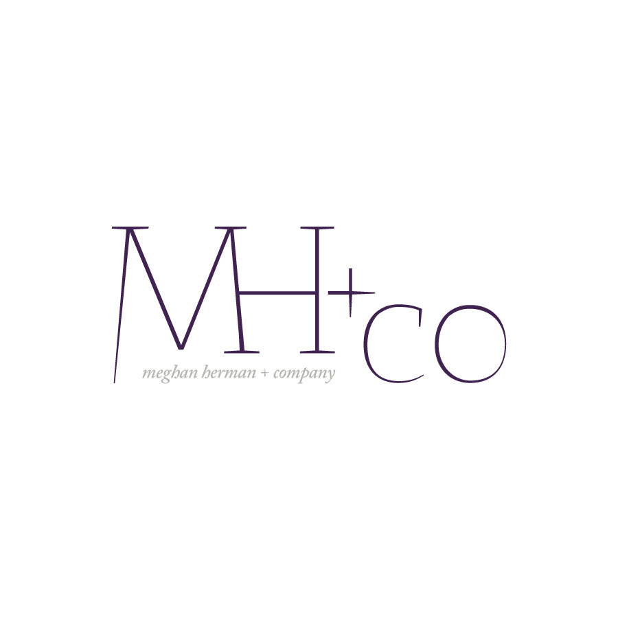
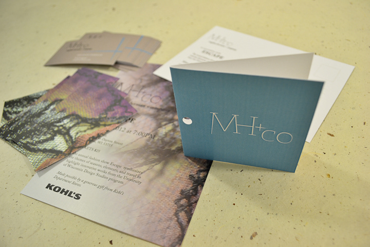
MH+CO identity
The logotype designed fordesigner Meghan Herman and her brand, MH+CO, mimics basic tools and patternsused to construct and design garments. The sharp terminals and thin strokesevoke a more provocative, edgy mood in contrast to the soft color palettechosen for all collateral materials.
mh+co wordmark, version 1 in grayscale

mh+co wordmark, version 2 in grayscale

mh+co wordmark, version 3 in grayscale
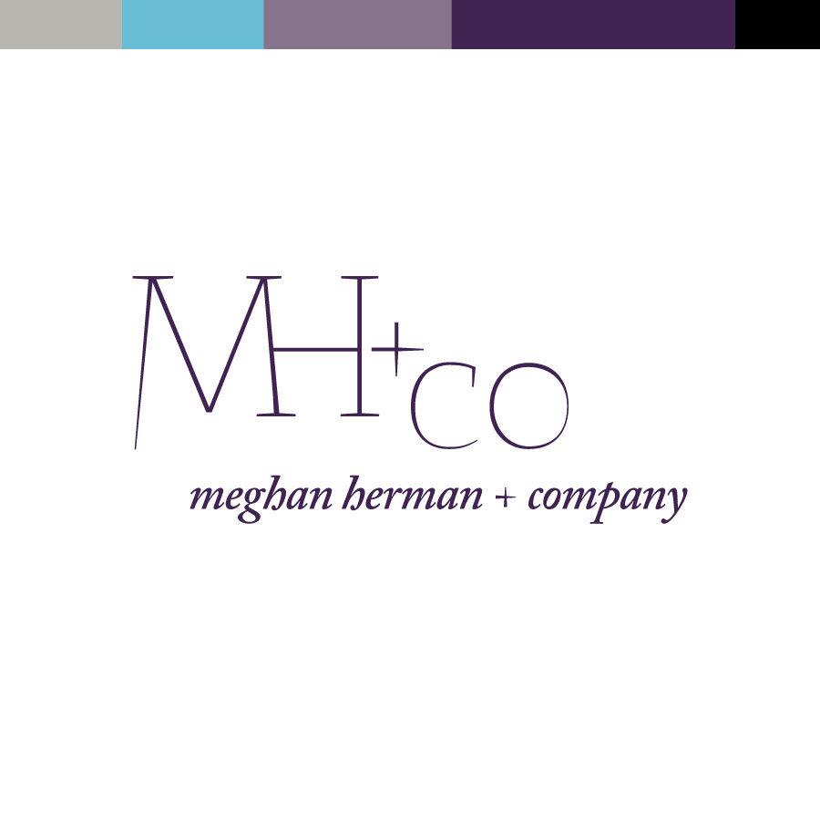
mh+co wordmark, version 3 in full color
mh+co wordmark, version 3 in full color

mh+co wordmark, version 1 in full color
mh+co wordmark, version 2 in full color
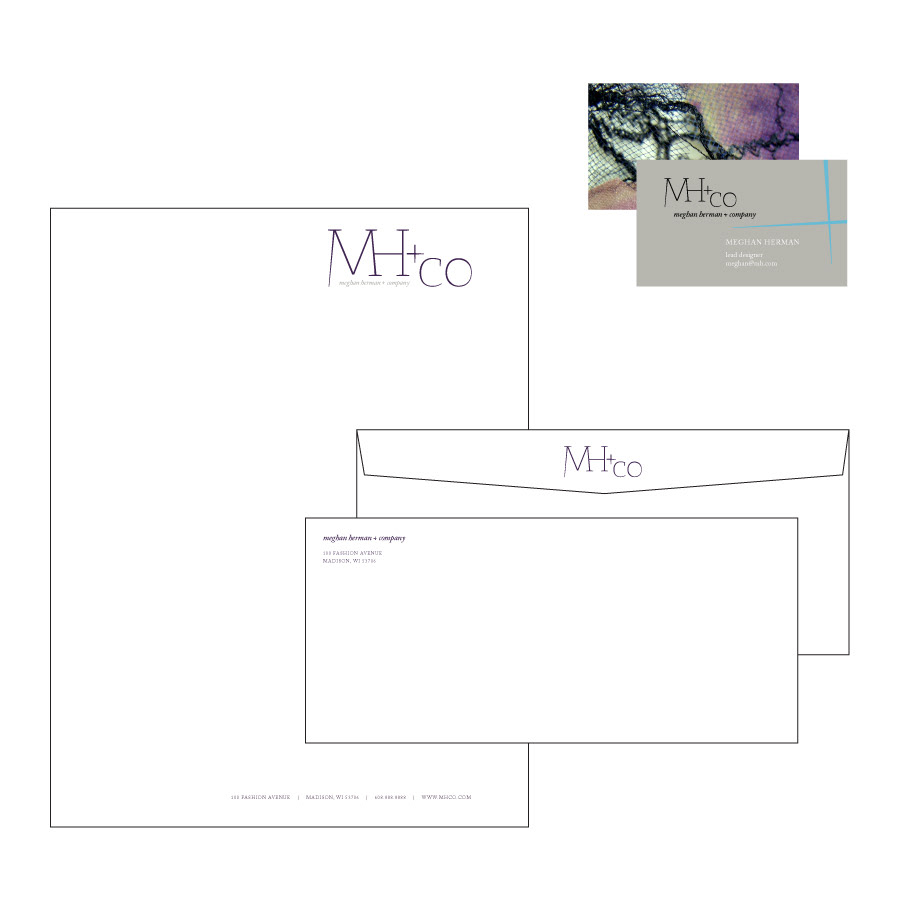
mh+co stationary

mh+co newspaper adverts

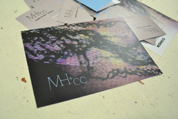
mh+co invitational postcard
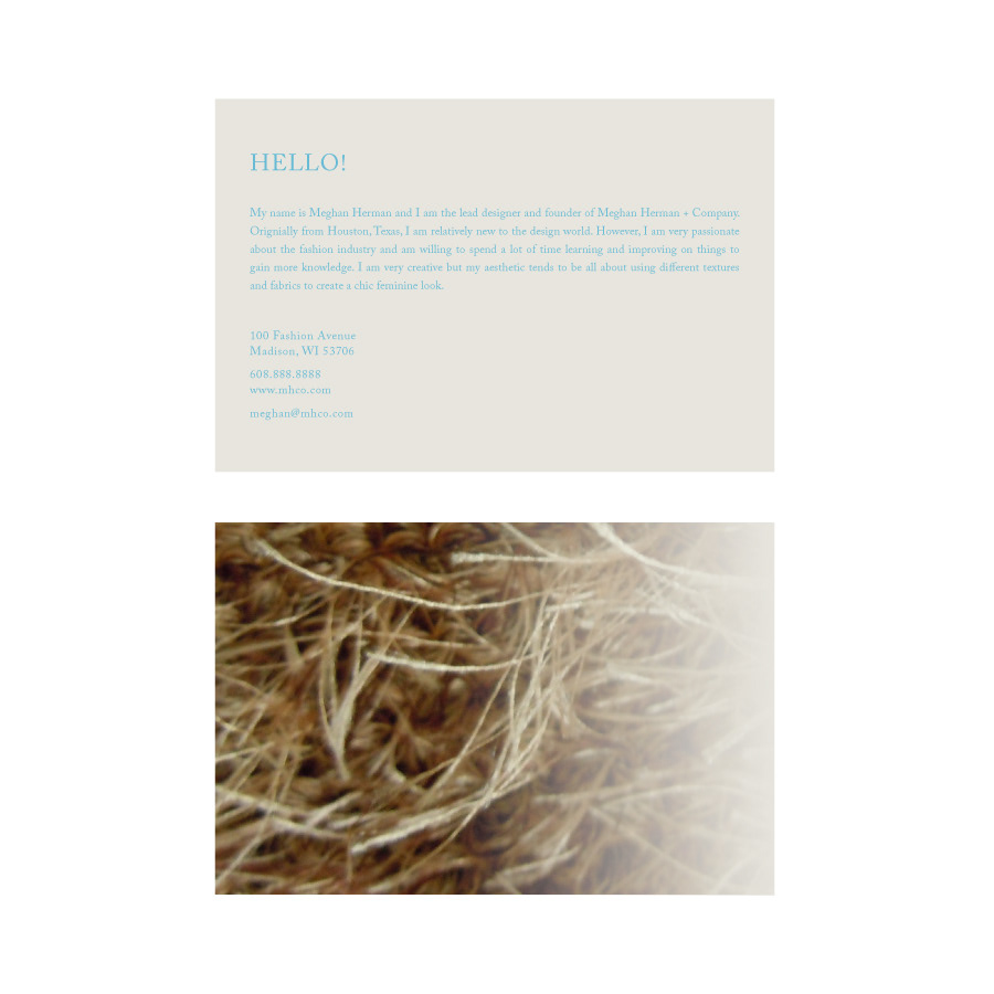
mh+co introductory note

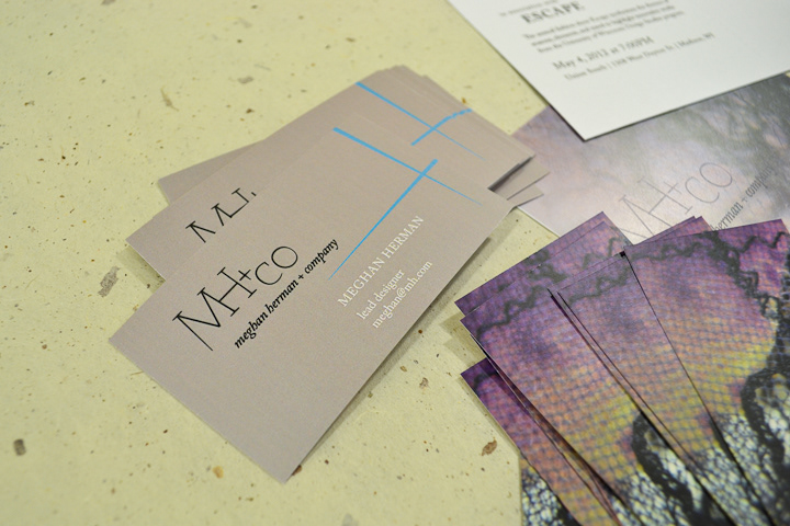
mh+co garment tag
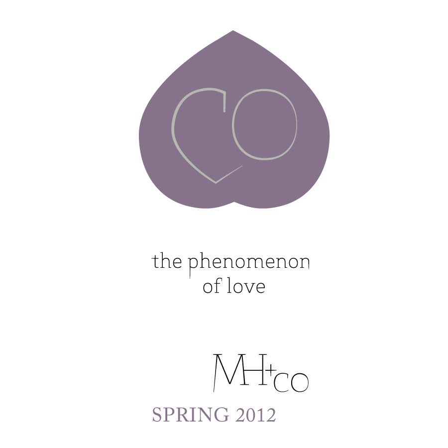
mh+co spring 2012 wordmark and logotype

mh+co spring 2012 trifold collection guide


