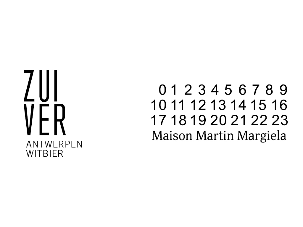
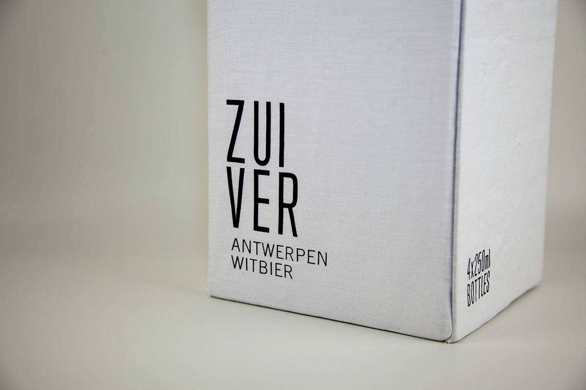
Zuiver
Antwerpen Witbier
Antwerpen Witbier
The packaging assignment was to create our own Premium Belgian beer that would compete with the likes of Duvel, Hoegaarden and Leffe. We need to differentiate from the current market and make it stand out on the shelves and also make it a premium quality beer.
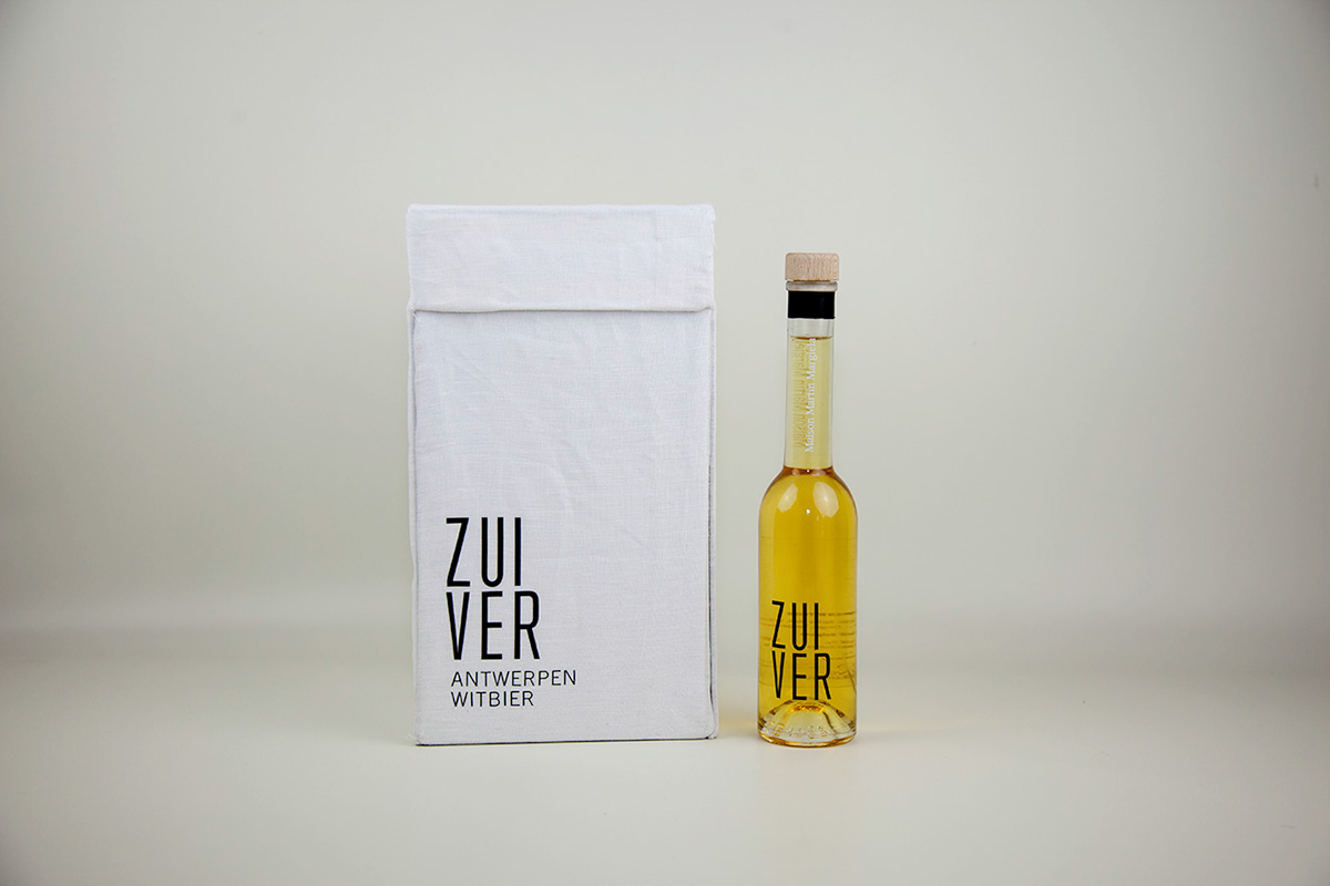
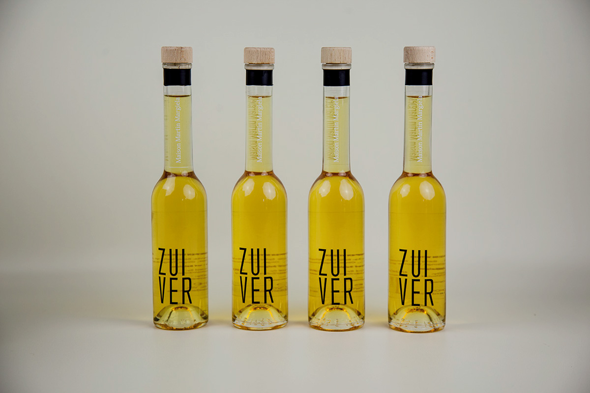
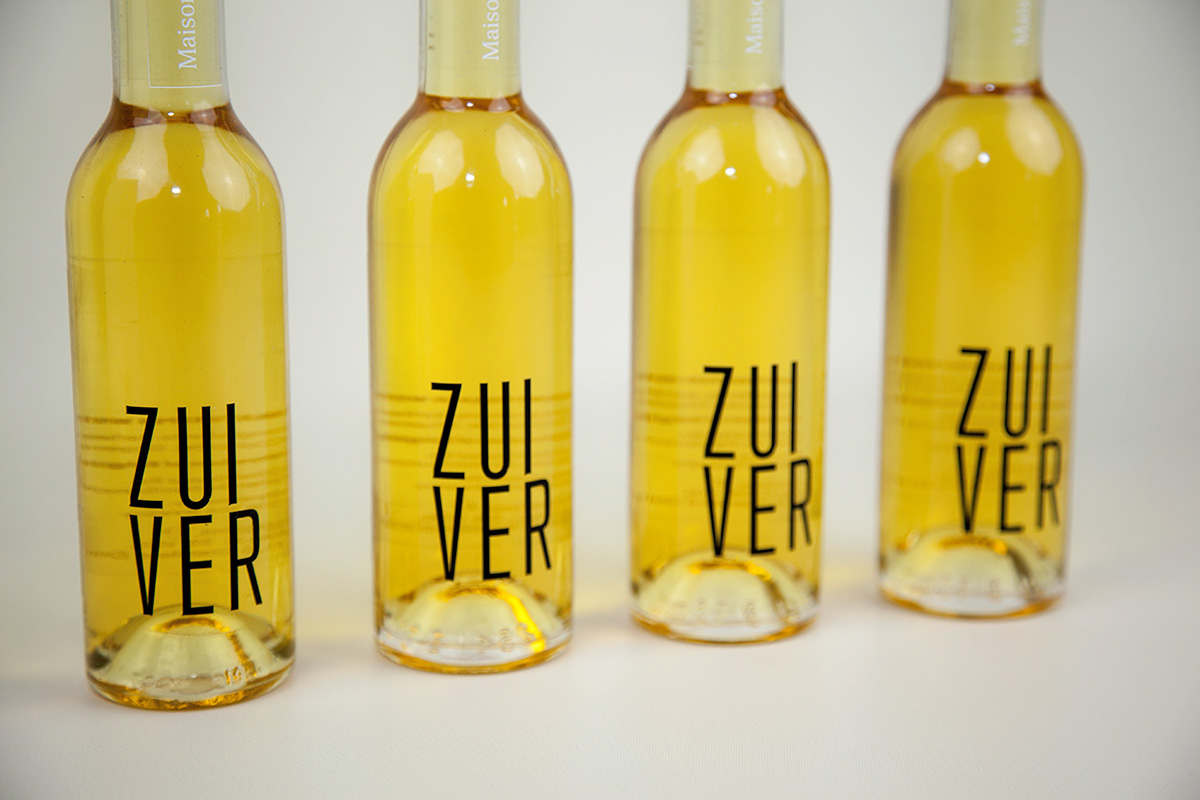
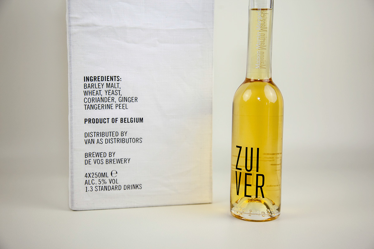
From the translation I gotten, Zuiver means pure in Dutch. My inspiration was from the city itself, Antwerp. Fashion is a big part of Antwerp, and I wanted that to be part of my design. I went for the simple modern, simplistic approach and using just black and white. I wanted a bottle to look slim and modern which will be different from the current beer bottles. Also a clear bottle so that the beer itself could shine through. Ideally I wanted this beer to be used during fashion events where beer could be served rather than wine or champagne to celebrate the locally brewed product. This would be targeting Male and Female audiences, but also encouraging the Female audience to the beer market.
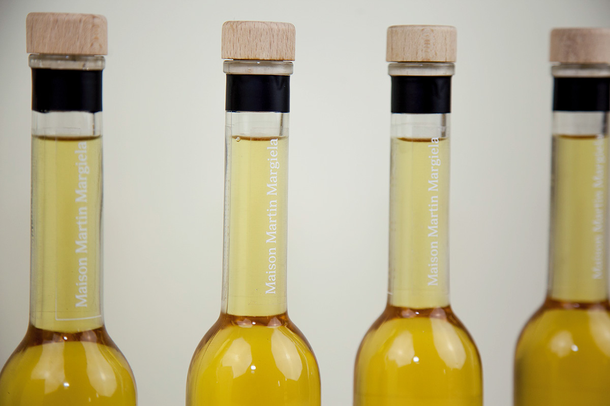
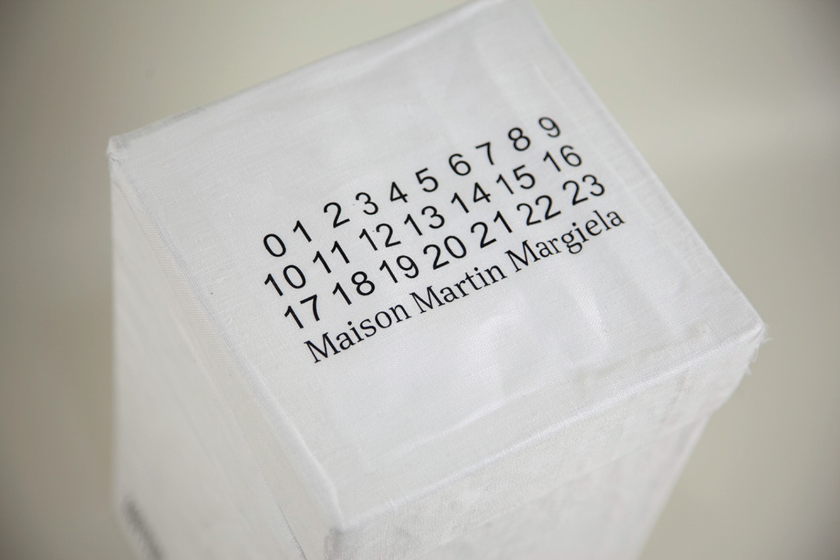
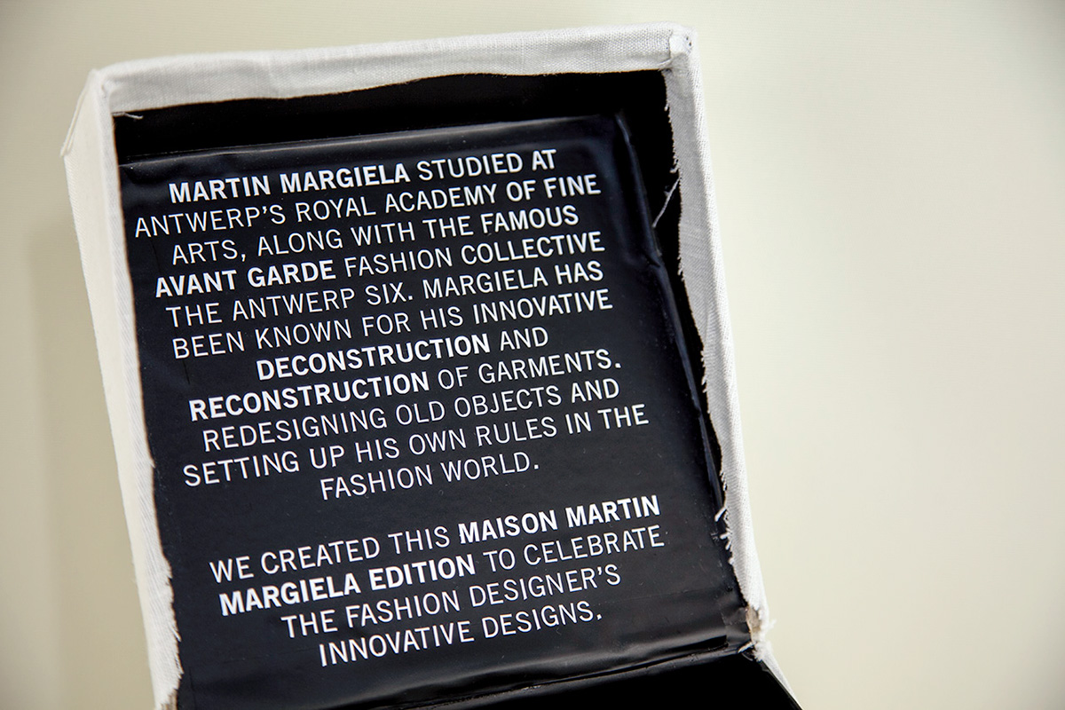
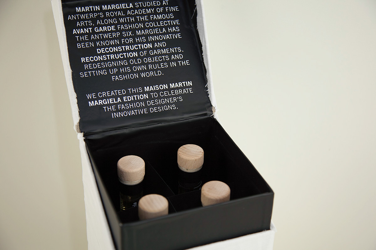
To make it even more premium, I have decided to make it like a special / limited edition. This edition would be called Zuiver: Maison Martin Margiela Edition. I wanted to celebrate the Belgian fashion designer who has played a huge part in the fashion industry and also be coming through Antwerp's famous Royal Academy of Fine Arts. His name and trademark numbers are incorporated into the design.
The box is layered with white linen to give that sense of fashion. The text are made from vinyl lettering and pasted onto the fabric. The insides are covered in a matte black sticker on top with white vinyl lettering again. The bottle also has the vinyl lettering to keep consistency throughout the design.
This is a fictional beer brand and I do not own the Maison Martin Margiela logo. It was re created with similar fonts.
From the translation I gotten, Zuiver means pure in Dutch. My inspiration was from the city itself, Antwerp. Fashion is a big part of Antwerp, and I wanted that to be part of my design. I went for the simple modern, simplistic approach and using just black and white. I wanted a bottle to look slim and modern which will be different from the current beer bottles. Also a clear bottle so that the beer itself could shine through. Ideally I wanted this beer to be used during fashion events where beer could be served rather than wine or champagne to celebrate the locally brewed product. This would be targeting Male and Female audiences, but also encouraging the Female audience to the beer market.
To make it even more premium, I have decided to make it like a special / limited edition. This edition would be called Zuiver: Maison Martin Margiela Edition. I wanted to celebrate the Belgian fashion designer who has played a huge part in the fashion industry and also be coming through Antwerp's famous Royal Academy of Fine Arts. His name and trademark numbers are incorporated into the design.
The box is layered with white linen to give that sense of fashion. The text are made from vinyl lettering and pasted onto the fabric. The insides are covered in a matte black sticker on top with white vinyl lettering again. The bottle also has the vinyl lettering to keep consistency throughout the design.
This is a fictional beer brand and I do not own the Maison Martin Margiela logo. It was re created with similar fonts.