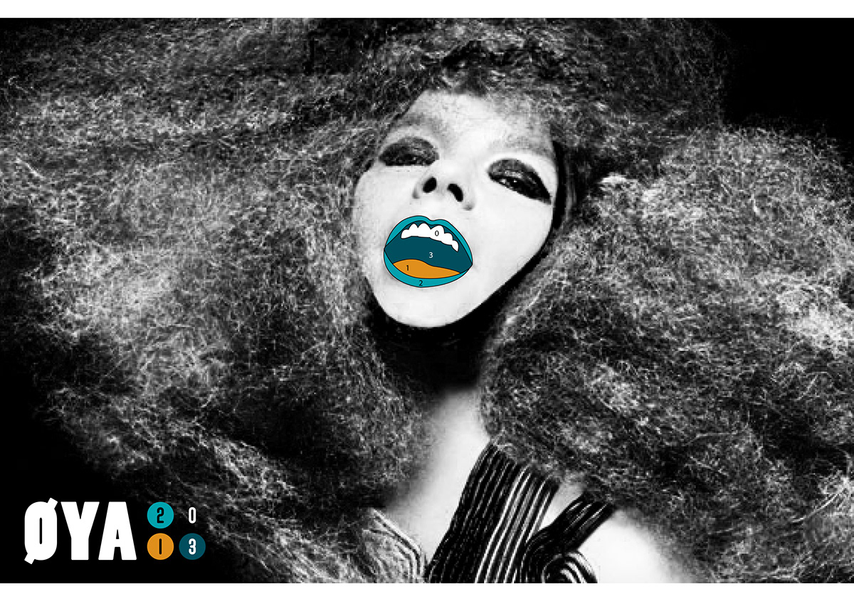
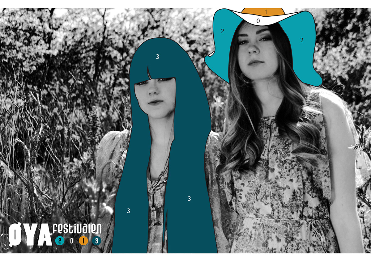
Øyafestivalen 2o13
The assignment was to make an identity for the norwegian music-festival Øyafestivalen.
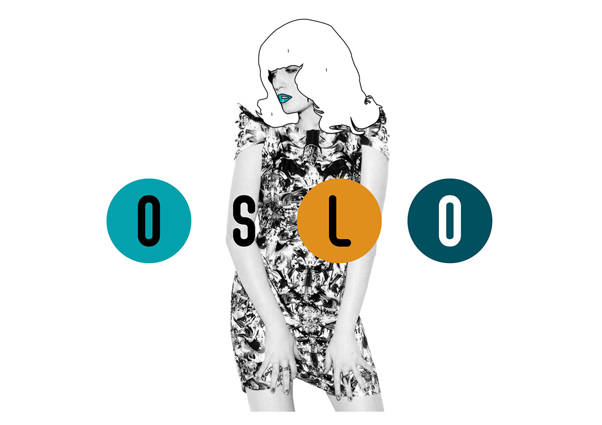
Concept: My concept is based on the well known and nostalgic children-activity "color by numbers". This would give the festival an opportunity to play with colors and illustration in many different ways. The profile then can be used with only black and white, some colors or many colors. This will be clearified if you scroll down and see the illustrational style and applications.
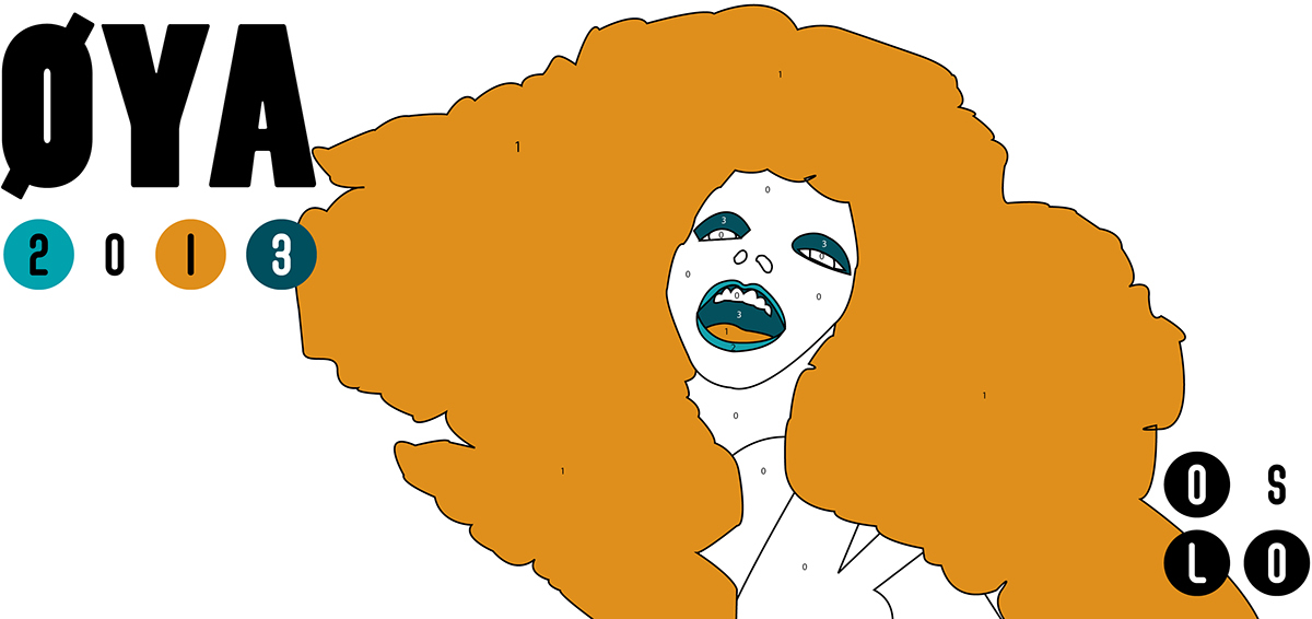
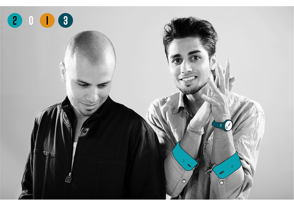
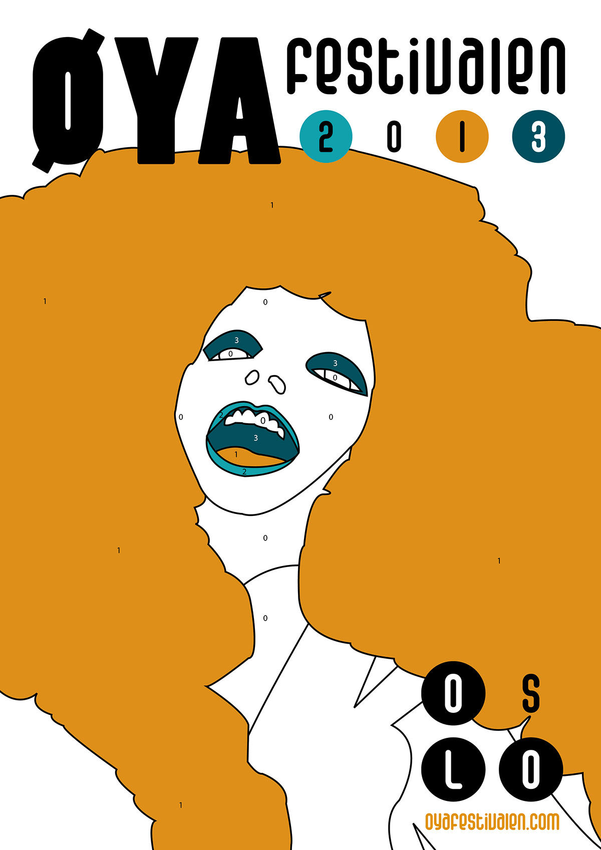
The logo: The logo is made to be the color palette for the festival. The year of the festival is 2013, which gave me 4 numbers to play with. Every number in 2013 symbolices one color each. 0 is no color, which always will be white. So whenever there is an illustration the concept is that the illustration is colored by numbers, which are the colors and the numbers you can find in the logo.
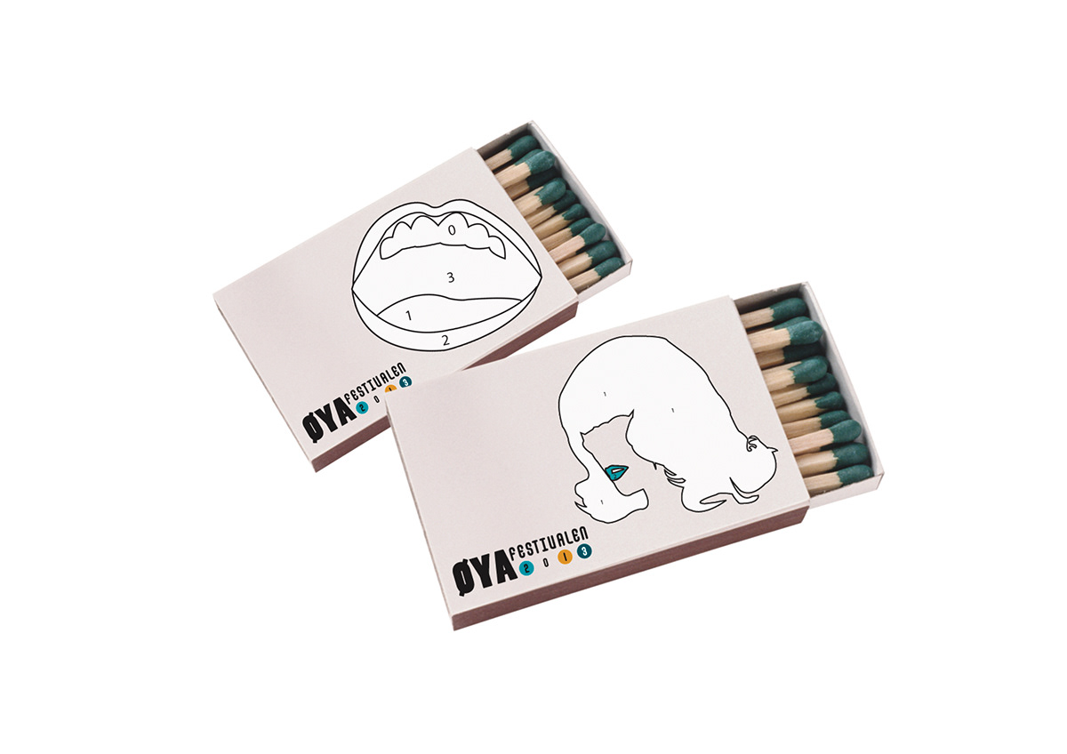
The festival-audiencel will also have the opportunity to do some coloring. Two of the festival applications are coloring books and coloring pencils. This will give the audience something to do while they take a break between the concerts, or if they´re just waiting for their favourite band to go on stage. It also involves the audience in a way that makes the concept and values of the festival more clear.
Concept: My concept is based on the well known and nostalgic children-activity "color by numbers". This would give the festival an opportunity to play with colors and illustration in many different ways. The profile then can be used with only black and white, some colors or many colors. This will be clearified if you scroll down and see the illustrational style and applications.
The logo: The logo is made to be the color palette for the festival. The year of the festival is 2013, which gave me 4 numbers to play with. Every number in 2013 symbolices one color each. 0 is no color, which always will be white. So whenever there is an illustration the concept is that the illustration is colored by numbers, which are the colors and the numbers you can find in the logo.
The festival-audiencel will also have the opportunity to do some coloring. Two of the festival applications are coloring books and coloring pencils. This will give the audience something to do while they take a break between the concerts, or if they´re just waiting for their favourite band to go on stage. It also involves the audience in a way that makes the concept and values of the festival more clear.
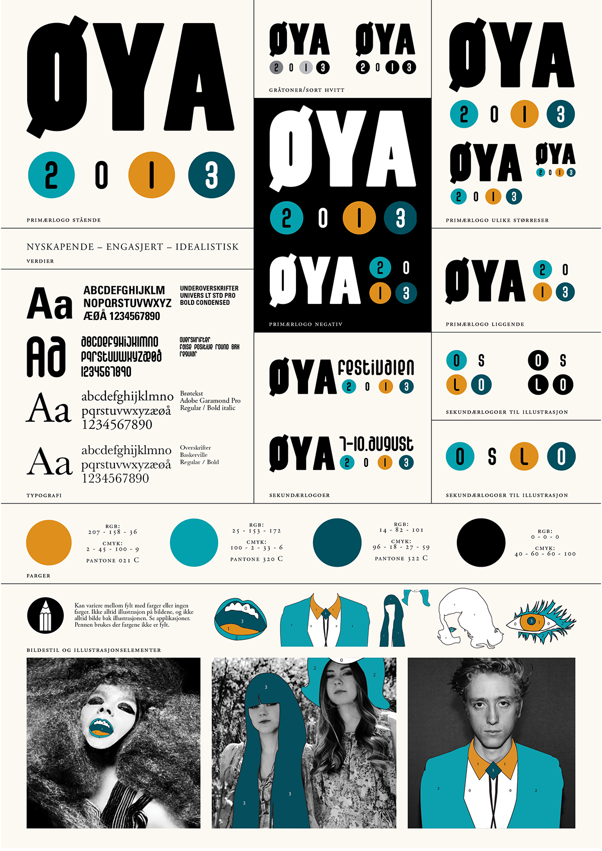
Illustrational style
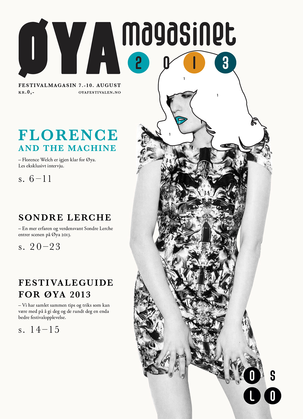
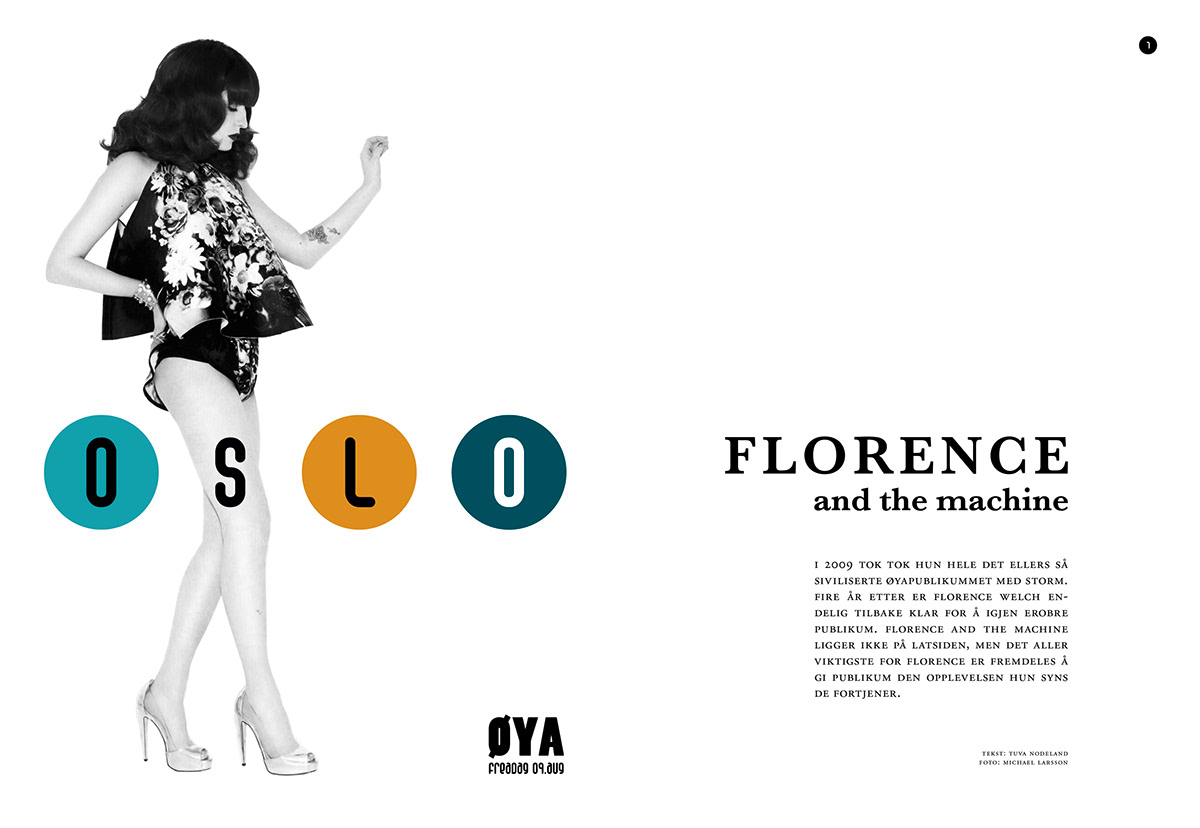
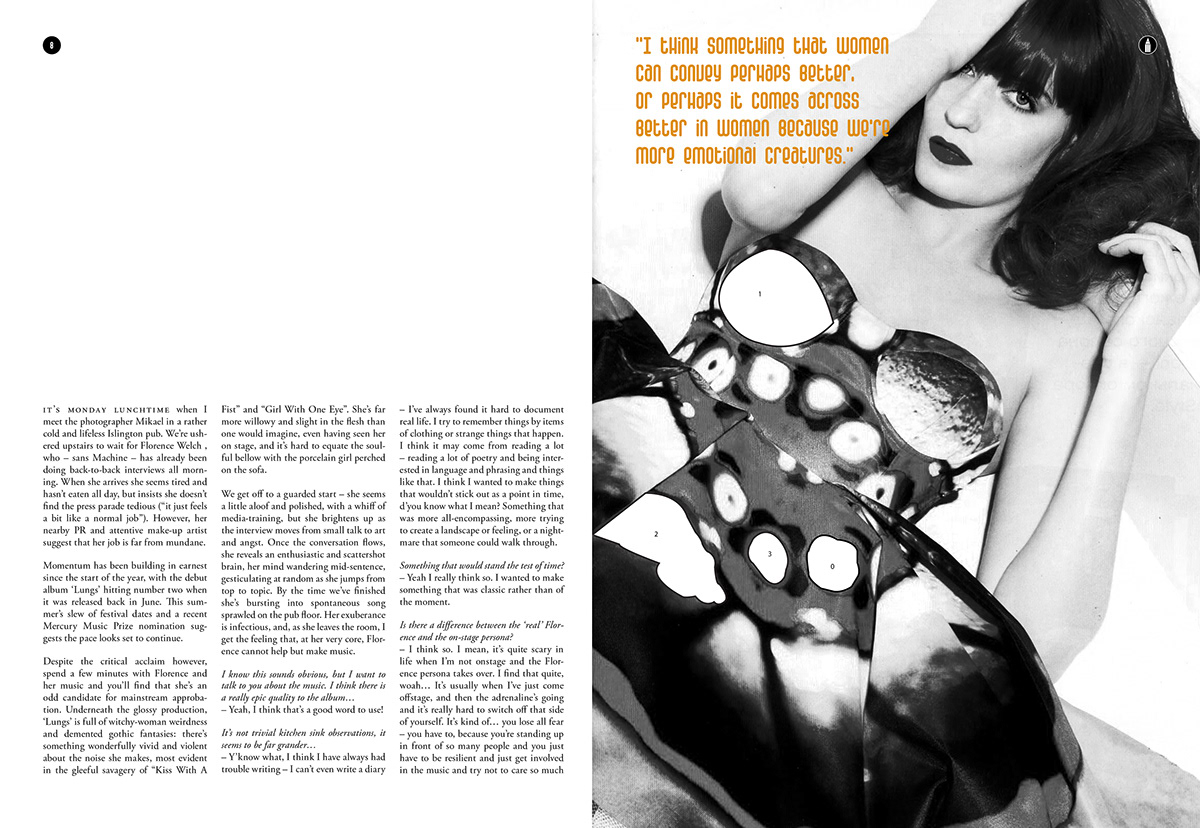
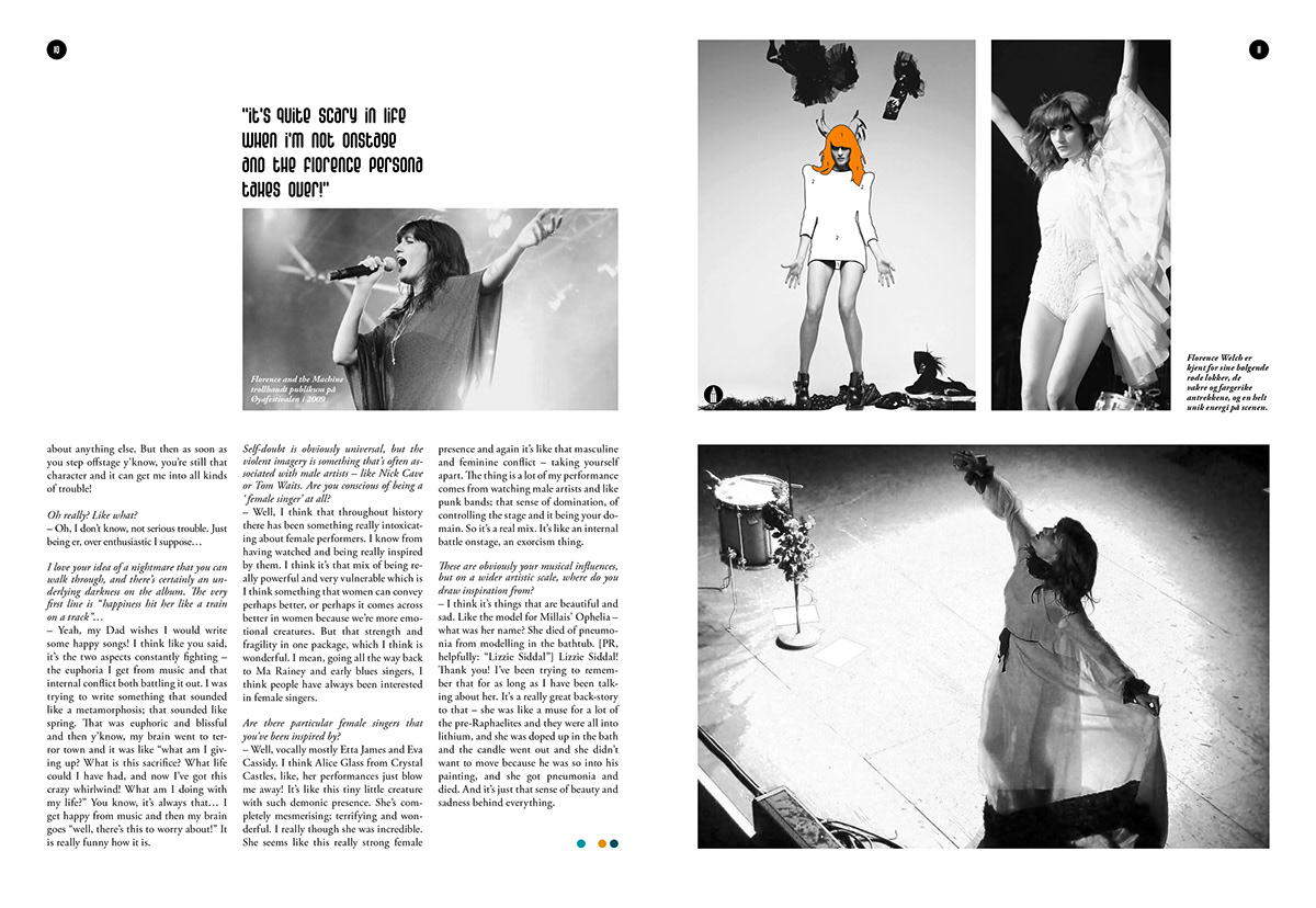
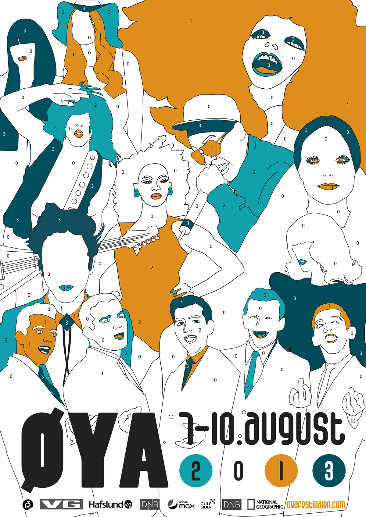
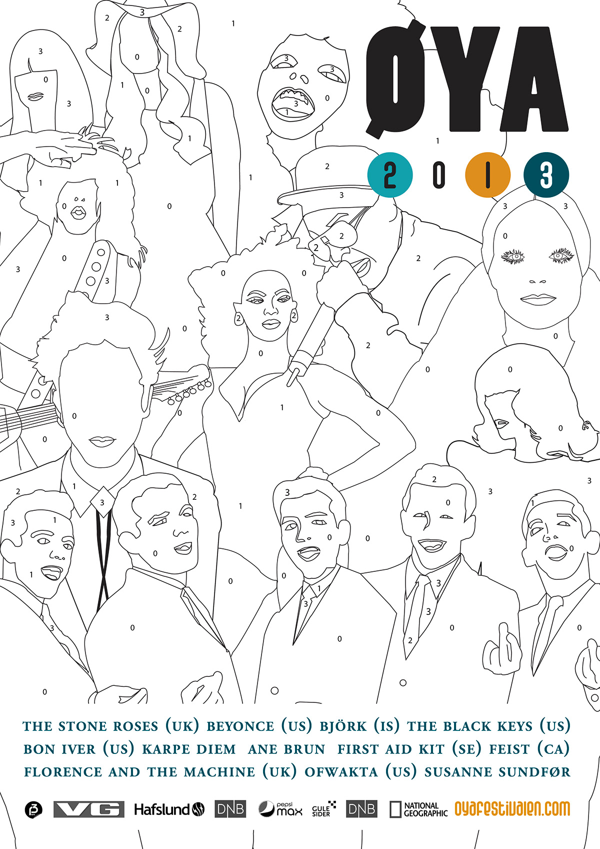
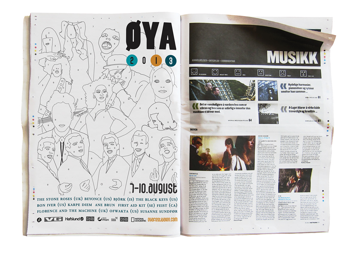
All the promotional photos of the artists are illustrated with a distinct illustrational style. This gives the festival its own way to show their artists promotional pictures. Sometimes the illustrations are not totally filled with all the colors. Then you will se a pencil sign on the photo which means that you can color it yourself. The illustrations from the photos can also be shown without the photo, and put on top of different applications.
All the photos should always be black and white. This makes the illustrations stand out even more.
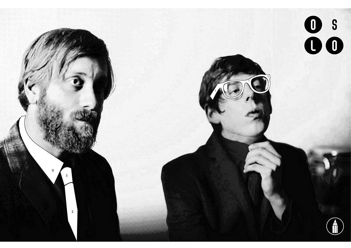
The pencil-symbol shows you that the illustrations needs coloring.
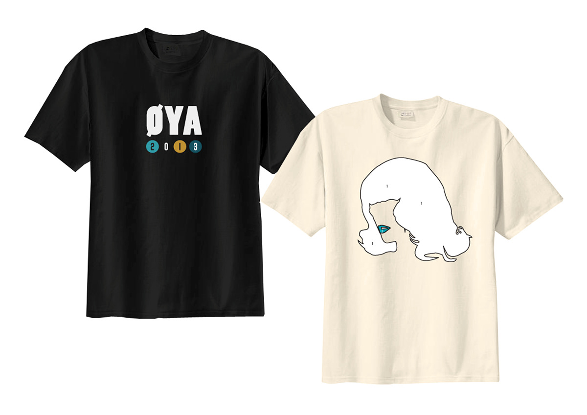
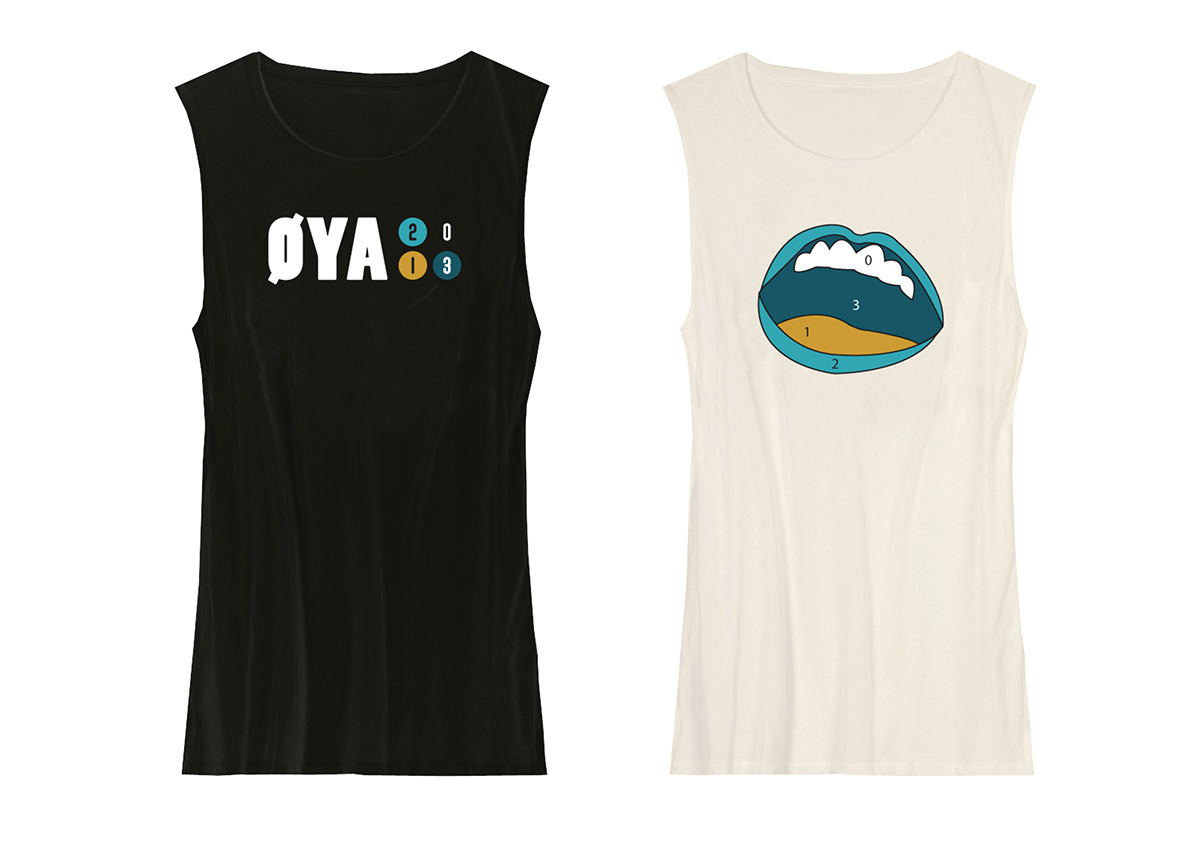
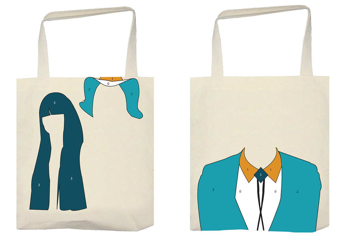
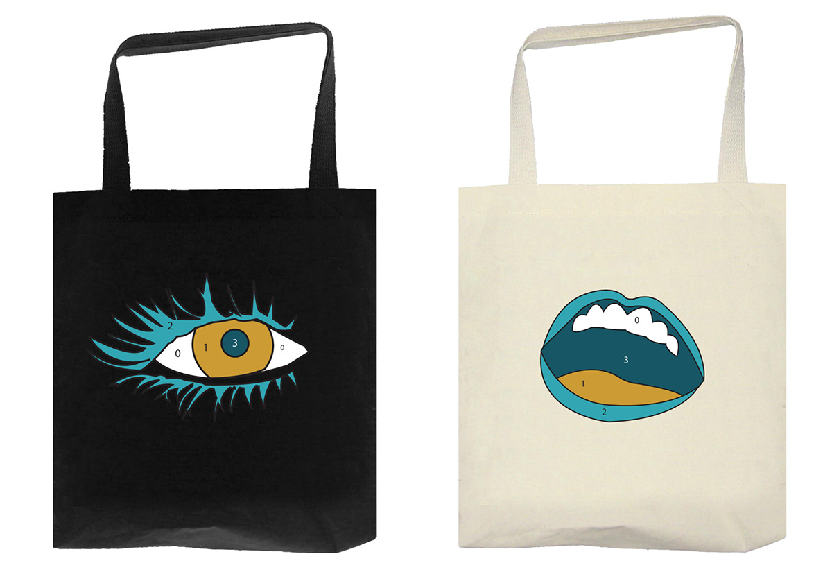
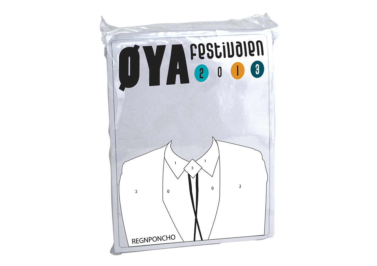
Applications/Merchandice
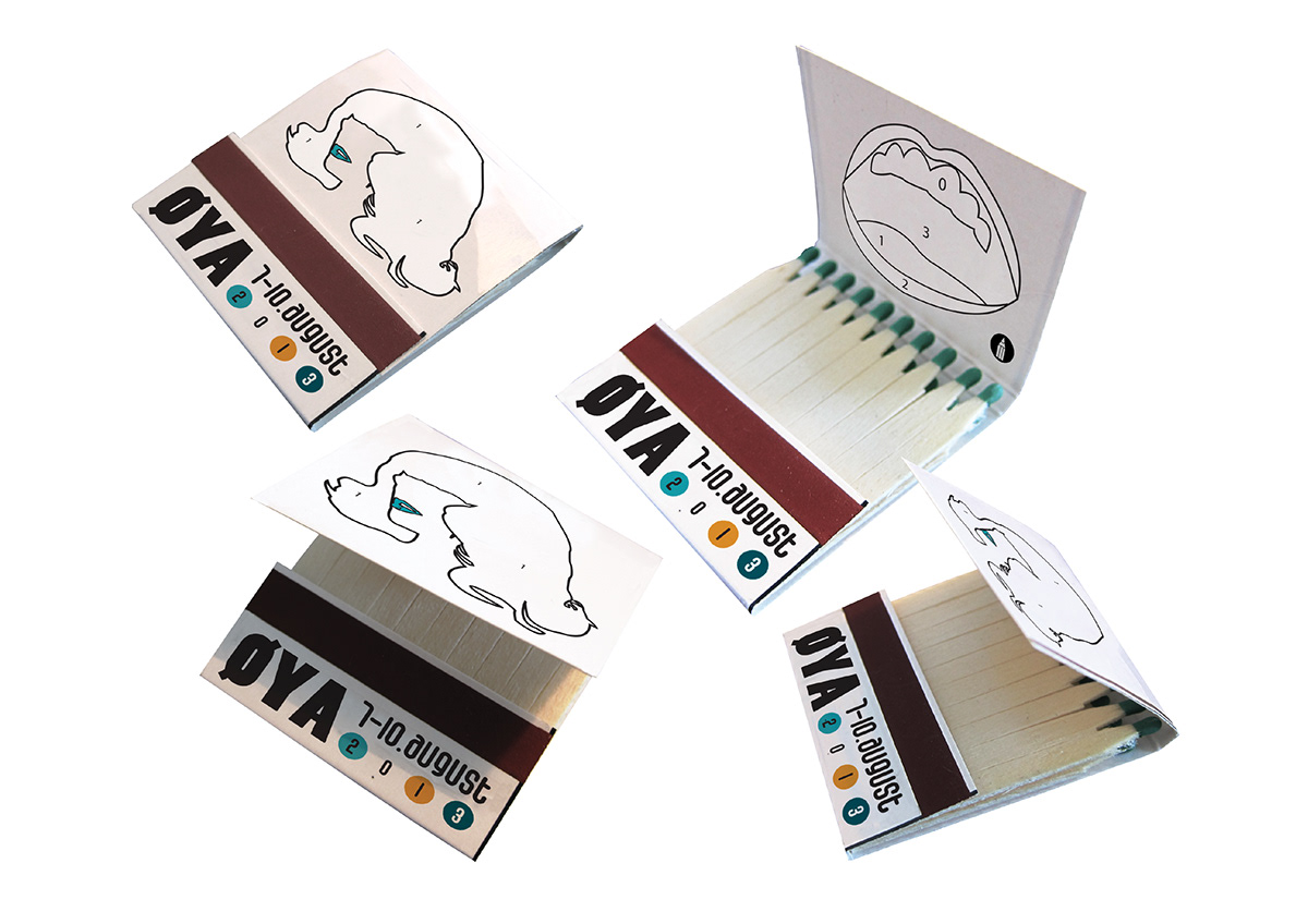
All the illustrations can seperated from the photos and applicated on to different types of merchandice. This adds more personality to the merchandice of the festival, and gives the festival more than just the logo to play with.
All the illustrations can seperated from the photos and applicated on to different types of merchandice. This adds more personality to the merchandice of the festival, and gives the festival more than just the logo to play with.

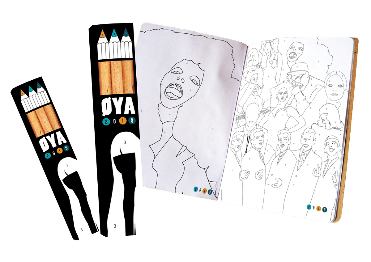
Some important parts of the idenity are the coloring applications; coloring books with illustrations of the headliners, and coloring pencils.The will also be more opportunities to color inside the festival magazine.
Posters
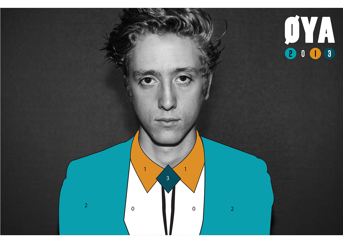
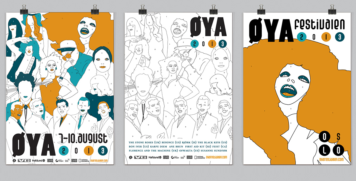
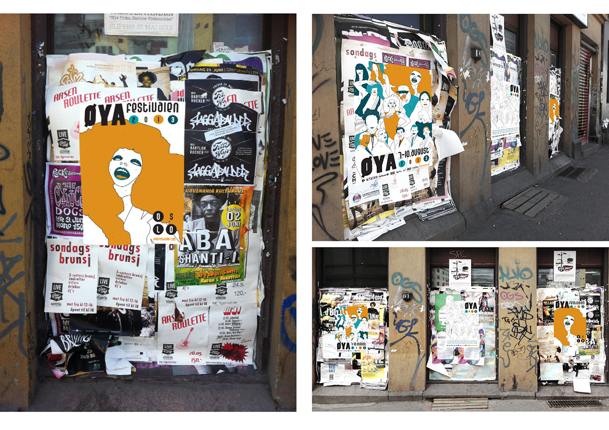
The posters are all illustrated with some of the festival-headliners. There are three posters. The first one is in colors. From far away you can clearly see the colors and Øya-logo, and when you get closer you can explore all the illustrations and the coloring-style.
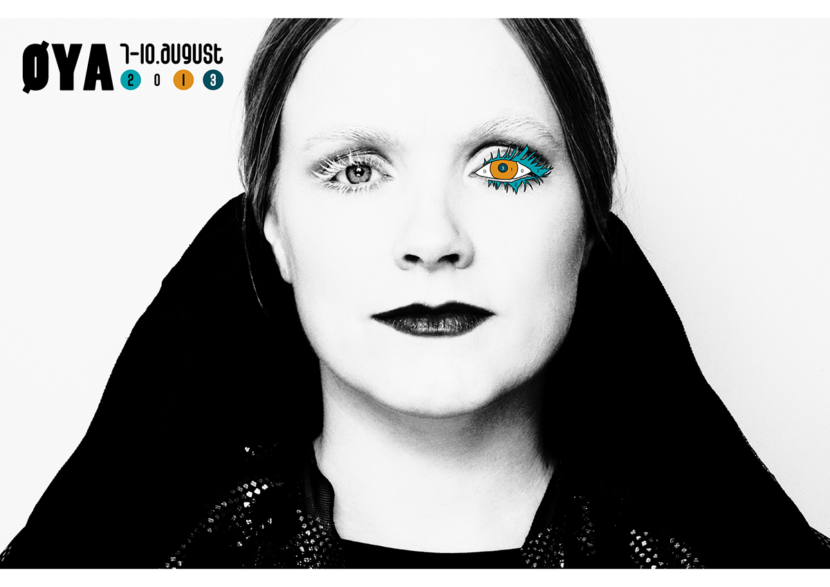
The second poster has no colors exept from the logo. This is ment to create interest and quriosity around the concept.
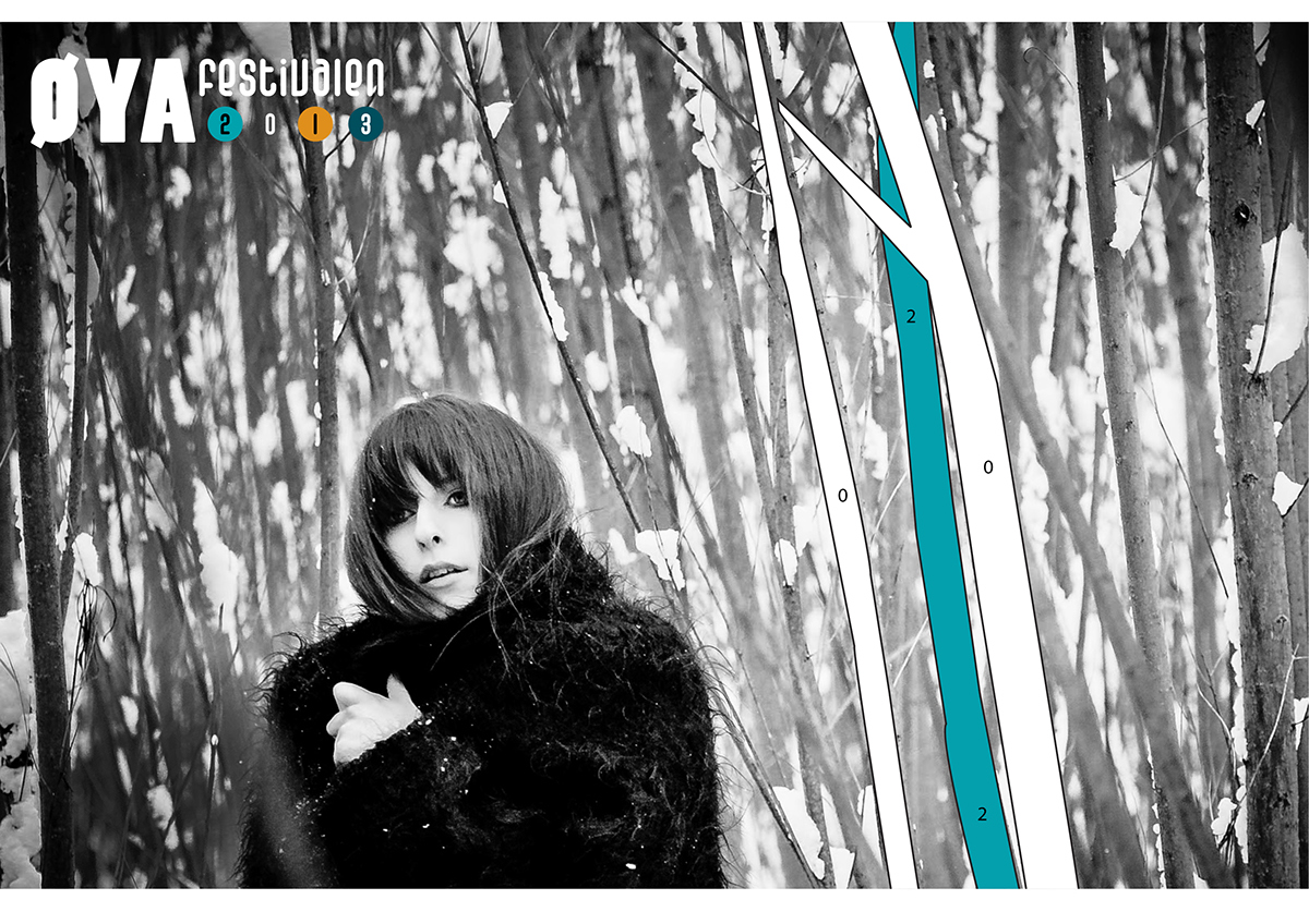
The third poster promotes one of the biggest headliners that attending the festival.
The posters are all illustrated with some of the festival-headliners. There are three posters. The first one is in colors. From far away you can clearly see the colors and Øya-logo, and when you get closer you can explore all the illustrations and the coloring-style.
The second poster has no colors exept from the logo. This is ment to create interest and quriosity around the concept.
The third poster promotes one of the biggest headliners that attending the festival.
Promo material
The posters are also made into ads for newspapers and websites.
The posters are also made into ads for newspapers and websites.

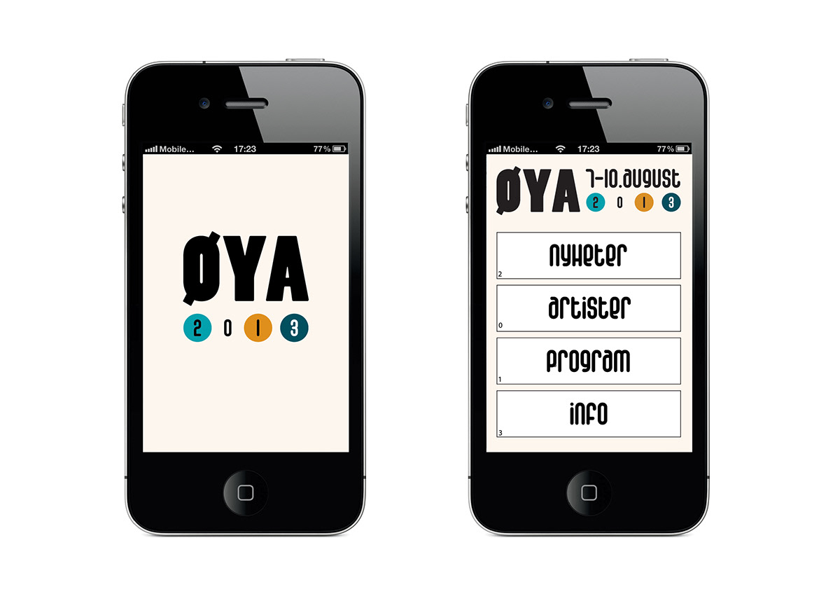
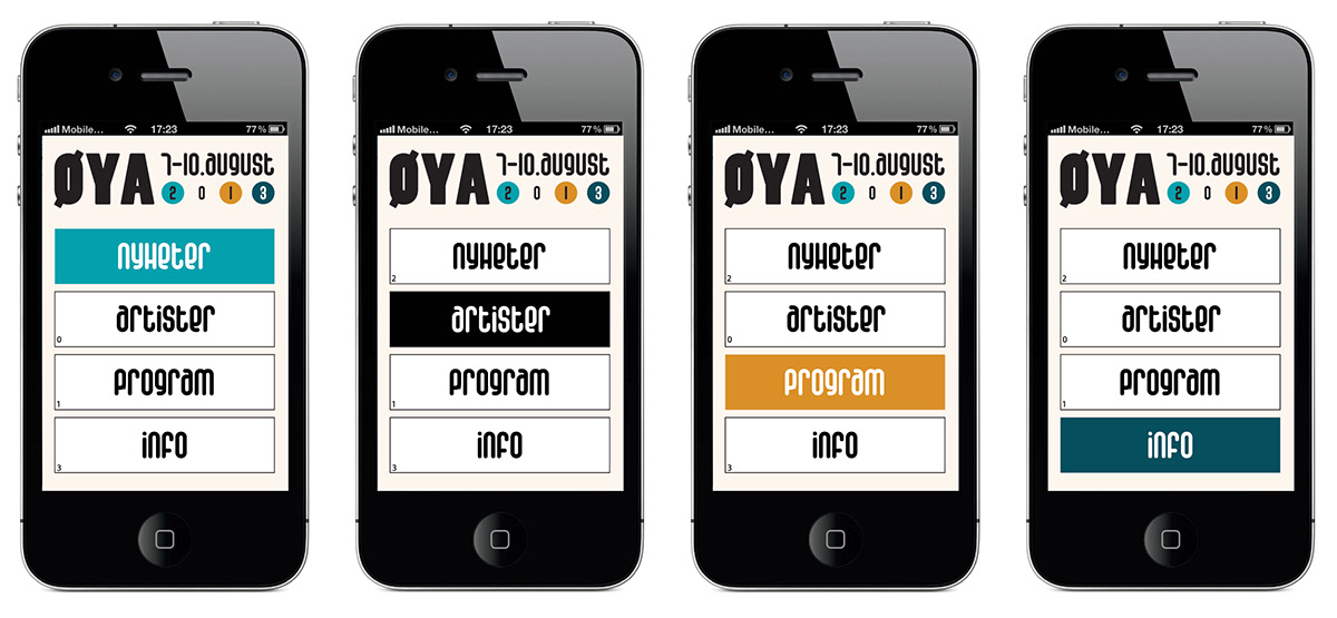
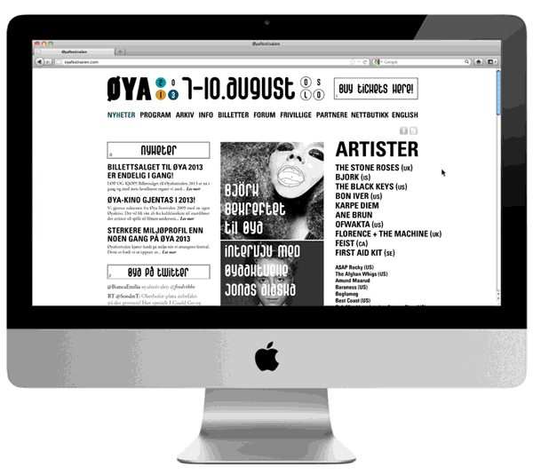
App and Website
The app and the website are made in a way that is supposed to clarify the color- and illustrational concept. Basically both the app and the website don´t have any colors. When you first enter the website there are no colors, except from in the logo (which is the color palette). When you move the cursor accross the objects in the page the objects will be filled with color.
The app and the website are made in a way that is supposed to clarify the color- and illustrational concept. Basically both the app and the website don´t have any colors. When you first enter the website there are no colors, except from in the logo (which is the color palette). When you move the cursor accross the objects in the page the objects will be filled with color.
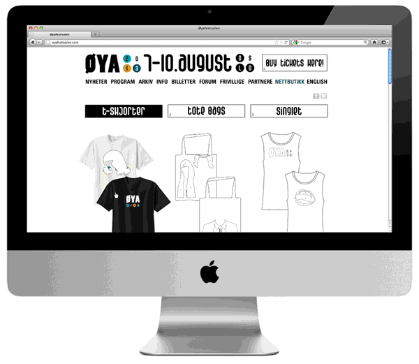
The website has also got a webshop. When you move your cursor accross the illustrations they will turn into photos.
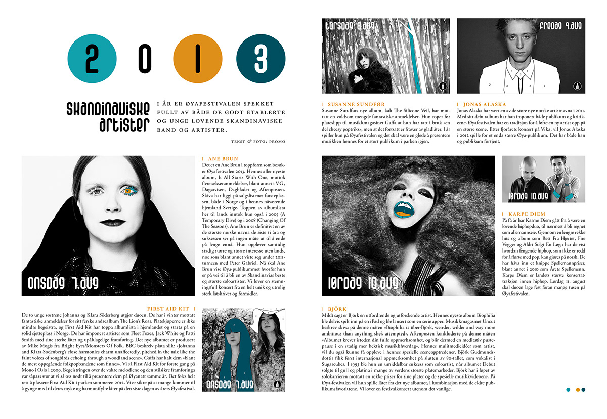
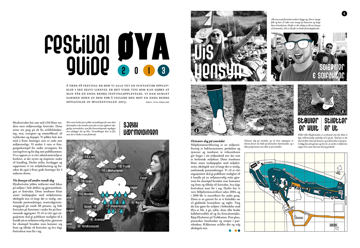
Magazine
The festival magazine contains interviews with some of the artists, and also other articles like a festival guide.
Inside the magazine there will be several places where the illustrations needs coloring from the reader.
The festival magazine contains interviews with some of the artists, and also other articles like a festival guide.
Inside the magazine there will be several places where the illustrations needs coloring from the reader.