

TypographyLogo and Stationery Design
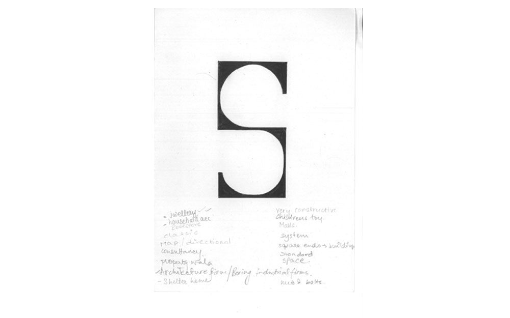
The sketch of the letter 'S'.

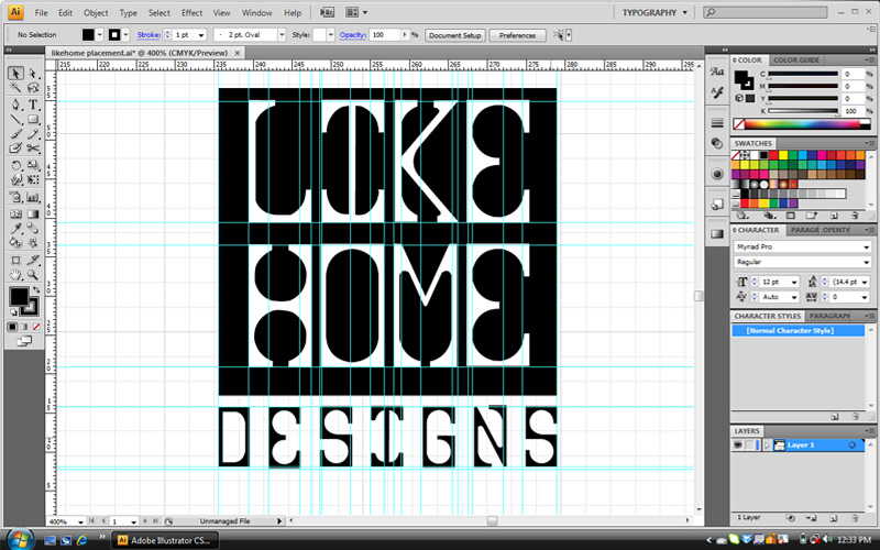
I took the sketch to the computer and creating the grid (as seen on the left) with the help of which I could design the font for LIKEHOME DESIGNS.

This is how it looked when I was done. But it didn't end here.

I explored in terms of colour, placement etc. to design the logo of the firm.
The process.
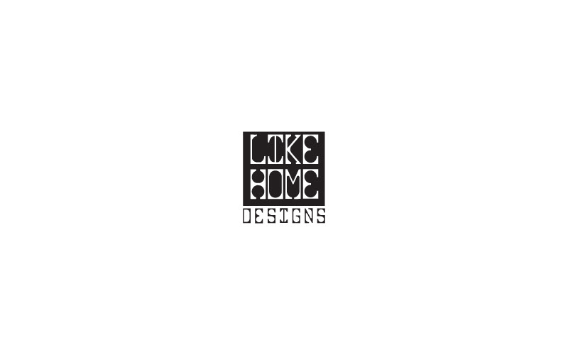
The final design for the logo.
The logo is simple and clean. Black and white makes it look professional and serious.

The logo was then used in stationery.
I wanted the design for the stationery to be simple and clean. Therefore, I used a darker shade of grey to mark the writing area in the letterhead (left) rather than defining it with marks.
The letterhead, envelope and visiting card follow a certain design language and therefore complement each other.


