This YCN brief was to create a new camapign for Ted Baker’s watch range, the outcome had to be fun, british and brave. With an influence from British fairytales I have tried to capture a delicate quirky and vintage feel to the campaign as well as not loosing that special Ted Baker essence

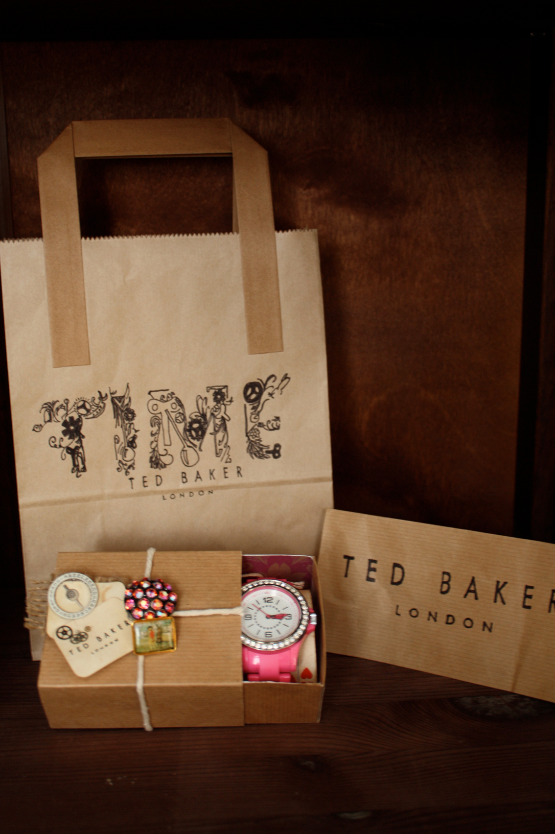
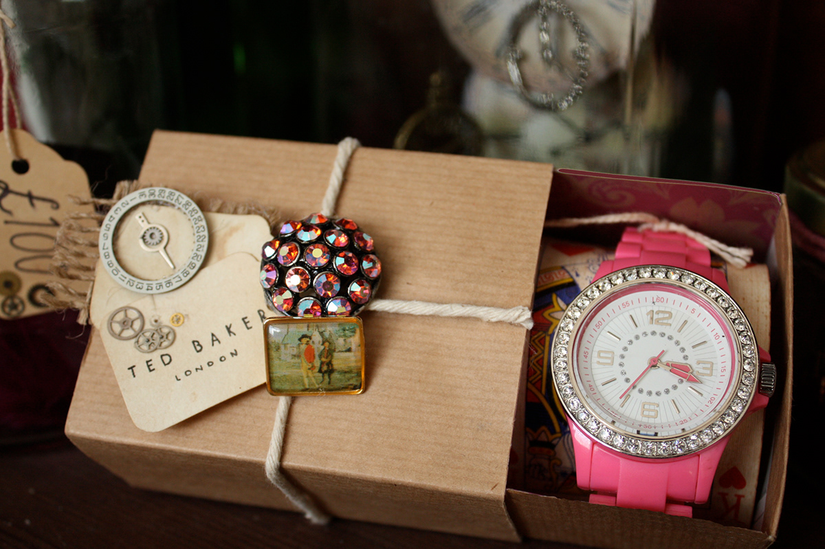
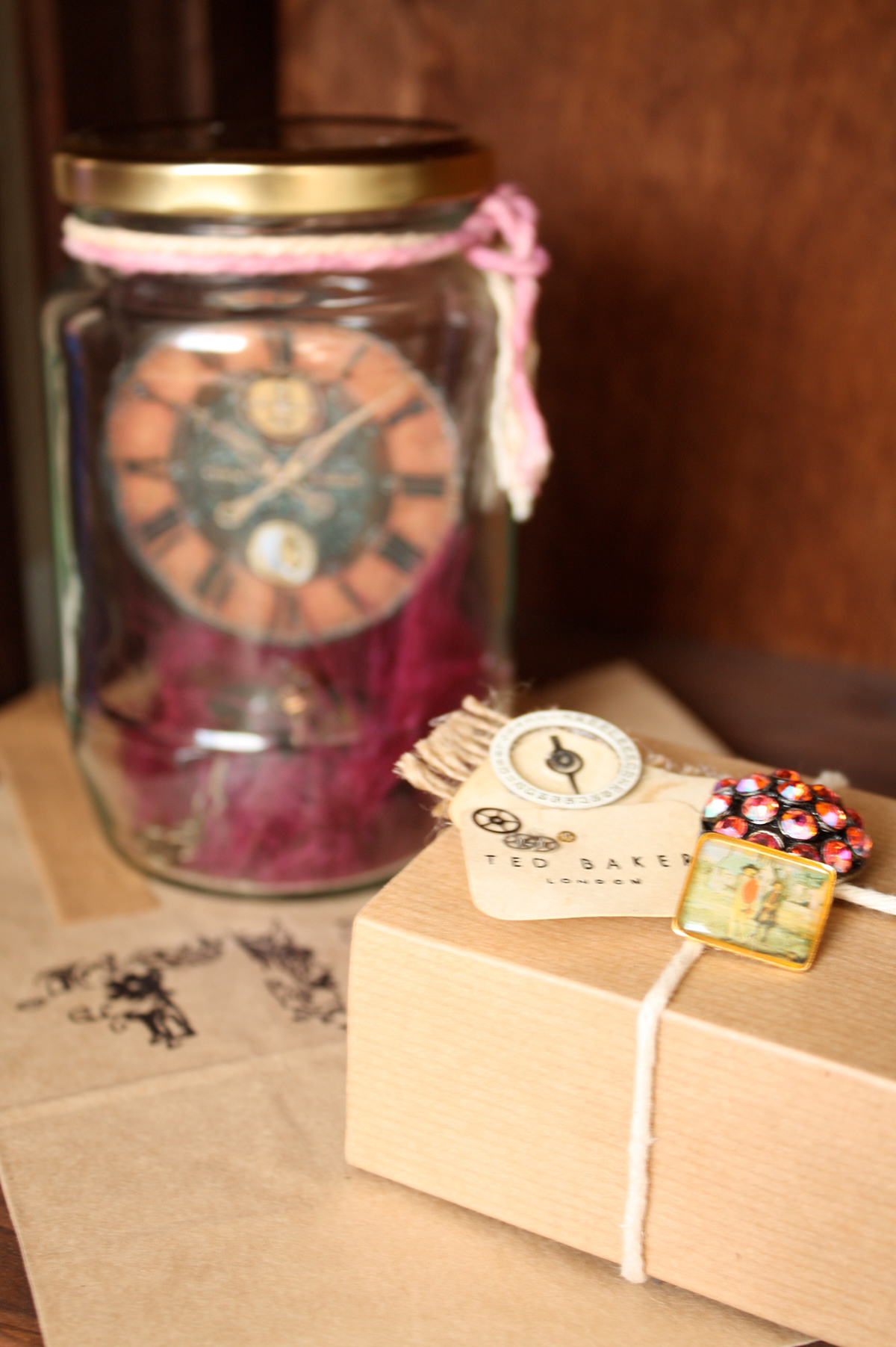
I named the campaign “Time” and created a typeface made of clock parts, flowers and the odd fairytale element, which can be seen on the paper carrier bag in the photo. The packaging I created is quite simple and not fussy but the added embellishments are what really catches your eye. The tags on the packaging are all handmade, with actual clock parts to add an authentic unique feel, and it has that affect where people want to pick it up, its that attention to detail. The watch inside the box is held in place by being placed around a cardboard playing card, its different and fun.
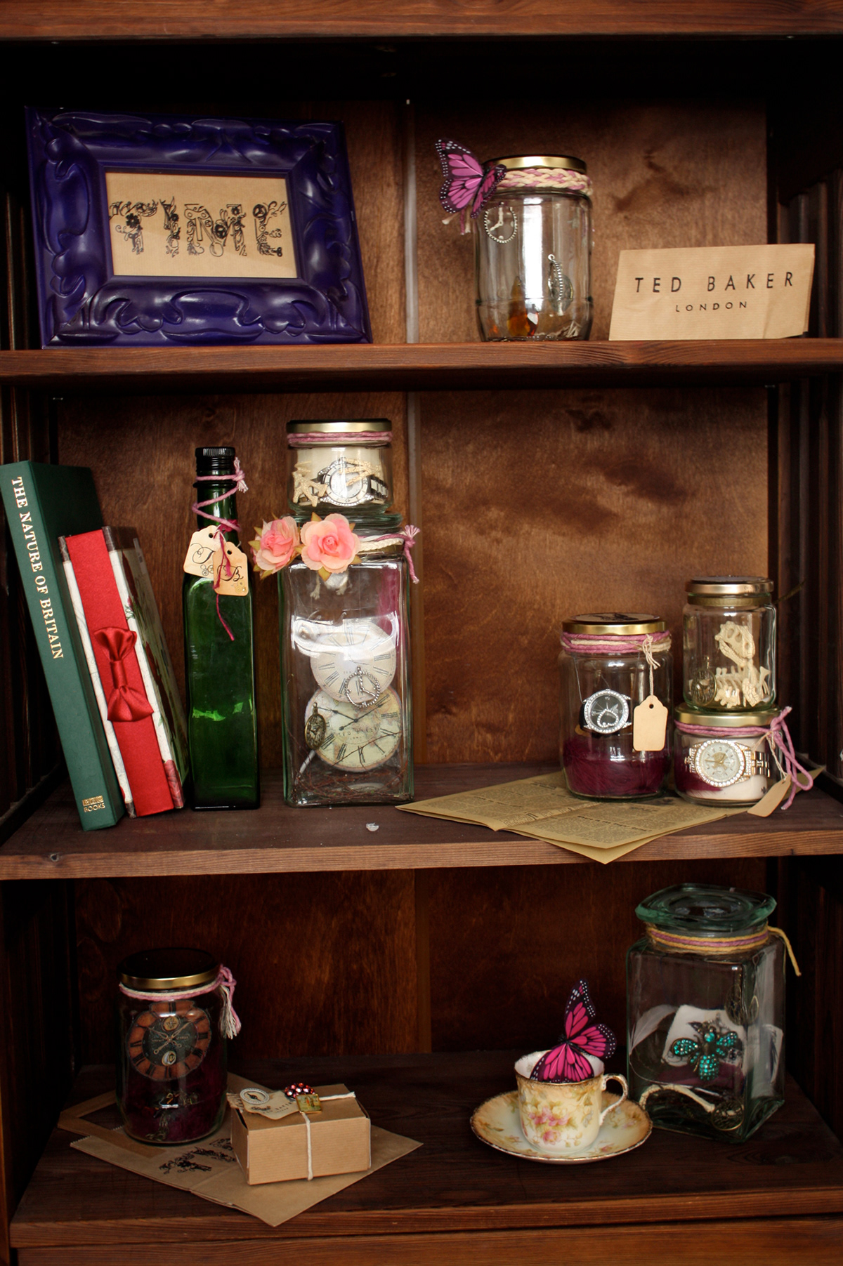
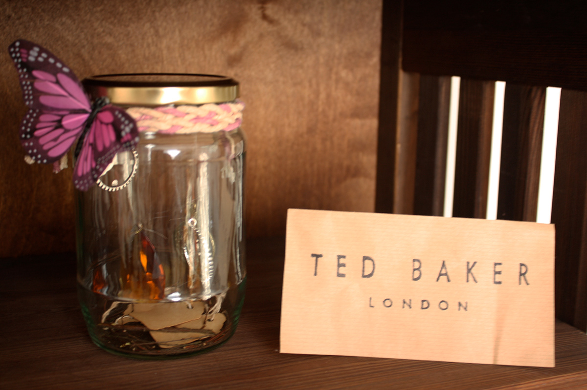
This image is to show the point of sale that would be in the Ted Baker shop. Old oak style shelfing would be used to display not only the packaging but also different sized jars, each unique. Some of the jars have what seem to be floating watches inside as well as butterflies, dinosaur skeletons, floating clocks, playing cards and twigs as well as other things. Its that idea of things being caught through time, and left on old shelves to be discovered and that idea of catching things, like in your childhood where you’d read books about catching fairys and other
precious things. It not only brings fun to the campaign but it intrigues people to have a closer look, and to put a smile on their faces.
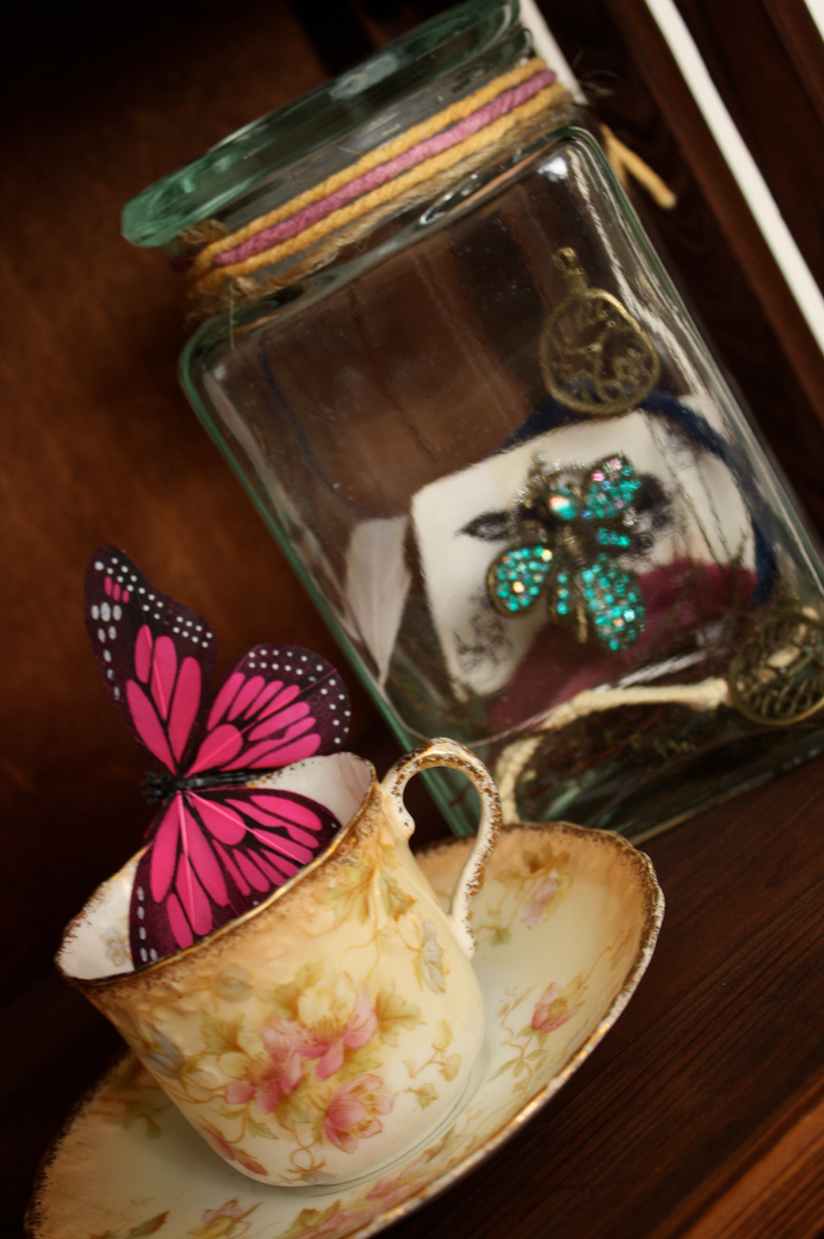
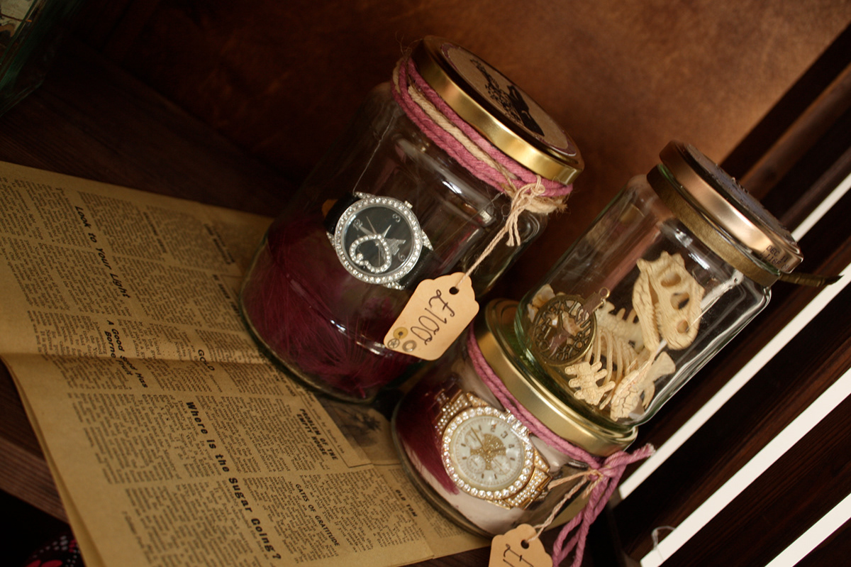
These photos show a close up of the items used in the point of sale. They all have a vintage quirky feel. The display definatly has the wow factor thats going to draw shoppers in but its not until you come up close that you can see the detail and quality in the entire thing, which I believe also reflects the product. The jars
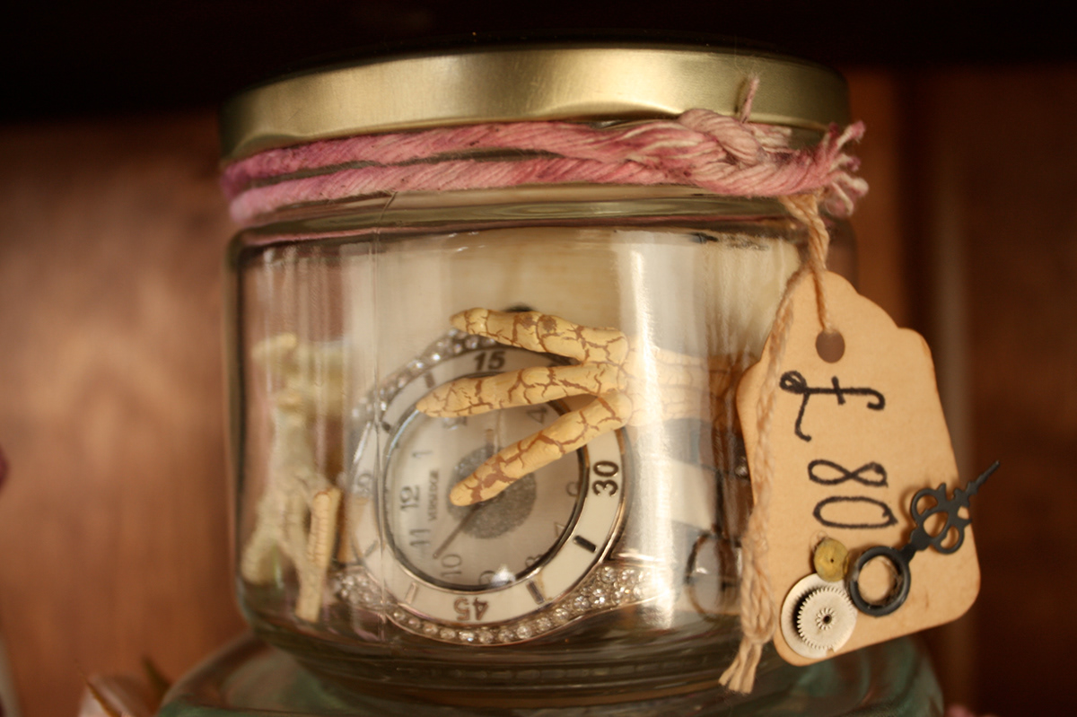
displaying the actual watches all have old
fashioned price tags hanging from the jars so the prices can be easily seen. Items put on the shelves such as the tea cup and newspaper finish off the display perfectly, as the Brisitsh always have time for tea and a newspaper.
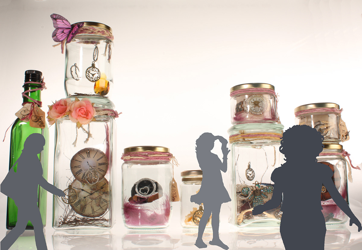
This image is to show the idea for the window display. The jars that would be used in the point of sale, would also be created in human size, icluding all the contents of the jars. They would be stood in the window to give the impression that when passers by walked up, it felt like they had been shrunk down, and could in fact be caught in one of the jars. Creating that fairytale feel.

