Stonewall Roman Typeface
Broad nib inspired with elegant natural movements and deadly details
Rooted in the logic of the broad nib pen, Stonewall straddles the line between something of antiquated, dusty handwriting and type that is a timeless authority.
Developed from hours of calligraphic studies and experiments, a transition to drawing offered more freedom to express a certain personality within the typeface. Taking inspiration from castle walls and an overall medieval aesthetic, a lengthy battle to find a natural, yet expressive, serif treatment began.
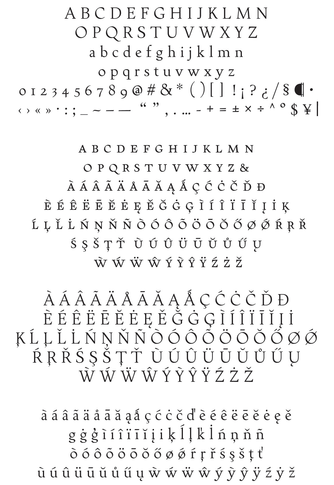
Stonewall is a text face suitable for extended text and titling within a print environment. With over 450 glyphs to a single Roman, it’s overflowing with diacritics suitable for any language the Latin alphabet can throw at it.
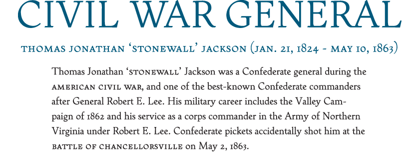
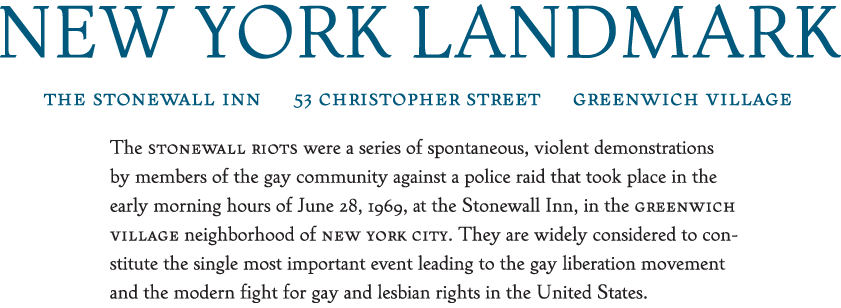
Stonewall holds up well at small sizes, bringing a lightness to large blocks of text. The small caps fall well in line with the lowercase and the non-lining numerals, creating a pleasant reading experience. But Stonewall isn’t restricted to small sizes. The details of each character shines when presented at larger header and titling sizes, giving a Trajan-like appearance to headings.


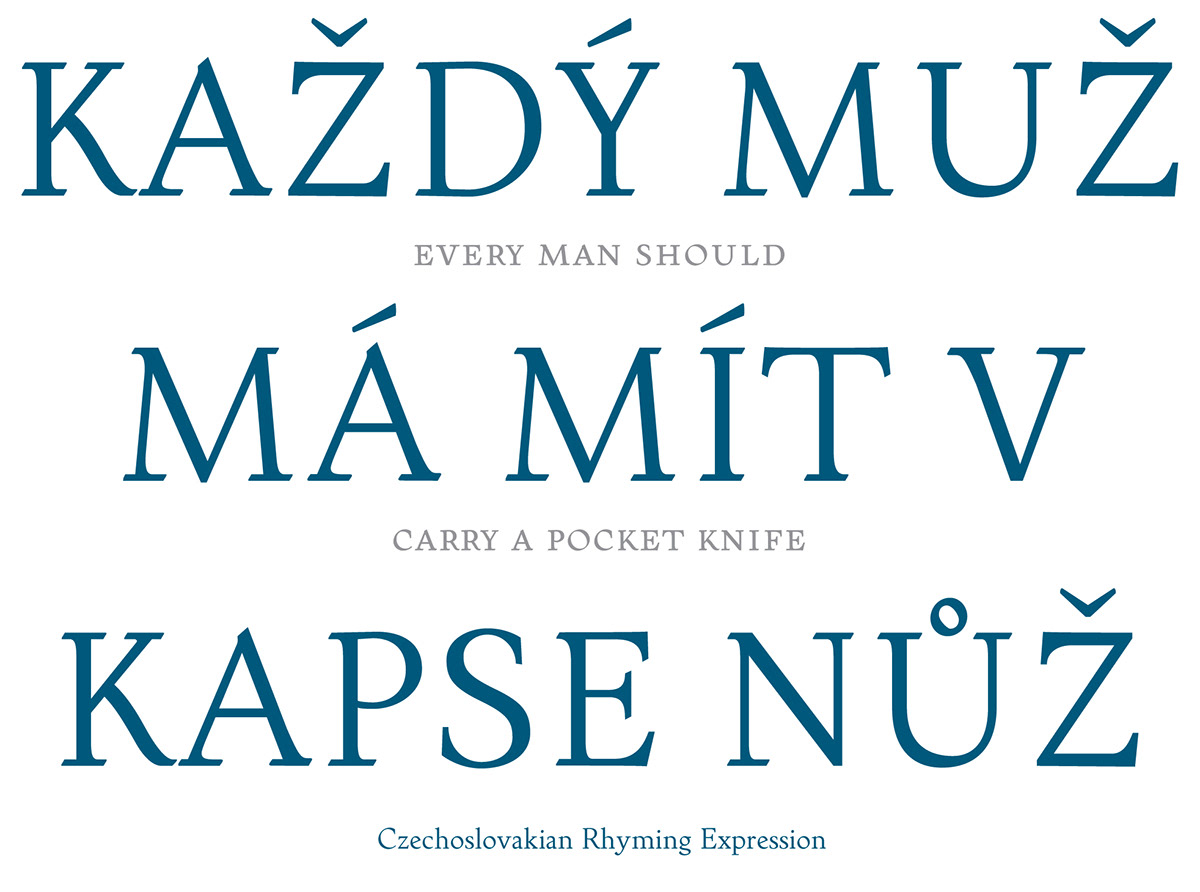
Making broad strokes with an ink and brush, I found by following the standard roman calligraphic construction, I could augment the asymmetrical serif of a descender (or stem on the baseline). With the simple addition of a left-to-right horizontal stroke, a bracket was created on one side and the other was left with a 90° angle. While there are other typefaces that recreate this effect, they do not mimic the forward motion found in Roman calligraphy. Enter Stonewall.


This awkward convention creates a slab-clarendon serif on and below the baseline, whereas the top appears boney and stone-like. However strange the marriage of the two treatments seems, it creates a authoritative, Venetian with contemporary twists. This gives Stonewall an appearance reminiscent of more chivalrous times, but does not leave it stuck in the Dark Ages.
With all these references to architecture, rocks, and slab serifs, Stonewall does not appear stiff. With the humanist calligraphic skeleton, the stems and brackets seem to have a motion to their outlines.

Currently, Stonewall is the foundation for a future family of varying weights and possibilities. The immediate step is to continue expanding the Roman to include ligatures. Afterwards, the next logical step would be to draw an italic. But, the family can benefit from weighted versions and even a titling version with contextual alternates.
Hopefully Stonewall will find a home and market with a distributor in the early part of 2014.
Hopefully Stonewall will find a home and market with a distributor in the early part of 2014.


