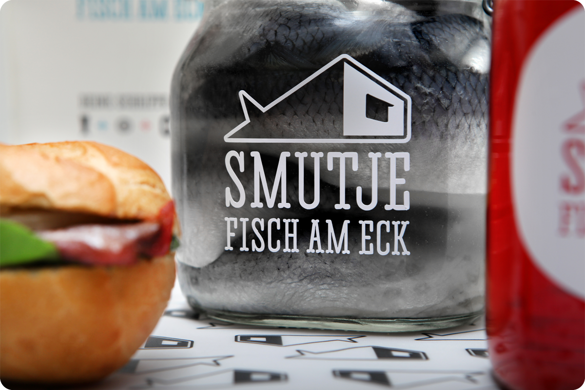
Smutje – Fisch am Eck
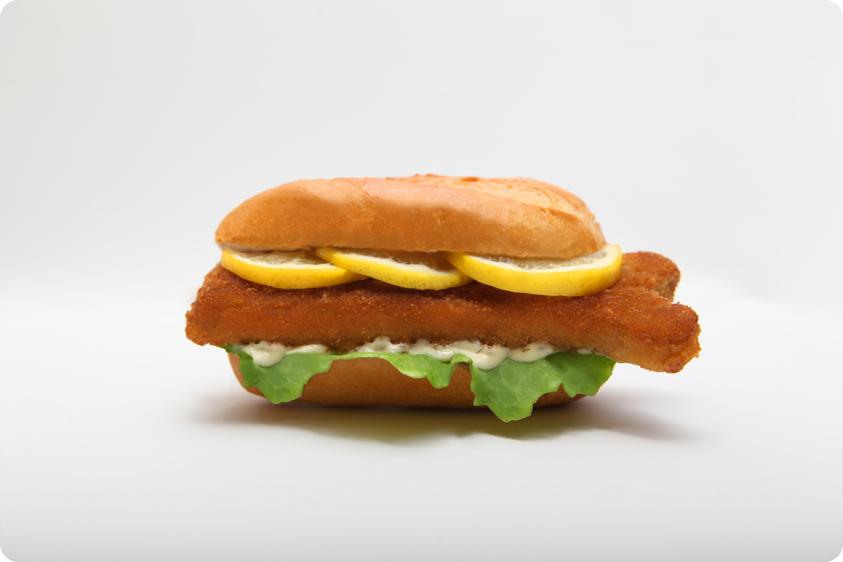
Des Norddeutschen liebste Delikatesse – das Fischbrötchen – trifft auf modernes Branding:
emotional, unkonventionell, maritim und nordisch-selbstbewusst präsentiert und vermarktet Smutje den Fischbudenklassiker.
Rückbesinnung auf alte Werte und die Herstellung traditioneller Produkte stehen an oberster Stelle von Smutje.
Harte Schale, weicher Kern – die Persönlichkeit besitzt eine kühle, lockere, freche Art verbunden mit einer herzlichen,
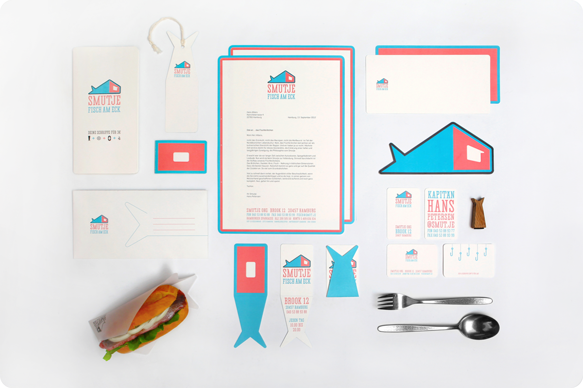
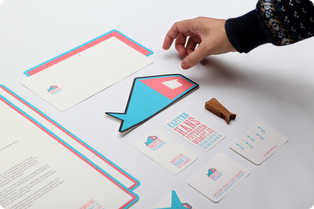
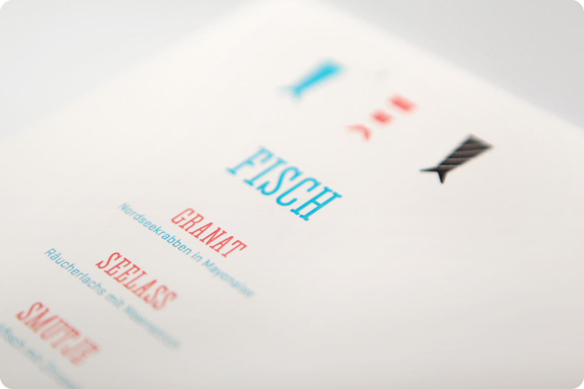
auf Qualität und Tradition bedachten, sozialen Art. Dabei spielt sie bewusst mit reduzierten und kontrastierenden Gestaltunsgmitteln: Abstraktionsgrad und Stilisierung der Marke sowie der Schmuckelemente kontrastieren mit weichen Formen in der Typografie und einer abwechslungsreichen, fröhlichen Farbwelt.
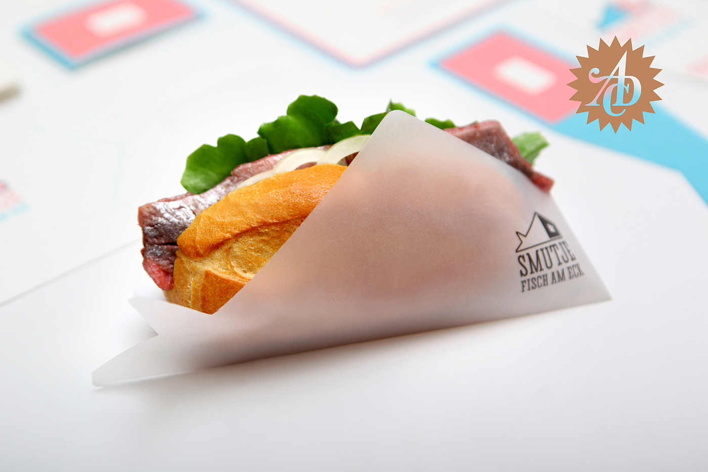
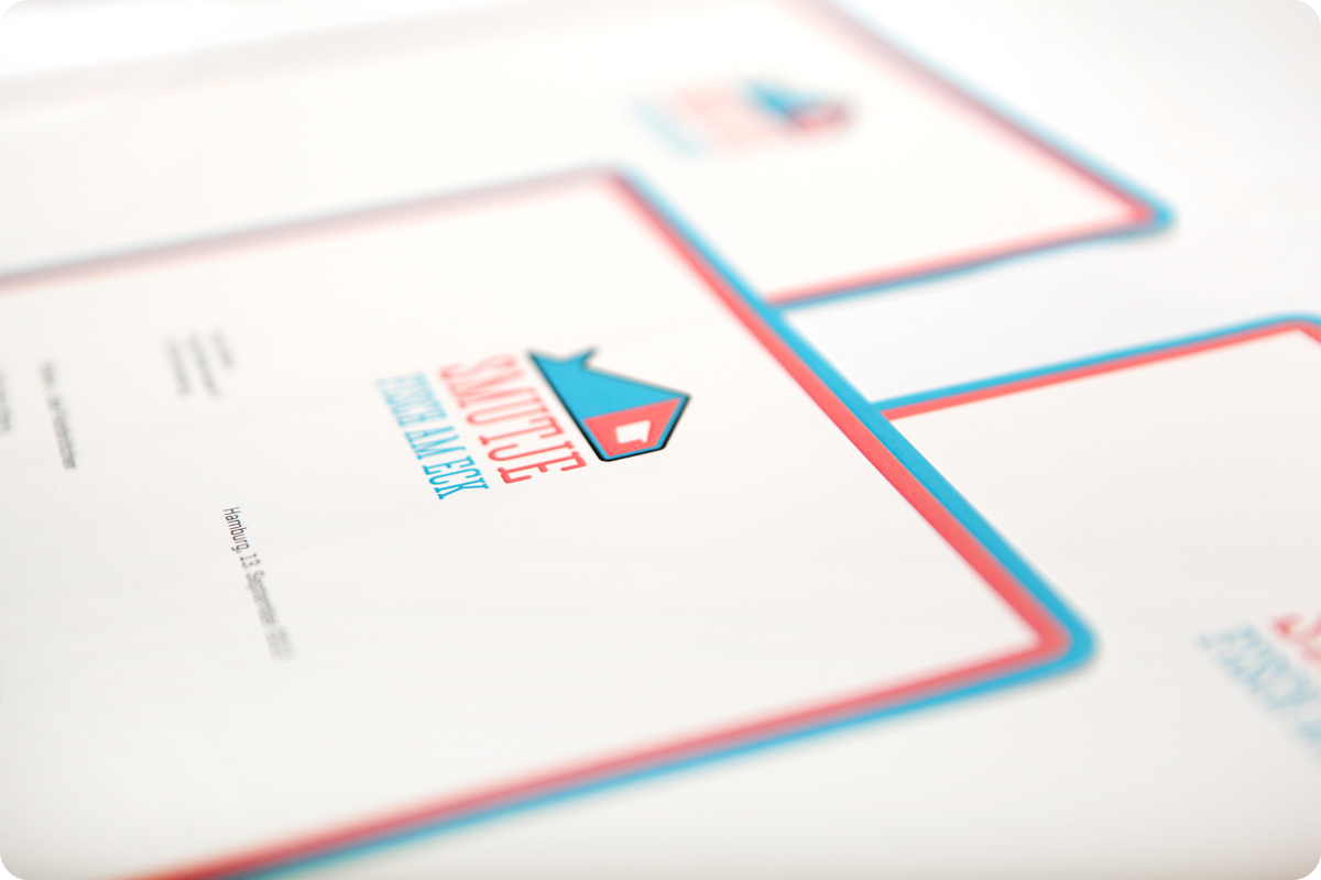
Die Marke ist mehrschichtig und kombiniert das Produkt, ein stilisiertes Fischfilet, mit der perspektivisch-abstrahierten Ansicht eines Gebäudes »am Eck« – des Smutjes Küche.
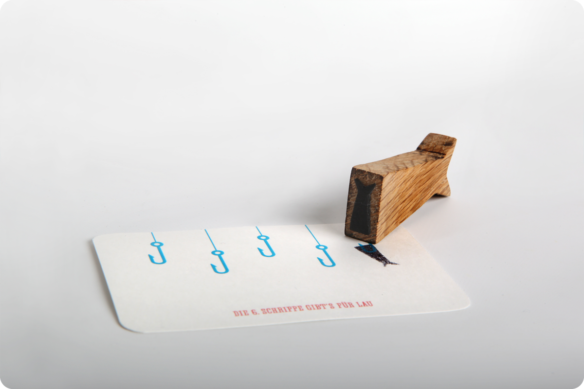
Der Smutje ist der Schiffskoch und für die Zubereitung aller Speisen an Bord zuständig. Er kümmert sich um Speiseplan, Einkauf der richtigen Lebensmittel und die Bevorratung. Aufgrund der langen Seezeiten ist der Smutje von besonderer Bedeutung für die Moral der Seeleute. Viele bezeichnen ihn auch als den wichtigsten Mann an Bord.
_
Northern Germans’ favorite delicacy – the Fischbrötchen – meets modern branding: emotionally, funky, maritime and Nordic self confidently Smutje presents and markets the classic bread roll with fish.
Knowledge of old values and traditional production are the top priority of Smutje. Smutje also emphasizes its characteristic identity, which is visualized in a multi dimensional combination of form, color and typography.
In an up-to-date visualized environment the brand links product and theme through functionality. In addition high degree of abstraction and reduction of elements stay in contrast to soft forms and colors. The logo combines the product, a cut fish filet, with an abstracted corner of a building – am Eck (at the corner) – in a perspective view. The logo also refers to the store’s location, which is located at a block’s corner.
Naming: As the ship‘s chief cook the Smutje holds responsibility for creating the daily menu and the purchase and storage of food for long journeys. Therefore, he is also called the most important man aboard, since the crew’s mood is determined by his meals.
Awards ADC Germany – Junior Bronze, 2013


Thanks for visiting and appreciating.


