Rafeedia Typeface
Typography
Typography
This is a school project in which we had to focus on a product and design a typeface that works well for it. For my type design, I chose Kellogg's Corn Flakes - hence the cereal sketches in the process.


Lettering process based on the diacritic dot of the typeface.

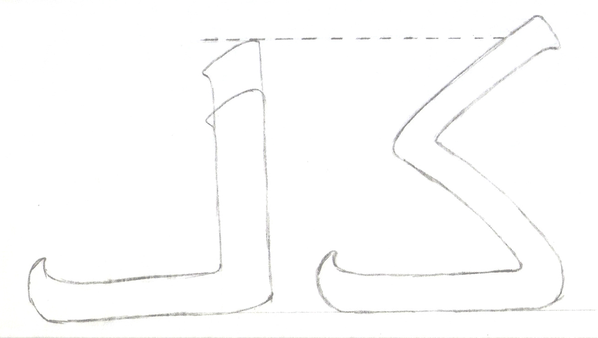
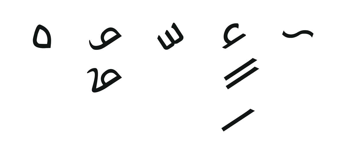
Study of counter form and letter eyes for legibility purposes.
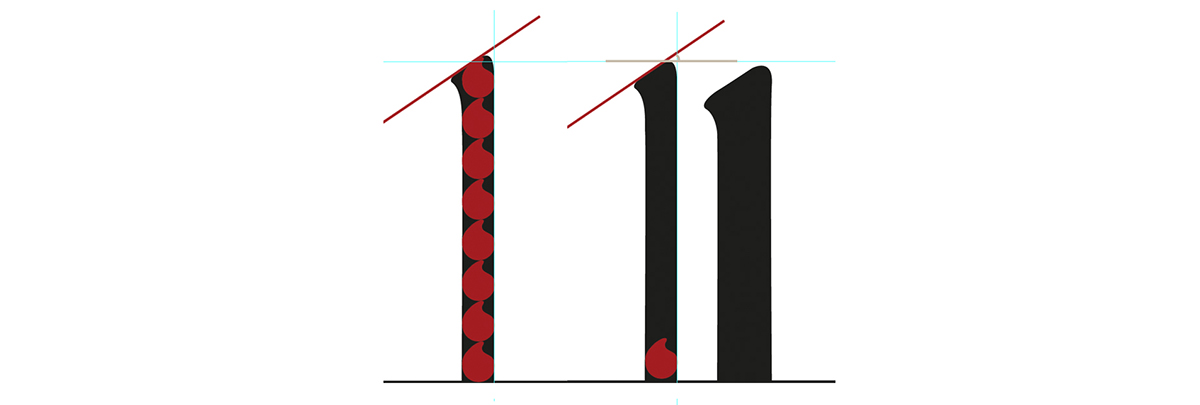

Stroke thickness refinements based on the proportions of the diacritic dot.
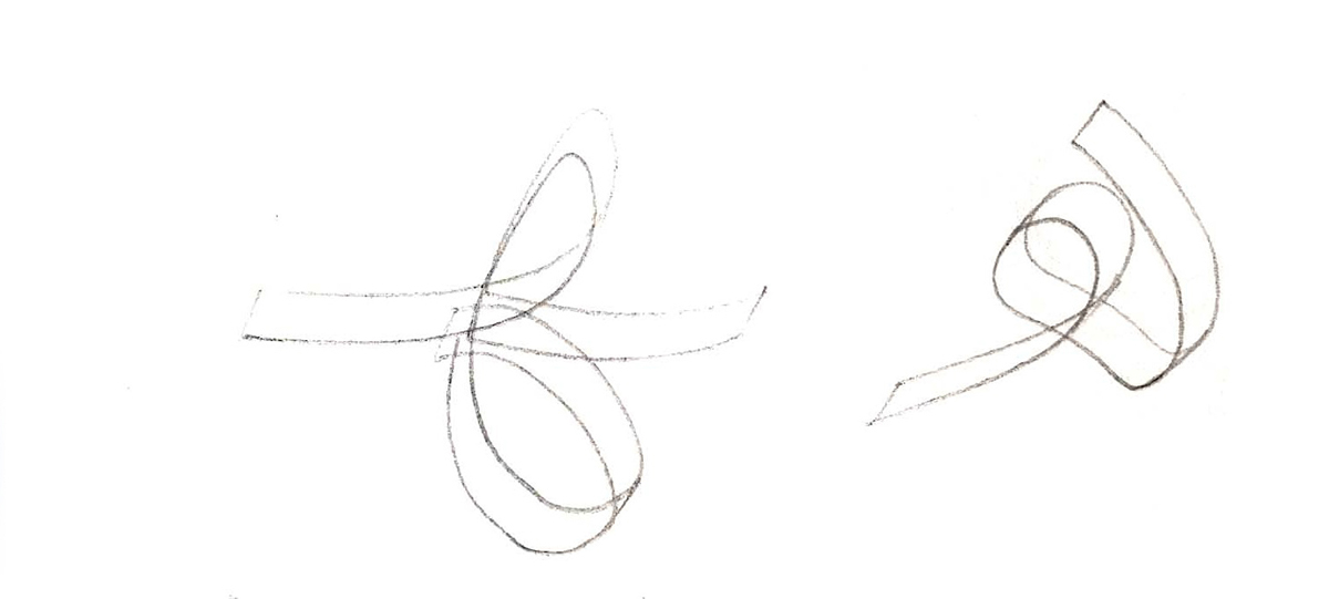
Letter connection details and tests.
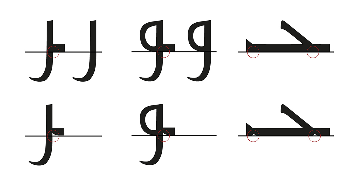
Quick view of the design process. (showing the letter 'waw' as an example)

Final repertoire. Rafeedia letter set.
Tashkeel.

