

plexo
www.plexo.eu
www.plexo.eu
Tal como descrito na página oficialdo projecto (www.plexo.eu) , “o Plexo.eu é uma plataforma decirculação livre de conhecimento, que garante o acesso de qualquer cidadão aregistos audiovisuais, em directo e/ou em diferido, de eventos ligados às áreasdo design gráfico e multimédia, em língua portuguesa”.
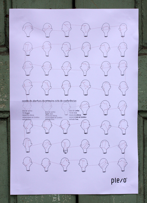
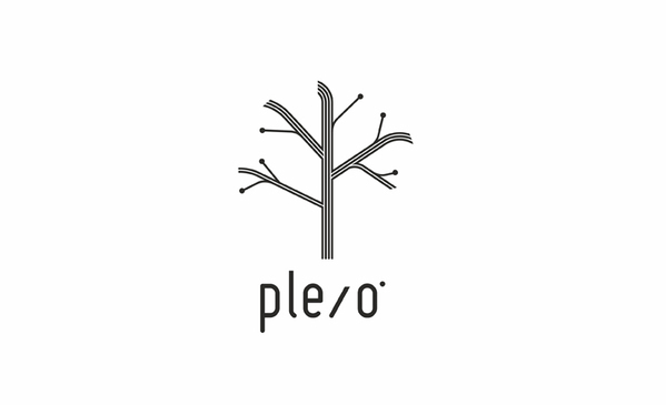
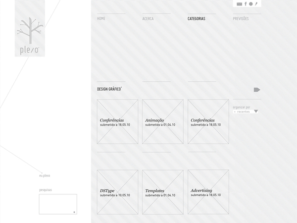
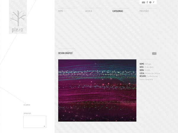
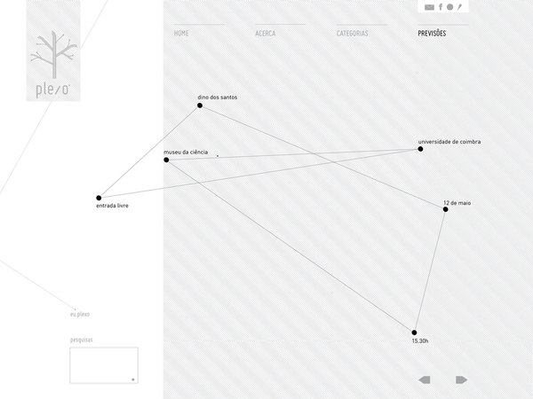
A ma.china.shape ficou com a tarefade definir uma imagem sólida para o projecto que abrangesse, não só a logomarcae o site, como também a linha gráfica dos cartazes informativos. Os plexos do corpo humano,especialmente os dos neurónios, são visualmente muito parecidos com árvores – efoi este o nosso ponto de partida. Pretendiamos que o símbolo gráfico seassemelhasse a uma árvore, uma árvore como símbolo do conhecimento. Umconhecimento que, como os ramos, se expande em diversas direcções. A formapouco natural como os ramos se ligam ao tronco principal pretende fazer umaalusão visual às ligações em “v” dos plexos no corpo humano. Os seis círculos da árvoresimbolizam os frutos do conhecimento e as terminações com que,tradicionalmente, os plexos são representados. O logótipo associa-se, na forma, àslinhas do símbolo gráfico. O círculo como expoente pretende simbolizar asobjectivas das camâras, a transmissão on-line das conferências.Pretendia-se que o site tivesse umalinha simples e descaracterizada tanto quanto possível. Para os cartazes,definiu-se que o fundo seria uma ilustração, desenhada com recurso aos métodostradicionais. Cada colaborador poderá desenvolver um fundo para os cartazes - a disparidade entre asilustrações, imposta pela sua temática e pelo traço de cada ilustrador, é vistacomo uma característica enriquecedora, ao nível da comunicação visual do Plexo. Os seiscírculos do símbolo gráfico foram aproveitados, no site, para concretizargráficos de infografias (uma espécie de agenda, presente na secção das “previsões”)e no cartaz das cabeças cortadas, para uni-las entre si. Note-seque os textos presentes nos materiais apresentados são ainda textos-maquete,sendo que a informação que exibem é fictícia.
Olançamento oficial da plataforma está previsto para Julho de 2010. Por motivosde força maior, o site e os cartazes podem ainda sofrer alterações.
//
As described on the official project (www.plexo.eu), "the Plexo.euis a platform for free movement of knowledge, which guarantees that everycitizen have the access to audiovisual recordings, live and / or deferred ofevents related to the areas of graphic design and multimedia, all in Portugueselanguage."
The ma.china.shape was left with the mission of defining asolid image for the project that would encompass not only the logo and thelayout of the website, but also a graphic line for the informational posters. The plexuses of the human body, especially those ofneurons, are visually very similar to trees - and this was also our startingpoint. We wanted the graphic symbol resembling a tree, a tree as a symbol ofknowledge. A knowledge that, like the branches, expand in various directions. The unnatural shape that connected the branches to themain trunk intends to make a visual allusion to the connections in "v" forrn of the plexuses in thehuman body. The six circles of the tree symbolize the fruits ofknowledge and their ends with that, traditionally, the plexuses arerepresented.
The logo is associated, in the form of lines of thegraphic symbol. The circle as a sign intended to symbolize the lenses ofcameras, the on-line streaming of conferences. It was intended that the site needs a single line andcharacterless as possible. For the posters, it was decided that the backgroundwould be an illustration, designed using the traditional methods. Each employee can develop an illustration for theposters - the disparity between the illustrations, imposed by its theme and thedifferent trace of each illustrator is seen as a rich feature, of the visualcommunication at Plexo.
The six circles of the graphicsymbol were recovered in the site, to deliver graphics of infographics (kind ofagenda, present in the section of "previsões") and also in the posterof severed heads, to stitch them together. Note that the texts present in the materials presented arejust text-models, and they display fictitious information.
The official launch of the platform is slated for July2010. For reasons of force majeure, the siteand the posters may still in change.
logo
note: image from the project "Links" of Tatiana Plakhova.
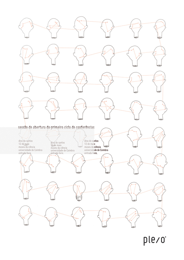
Esta ilustração pretende simbolizar a partilhade conhecimento, a principal motivação do Plexo. Este simbolismo encontra-serepresentado pelas linhas que unem, cabeça a cabeça, os seis círculos dosímbolo gráfico da plataforma. Tal como acontece na secção “previsões” do site,estes pontos são rodados e escalados, como um todo, sendo que as suas posiçõesrelativas se mantêm, criando-se assim uma alusão evidente ao símbolo gráfico.As linhas são vectores, criando-se assim uma separação evidente entre ascabeças, desenhadas à mão, e as linhas de união entre as cabeças, elevando-asassim a um plano mais espiritual, como se esta união fosse metafísica.
//
Thisillustration intended to symbolize the sharing of knowledge, the mainmotivation of Plexo. This symbolism is notable by joiningthe lines, head to head, the six circles of the graphic symbol of the platform.Just the same, like in the section of"previsões" of the site, these points are rotated and scaled as awhole, and their relative positions are standard, thus creating a clearallusion to the graphic symbol. Thelines are vectors, thus creating a clear separation between the heads,hand-drawn, and the lines of union between the heads, raising them to a morespiritual plane as if it were a metaphysical union.
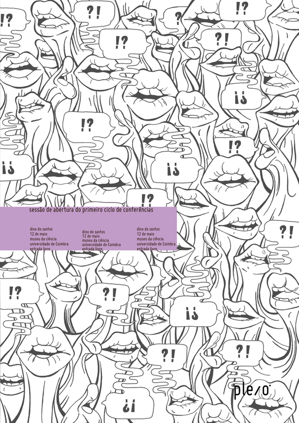
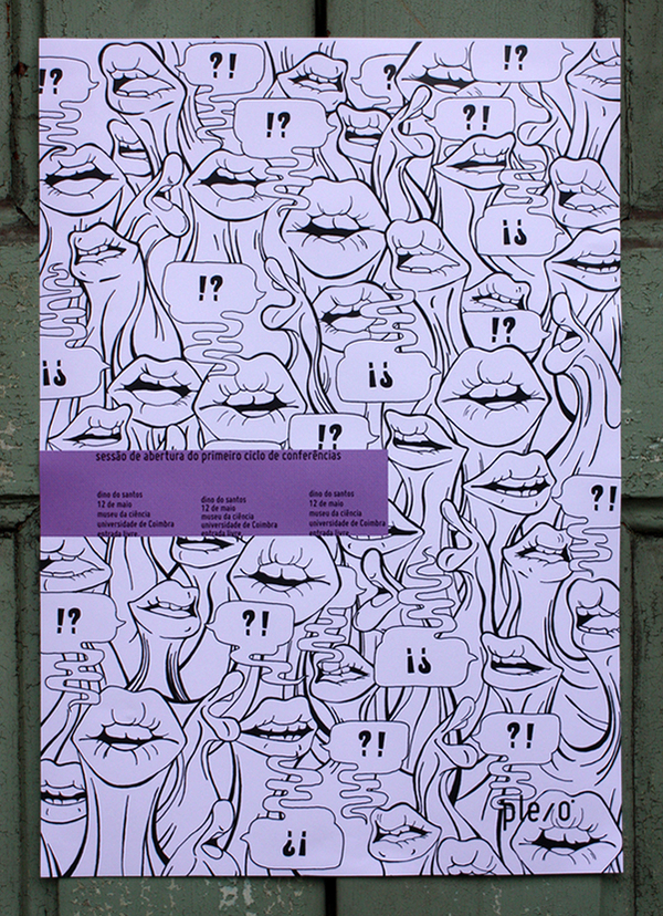
As diversas bocas presentes na ilustraçãopretendem representar um ambiente de exposição e debate de ideias numaconferência. Esta ideia é acentuada pelas diferentes expressões das bocas, queparecem expor opiniões divergentes. Existem ainda diversos balões de falasempre ligados a duas bocas, no qual uma boca coloca uma questão e outraresponde, tal como representam os símbolos tipográficos.
//
The manymouths represented in the illustration intended to represent an environmentalexposure and discussion of ideas during a conference. This idea is emphasizedby the different expressions of the mouths that seem to expose divergent pointsof view. There exists also several speechbubbles always connected with two mouths, in which one mouth asks a questionand another mouth gives the answer, asrepresented with the typographic symbols.