


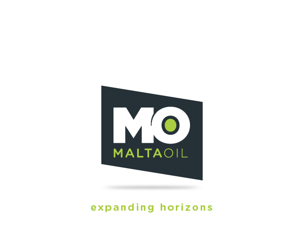

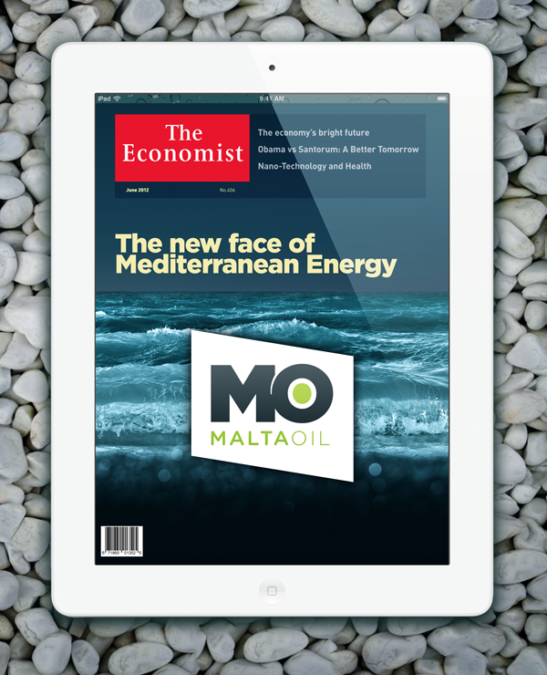
The Malta Oil identity was specifically designed to visually represent the new local energy company. The bold MO typography enclosed within the rhombus effectively creates a distinctive crest. Elements such as the tapered “wave-inspired” tear that seemingly separates the two letters add subtle touches of style to the corporate mark.
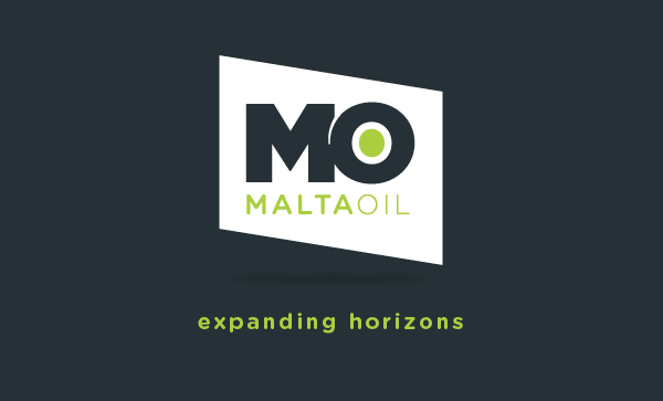
Other subtle elements, such as the soft shadow under the MO mark signify the company’s elevation from traditional, and sometimes controversial, energy company practices.

The wave-like tear and green sphere enclosed by the letter “O” both symbolise green & renewable energy sources, issues that are regularly tackled in the energy market. Having a mark that takes these issues into consideration will aid third party companies and consumers in believing in the MO Brand.
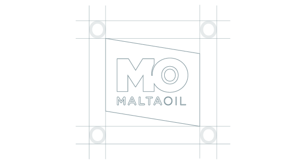
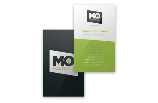
The rhombus symbolism is also present in all MO Stationery, Vehicles, Product Packages, Clothing and Online Presence. Keeping a consistent theme throughout all the company’s corporate material will emphasise on consistency and professionalism, two elements that are crucial in any market.


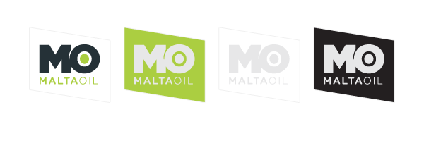
The primary corporate colours, Pure White, Apple Green and Prussian Blue enhance the contemporary branding direction. The MO Mark may also be applied in one colour rather than full colour, however, it must be reproduced by abiding to the three corporate colours.


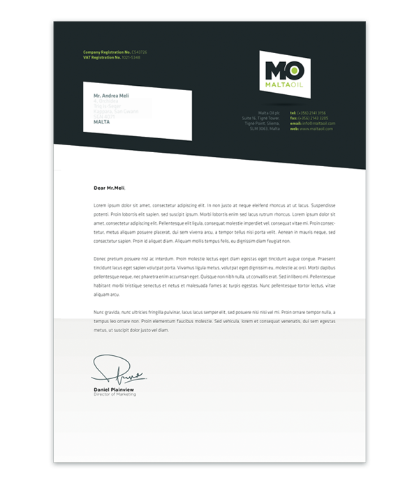
When developing the MO Stationery I opted to follow a strict set of visual guidelines that gave
the printed material a coherent and unified look.
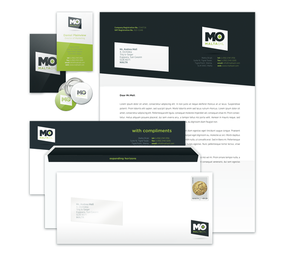
Since the stationery will be distributed to countless clients and other business individuals, the “reversed-out” logo was used to strengthen the overall corporate look that is so widely sought. I applied the MO rhombus to the envelope window that stylishly displays the client details that are printed on the company letterhead.

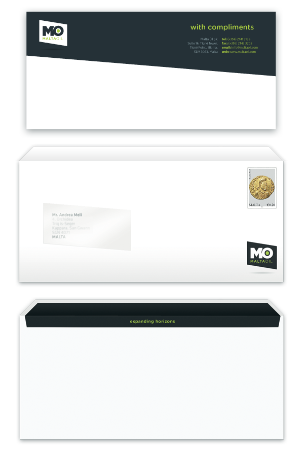
I also opted to include the tagline in the stationery by placing it in the inner section of the envelope. This created a form of interactivity between the corporate material and the client, where upon opening the envelope, the client reveal’s the tagline “expanding horizons.”

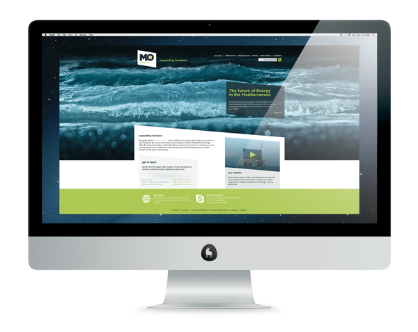
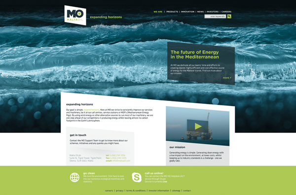
Like the MO Stationery Set, I designed the Malta Oil website with the MO Rhombus in mind; both in the text areas and the video player container. All the website elements, including typography, layout and the photograph follow the established MO guidelines.

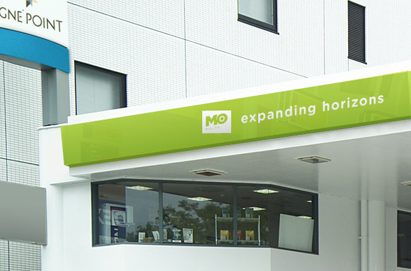
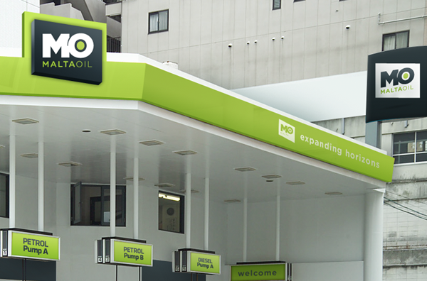
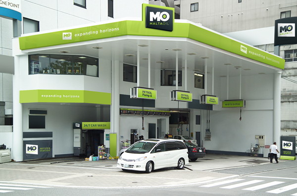
I approached the MO Service station with one clear objective in mind: to create an aesthetically pleasing, high profile Service Station to clearly represent the MO company status. After researching numerous station imagery, I came across a gas station who’s architectural elements resembled those seen in Tigné Point.
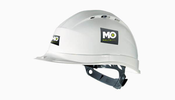
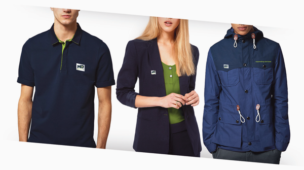
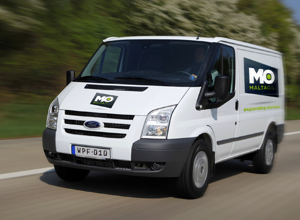
Like the stationery and products, the MO Vehicle Fleet and Uniforms have all been specifically designed
to suit the Malta Oil look. The use of dark blues, green and white are evident in trucks, clothing
and safety-gear alike.

Selected samples of brand development and further examples of brand application can be seen
in the 'Malta Oil - Brand Application Guidelines' booklet below.


