Thank you Praveen Kumar Pounraj, the Creator of Kiruku for his constant support and encouragement.
About
"KIRUKU (pronounced “ki-roo-koo”) is a global design consultancy that takes a human-centered, eco-friendly, intuitions, design based approach to helping organizations in the public and private sectors innovate and grow"
"KIRUKU (pronounced “ki-roo-koo”) is a global design consultancy that takes a human-centered, eco-friendly, intuitions, design based approach to helping organizations in the public and private sectors innovate and grow"
Mission
Spread creative awareness in people from all walks of life
Company Overview
Founded in 2008 in Madurai [ http://en.wikipedia.org/wiki/Madurai ], a small town in the south of India. Extended design services to the North American clients in the year 2011.
Our design process if based on introspection through retrospection, relativity theory and sensibility forms and tessellates the group of people looking towards a consistent uplift of the society through unique design sense.
The group comprises of designers, artists and self made learning people who take turns to work for the appropriate platforms.
Description
We envision new companies' brands, design the products, services, spaces, and interactive experiences that bring them to life.
We Work with organizations to build creative culture and the internal systems required to sustain and launch social innovation ventures that help embrace humanity.
We Identify new ways to serve and support younger generation by uncovering latent needs, behaviors, and desires.
We Work with organizations to build creative culture and the internal systems required to sustain and launch social innovation ventures that help embrace humanity.
We Identify new ways to serve and support younger generation by uncovering latent needs, behaviors, and desires.
Specialties
Communication Design, Product Design, Green Products, Creative Workshops

The brief was as simple as to redesign the existing logo of Kiruku Design Studio located in Madurai and The US. To redesign meant to sustain the elements used currently, modify according to need and overall simplify the form.
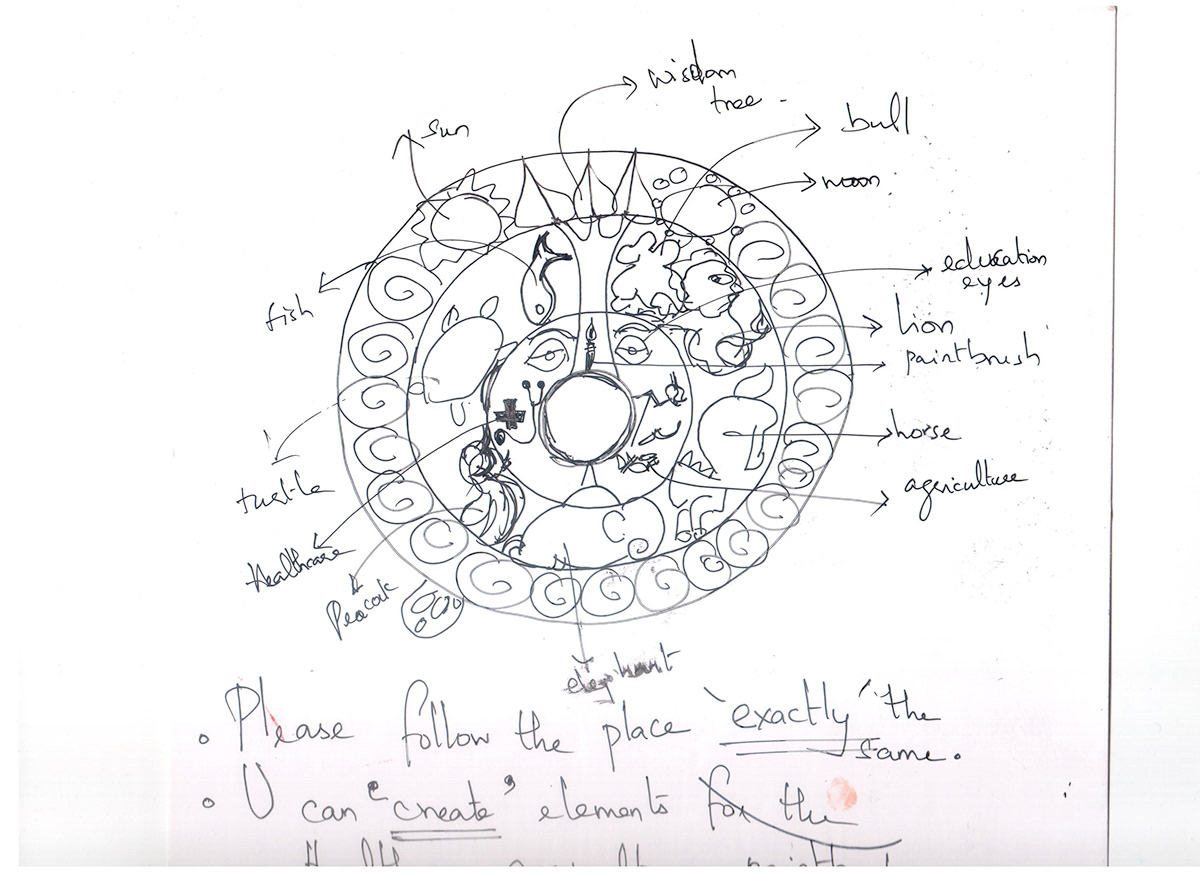
The Brand functions based on principles of Buddhism. Hence, each element has a specific meaning behind it's location and style.

Few Illustrations to understand and define the kind of language which defines Kiruku as a brand.
Few Illustrations to understand and define the kind of language which defines Kiruku as a brand.

Few Illustrations to understand and define the kind of language which defines Kiruku as a brand.

Few Illustrations to understand and define the kind of language which defines Kiruku as a brand.

Few Illustrations to understand and define the kind of language which defines Kiruku as a brand.
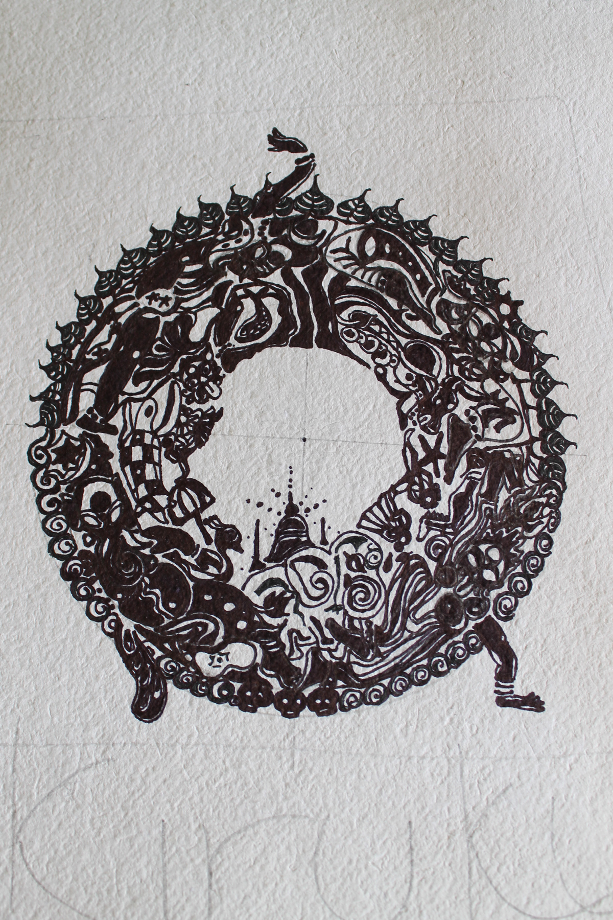
Rough Plan towards drafting the new logo.
The very first draft from the existing logo. Creating more white space was the key to simplify the form.
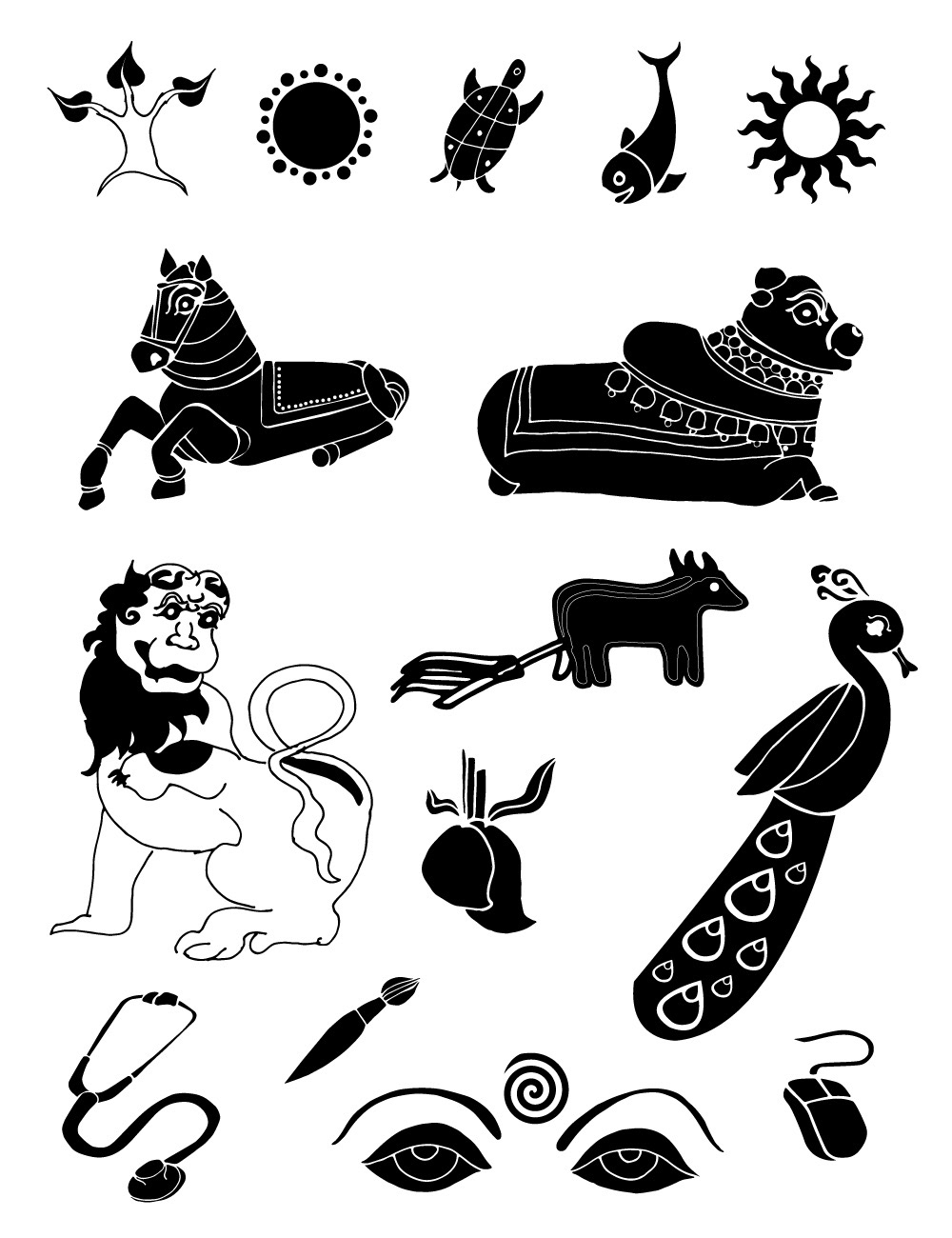
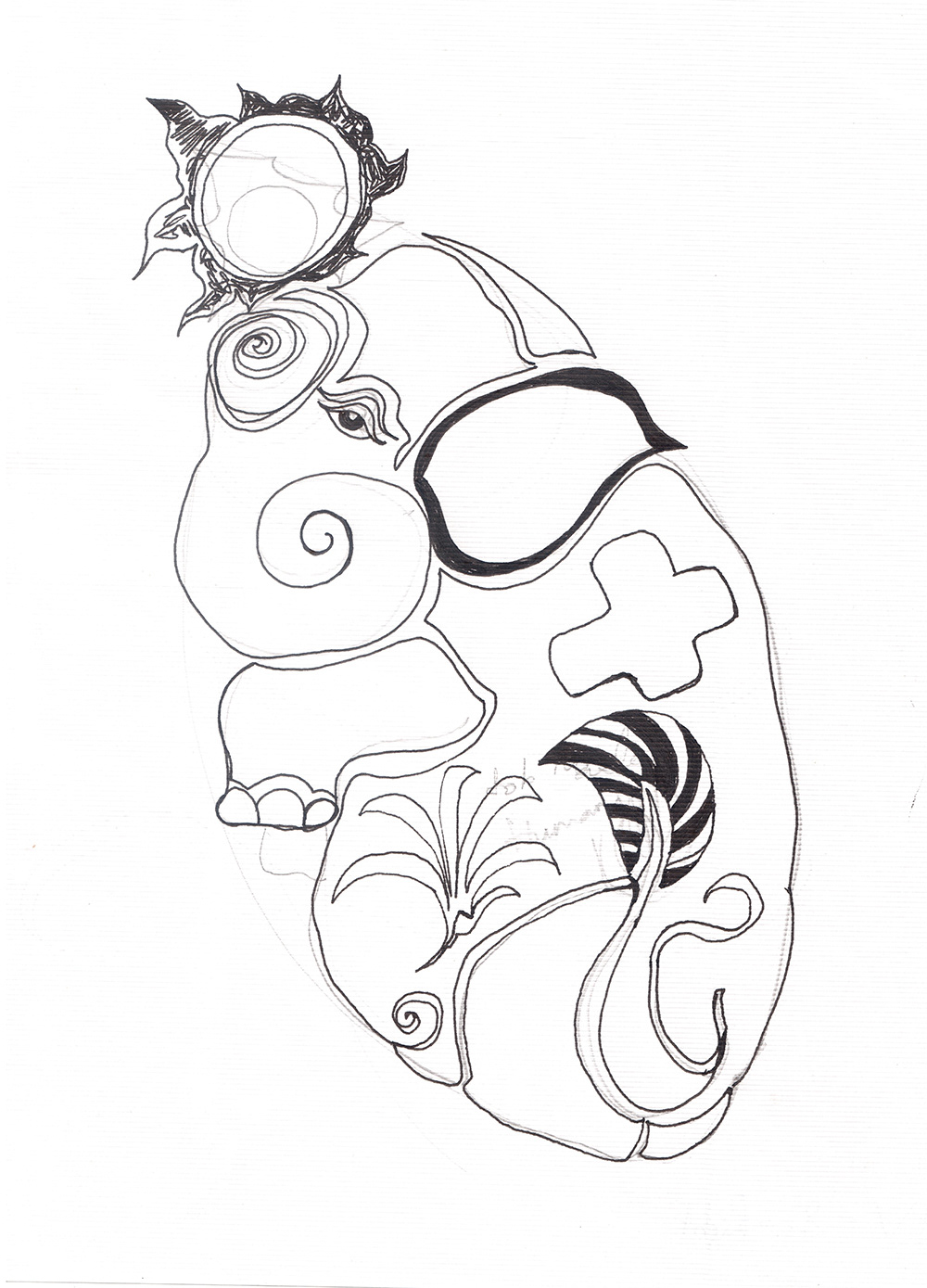
Various Elements to be used in the logo.

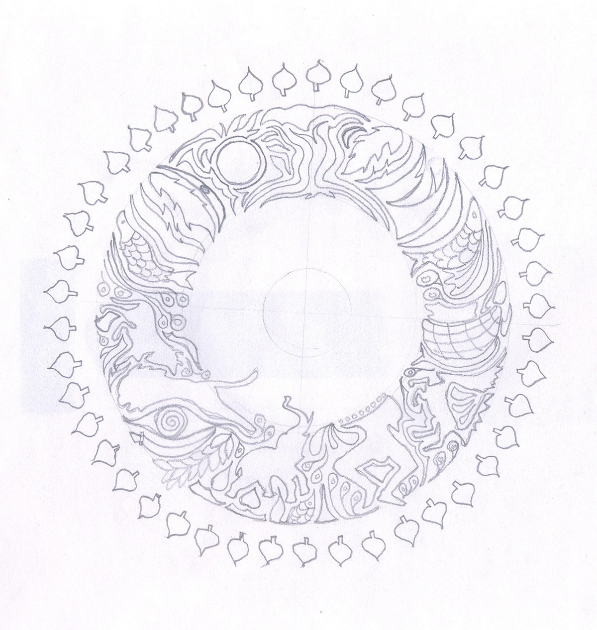
More Explorations with the form and the placement of the elements.

Various Elements to be used in the Logo.

Digitizing the form helped a lot with the simplification.

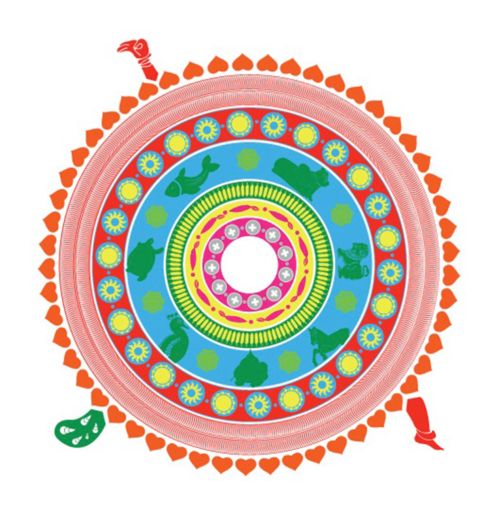
Next Step was to figure out the colour palette. The client wanted to use bright, pop art colours.
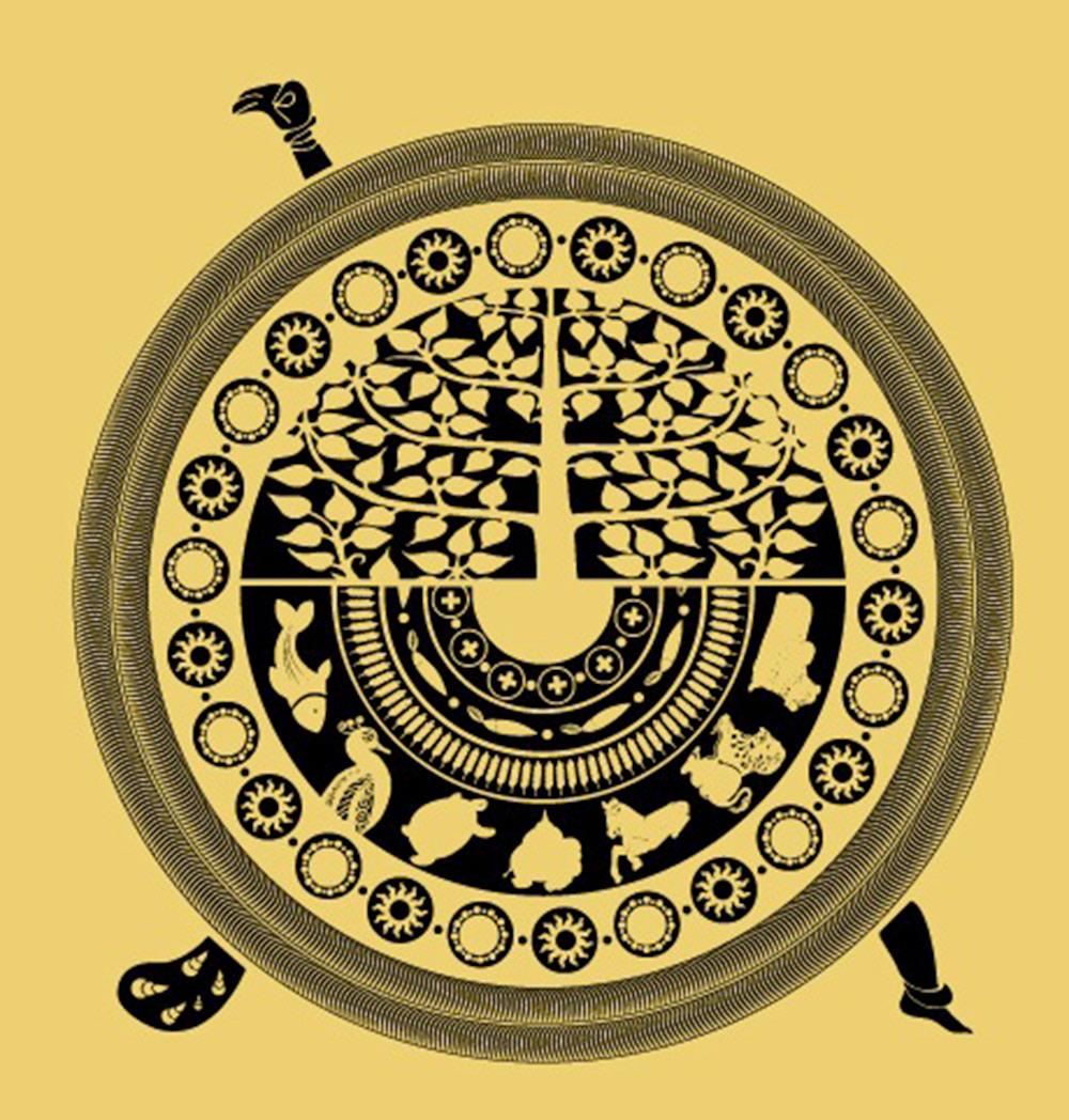
The Bodhi Tree in the centre was an important element to be used. To include that without disturbing the harmony of the rest of the form, I tried incorporating the same in different layers. Like in this case, the semi circles form 2 different layers.

After simplifying the semi circles more and more, we also came to the positive outcome of the 2 semicircles combining to form a structure like that of a Yin-Yang. Hence, we now knew how to take the next step of simplification. It was evident to make one half bolder and heavier and the other in contrast to it, but still completing the overall circular form.
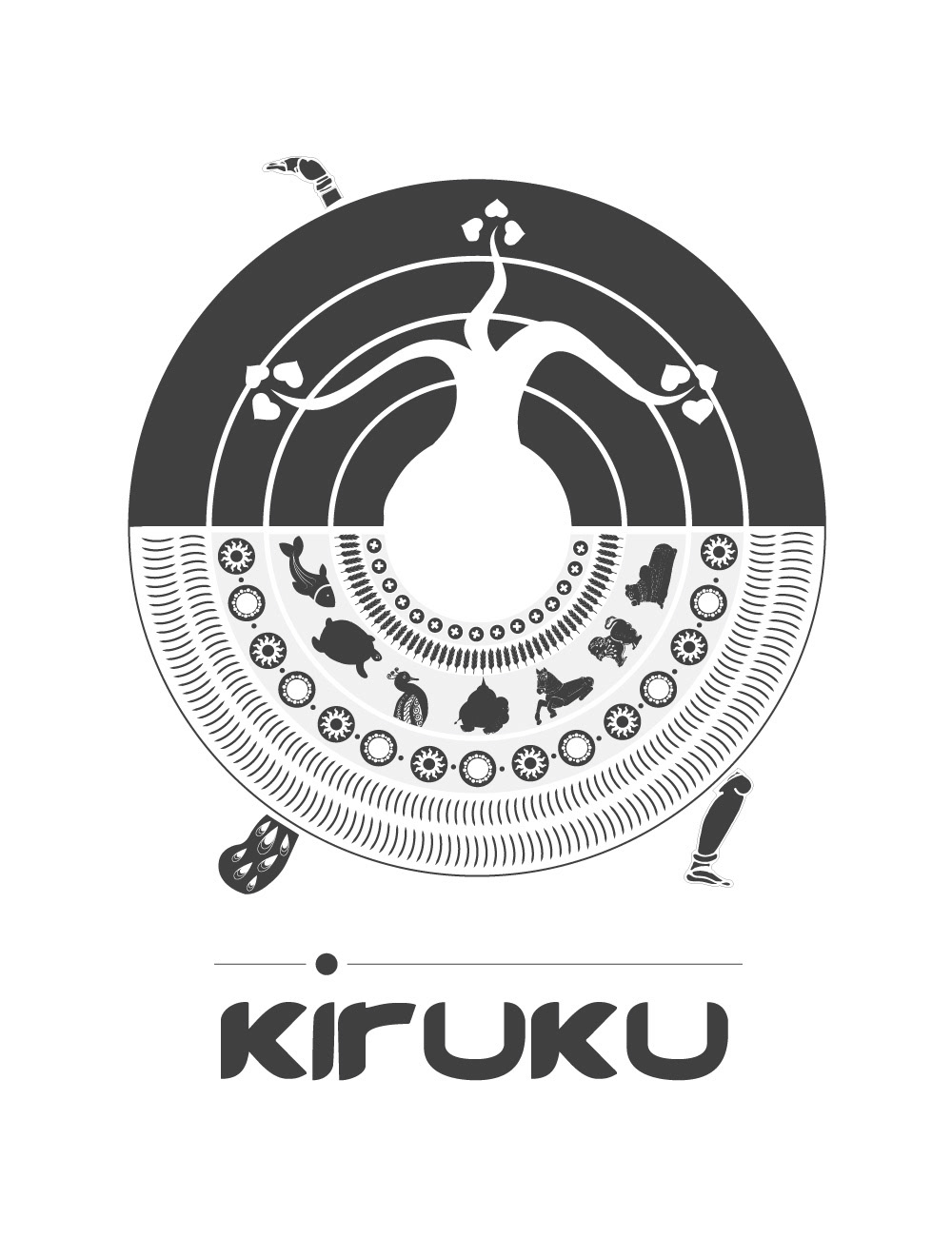
Final Logo.

Final Logo
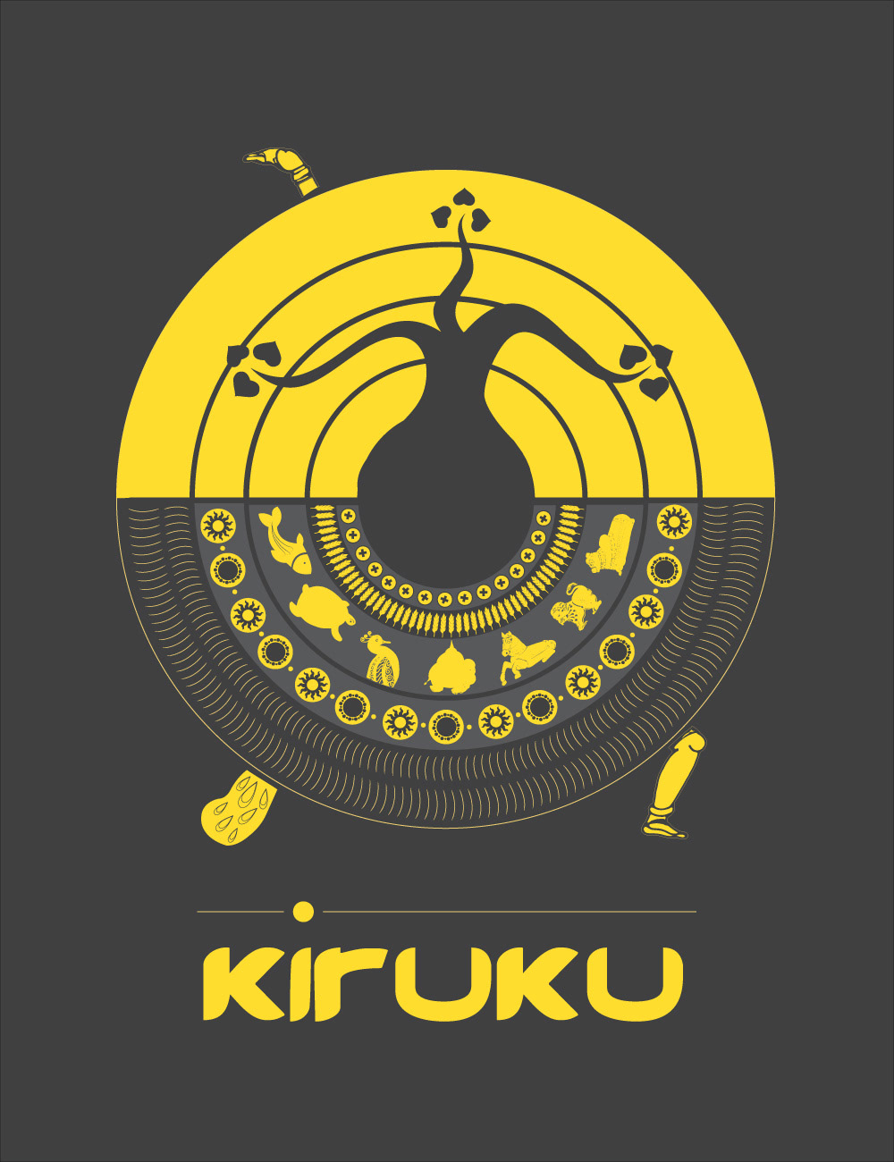
Final Logo in it's corporate colour.

Different colours, define different sections in the design studio.

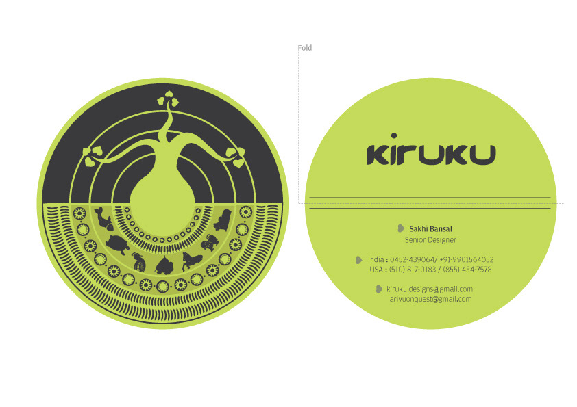
The Visiting Cards are 3 inches in diameter.
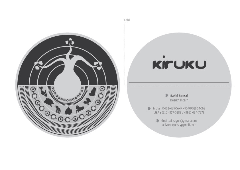
The cards are folded horizontally to create 2 pieces of information.

The Cards will be digitally printed on 280 GSM Paper.
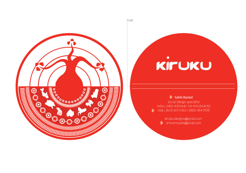
Circular Form compliments the form og the new Logo.


