Promotion of the Helvetica typeface
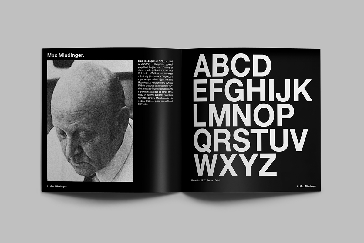
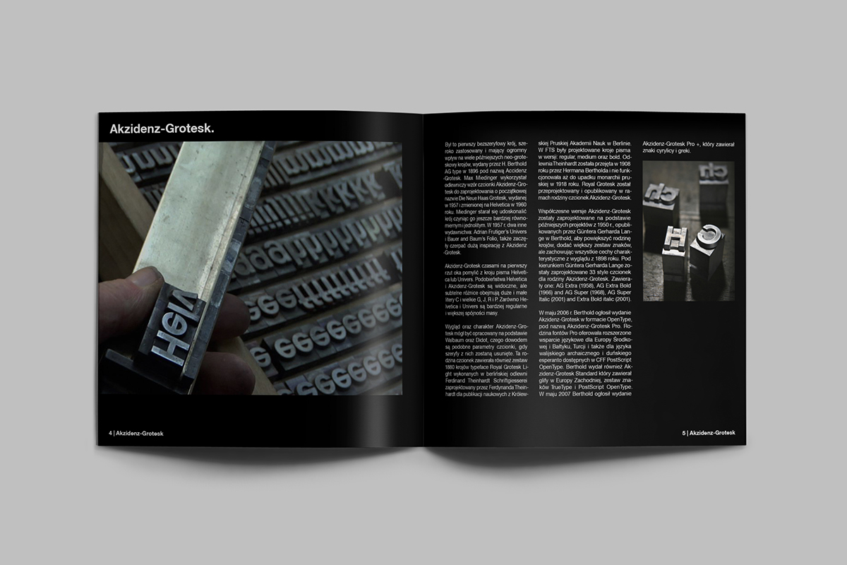
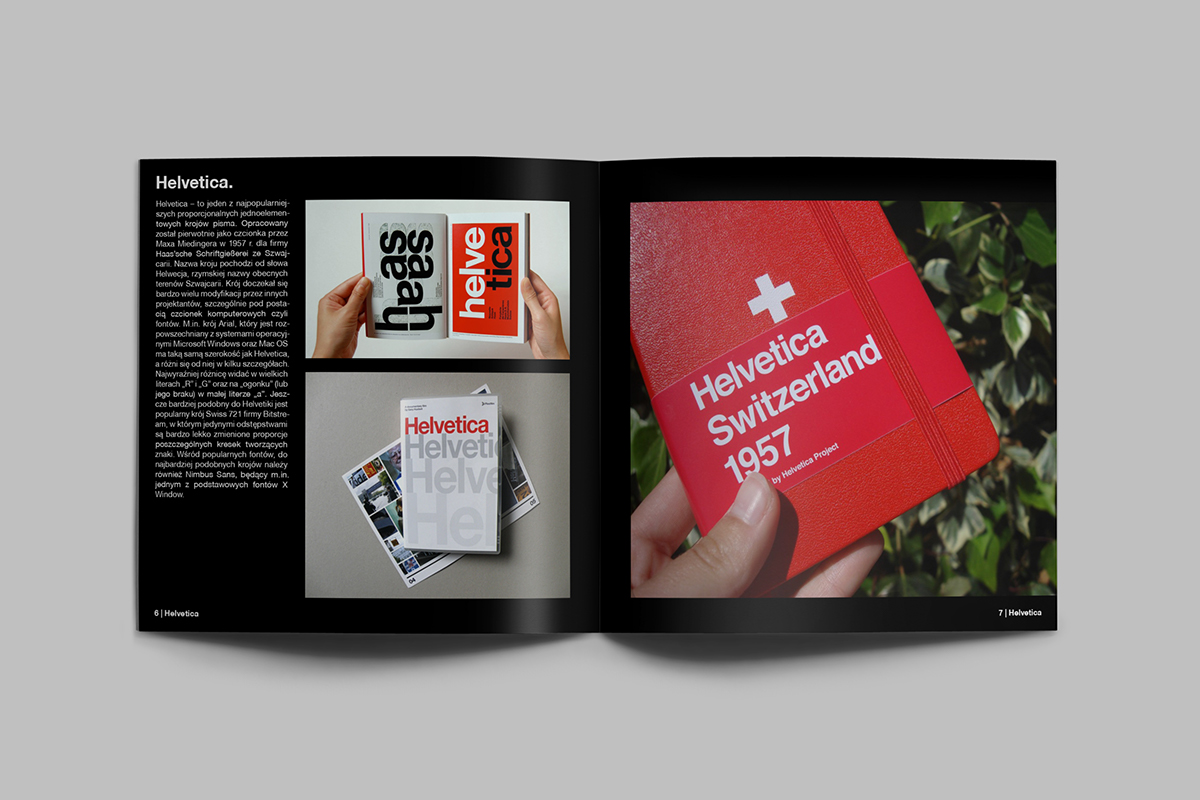
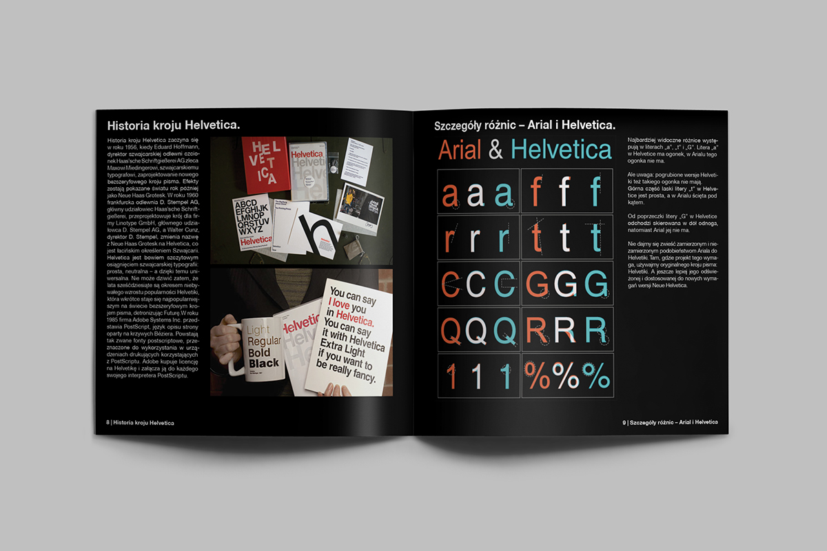
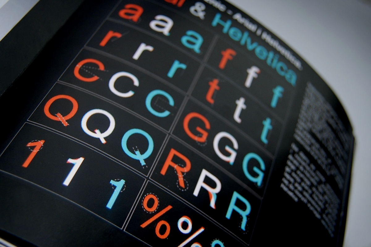
Helvetica was developed in 1957 by Max Miedinger with Eduard Hoffmann at the Haas'sche Schriftgiesserei (Haas Type Foundry) of Münchenstein, Switzerland. Haas set out to design a new sans-serif typeface that could compete with the successful Akzidenz-Grotesk in the Swiss market. Originally called Neue Haas Grotesk, its design was based on Schelter-Grotesk and Haas’ Normal Grotesk. The aim of the new design was to create a neutral typeface that had great clarity, no intrinsic meaning in its form, and could be used on a wide variety of signage.
When Linotype adopted Neue Haas Grotesk (which was never planned to be a full range of mechanical and hot-metal typefaces) its design was reworked. After the success of Univers, Arthur Ritzel of Stempel redesigned Neue Haas Grotesk into a larger family.
In 1960, the typeface's name was changed by Haas' German parent company Stempel to Helvetica in order to make it more marketable internationally. It was initially suggested that the type be called 'Helvetia' which is the original Latin name for Switzerland. This was ignored by Eduard Hoffmann as he decided it wouldn't be appropriate to name a type after a country. He then decided on 'Helvetica' as this meant 'Swiss' as opposed
to 'Switzerland'.
_
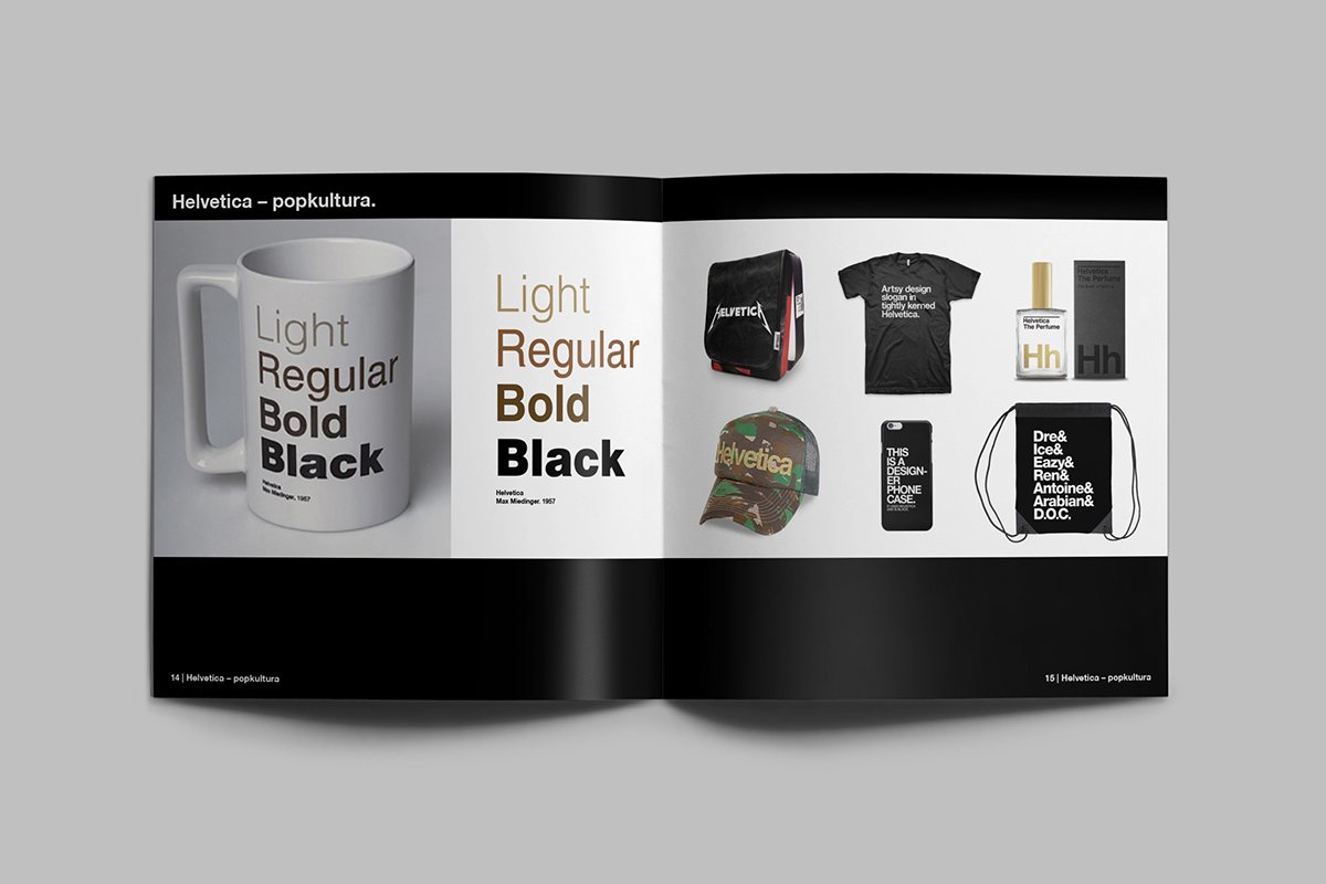
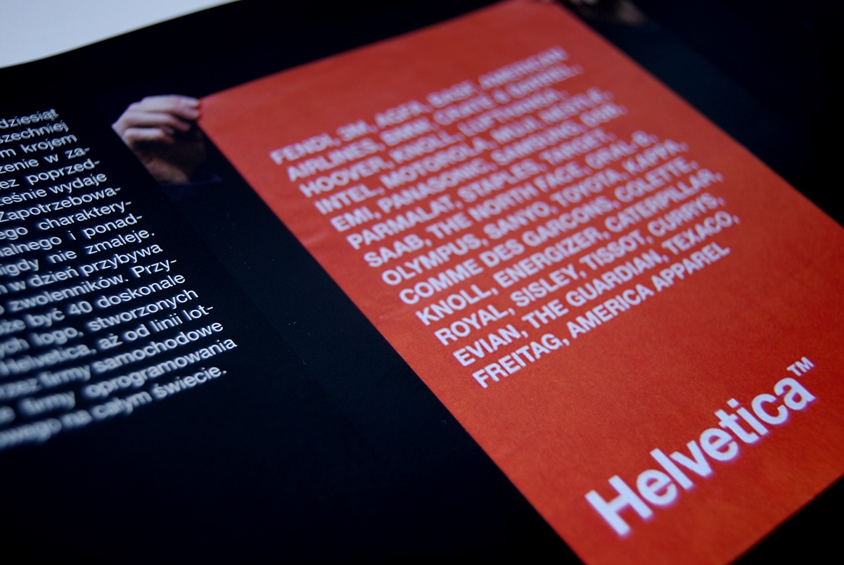
The designer created elements of the promotion of Helvetica typeface.
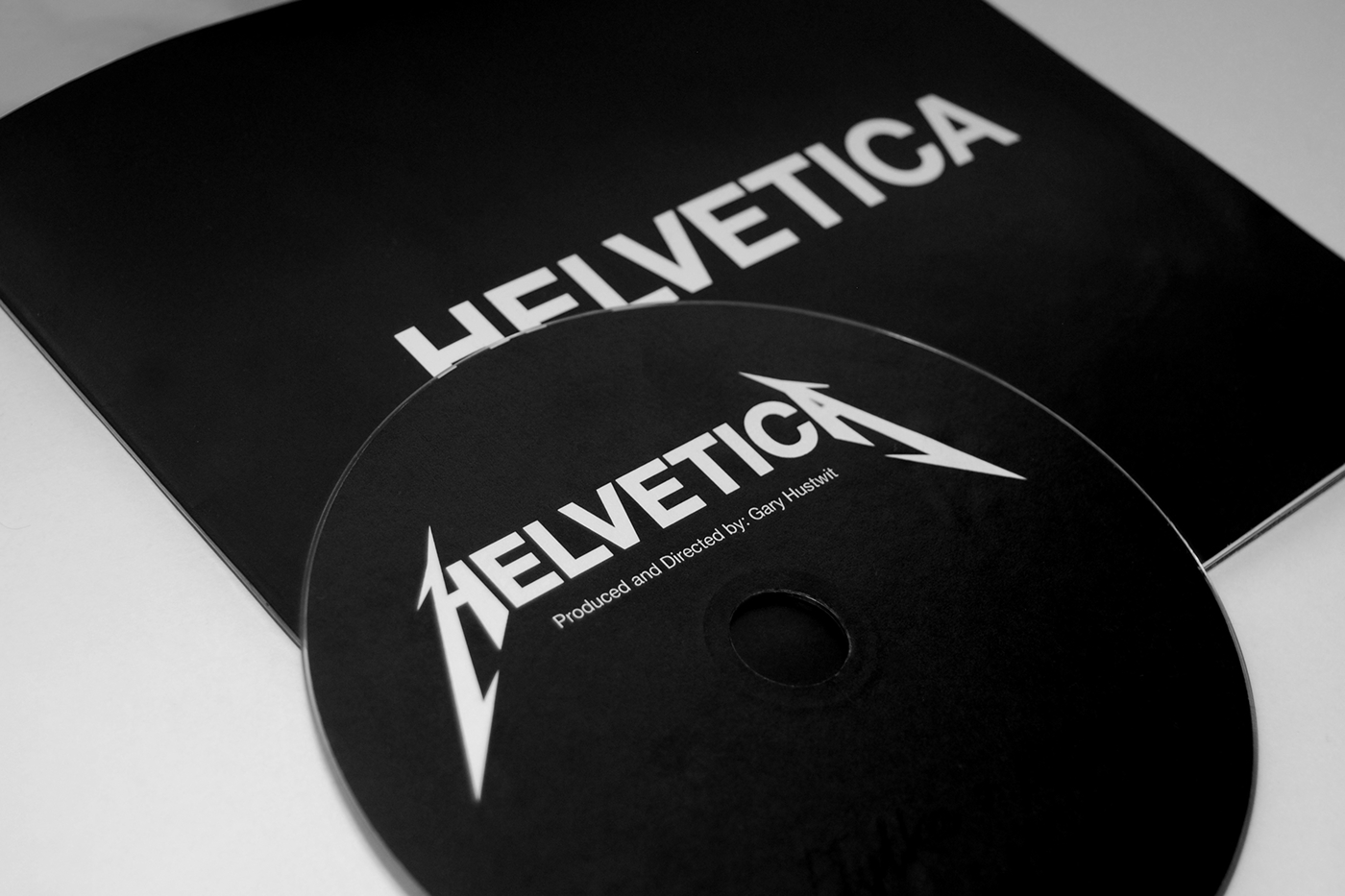
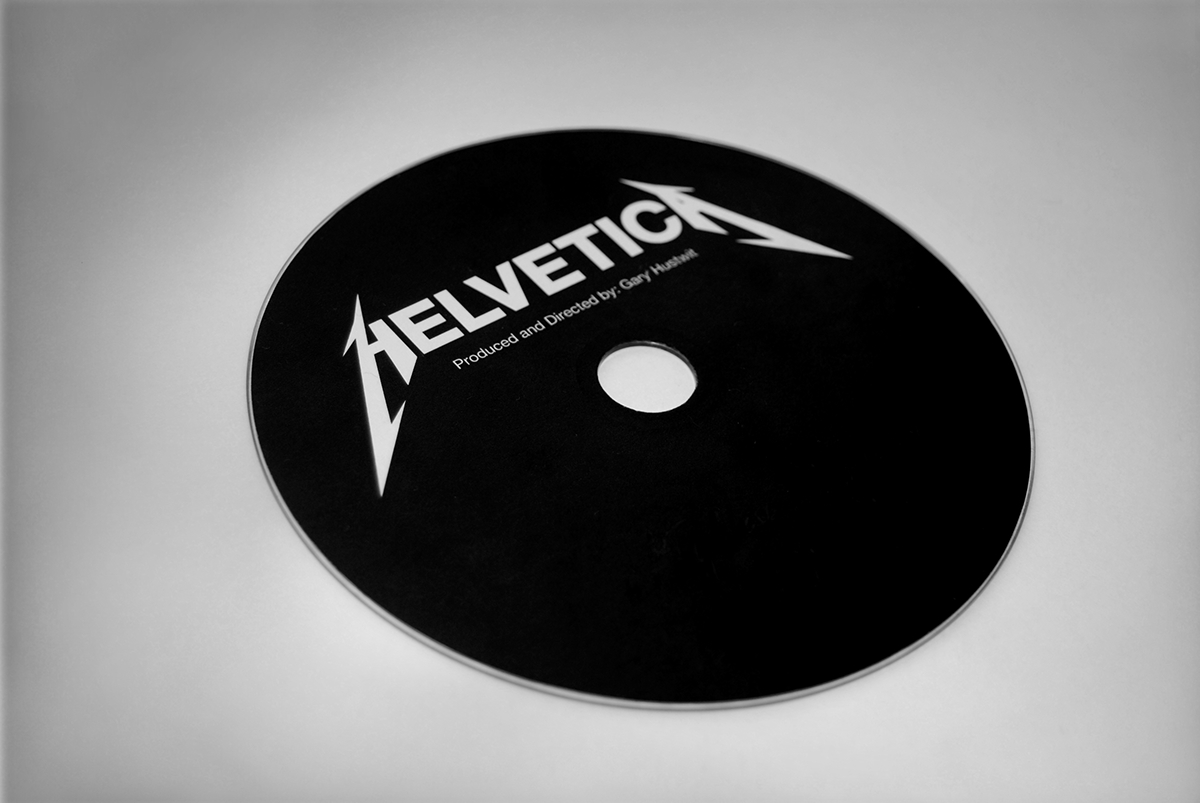
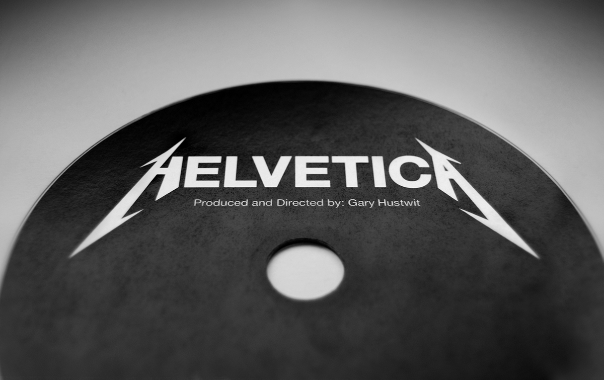
Limited edition Black Album is tribute to Helvetica.
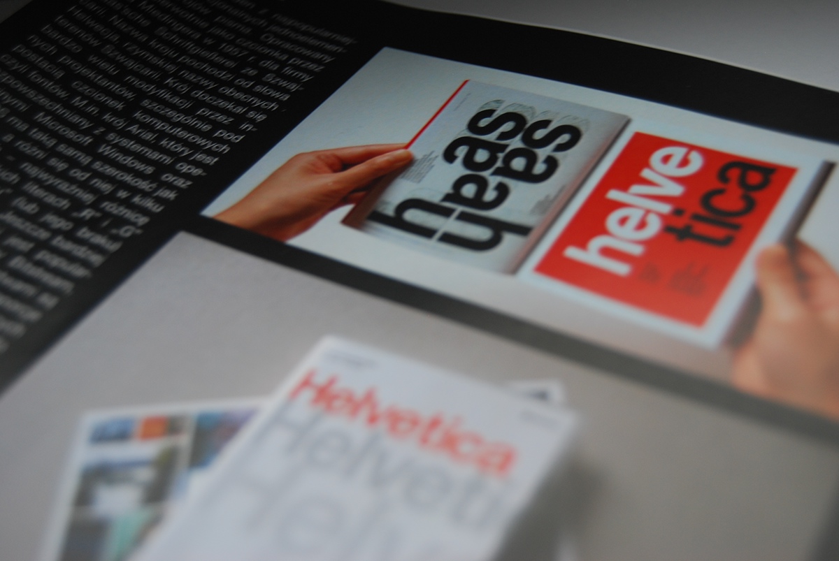
Project include booklet, packaging, DVD.
_
Book about Helvetica + Video on CD
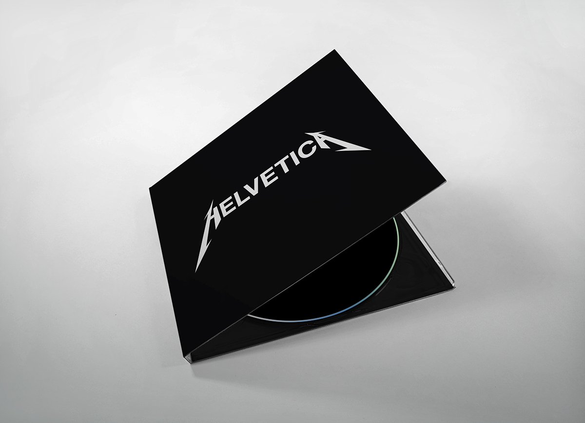

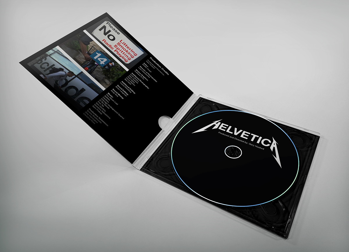
CD Pack: Book + Video


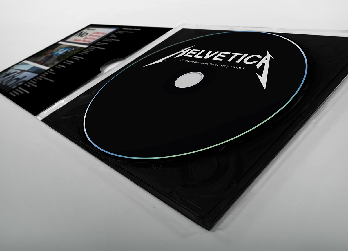
Video on CD about Helvetica

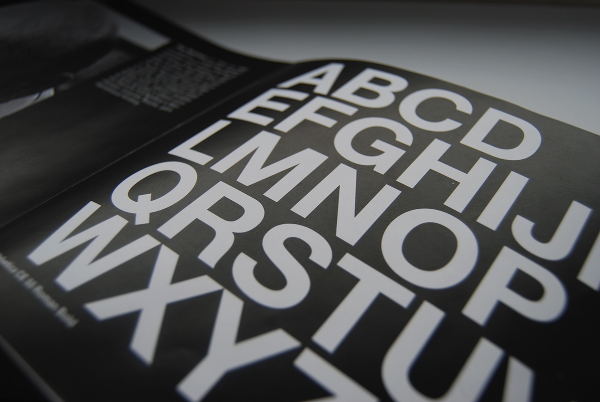
Print detail's
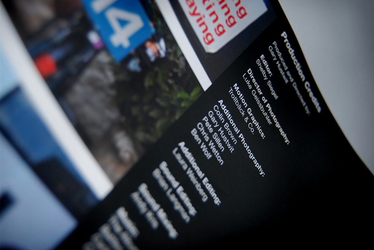
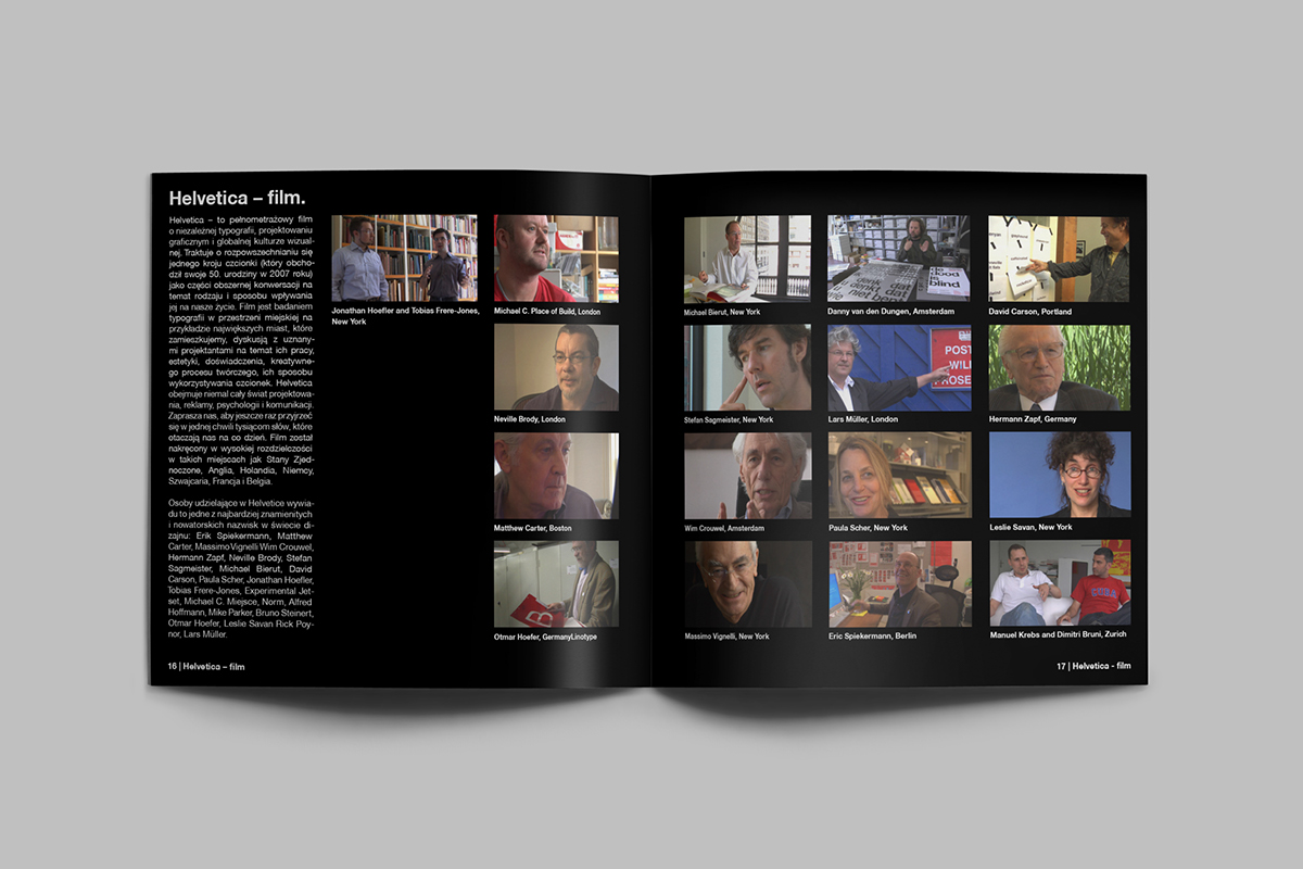
Helvetica - A Documentary Film by Gary Hustwit

