Felicity J Lord wanted a new brand identity to set them apart in an overcrowded marketplace. Prior to the rebrand, the company was based in East London. This rebrand needed to enable them to open new branches to include increasingly affluent areas such as central and west London.
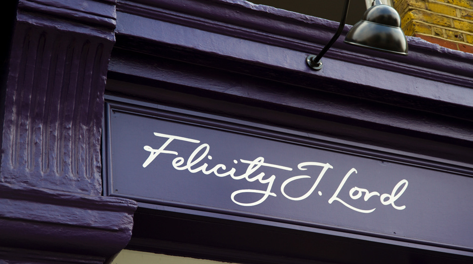
We created a distinct proposition building on the name "Felicity J Lord". Very few competing agencies used a female brand name and this became the building block on which the brand
was created.
was created.
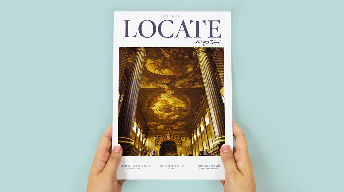
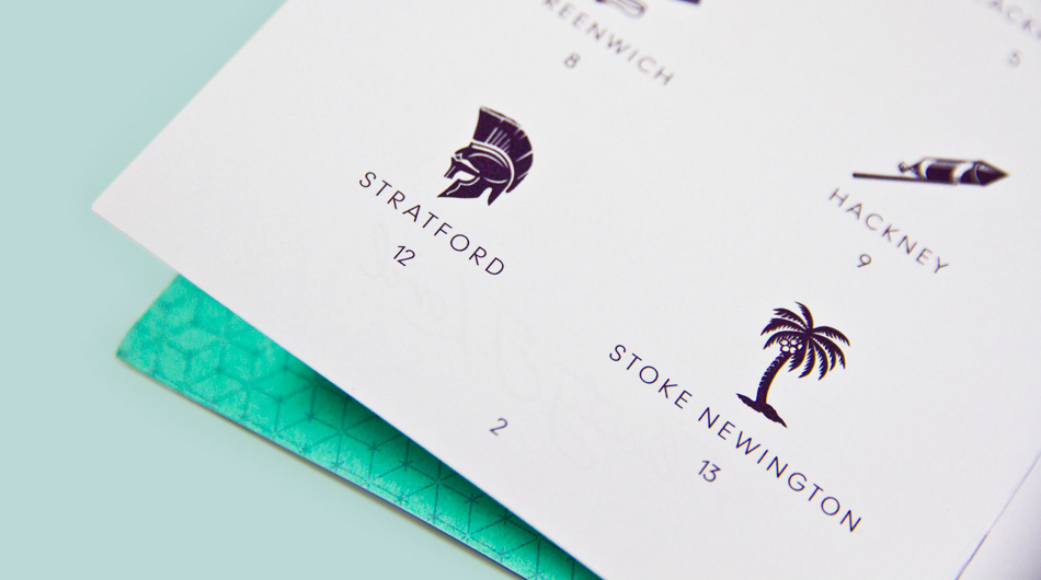
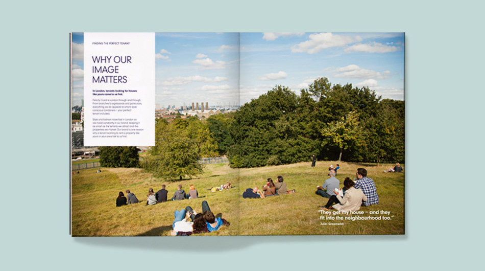
The 3 main attributes of the brand were developed as "Purposeful, Considered and London-centric". The London-centric approach was developed from an idea that London is made up of small villages. We chose to tell the story about these areas by commissioning a photographer to capture everyday images that local people could relate and aspire to.
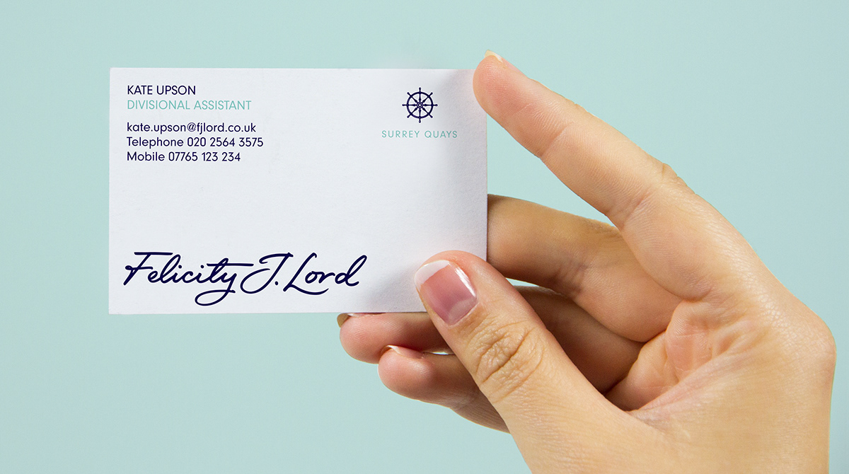
In each office there is a unique icon designed to depict a little known fact of each small 'village' the specific office represents. This brand was to be seen as aspirational yet attainable, stylish, good quality, local, but still London wide.
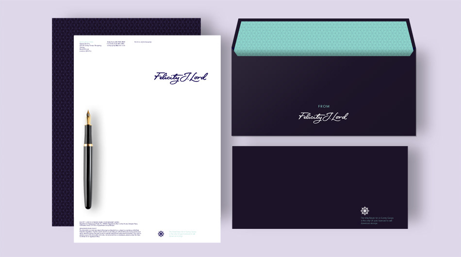
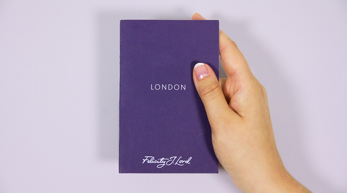
The rebrand included the brand positioning, toolkit (logo, colour palette, image library), messaging, marketing collateral (direct marketing, signboards and advertising), retail spaces and websites (including a suite of local landing pages). We also set out the brand values and turned this into an Employee Value Proposition for the firm.
The brand has been rolled out across all 13 London offices. Felicity J Lord has since opened an office in Chiswick with another planned to open in Fulham.
Creative Direction: Al Baird
Design: James Flint and Ben Philpott
Designed at SAS.


Thank you.

