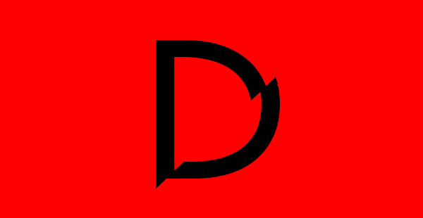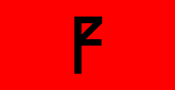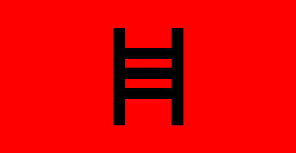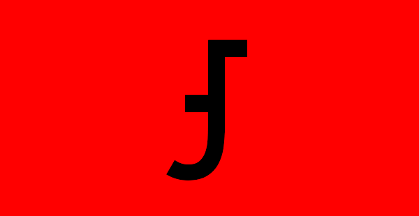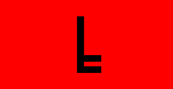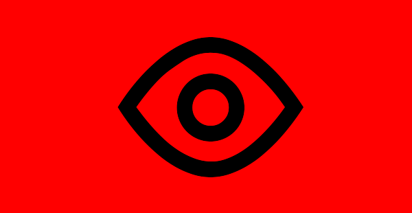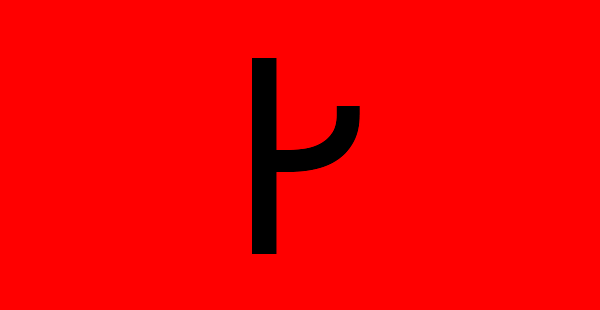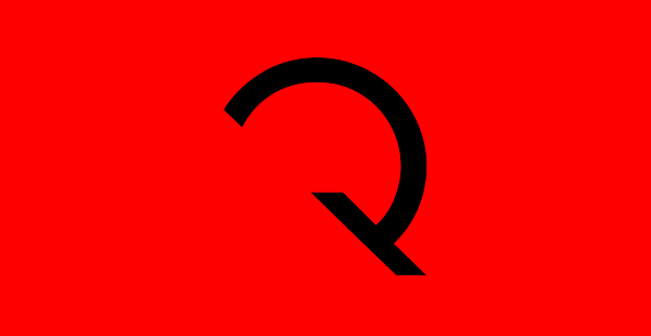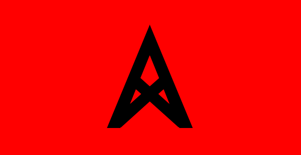
Evolution is a typeface I completed to complement my dissertation, entitled Typography: Reclaiming Language's Lost Soul. The essay charts & explores the reasons behind typography's (relatively) recent shift from the utilitarian to the expressive, and Evolution echoes this transition.
Based on Paul Renner's Futura (1928), it begins as archetypal Roman letterforms and gradually disintegrates into abstraction and illegibility. The aim was to represent how current typographers have taken what we recognise through association & cultural agreement to be our alphabet and modified it through ornamentation, subtraction or deviation to unreadable extents. This typeface, in its journey from perfect alphanumeric characters to illegible symbols, brings the notation of language to paradoxically its most abstract and most core forms: coded visual marks, decrypted into linguistic and semantic meaning.
The typeface is caps only, but the lowercase contains contextual alternates for many characters to help avoid repeating forms.