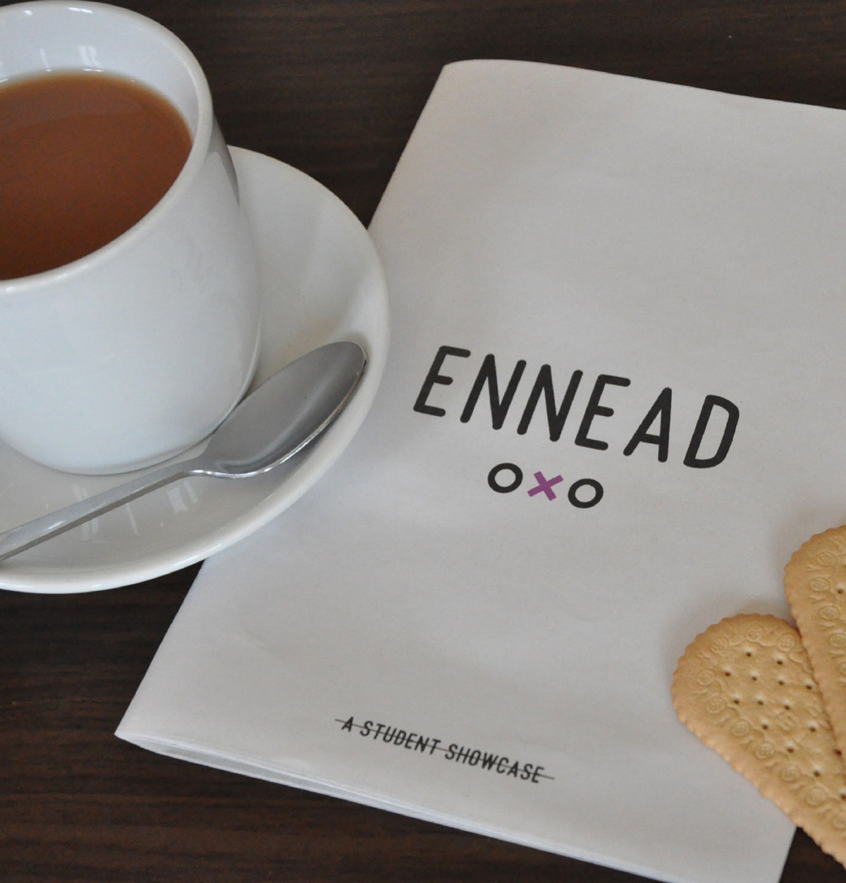
Ennead is a student exhibition showcasing the best new designers.
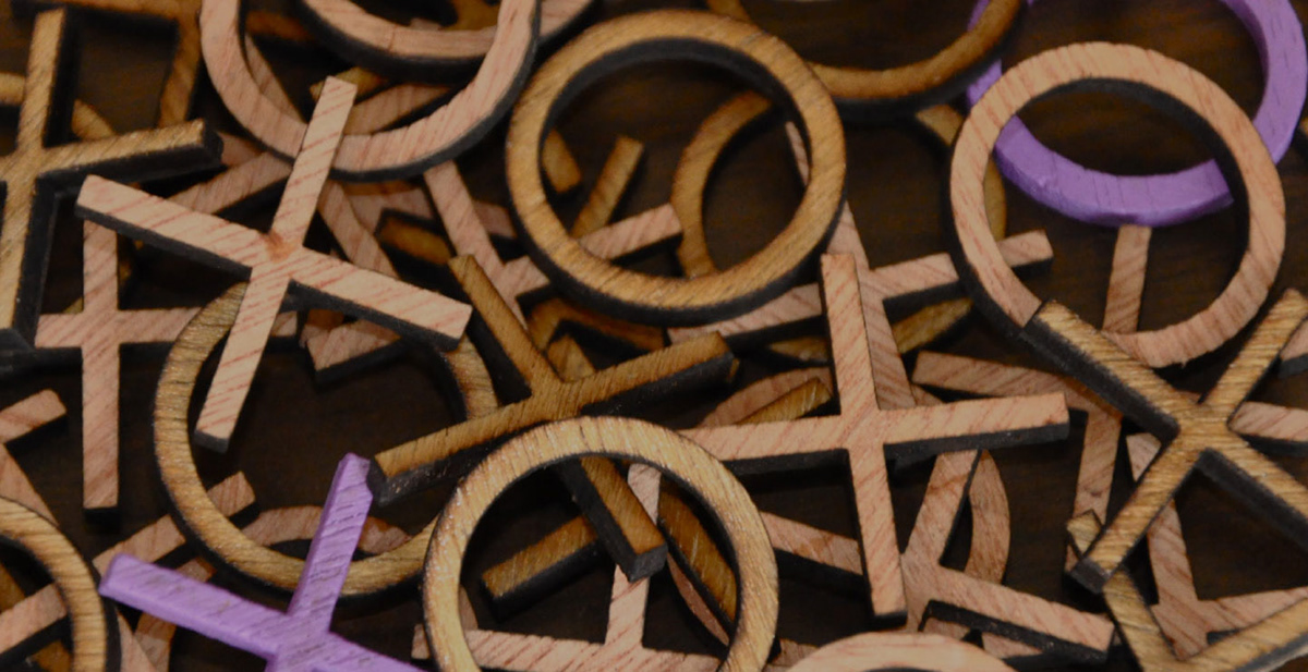
The nine designers create Ennead; a set of nine.
The nine designers create Ennead; a set of nine.

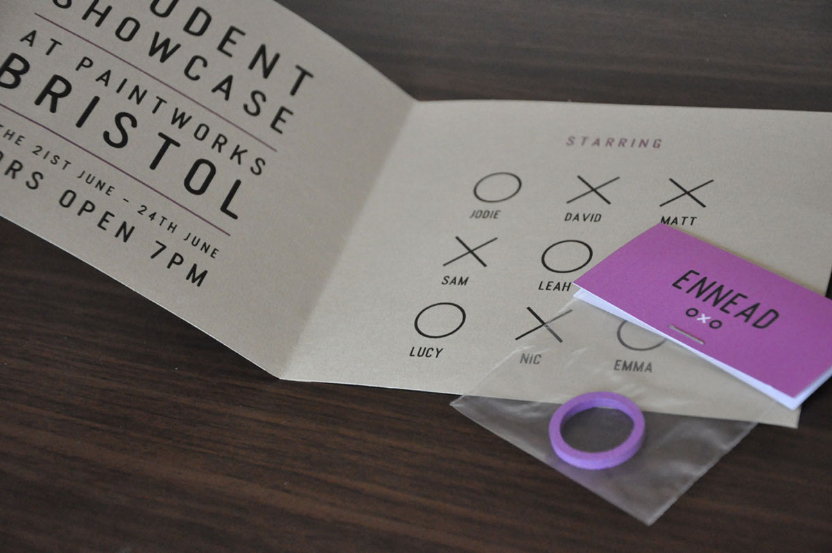
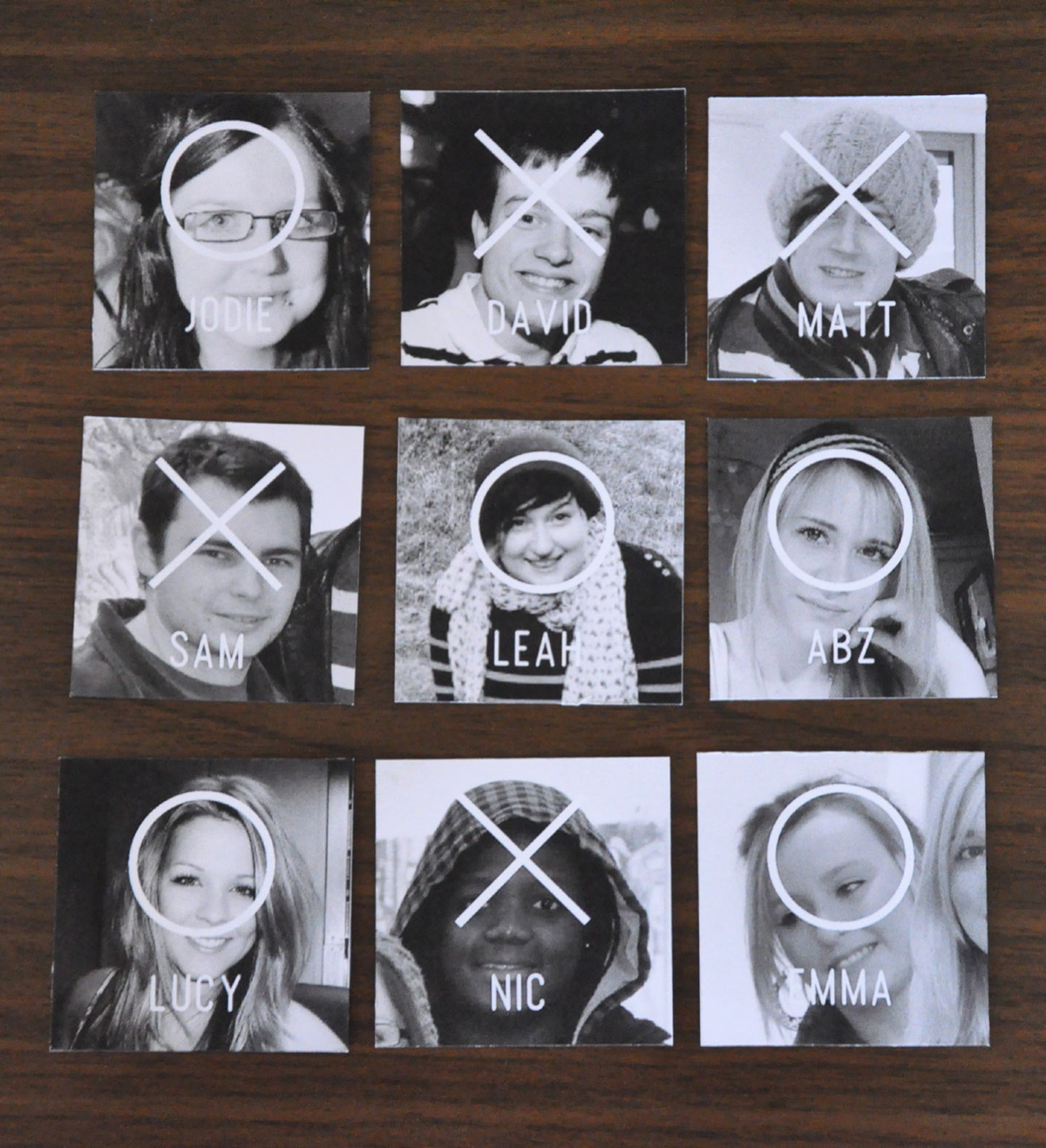
An invite would be sent out to industry members. As noughts and crosses was known to begin in newspapers and this is how the concept should be represented. The invite was therefore a simple open booklet. Each student was allocated a nought or a cross. This was to reinforce the concept behind the name ‘Ennead.’
Along with the booklet the industry member will receive either a nought or a cross. On the back of the packaging to the nought or cross simply has written: Bring your nought or cross to the show... you’ll find out why when you arrive. This will hopefully make the industry member curious and encourage them to come to the show to see why.
Along with the booklet the industry member will receive either a nought or a cross. On the back of the packaging to the nought or cross simply has written: Bring your nought or cross to the show... you’ll find out why when you arrive. This will hopefully make the industry member curious and encourage them to come to the show to see why.
When at the exhibition industry members will be able to view each students work. Each student will have information written next to their work to help support their designs. A look book was created as a tool to help possible employers remember a students work they liked. It also provides information previously unknown. Some facts and quirks about each student.
The design of the look book follows the design of a newspaper, this is mainly achieved by printing onto newsprint paper to give the texture and look to match a newspaper. The look book was folded to match the style of a newspaper, no modern binding techniques were used.
The design of the look book follows the design of a newspaper, this is mainly achieved by printing onto newsprint paper to give the texture and look to match a newspaper. The look book was folded to match the style of a newspaper, no modern binding techniques were used.
The look inside was adjusted from that of a newspaper. This was to bring a new edge and contemporary feel.
The only colour to be used was violet. The reason for this was because violet is a combination of blue and red. Red is a
focusing, dynamic and active energy, while blue is cooling, calming and explosive. Violet brings a new dynamic to the expansion of blue and the achieving of red. Red brings the practicality to the undirected expensiveness of the blue, and allows more creative energy to emerge. For this reason, violet is associated with imagination and inspiration. These are all elements that represent the students so were very suited to the feel. Apart from Violet the look book was all in black and white. This was to bring back an element of the first newspapers.&nbs

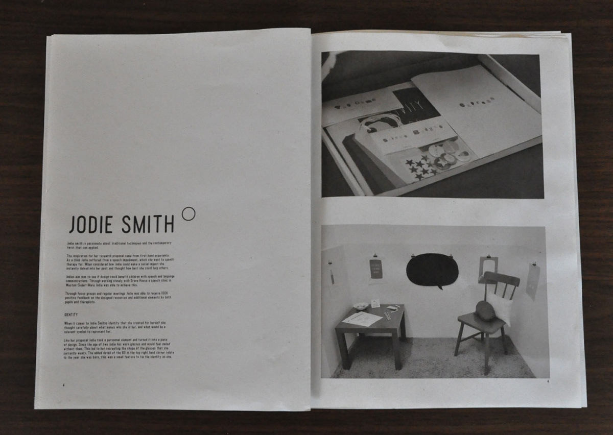
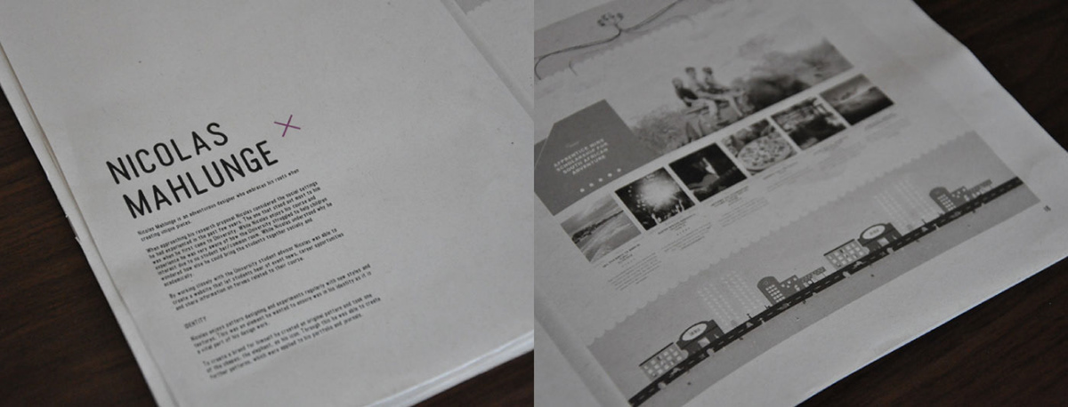
Each student has an ‘article’ written about them, explaining briefly into their design style, their research proposal and reasons as to why they branded themselves in the way they have. This is to give the reader an insight into the student and understand their influences and reasons for what they have done. While knowing how the student achieved something is interesting it doesn’t givepossible employers anything attention grabbing enough, this is why the look book contains a personal approach to the students journey and how they bring in experience from their own lives.


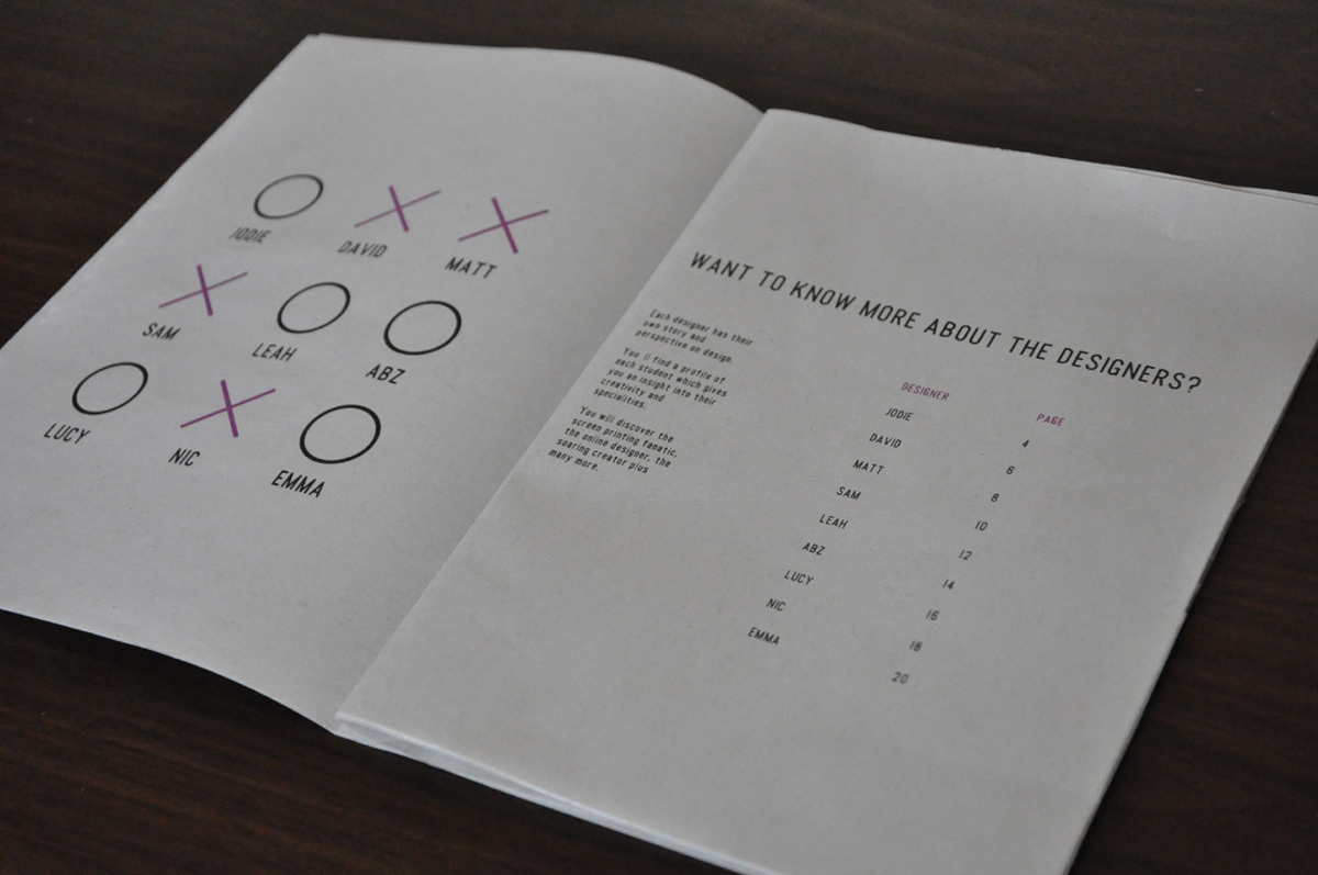
The layout of the article for each student follows a template. However, the nought or cross placed next to the name varies due to the name being taken out from the noughts and crosses shape. In the contents page you can see each students name has been given a nought or a cross. When in the look book the student keeps the same nought or cross. This aims to clearly show the concept behind theexhibition. It also gives a fresh and clean look.
Similar to the look book the information cards help any possible employers remember a student.
The information cards are left next to the correct students exhibition space letting the possible employers take the card in case of wanting to contact the student, and also to put a face to a name, or shall we say a face to a design.
This way the industry members can easily locate the student at the exhibition and ask them any questions or place an enquiry.


The back of the information card holds the students full name and contact information, this is so the cards can be taken away and kept in case they would like to further any enquiries. The design of the information cards follows from the look book and you’ll see each student has the same nought or cross above their name from the look book layout placed over the image of them. This reenforces theconcept behind the name and exhibition.

