

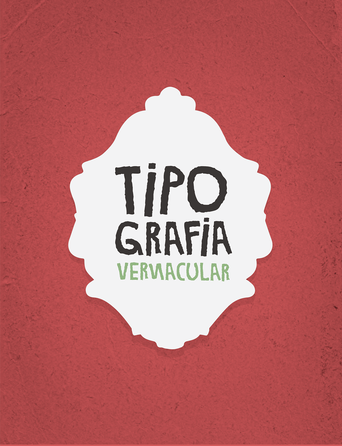
Typography academic project where the students looked for vernacular typography in the city and, from that, made the rest of the characters and created a font out of it.


Here's the vernacular typography that I found and used to make Duaz Irmã. It was on a street in Campinas, Sao Paulo, but a week after I took this photo the wall was painted over :(

This was the follow-up project to the Duas Irmã typography. In this one, the students used the vernacular type to create a cachaça label.
I made two, each one for a different kind of cachaça (silver and gold).
I made two, each one for a different kind of cachaça (silver and gold).
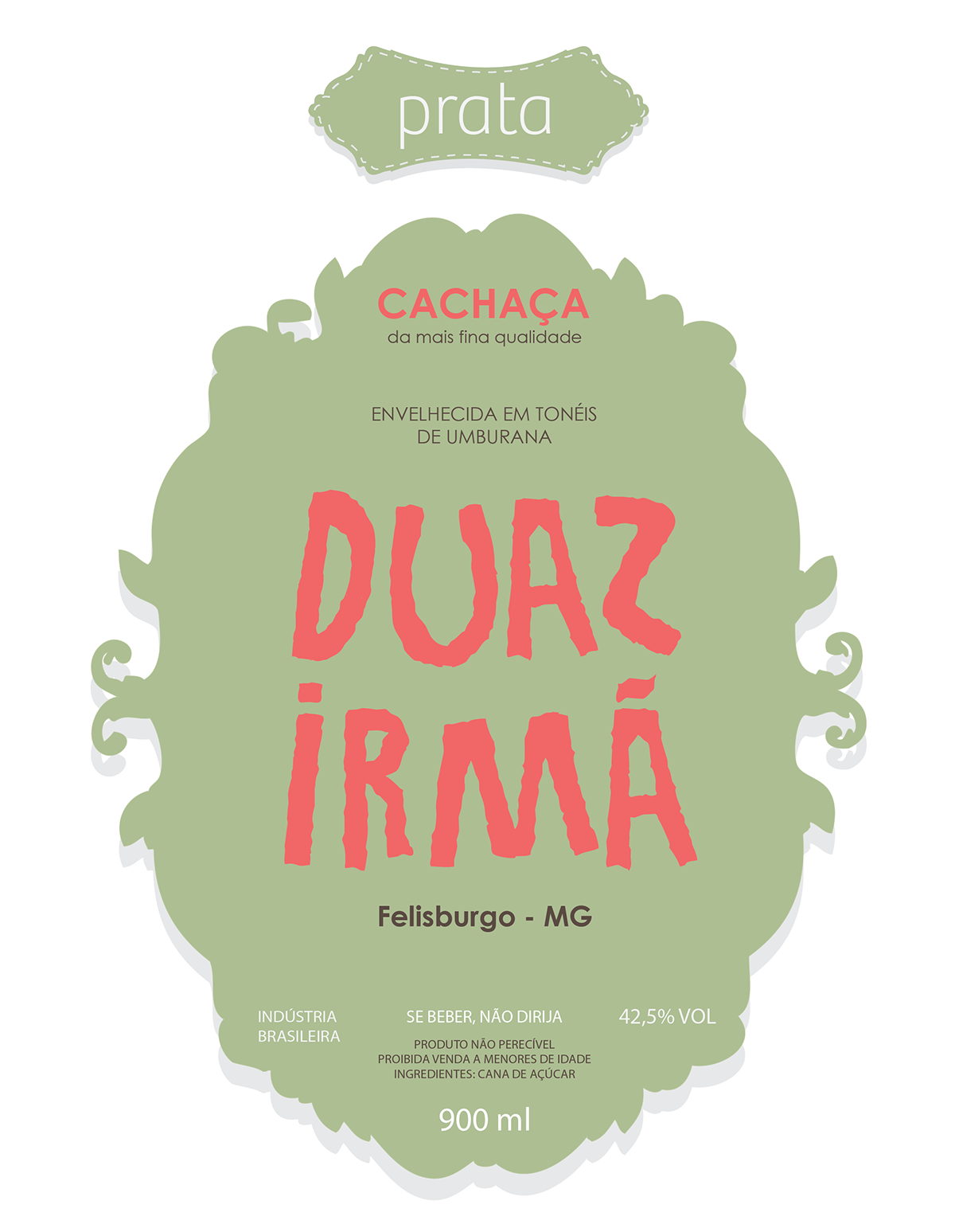

Soon I'll post photos of the bottles with the labels on them :)


