Brief.
Nottingham Trent Design students hold an exhibition at the end of every year for third year students. This is an opportunity to demonstrate their talent to industry and potential employers.
Concept.
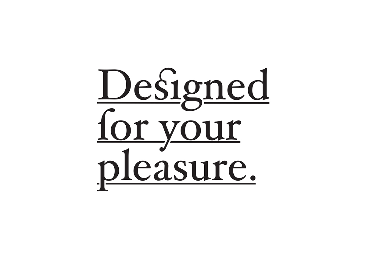
Every body in the creative industry has their ‘design porn’. Something that gets their blood pumping. This can be anything from: a beautiful ligature on a piece of type, a deep de-boss on heavy paper or even a spot varnish applied to a piece of work. The idea is constructed around using these ‘design fetishes’ to create a pleasurable experience and engaging degree show.
Solution.
For the execution of this project, it was all about getting the touch points to stand out to designers. The type used for the logo was fitting to the tone of voice of “pleasure” and the video supports this concept as if we were designing for your pleasure.
All the aspects of the project are design related and almost creates an in joke for designers coming to visit.
All the aspects of the project are design related and almost creates an in joke for designers coming to visit.
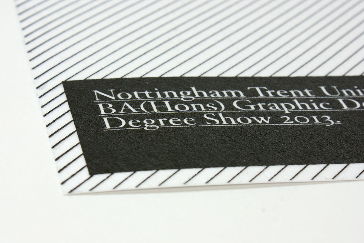
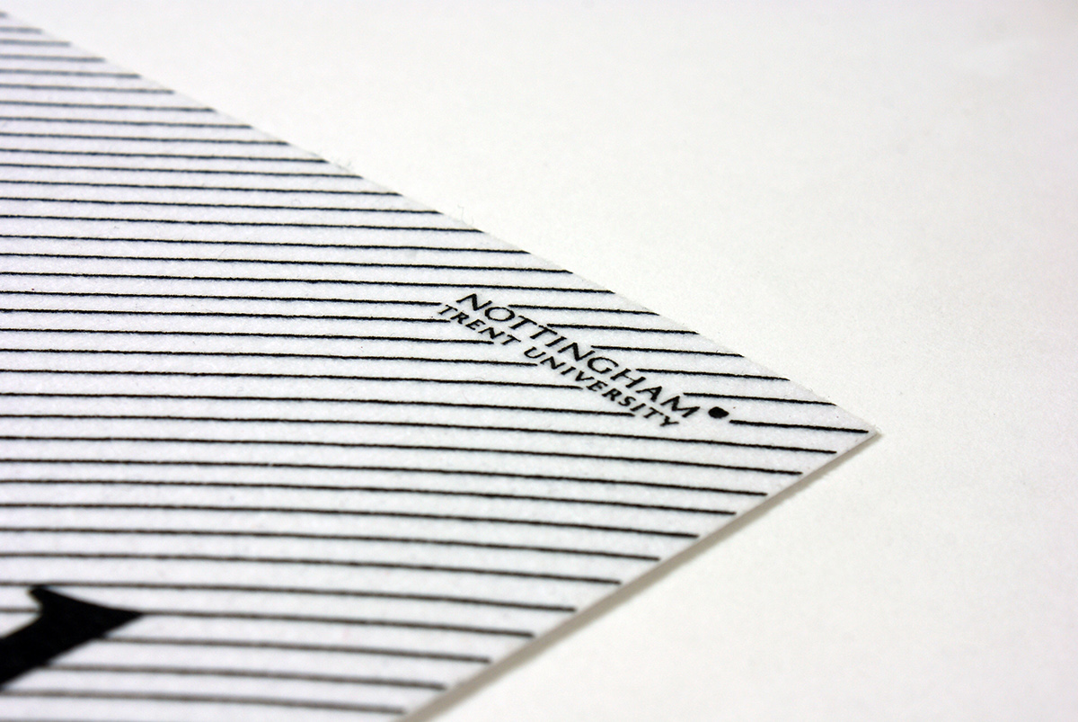
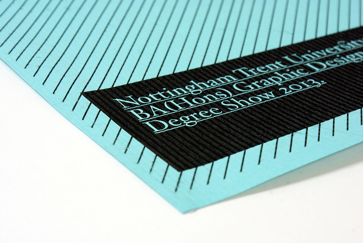
Logo uses hoefler text as it is appropriate for the theme to the project
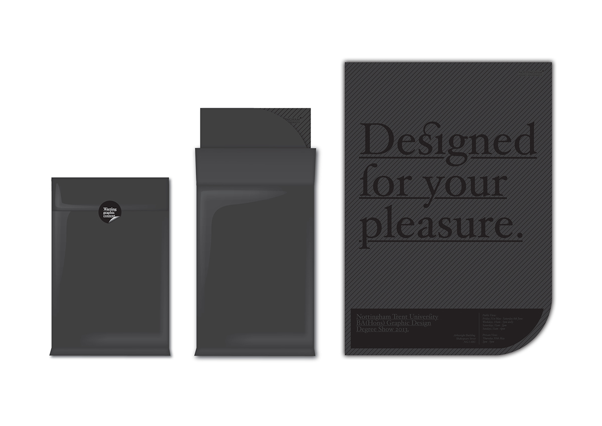
The invitation will arrive in a black concealed bag with a plastic texture, The sticker stating “Warning graphic content” will seal the bag shut. The invitation will be folded up inside.

To accompany the textures and typeface, there would be witty copy to help the tone of voice of the degree show stay serious but not to take it too far.
The posters would be placed around the university buildings and mailed out to agencies to advertise the show. These would have different paper stocks, weights and print methods applied to them.
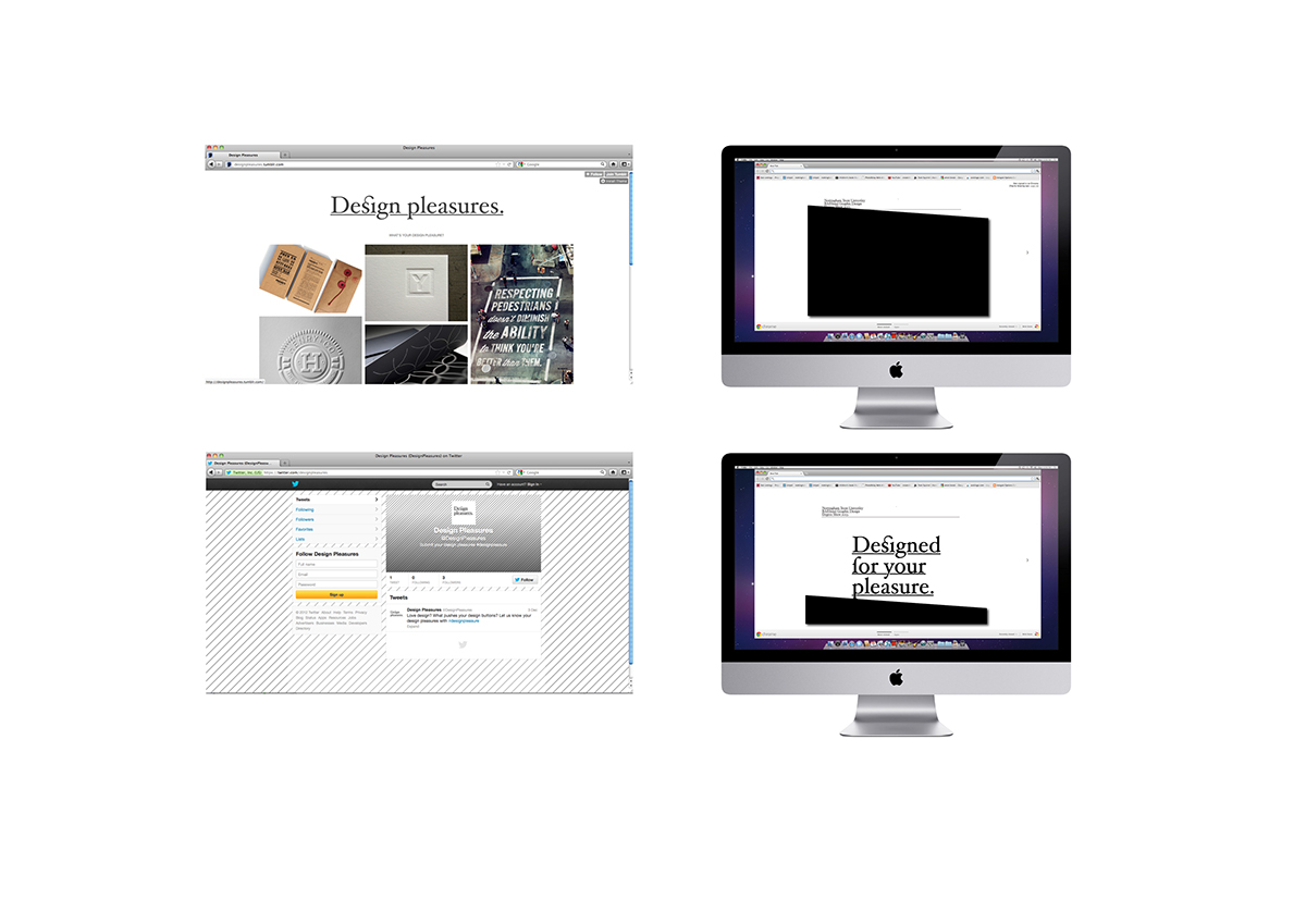
The degree show would also work online. Using social networking, other designers could be asked what their ‘design porn’ is getting a larger audience involved.There would also be a blog with the years work on show that would be updated frequently.
The website for the degree show would be an interactive website with a black screen that the viewer has to drag away with their mouse to ‘reveal’ the work behind it.
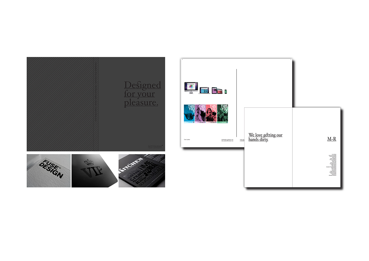
The catalogue has a textured cover to contiinue the theme, inside the chapters are separated by a semi translucent sheet of paper.
Each student would have a full page to display their work on with name, contact details and website printed in hoefler text at the bottom.

The texture theme runs through to the staircase leading to the exhibition space. The exhibition space will have a blurred glazed panel with the ‘Design for your Pleasure’ logo behind seducing the visitors into the degree show.