(Please view video in HD for your viewing pleasure)
Blue Velvet Titles, Celeste Watson, 2013
Digital rendering on screen
1920×1080 pixels
Digital rendering on screen
1920×1080 pixels
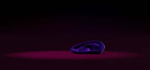
I was given a hypothetical brief to redesign the pre-existing title sequence for David Lynch’s film ‘Blue Velvet’ (1986). The film is an American mystery film containing themes of voyeurism, violence and addiction. In terms of genre, the film exhibits traits of both film noir and surrealism. Blue Velvet exposes a dark underbelly that exists within a seemingly idealised small town.
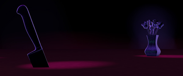
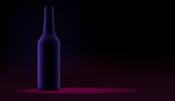
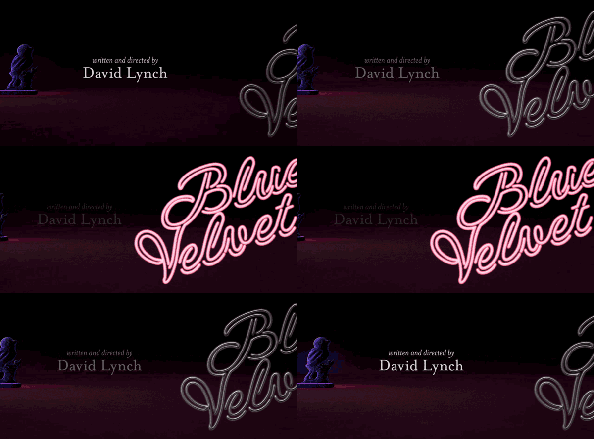
I chose to create my animation in Cinema 4D and After Effects in order to create a somewhat realistic illustration of the core symbols throughout the film. Each of these are open-source models sourced from GrabCAD and Thingiverse. Each object is paired to an actor as that symbol represents their character in the film. I took sinister imagery such as a gun and a knife and juxtaposed them against pleasant objects such as roses and a robin. This is all in an attempt to hint at the duality of themes displayed in the film.
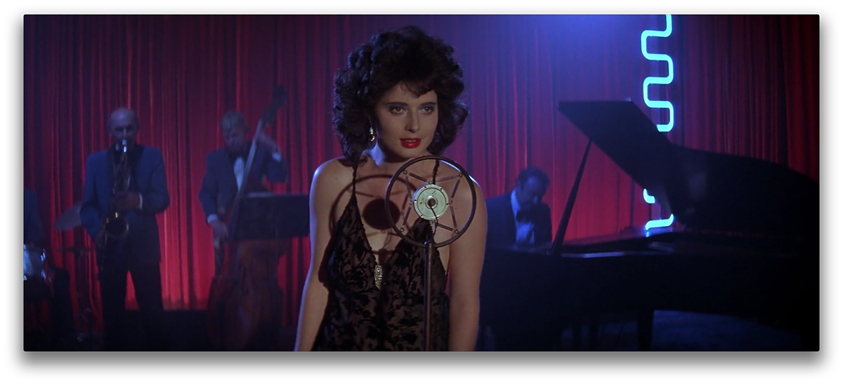
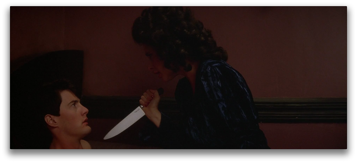
(Above image taken from the original film)
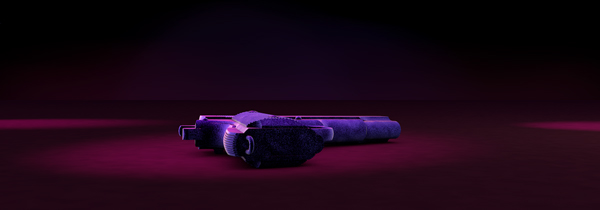
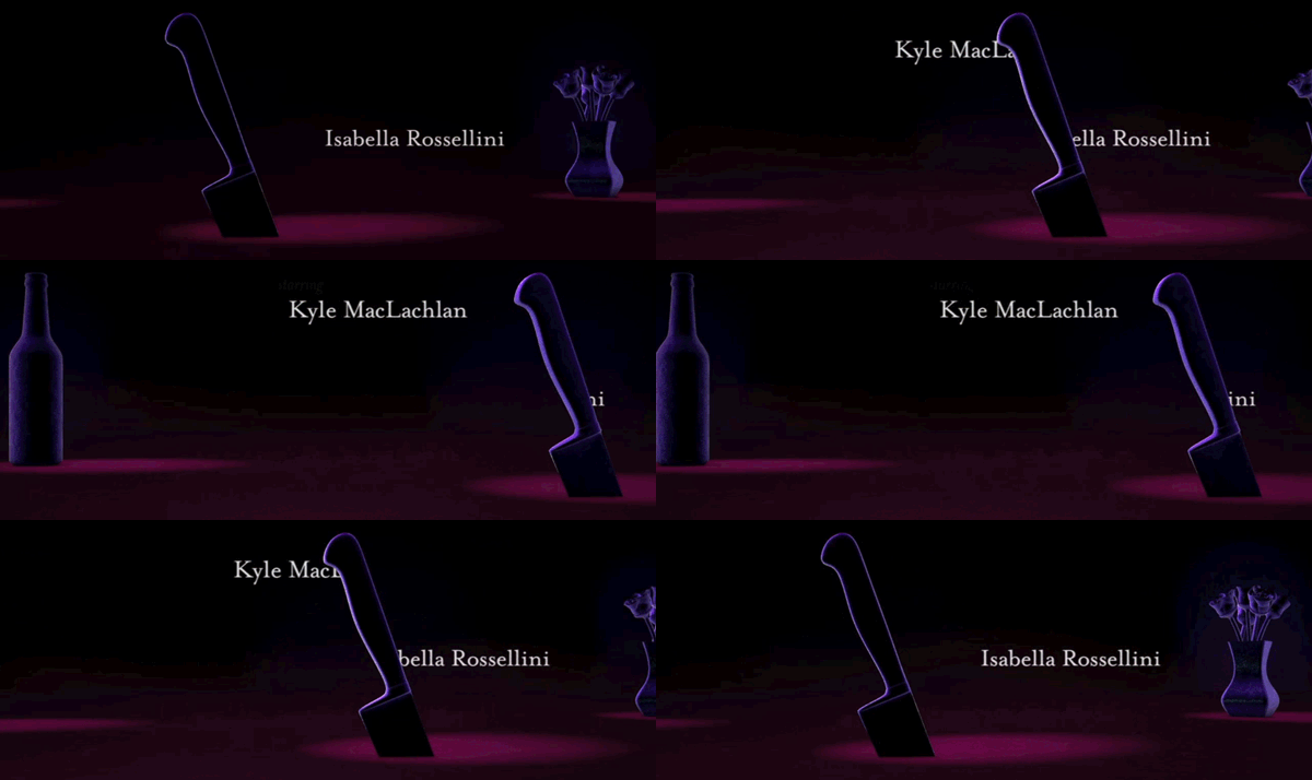
The titles are set along a table as a camera pans past each object as it sits still in space. This is in order to recreate Blue Velvet’s unnerving tension. The lighting, camera and composition were manipulated to make it seem as though the objects and type are moving subtly despite their fixed positions. Velvet was an obvious choice for the material to render the objects in, but a necessary one. The use of this material on objects such as a knife and gun hints to the weird world of fetiches and violence that the viewer is about to be exposed to for the next 120 minutes.
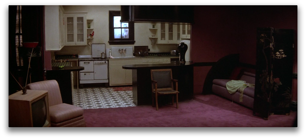
(Images above amd below taken from the original film)
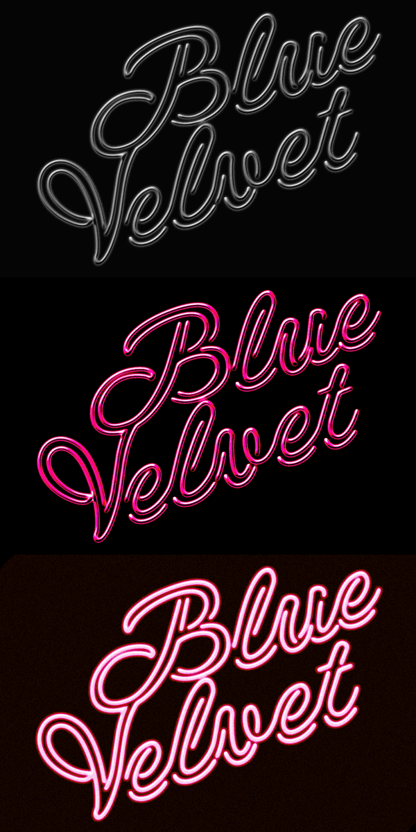
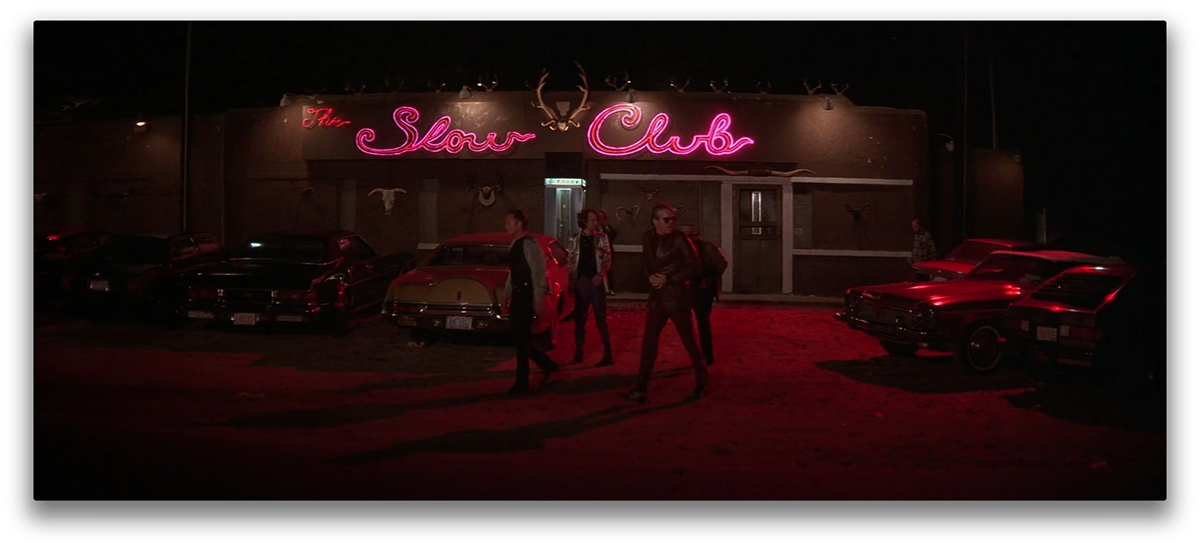
I wanted to reference the dark cinematography that Lynch employed in the film. The overall colour palate of the titles was taken from the scene at The Slow Club; a pivotal scene in the film. This is where Dorothy (Isabella Rossellini), makes her debut in the film. I believe that the way at she is lit and coloured in this scene summarises the feeling of the entire film. It’s dark yet vibrant and everything is sexualised. The construction of the neon sign for the logotype for the film’s identity comes directly from the signage of ‘The Slow Club’. I treated my objects with a strip club aesthetic in order to reinforce the sexuality of the film.
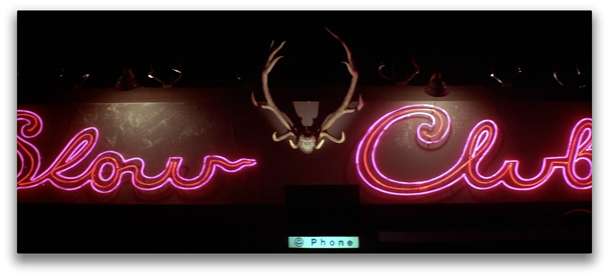
(Images above amd below taken from the original film)
~ * • Thanks for your time • * ~
⬇
⬇


