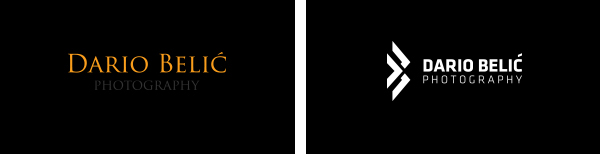
Self rebranding. I had an old logo that I have made for myself long time ago. It was simple serif typography (Trajan Pro) and now I decided to make it more suitable for type of photography that I do and am intrested in doing. So I used Klavika typerface and made myself a symbol out of my initials that can be implemented almost anywhere. Replaced old orange color with cyan (links on website) and good old black and white combination.
Main inspiration and guide was minimal, sharp, modern, clean & black all the things that I love.
OLD vs. NEW
INSPIRATION

FULL LOGO

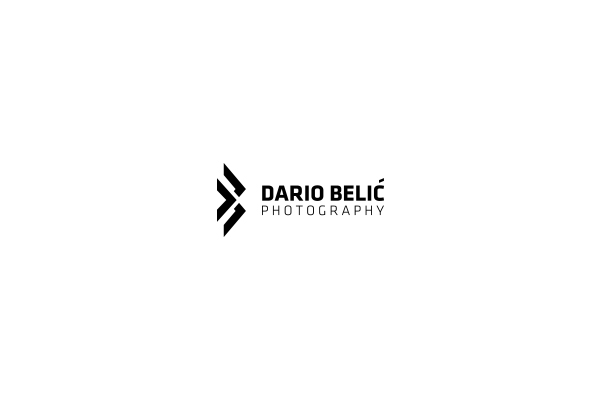
SIMPLE LOGO

BUSINESS CARDS

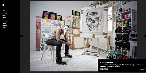
WEB - www.dbelic.com
Responsive design, big photos & easy navigation were a must. Also I wanted to get rid of everything that could distract attention from main purpose of site - photos.
Used: Wordpress + modified Touchfolio theme

FACEBOOK PAGE - facebook.com/dariobphotography


