Background and objectives
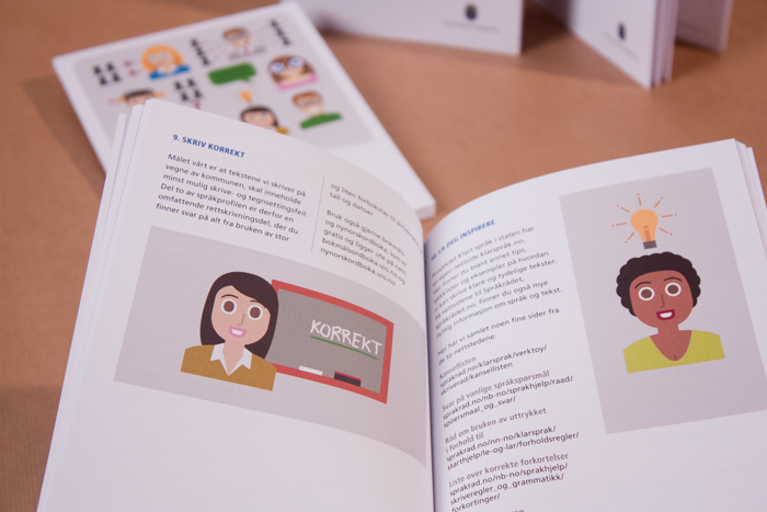
In 2012 the City of Stavanger started a comprehensive language strategy. The goal was to raise language awareness among employees and improve the written dialogue with inhabitants of the city. They developed their own language manual in collaboration with language consultants. The manual contains rules and guidelines for employees to write clearly and correctly.
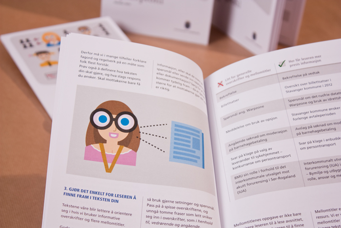
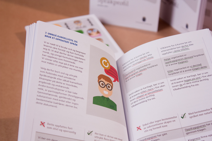
Comprehensive and representative samples of texts produced in the municipality were collected and made the basis for the language profile. On the basis of the linguistic shortcomings that recurred in these texts, it was then drafted rules and guidelines to improve spelling and increase the overall writing competence among employees.
Concept / idea / strategy
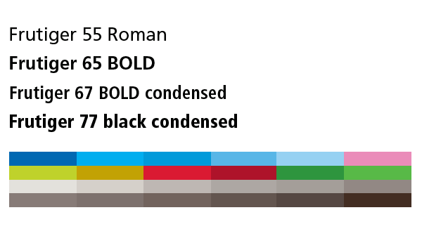
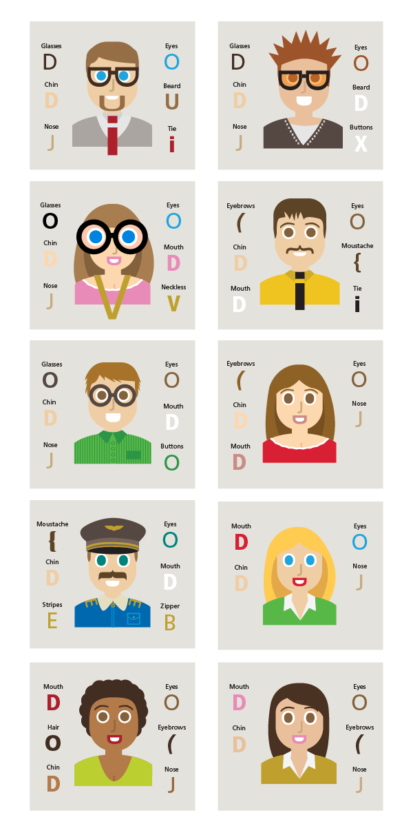
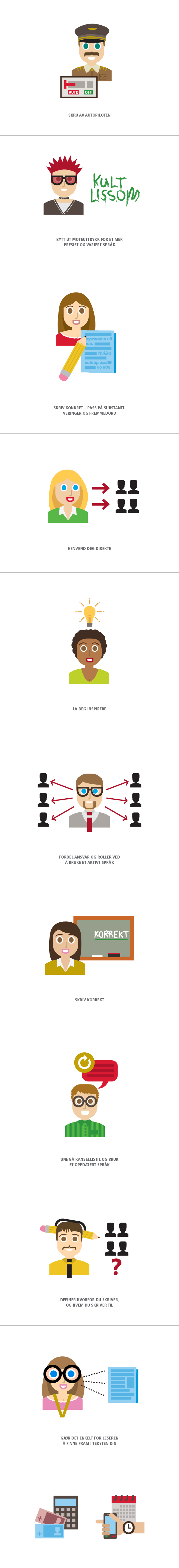
Since it is a manual for how to use the language, it was decided that the letters could represent this well as illustrations. The use of letters represents language and a motive of the illustrations represents the usage in the language. The use of humans as a motif in various situations also made it more personal. Every single illustration is based on the linguistic rules and guidelines of this manual and should be placed in coexistence with the text. The typeface Frutiger was picked from Stavanger municipality's design manual, and with the variations in form from condensed-to the normal it was flexible enough to create human shapes.
Made while working at
Reload
Client
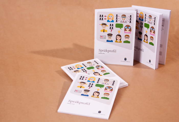
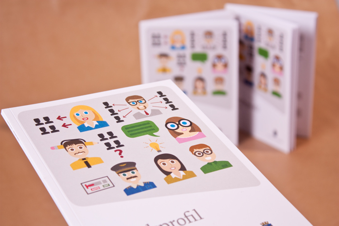
Stavanger kommune
Art Direction
Art Direction
Aud Vikør
Design & illustration
Design & illustration
Stig Bratvold
Typeface
Frutiger
Frutiger