
CDC Visual
Social Media Background & Wallpaper
Chicago Dubstep Connect is a small and relatively new company which promotes live dubstep performances in the greater Chicagoland area. Their goal is to reach people who love dubstep and enjoy going to concerts frequently.
Two days ago, CDC requested a background for their Twitter and Youtube accounts. I had pretty much completed the project when I decided to reformat it into a wallpaper in addition to the social media design request. Last Christmas my dad gave me my first tablet, a Wacom Bamboo. I've found that it's actually harder to use than drawing with a pencil because you can't look down and see what you're hand is doing. I'm saving up for a Cintiq but who knows when I'll be able to get that =/. Anyhow, in order to get better at using my tablet I put my mouse back in the box and put the box in my closet. This project definitely helped me get better at digital painting and lighting.
Two days ago, CDC requested a background for their Twitter and Youtube accounts. I had pretty much completed the project when I decided to reformat it into a wallpaper in addition to the social media design request. Last Christmas my dad gave me my first tablet, a Wacom Bamboo. I've found that it's actually harder to use than drawing with a pencil because you can't look down and see what you're hand is doing. I'm saving up for a Cintiq but who knows when I'll be able to get that =/. Anyhow, in order to get better at using my tablet I put my mouse back in the box and put the box in my closet. This project definitely helped me get better at digital painting and lighting.
You can download the wallpaper here.
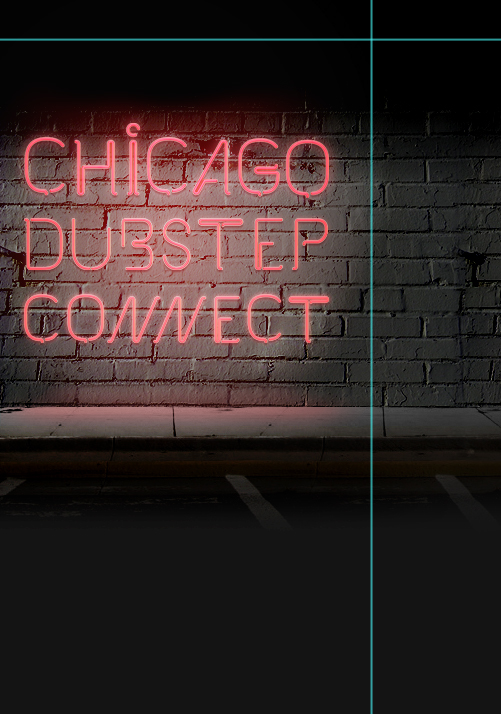
I always approach my projects as a problem or puzzle that it's my job to solve. So when you're creating a background for someone's Twitter/Youtube, what's the problem? There isn't much one can communicate through this medium, as it is not dynamic or interactive, nor is it usually very specific. So what should a Twitter background do? What CAN a Twitter background do? To answer this, I looked at over 100 Twitter accounts for well-known brands. Many had backgrounds with minimalist design and a small amount of contact information. Some just used a simple color-scheme or even one of the design options provided by Twitter. Eventually I came to the conclusion that this project would be mostly aesthetic in its nature.
With that in mind, I wanted to create an aesthetic that projected the emotions that CDC wants to use to connect with their target audience. If you take a look at some of the photos on CDC's Facebook page, you'll see that the people at CDC like to party. Since the client and the target audience both enjoy nighttime activities, I wanted to show this and evoke a positive emotional response through humor. Since the age bracket for the target audience ranges from late adolescence through the mid-twenties, I was allowed be more adult, but less mature, in my approach. Humor in this age bracket is often a derivative of shock-value, so I wanted the result to be something that would reject traditional, more conservative values.
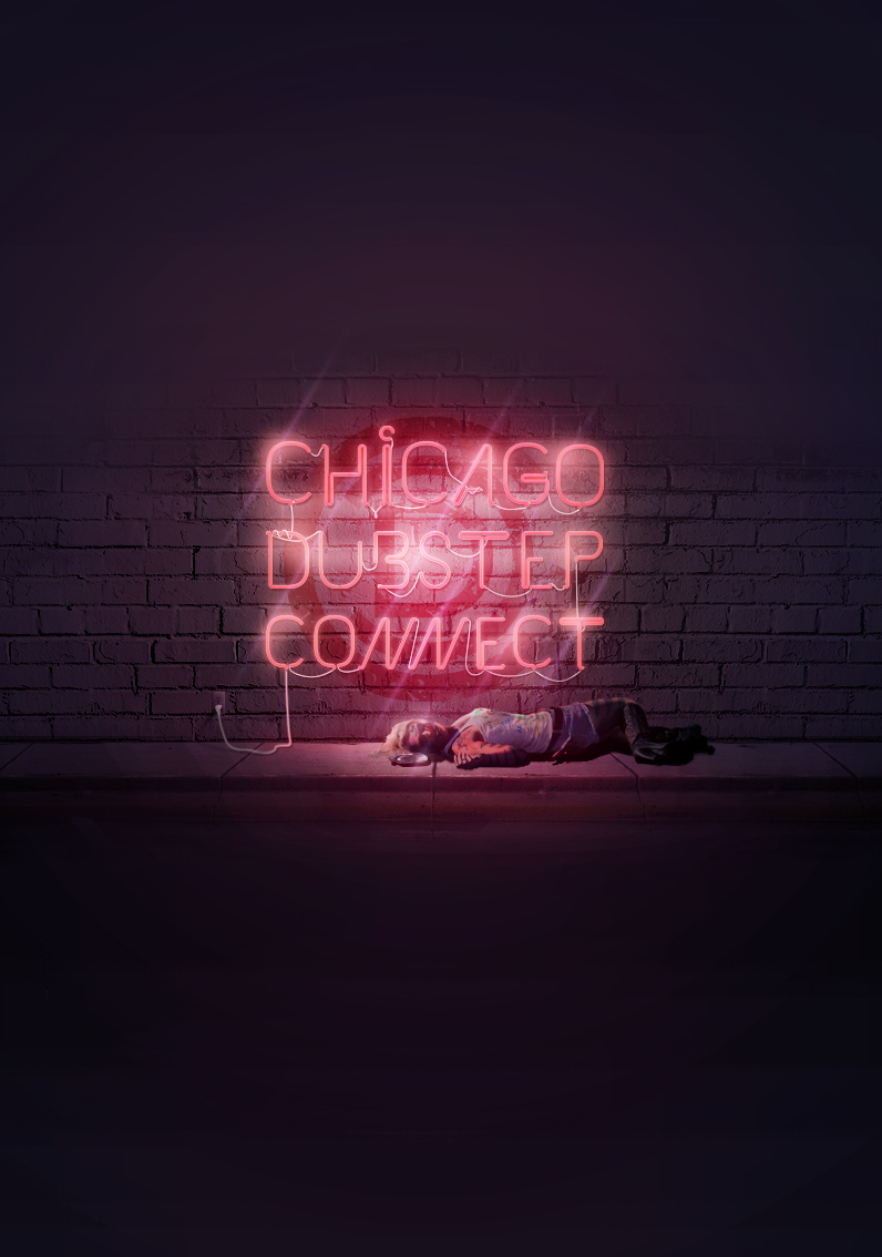
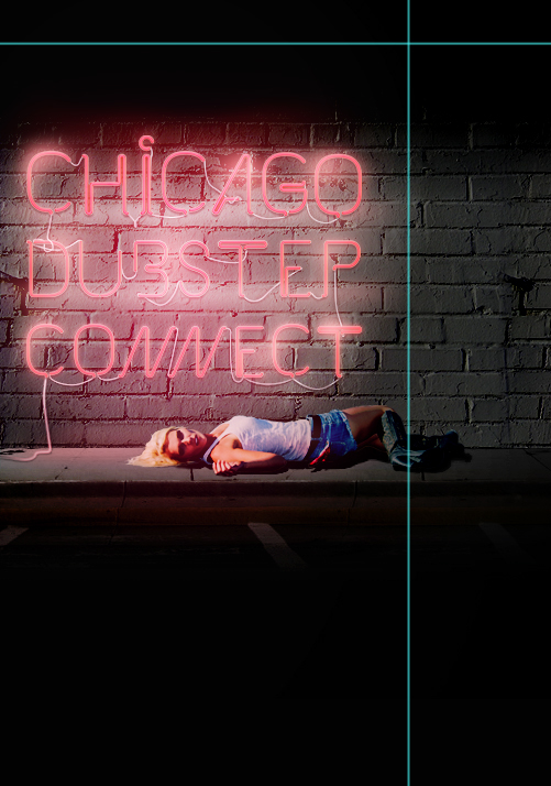
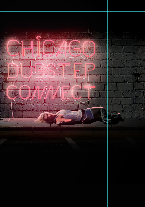
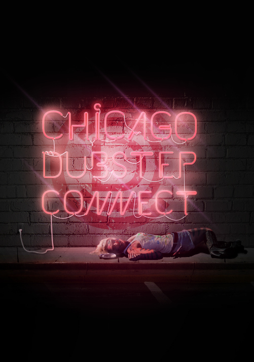
The end result is the main focus, Chicago Dubstep Connect, in appealing and eye-catching typographic neon signage with a woman passed out on the sidewalk below. The marker all over her body and the empty bottle next to her implies that she's had a rough night. Her role in this project depicts "that one time" that the target audience can relate to when they've had a little too much. Thus, the target audience can connect with CDC in a more personal way.
Resources
I was browsing through some of the entries for the Behance Student Showdown and I came across the designer Mathias Nösel. His portfolio is awesome and it includes his Kabel typeface which is based off of neon signage. Inspired by this, I used it as the main element of this piece. A major thanks to Mathias for making this available for free. Check it out:
http://www.behance.net/gallery/The-Kabel-Font-free/1912005
Below are the rest of the stock I used. Pictures of the girl and the outlet were purchased from Dreamstime. Everything else, except for the CDC logo, is from sxc.hu.
http://www.behance.net/gallery/The-Kabel-Font-free/1912005
Below are the rest of the stock I used. Pictures of the girl and the outlet were purchased from Dreamstime. Everything else, except for the CDC logo, is from sxc.hu.


Technique

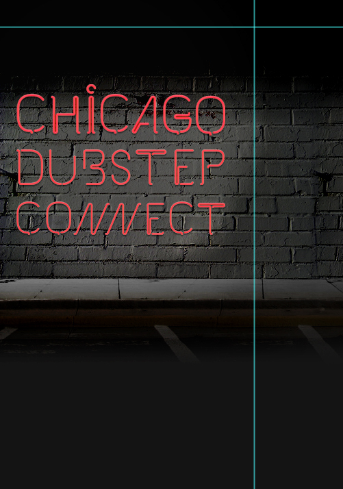
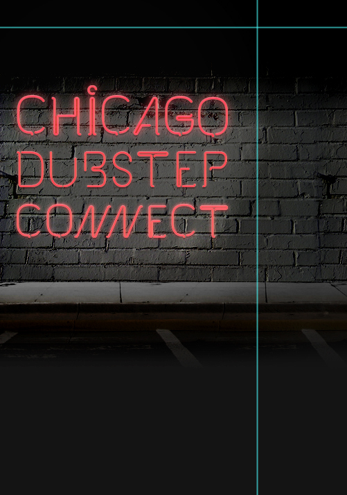
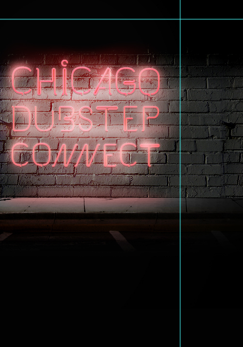
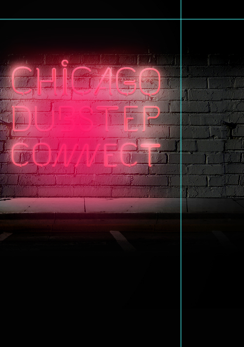
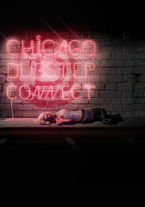
This gradient is the most important lighting element in the composition. When blended (Screen, 50% opacity), this layer becomes the foundation of the atmosphere and increases immersion when placed above the object layers.

The contrast of the subject was fixed through a combination of Vibrance and Brightness/Contrast.

The highlights and shadows on the girl are painted using a tablet and intricately blended to appear correctly.
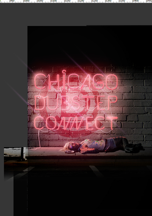
The project expanded to include a wallpaper pack and the composition was centered, requiring leftward extension of the scene.

Shadow layers were blended above the main gradient layer to create darker, richer shadows and add depth to the composition.

Final touchups include fine-tuning the background colors and fixing the gaps in the sidewalk to direct towards a vanishing point. The finished composition is displayed below.


