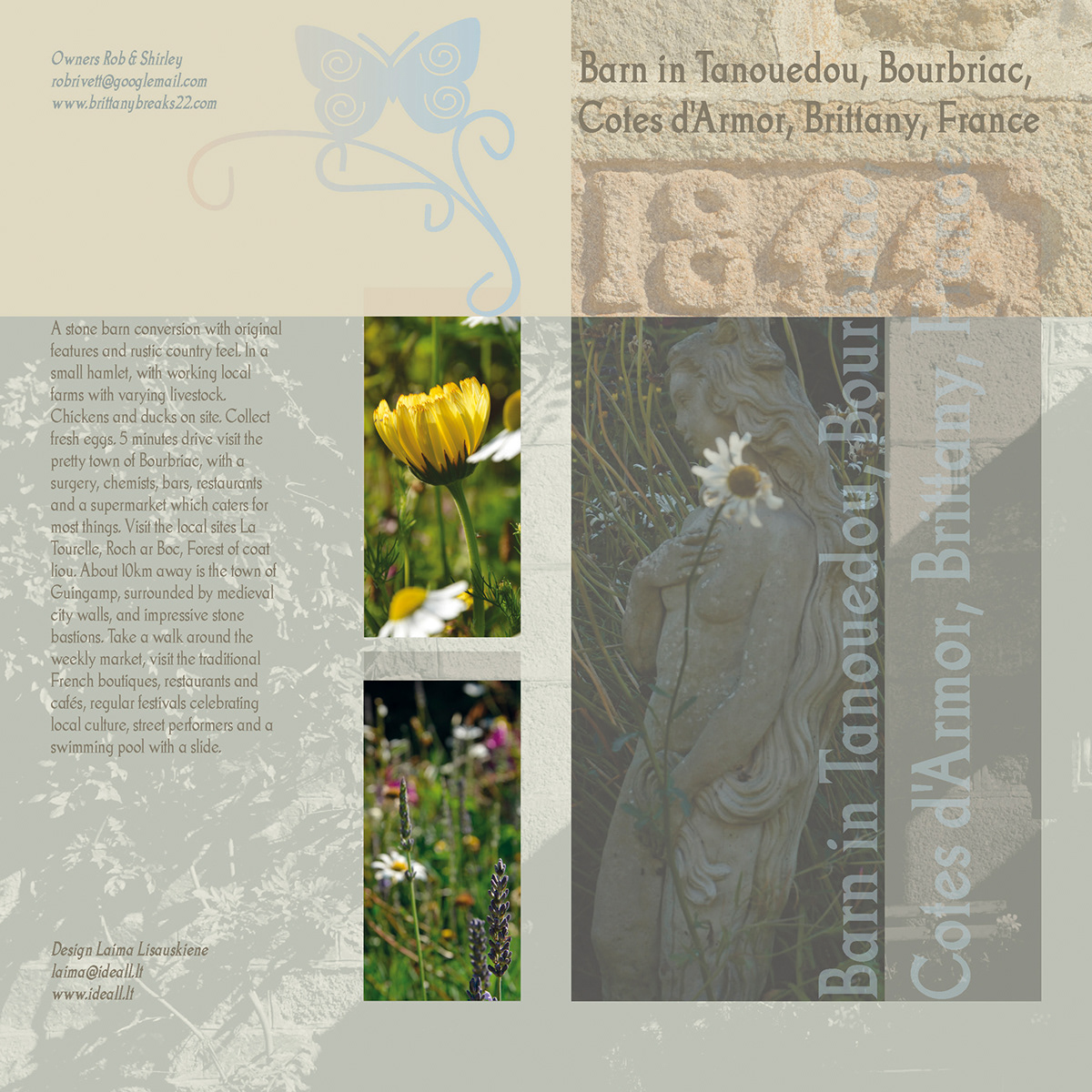
Barn in Tanouedou, Bourbriac,
Cotes d'Armor, Brittany, France
Booklet
The color language here is a starting point. The color concept is limited palette selected for its elegant feeling. Earth tones are traditional, gray is chic, blues and grays mean business.
The typeface's texture generates light, romantic feeling. Also the typeface reflects the idea of rustic country itself. I limited myself to one type style. From an aesthetic standpoint, a bit of restraint makes the visual language much clearer. A transparent type (opacity 40%), placed behind the main text becomes part of it and acts as a "bridge" between main text and title.
“We think the brochure looks really good for us, and we appreciate the information on its style.” – Rob Rivett
2012


Thanks for visiting!

