
Børk
About the project
The name
Logo - Sketching process

Grid and guides
I wanted the logo to be simple and free from any major style indicator of what was to be expected in the product line. Other than the fact that this is a creative studio and that the company focuses on Scandinavia in it's style and theme, I want the style portrayed in the product line to be broad in that sense and not limited by a design decision in the branding of the company.

Usage and graphical elements
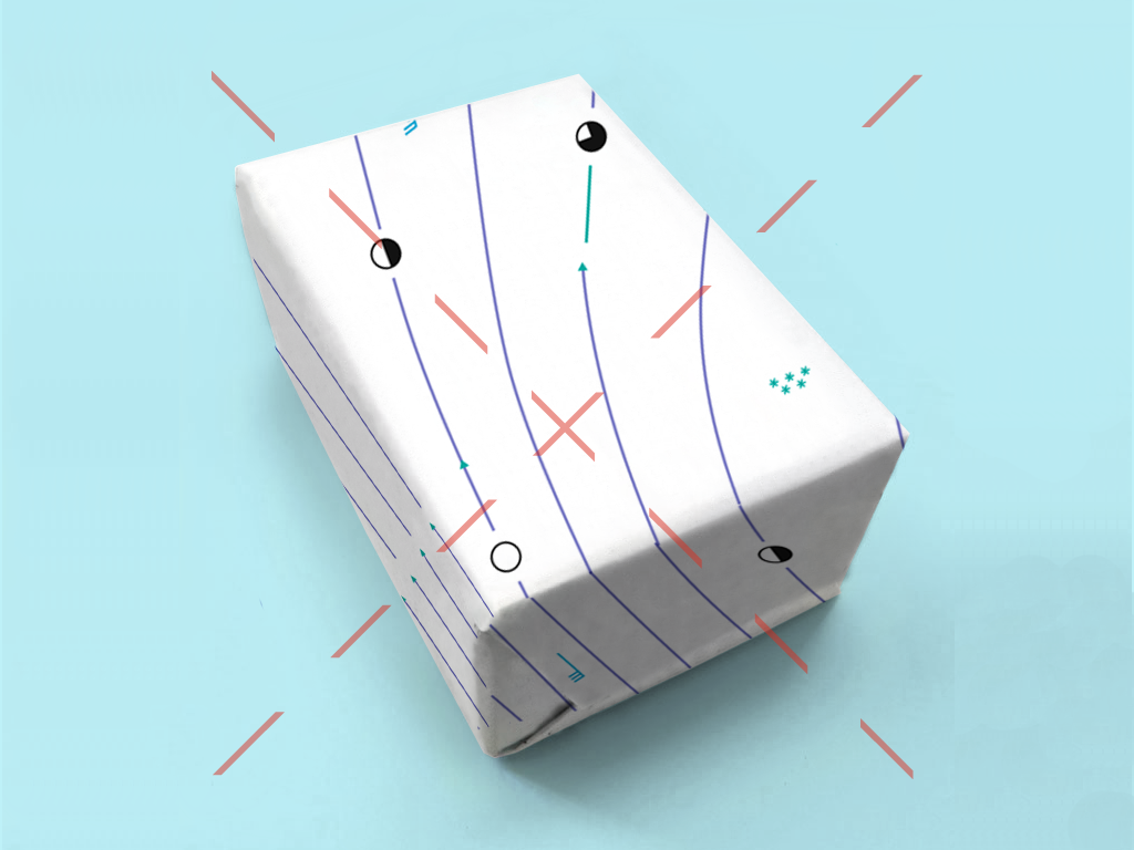
By tilting the logo by 45°, the line crossing the Ø becomes vertical or horizontal. I decided to use the line crossing the Ø as a graphical element and use it as a folding line for the identity. Given that the name refers to cover, conceal or wrap around something, I think that the logo should too.

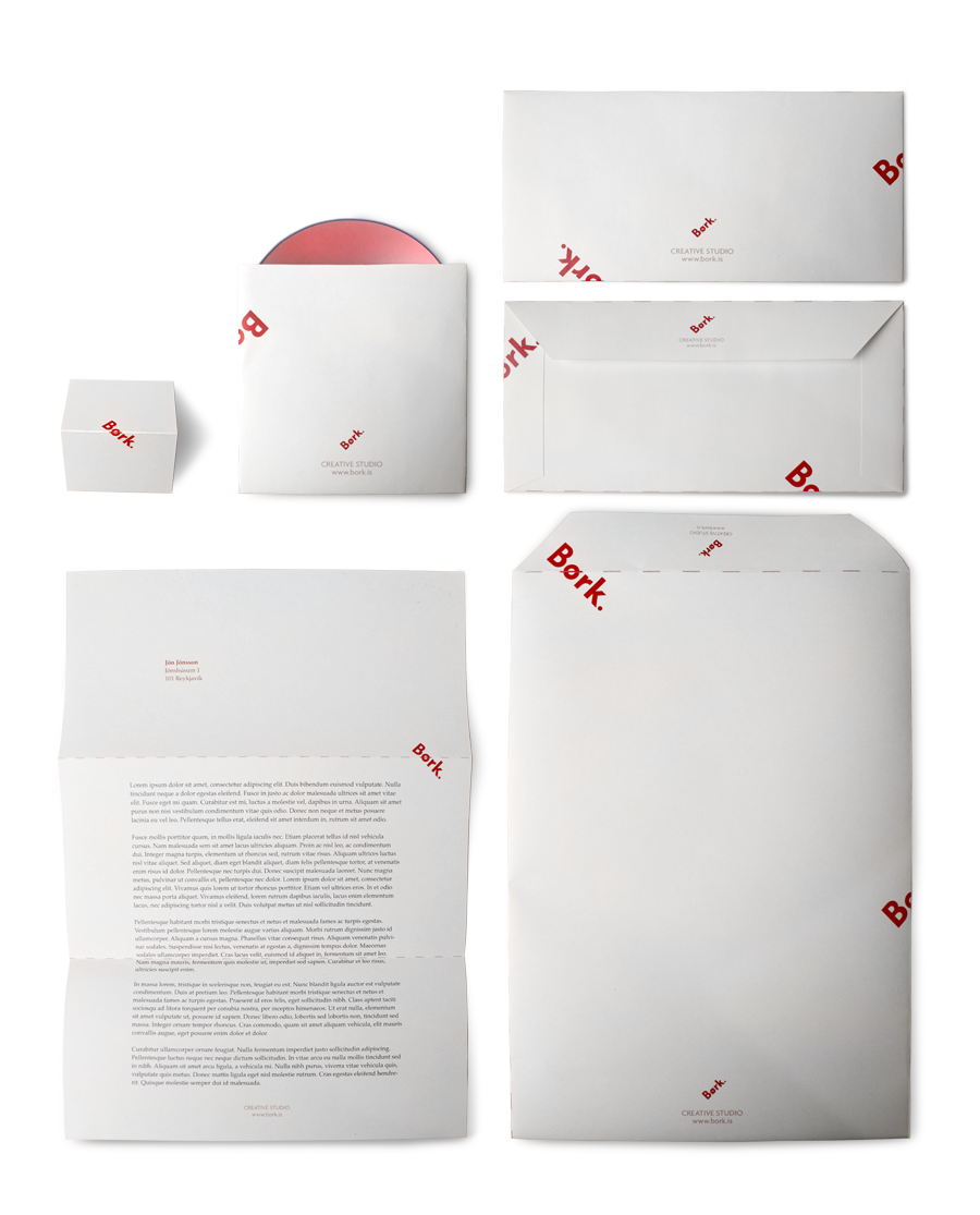
Graphical elements - Usage
For the stationary, business cards, envelopes and cd envelope, the logo and the folding lines create the visual interpretation of concealing something in a simple way.


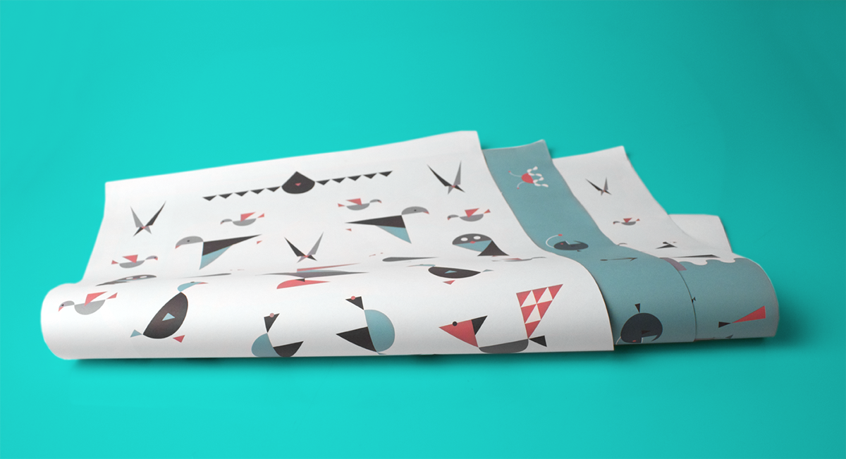
The gift wrapping paper comes in two different sizes, 50x70cm and 70x100cm. The paper is sold in triangular holsters. During the exhibition, some visitors mentioned that this would be a good gift, raising the weird question, whether the gift wrapping paper + holster would need additional gift wrapping paper.

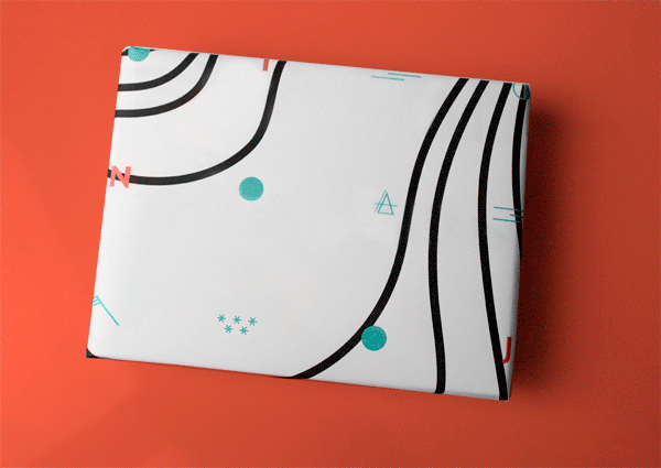
Børk gift wrapping paper
For the gift wrapping paper, I set out to use scandinavian theme or input and illustrate them in a Scandinavian style. Usually gift wrapping paper consists of seamless patterns, making them perhaps easier to use for wrapping in gifts, but my goal was to make gift wrapping paper that could work as a poster as well. My approach for the arrangement, balance and layout of the images was to make a center, top and bottom, making the orientation of the piece more clear when used as a poster. It also gives the option of making a part of the illustration as a center piece on a gift.
My inspiration varied from Marimekko, Siggi Eggertsson, Brita Sweden, Ferm Living, Heydays and Grandpeople to name a few. My interpretation of Scandinavian graphic design comes down to simplicity, use of simple forms and/or distortion of shapes.
Color Palette
The idea is to have an annual collection, differentiating itself with a changing color palette. The colors I use have a festive tone to them without becoming seasonal.


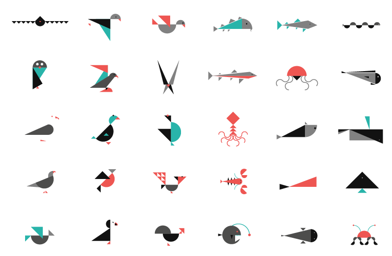
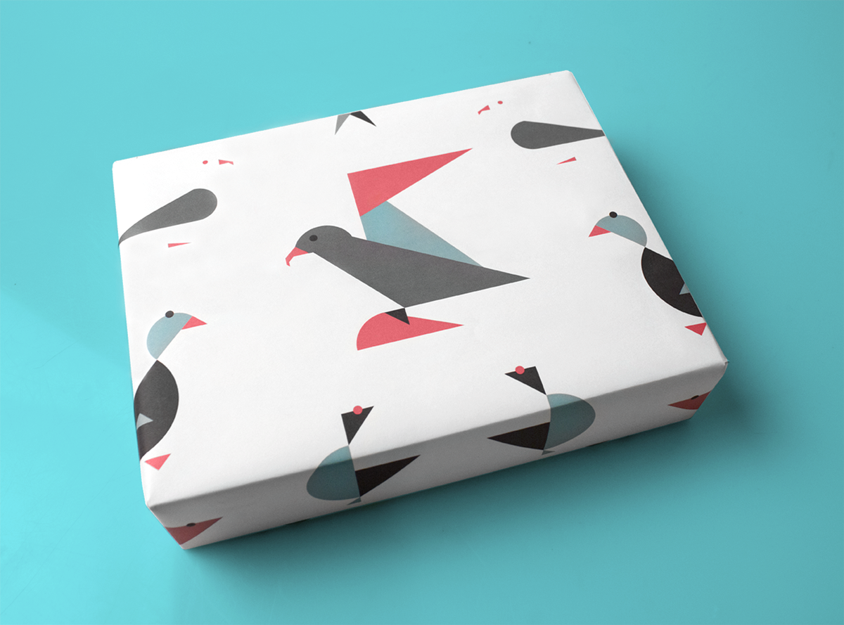
For the animal series, the biggest challenge was to make the animals recognizable using only circles and triangles in the most simplistic way possible. All the animals can be found in Scandinavia.


Børk paper in a frame.


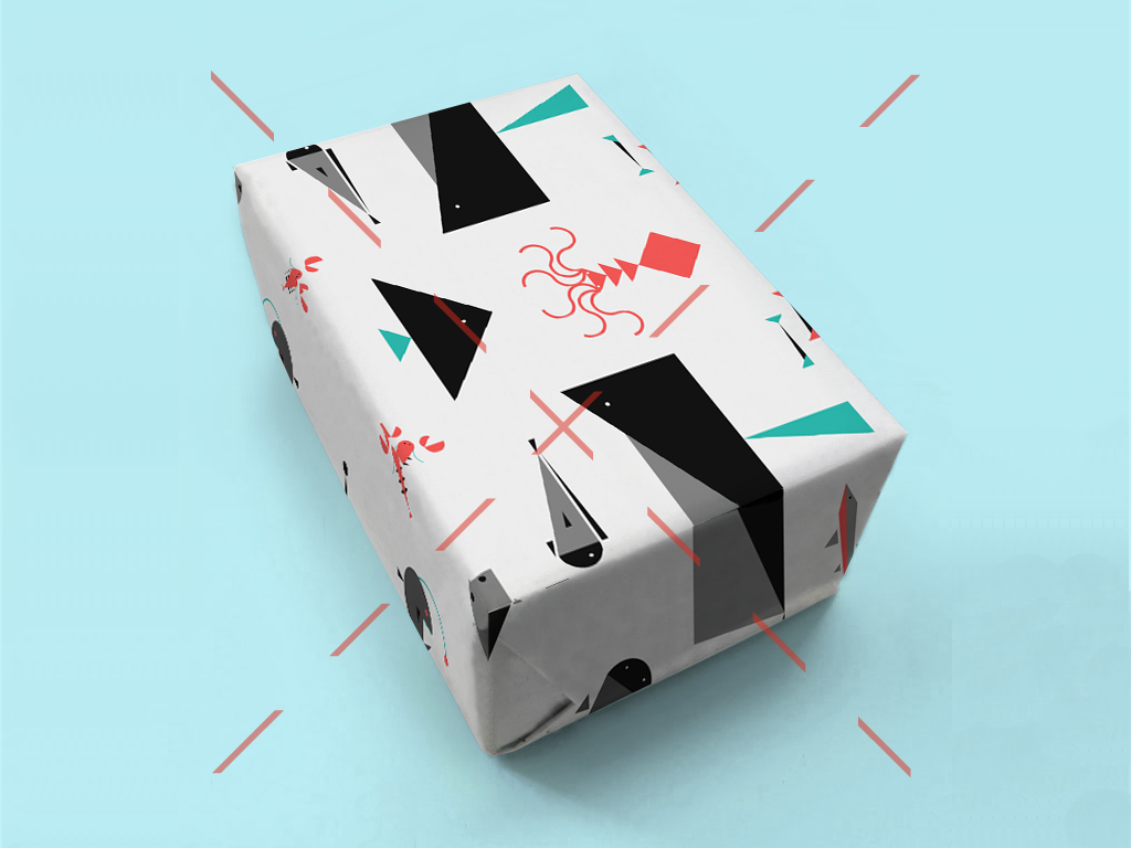
Out-takes
Some proposals I did but decided not to use for the exhibition. They may however become available later on.

Exhibition
The graduation exhibition of the Iceland Academy of the Arts took place at the Reykjavík Art Museum between 21. april and 6. may 2012.


