Before I Die
Independent Study: Typography Exploration
Independent Study: Typography Exploration
When given the opportunity to have an independent study, for the University Honors Porgram, I knew I immediately wanted to do a project centered around typography. I explored many different areas of typography
from Paul Elliman to Nell May. I came across a typeface, created by Nell May, that was based off of children’s handwriting and immediately I was inspired.
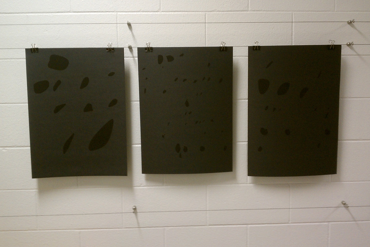
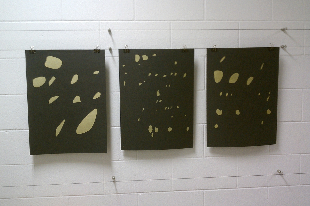
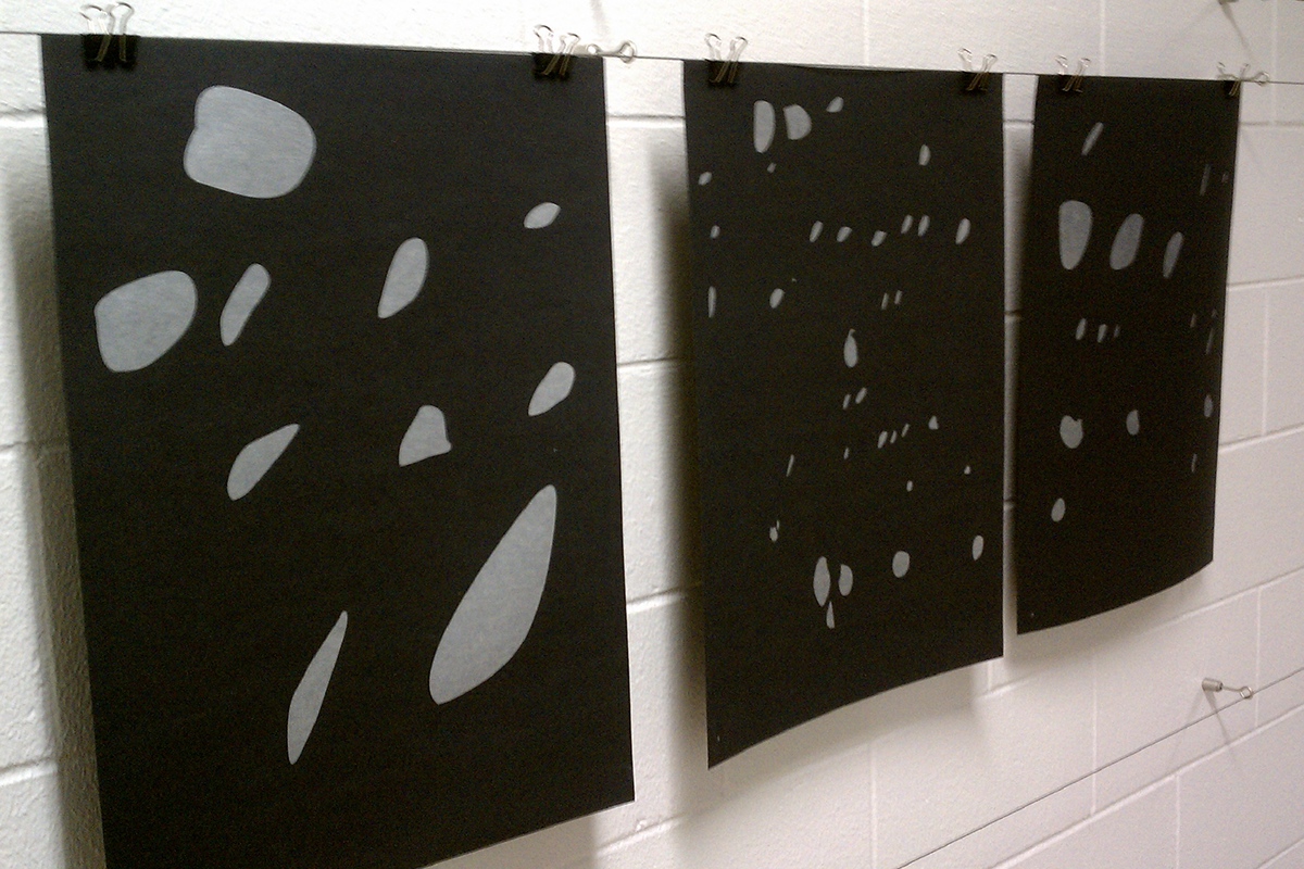
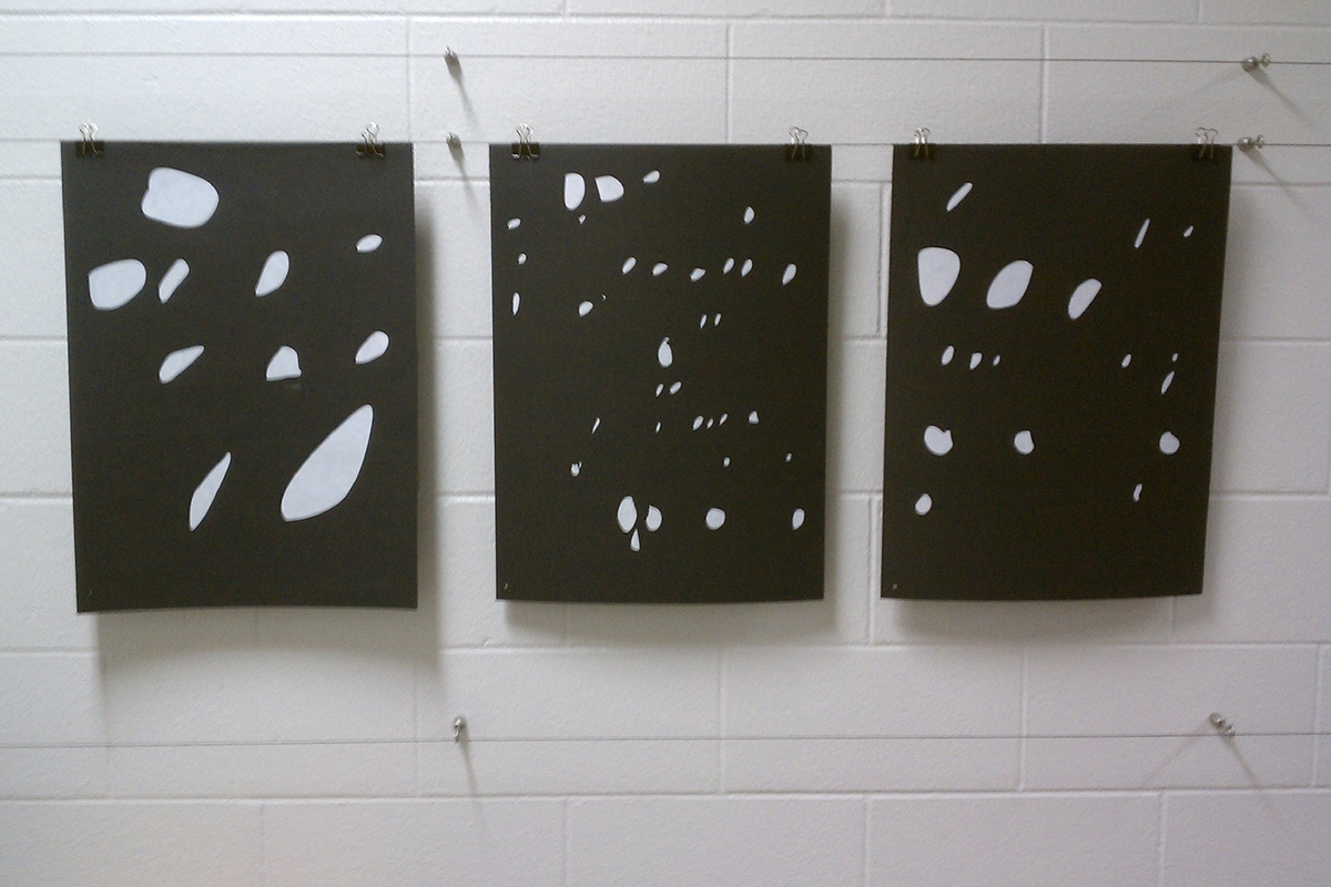
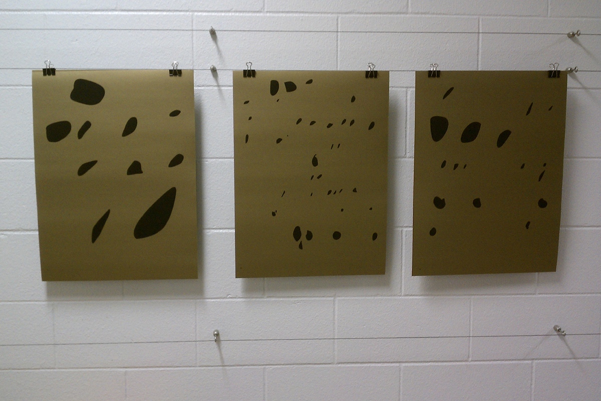
Before I Die is a project I created to further study typography in a unique way. First, I collected handwriting samples by asking people what they wanted to do before they died. I took the samples and created shapes from the counters of the letterforms. The unique shapes were so inspiring that I was able to experiment until I came up with a series of three posters.
The posters are screen printed on various colors of paper with four different ink colors. It was fun to play with the metallic ink and paper to symbolize the person’s final wish. It was both a fun and rewarding project and I hope you enjoy!
from Paul Elliman to Nell May. I came across a typeface, created by Nell May, that was based off of children’s handwriting and immediately I was inspired.
Before I Die is a project I created to further study typography in a unique way. First, I collected handwriting samples by asking people what they wanted to do before they died. I took the samples and created shapes from the counters of the letterforms. The unique shapes were so inspiring that I was able to experiment until I came up with a series of three posters.
The posters are screen printed on various colors of paper with four different ink colors. It was fun to play with the metallic ink and paper to symbolize the person’s final wish. It was both a fun and rewarding project and I hope you enjoy!

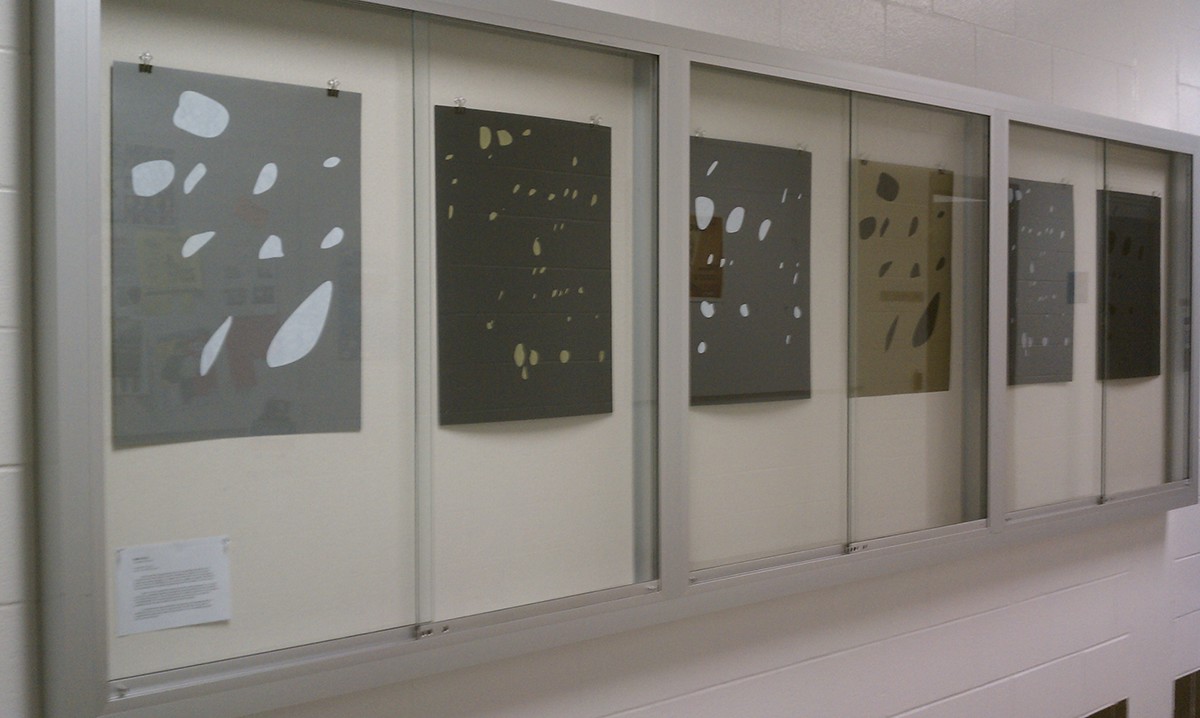
My very own display case. Enjoy!
