
This poster design was an assignment for my history of design class of our interpretation of Bauhaus, De Stijl, or Le Corbusier along with a two page artist statement we were allowed to design freely.
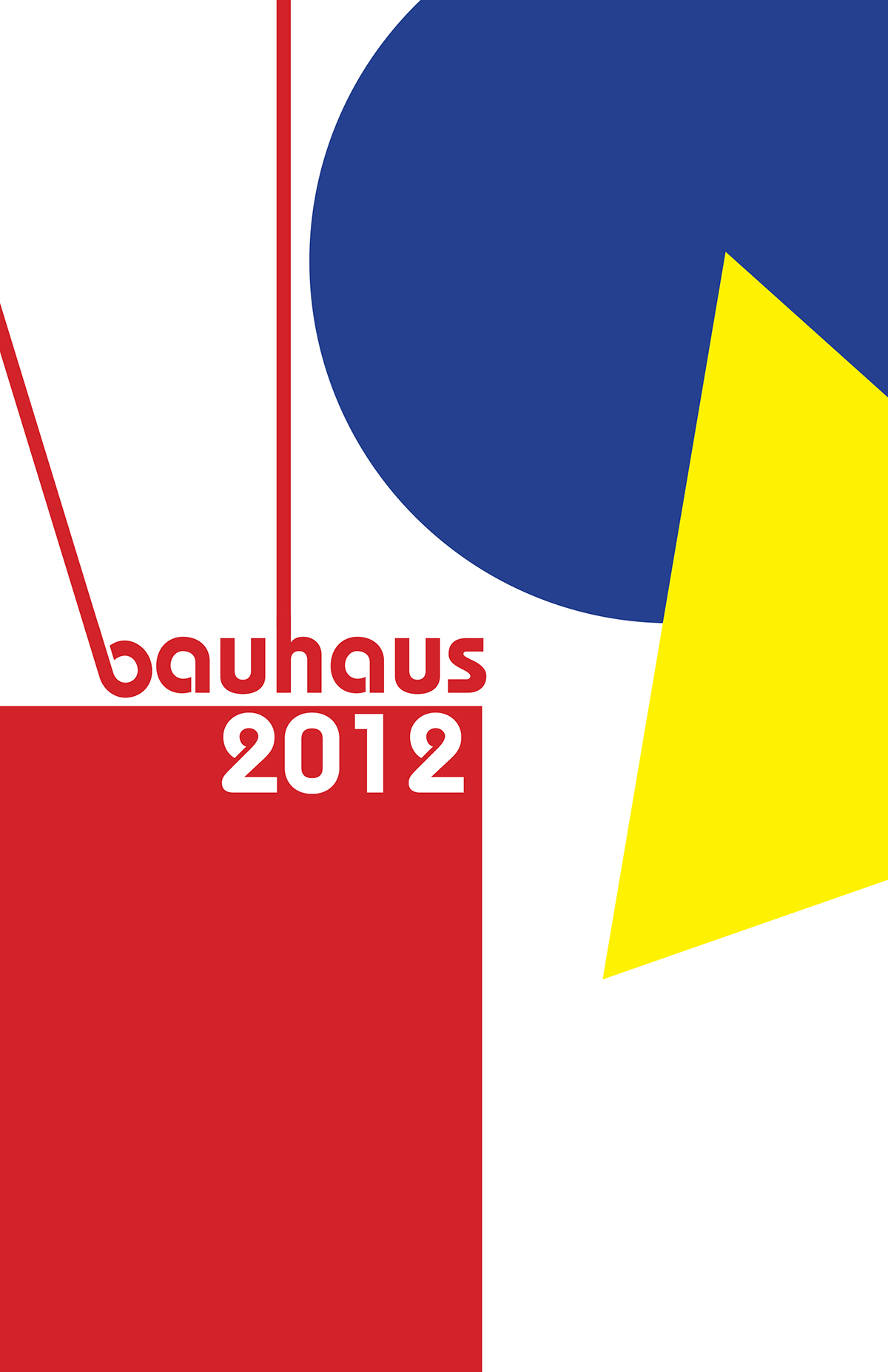
In the beginning I was stuck with this project, but with my love of Bauhaus I began to research and I read the Graphic Design Theory and came across Jan Tshchicholds, The New Typography essay/section. His words are simply inspiring and I have read this before but for some reason I was not as inspired but I used his words to influence my design. I started designing basing it off of the psychological/design study of the red square, blue circle, and yellow triangle but it just was not there. The bauhaus 'b' seems cliche in its typeface but it is truly beautiful because it represents history and yet I was still not happy with my first poster idea. While designing this poster and becoming more upset, the Target logo flashed on my T.V. and out of know where I was inspired. I remembered that Target is based around modern design and then went into the thought process of a new furniture section based around bauhaus design. Little fact IDEO (best design firm in the world/my dream job) designed some of the furniture for Target. With that inspiration I looked into the use of the lines and space of bauhaus design. Below are just a few of my steps of my process through my design. The last image is my final design.
Summary of my rant.
This poster design was inspired by bauhaus, Jan Tschichold, and Target. The concept was a new bauhaus furniture line is coming out in stores featured at all Targets and this would be the advertising they would use.
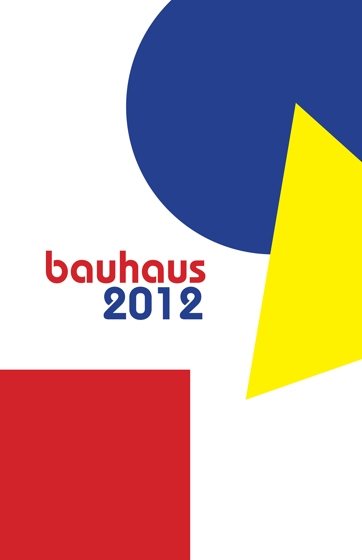


Final Design!
This was a school project and not an actual project for Target.


