BRIEF
Develop a brand, identity and packaging design that will get people to believe in an indulgent product as truly healthy AND with taste credentials to match any premium ice cream. We must powerfully disrupt the category creating a shift in audience perception and loyalties to existing brands.
CONCEPT
The concept behind this project was to look at the duality that is found within the product, such as the flavours being a mix of a traditional western favourite with an eastern exotic twist, as well as the product being a delicious treat and healthy choice. The design needs to visual stand out on the shelves.
SOLUTION
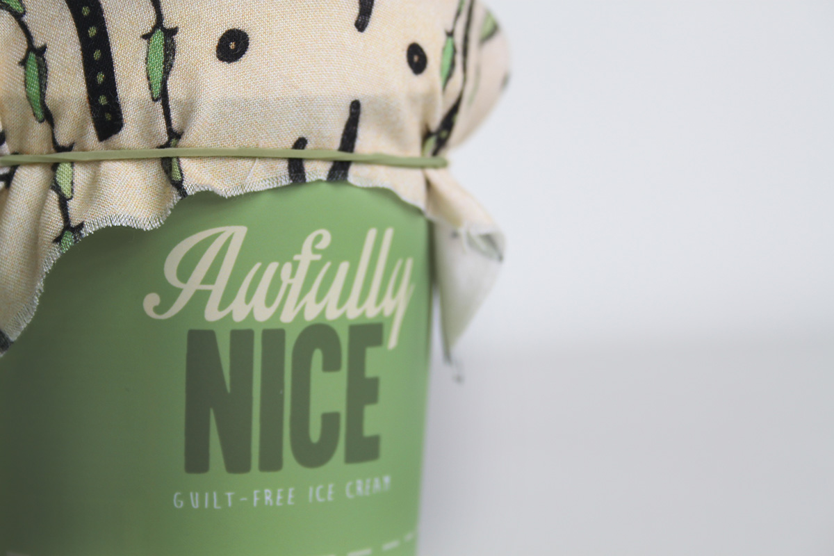
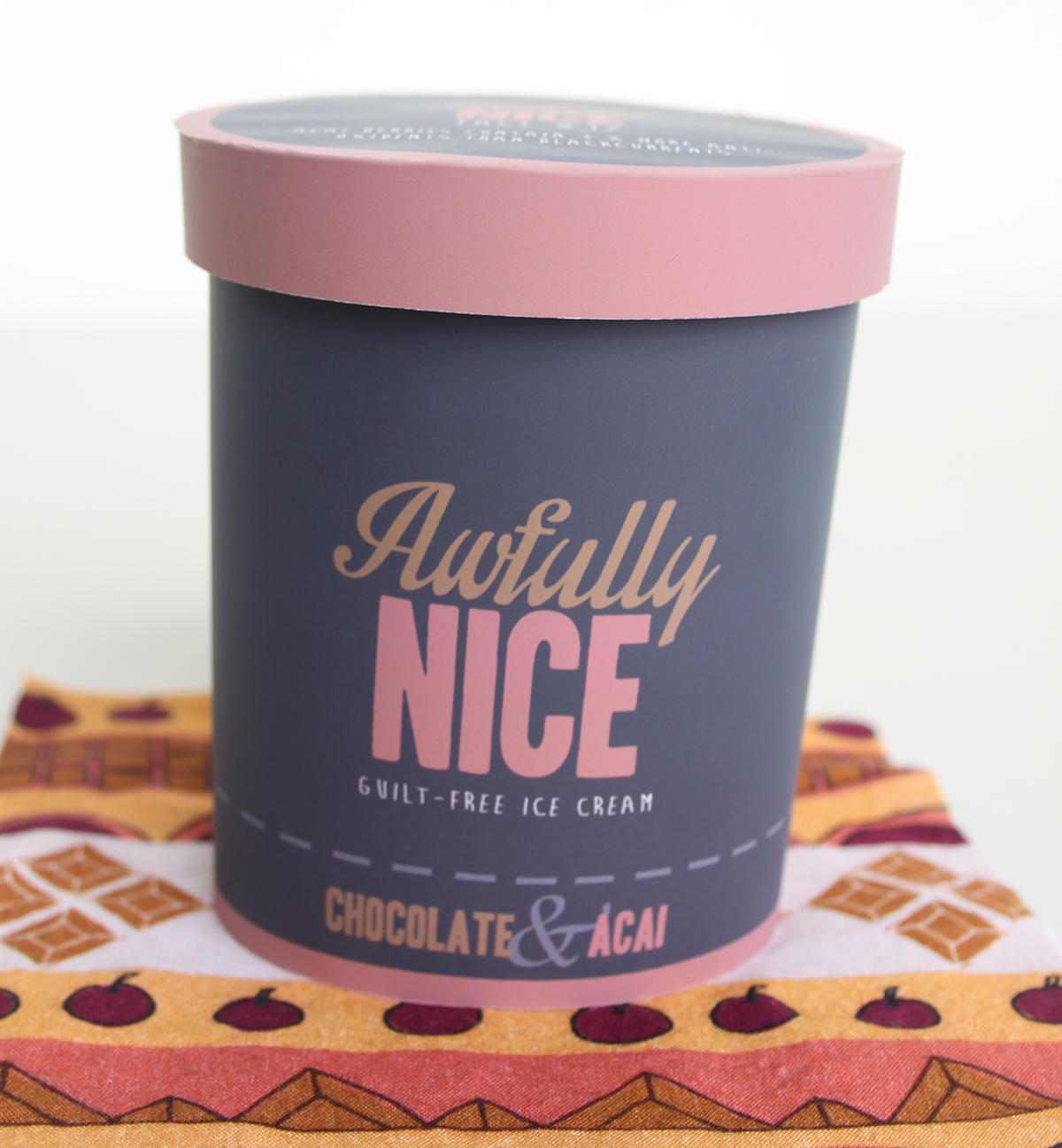
My solution was “Awfully Nice” whose name originated from a British oxymoron which describes the duality of this product well and in a positive way. The packaging is a mix of culture having the form have a resemblance to traditional homemade British jam jars with the pattern adding an exotic culture twist to the product. The colours were based upon the flavours and stylised to have a rich and luxurious feel. The brand has a clear, fun personality and charm whilst being a high quality product. A combination that competitors have been unable to achieve.

Photo of Choclate & Açai Bery Flavour and Manuka Honey & Ginger Flavour
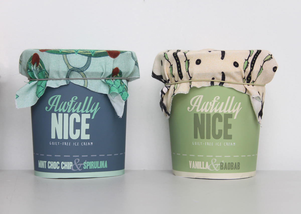
Photo of Mint Choc Chip & Spirulina Flavour and Vanilla & Baobab Flavour

Photo of Awfully Nice Ice cream tubs together

Photo of Awfully Nice ice cream tubs in a line.

Above view of tubs with their own fabric wrap
PATTERN
I developed a pattern for each of the flavours to help communicate the exotic background that it has come from. These were then applied to a fabric, which can be used as a serviette to wipe any ice cream drips or to hold the tub to keep your hands warm.
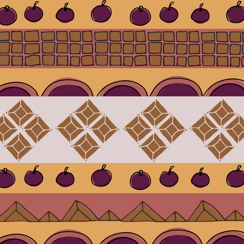
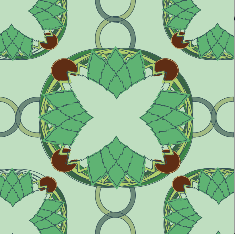
AÇAI & CHOCLATE - BRAZIL
For this pattern, I took inspiration from Brazilian textile fabrics. These often feature a repeat line pattern based on a variety of simple geometric shapes with a vibrant array of colours used. These shapes were often hand drawn giving the pattern some nice quirks.
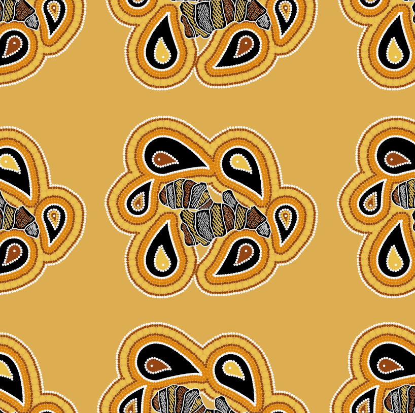
MANUKA HONEY & GINGER
For this pattern, I took inspiration from Aboriginal paintings, which consist of a lot of finger painted dots. These often lead to forming elaborate layers of strokes around symbols as well as simple yet rough detailed drawing of animals, particularly lizards and kangaroos.
MINT CHOC CHIP & SPIRULINA - INDIA
For this pattern, I took inspiration from Indian textile patterns, which usually were based around floral designs that were symmetrical and repeat pattern. The detail and precision in these patterns were very high, with colour purposefully over spilling out the lines.

VANILLA & BAOBAB - AFRICA
For this pattern, I took inspiration from African pottery; the use of negative space was an important factor as well as the highly detailed marks made on block colours, often having a thick dark stroke around the drawings.
Fabric wrap undone, showing the tub in it's birthday suit
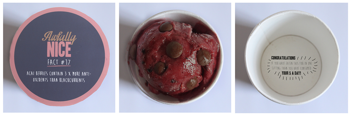
Left to Right: Lid shot, Ice Cream in tub shot, Empty tub shot
LID
Once the fabric is removed, a random fact is revealed which informs the consumer of one of the many benefits of consuming the super ingredient within the ice cream.
ICE CREAM
Once open, the consumer will be presented with a rich, premium and healthy ice cream that tastes as good as it looks.
MESSAGE AT THE BOTTOM
In the event that the consumer “accidently” eats the entire tub within one sitting, they will be reassured with some positive information at the bottom such as the nutrition or fruit value of the entire tub.
BILLBOARD
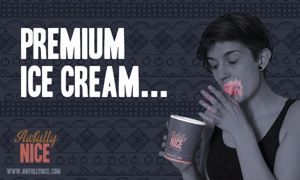
With the theme of duality in mind, I decided to use two billboards that were always side by side. Each of the billboards could be used to communicate the two key points of the product; the premium great taste of the product and it’s an healthy option.
For the imagery, I wanted to try to step away from using “sex sells” advertising that most luxury ice cream brands. I looked at how children would enjoy and eat a meal without thinking of the consequence of mess or calories and wanted to apply this carefree attitude to adults. For the taste billboard, the model is enjoying the ice cream confidently and honestly. In the healthy billboard, the model would use the fabric to clean up any mess. This brings the fabric into the consumer’s eye and provides it with a function as apposed to a cosmetic detail.

Example of the billboards being used within the environment
WEBSITE
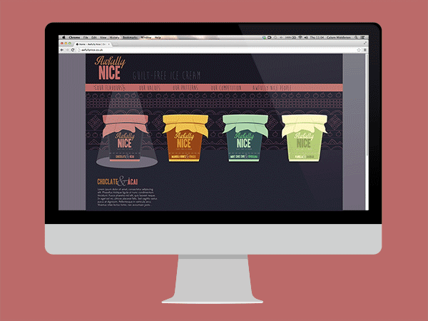
AESTHETIC
The website for this brand is used for curious consumers to find out more about the exotic ingredients used. When they click on a flavour to enquire, the colour scheme and patterns of the website changes to embody the flavour and culture of that flavour. This gives each flavour its own heritage and personality within the brand.
FEATURES
The website will also exhibit textile artists from around the world and offer competitions to feature their work on limited editions tubs. Another feature would be an blog that shares positive news articles about entitled “Awfully Nice News” to help provide a more uplifting read as apposed to the negativity that we are constantly surrounded by.


