Original Problem: Company needed a series of 3 award logos to align with a pre-existing medallion style logo that was a pair of wings enclosed in a badge.
CONCEPT 1 -
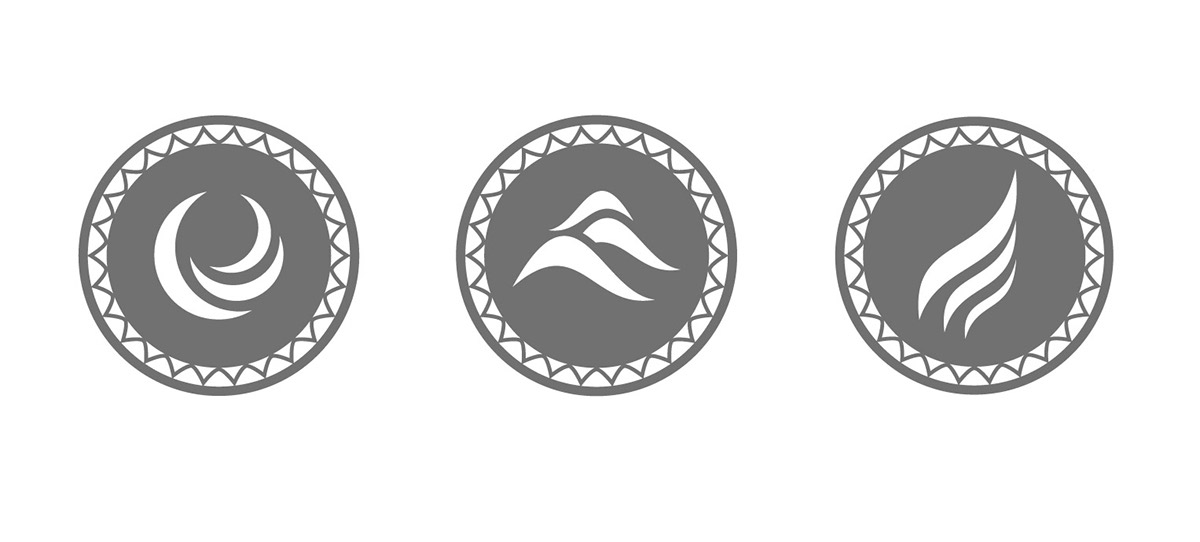
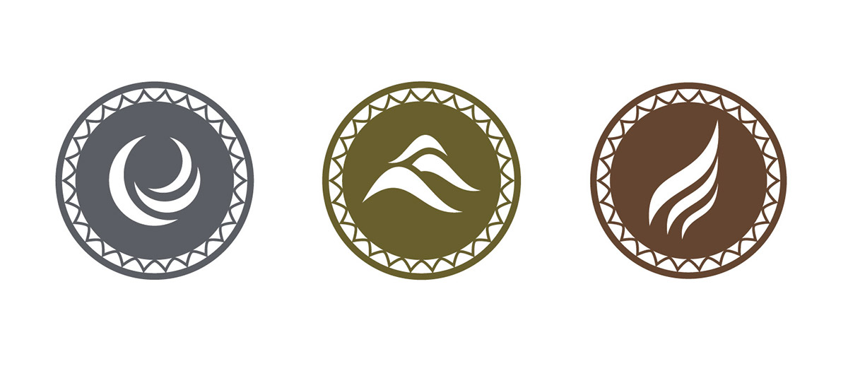
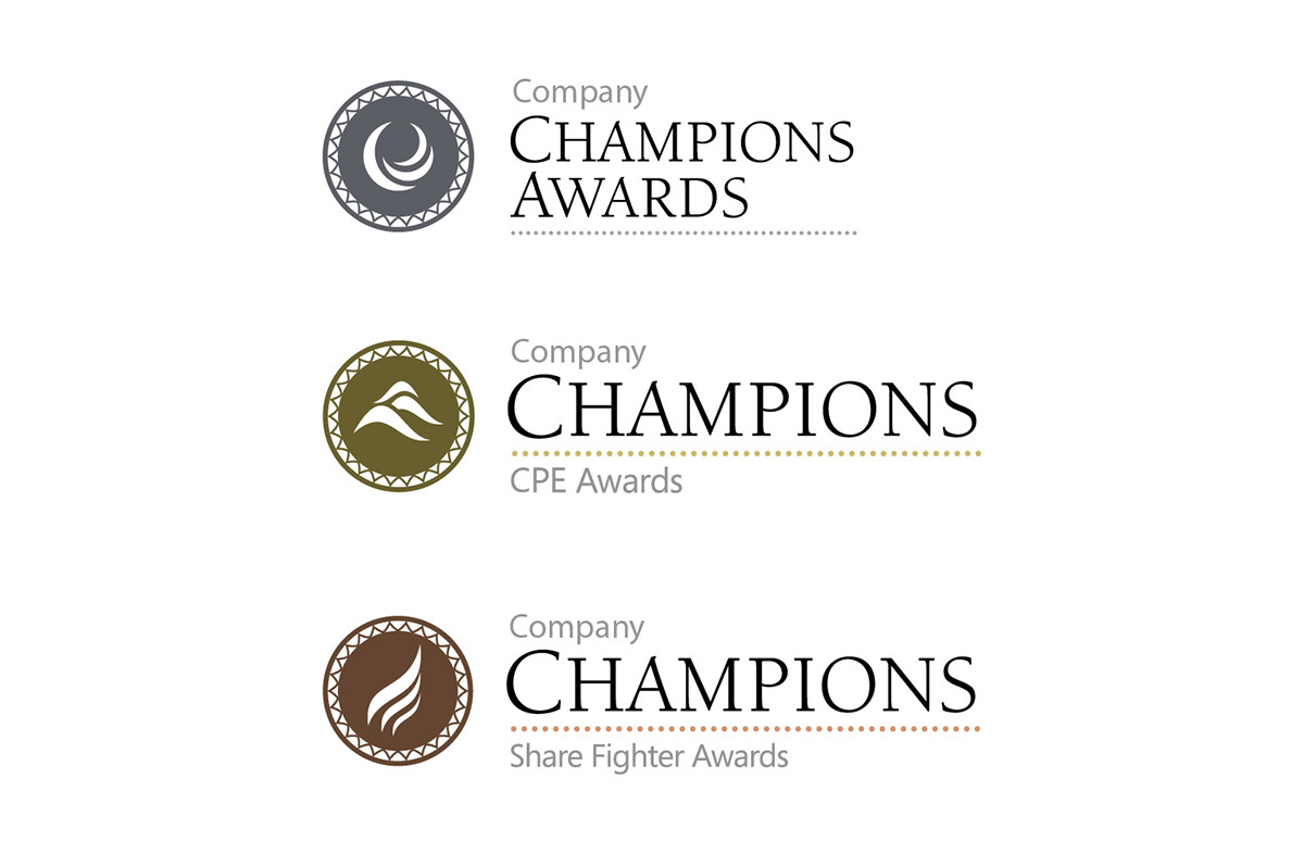
Concept one revolves around the idea of elements. The wings of the existing logo were initially interpreted to represent air. From there, the individual award logos were assigned one of the remaining elements. Each logo uses three repeating shapes that create the icon itself. The shapes feel very organic and abstract, while still echoing the feel of the wings by coming to a sharp point and having a smooth curve. The rich, muted colors relate back to the assigned element and align with the prestigious tone of the awards.
Concept one revolves around the idea of elements. The wings of the existing logo were initially interpreted to represent air. From there, the individual award logos were assigned one of the remaining elements. Each logo uses three repeating shapes that create the icon itself. The shapes feel very organic and abstract, while still echoing the feel of the wings by coming to a sharp point and having a smooth curve. The rich, muted colors relate back to the assigned element and align with the prestigious tone of the awards.
CONCEPT 2 -
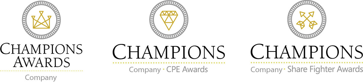
Concept two was inspired by well-known symbols from the medieval time period. This family of logos was designed to stand on it’s own, but relate back to the existing award through the use of the medallion. The exterior pattern on the medallion gives it the appearance of a coin. All the icons were created using equilateral triangles, strengthening and unify the three logos, while keeping them cohesive with the existing logo. Gold and silver were used in the logos to represent the importance and honor of the awards.
This work is purely concept work.
Creative Director: Bart Heird
Company Credit: AIMIA
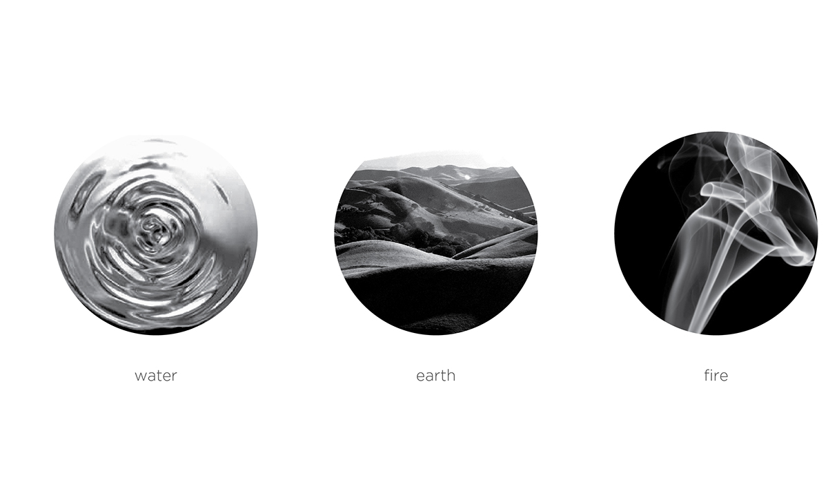
Inspiration for Concept 1
Concept 2