

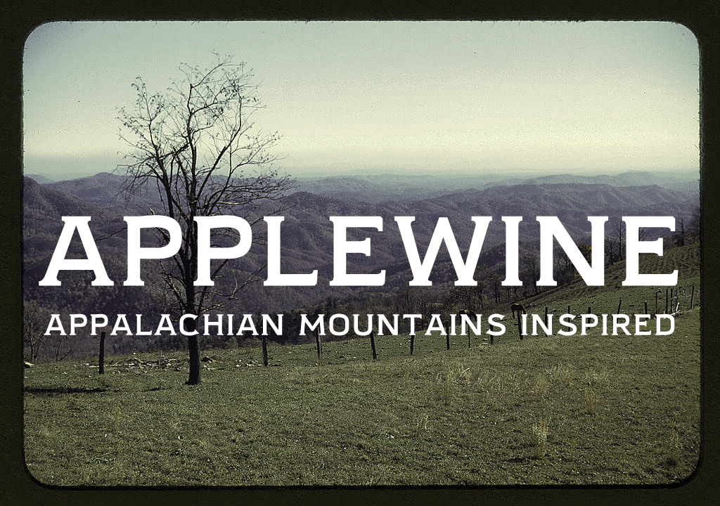
Applewine Typeface
A study of American typography, inspired by the Appalachian Mountains and my grandfather.
A study of American typography, inspired by the Appalachian Mountains and my grandfather.
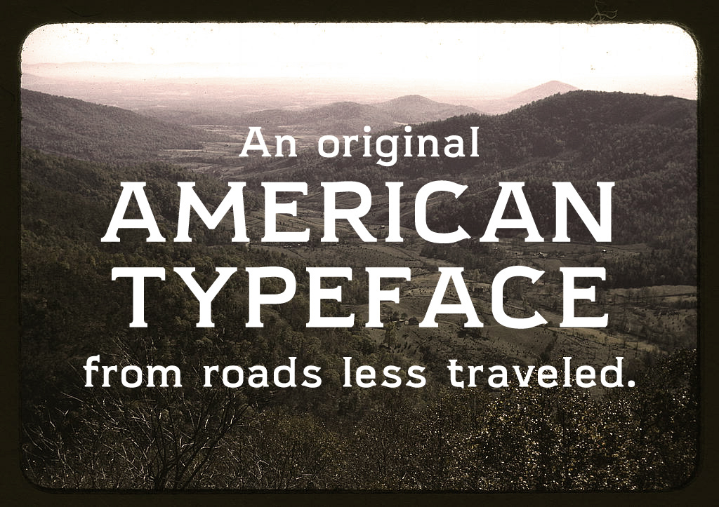
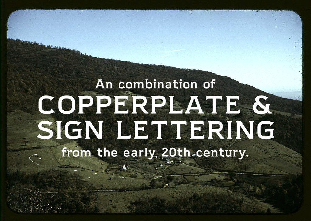
Days before I was hired by the Brooklyn Sandwich Society to revive Thick Block, I started work on an experiment combining the sign-painter letterforms I'd found in turn-of-the-century, sans serif American lettering, with the utility and prestige of Frederic Goudy's Copperplate Gothic.
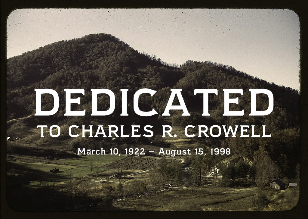
At the onset of the design, I also found myself fondly remembering my departed grandfather, Charles R. Crowell. He was born and raised deep in the mountains of Virginia, home to some of the most beautiful landscapes and oldest cultures in America. Combining typographic influences, memories, with beautiful landscapes, the typeface needed a name to encompass them all. Out of this swirl of ideas, Applewine was born.
At the onset of the design, I also found myself fondly remembering my departed grandfather, Charles R. Crowell. He was born and raised deep in the mountains of Virginia, home to some of the most beautiful landscapes and oldest cultures in America. Combining typographic influences, memories, with beautiful landscapes, the typeface needed a name to encompass them all. Out of this swirl of ideas, Applewine was born.
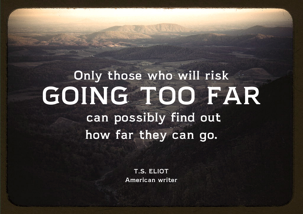
Applewine represents the laid-back, old fashioned warmth you feel sitting on a front porch as the lazy breeze blows through. It's the satisfying tiredness you feel after an all day hike to a view you can never capture in a photograph. It's the pride you feel at the end of a hard day when you step back to look at your work.


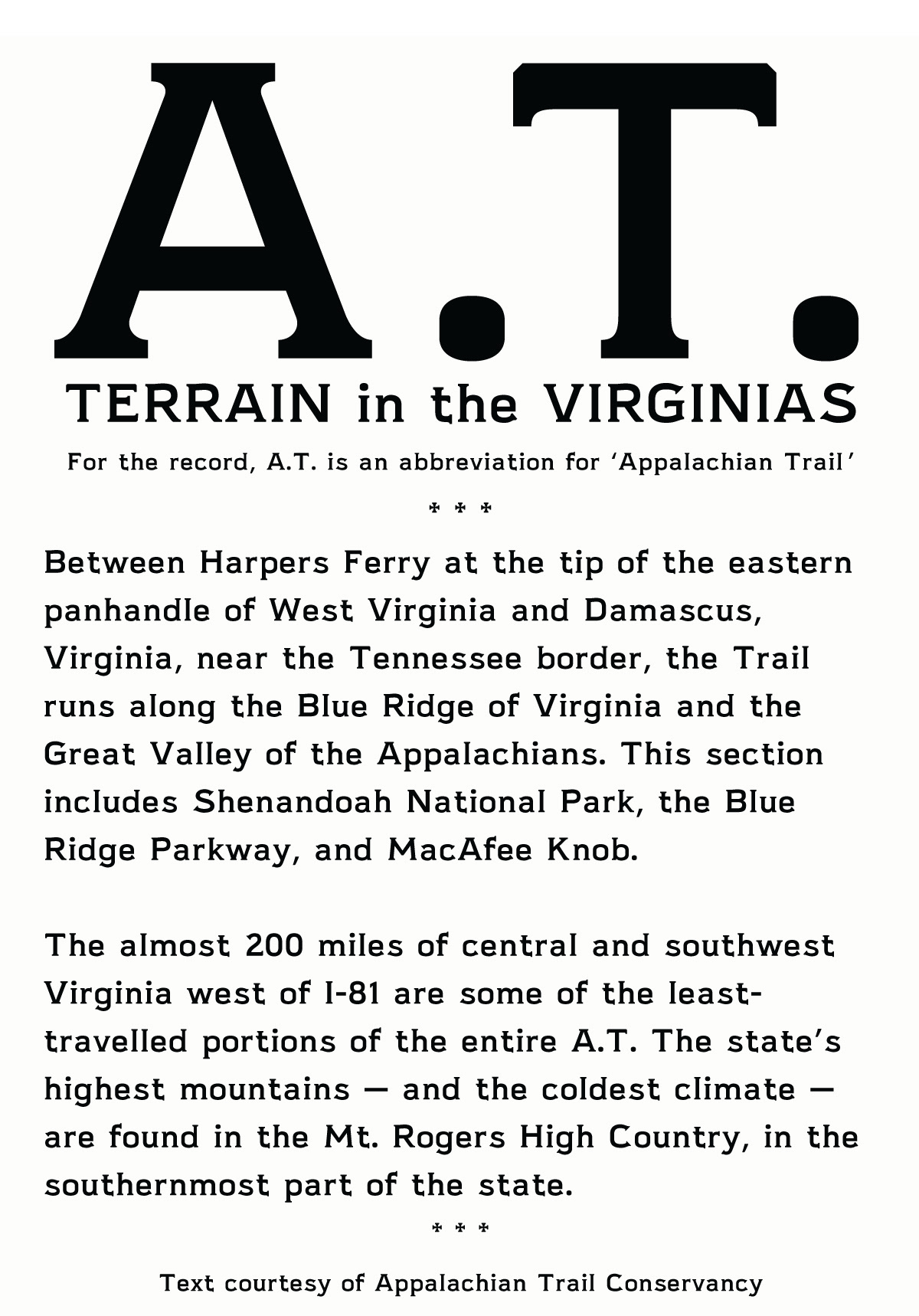


The story told about my grandfather is he provided mechanical assistance to moonshine runners by fixing up their cars, and was forced to move from his home town. Settling on the east coast of Virginia, he enrolled in the US Army to fight on German soil in WWII. When the war was over, he became a notorious mechanic with a reputation for welding and fixing anything. He loved to make things, and I like to think that I get my love of craft and attention to detail from him. Applewine is for him.
All photos were taken by Jack Delano in 1940 as part of the Farm Security Administration.
Original slides are property of The Library of Congress and held in the public domain.
Original slides are property of The Library of Congress and held in the public domain.


