

A Small Orange
Identity and web design
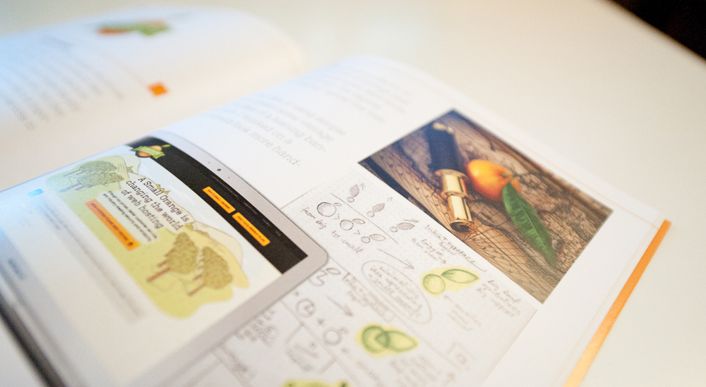
We worked closely with A Small Orange’s in-house marketing team to help take the company’s online marketing in a different direction and set them apart from their competition. As part of a lengthly process, we came up with a new logo and identity and applied this to their whole online presence.
Inspiration
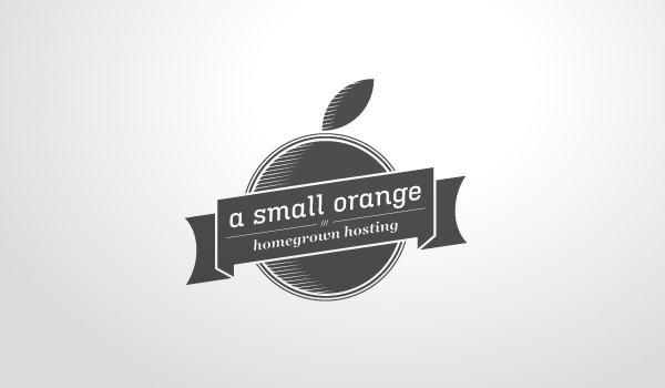
The idea for the logo came with the adjectives like friendly, personal, organic and technical. So the decision was to present an orange like the main object and add some detail to gain the professional and trusted feel.
The idea for the logo came with the adjectives like friendly, personal, organic and technical. So the decision was to present an orange like the main object and add some detail to gain the professional and trusted feel.

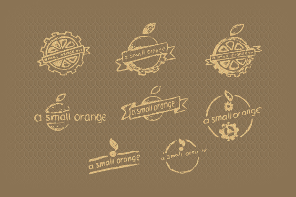
Sketching and development
We started the process by sketching different layouts and shapes to get the most sensible solution. Two things that added some vintage flavor in the logo are the circular layout and the slightly laying banner.
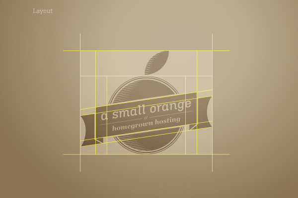
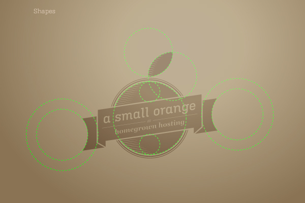
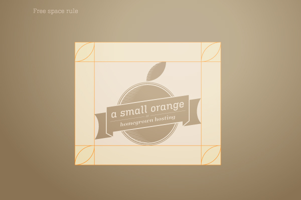
Logo development
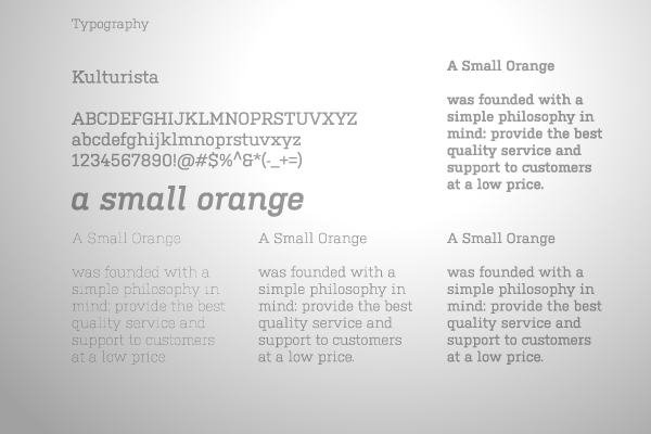
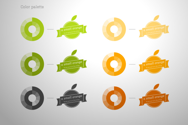
By digitising the logo, we set up the proportions, shapes and space rules. We also tried out some different typefaces, experimented with colours and added some shading to give it a more natural feel.


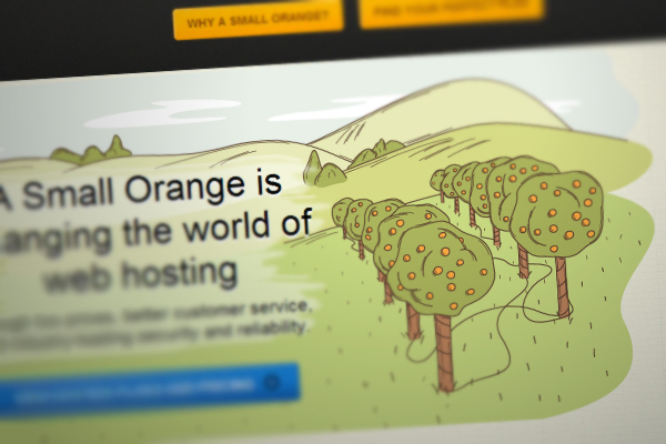
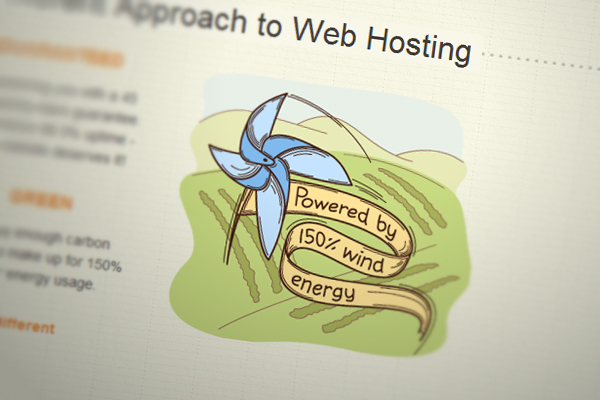
Illustrating the website
The main idea was to gain an organic, personal feel and to connect all illustrations with its styles and conceptions to the one story, which could be technically and conceptually integrated into the website design. After many sketches, redrafts and variations, I came with the general style, which gives the friendly and easy look for the visitors.

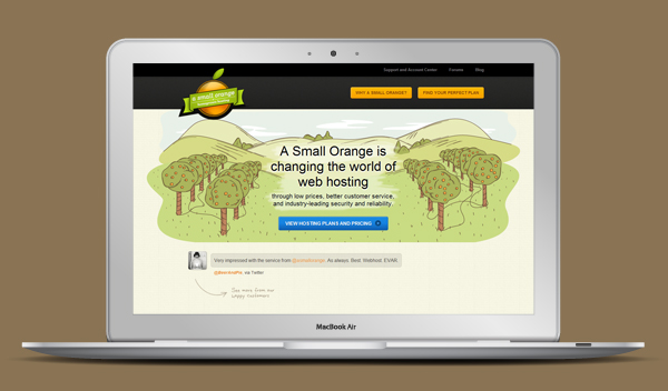
The redesigned website and brand was focused on applying their offline values and dedication to outstanding customer service to their online presence, and since it was launched, has led to a significant increase in new customer signups and sales.
Visit site →Appreciations and all the feedback are welcome!


