
Clearfind
Bridge the gap between tech and humanity by using tangible materials while communicating the software’s narrative.
Client: Clearfind
Creative Director: Bobby Ghoshal

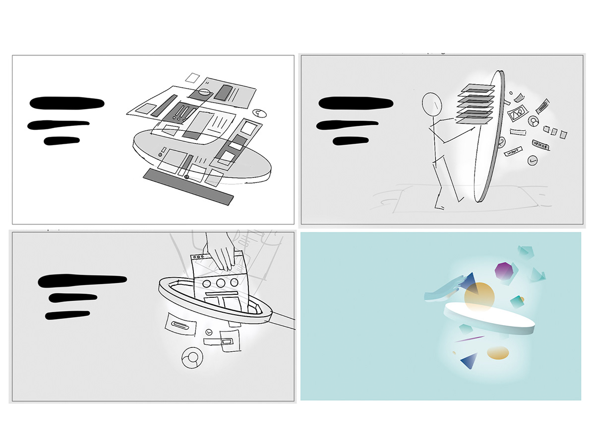
Five images needed to be created, which stayed on brand and within strategy. During the sketching phase, staying within simple black and white drawings help us to focus on message instead of aesthetic.
The concept has to both communicate the message and be visually unified across the series.
Above, the first image in the series went through four iterations - the final one being color.
Above, the first image in the series went through four iterations - the final one being color.
For this project, a proof-of-concept was needed using a real hand and the style in which to render it.

With the concepts and stylistic approach approved, it was time to create and photograph the sets.
Photography days are always such a beautiful blend of chaos and magic.

The finished work will be the heroes of an upcoming website launch, but could also adorn your walls with their ethereal beauty.


Ah! thanks Bobby! I adored working with you too.
Below are some detail shots, because I’m smitten by this style.


Thank you for your time!


