Herzensheimat
The Buddenbrookhaus and Drej Scenography asked me to develop a visual identity for the exhibtion called »Herzensheimat« which descriped and reflected Brothers Mann´s relationship to their hometown Lübeck in giving a related and detailed overview on the relationship to their parents.
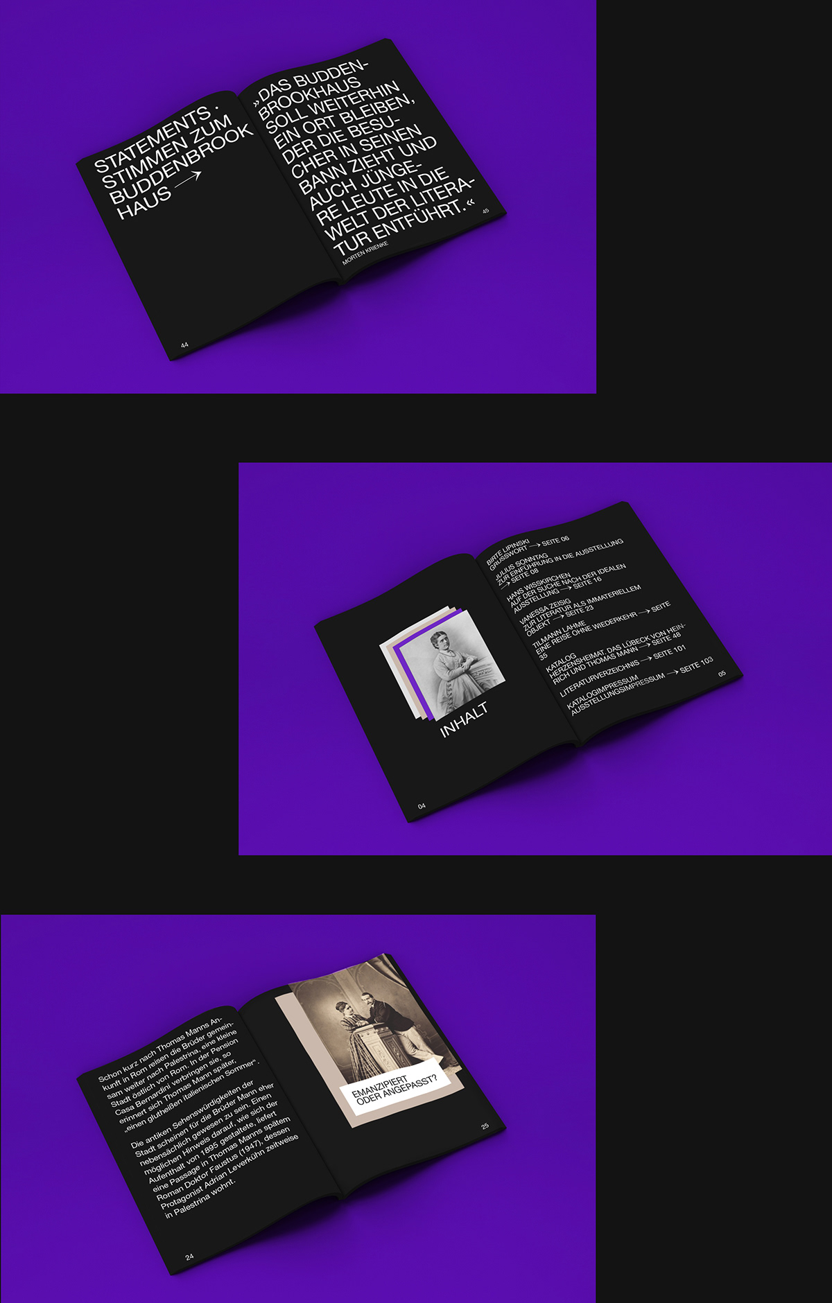
Role: Visual conception for an exhibition identity, including layout, final artwork preperation for all exhibition walls, as well as a catalogue concept.
Client: Buddenbrookhaus Lübeck
Scenography: Drej Gbr Kiel
The Identity

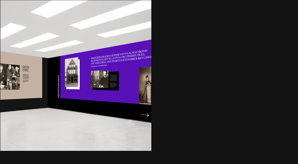
A flexible layout system reflects the exhibition´s narrative of Brother Mann´s dynamic and multilayered relationship to the idea of »Heimat«.
A strict combination of all layers ensure a strong design principle for all public communication.
*Image credits at the end.
A strict combination of all layers ensure a strong design principle for all public communication.
*Image credits at the end.


The Exhibition

The dynamic identity system also reflects three layers within the exhibition´s narrative via colour and typographic coding. The Mother´s World, inspiring, deep minded and creative, represented by the dark violet and tender serif type. The Father´s World, disciplined, well ordered and accurate represented by white and grey colouring and strict sans typeface. The Lübeck World, grounded, backward and old fashioned, represented by grey and beige colour and a more rough cutted slab serif.