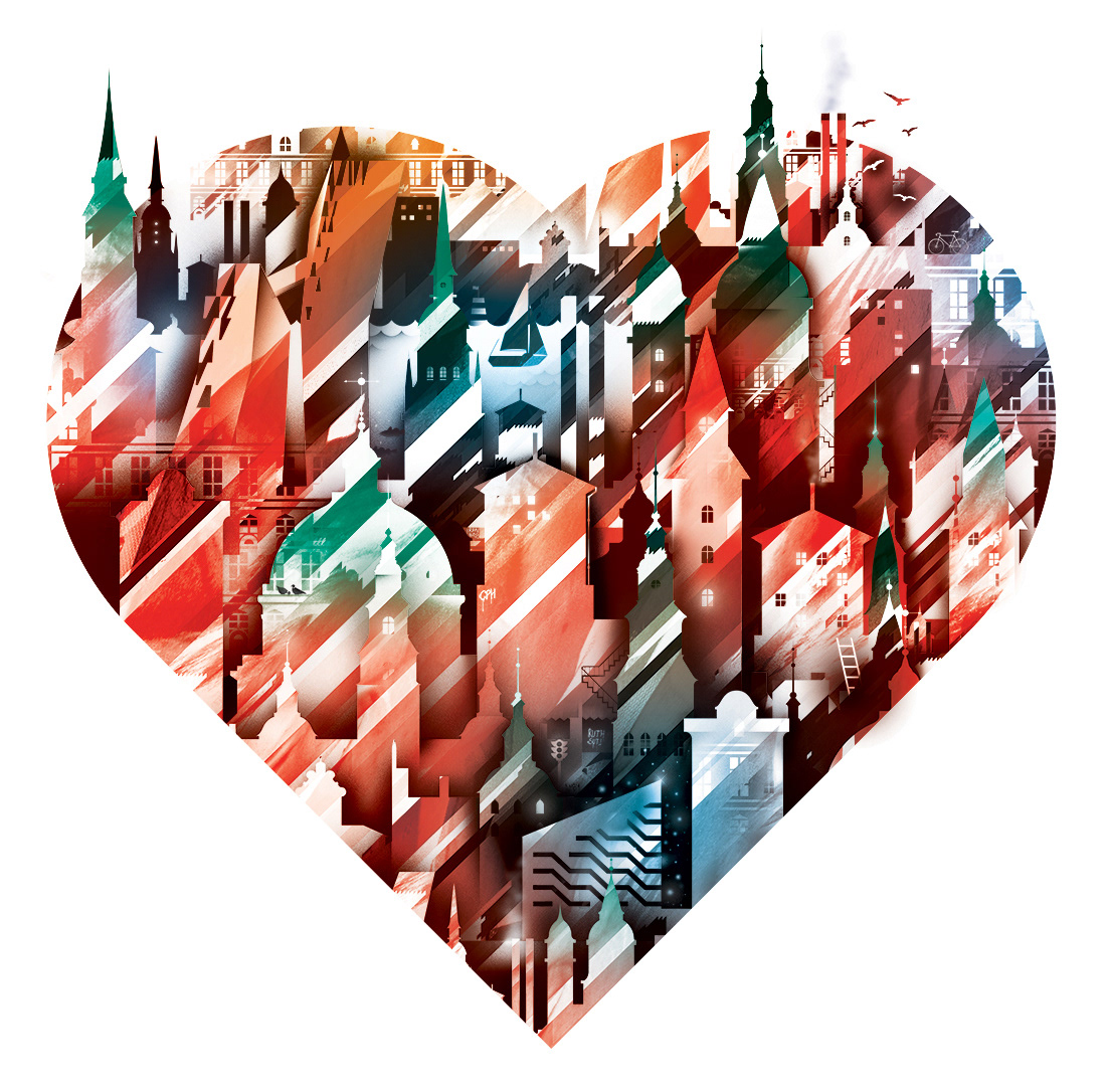
Exam project, first year.
The Brief was to revitalise the classic tourism poster in order to attract more visitors to Copenhagen.
During the design process I came up with 125 different drafts based on several concepts and techniques before finally deciding on this idea for further development.
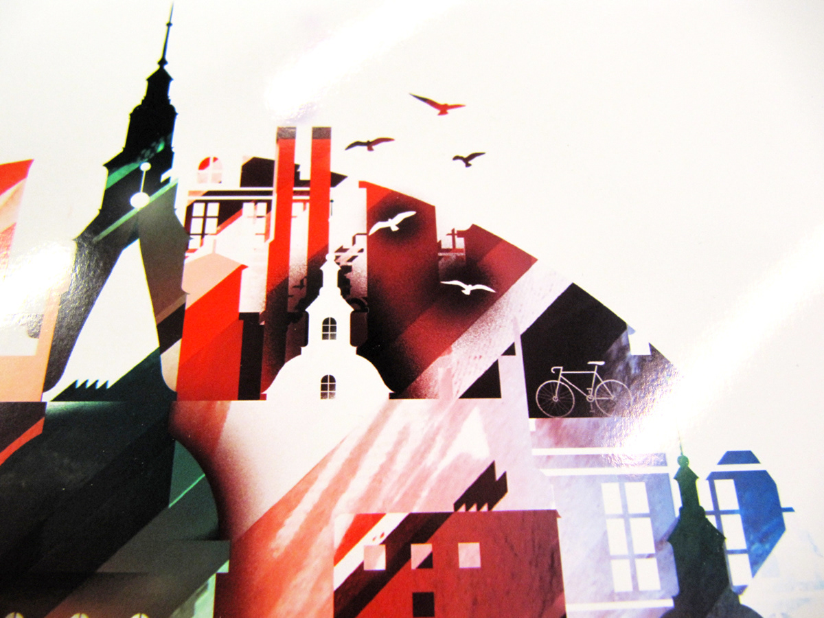
The idea was to catch the atmosphere of Copenhagen by using local, recognizable buildings and marks while combining them with a simple shape that holds an emotional and universal appeal; the shape of a heart.
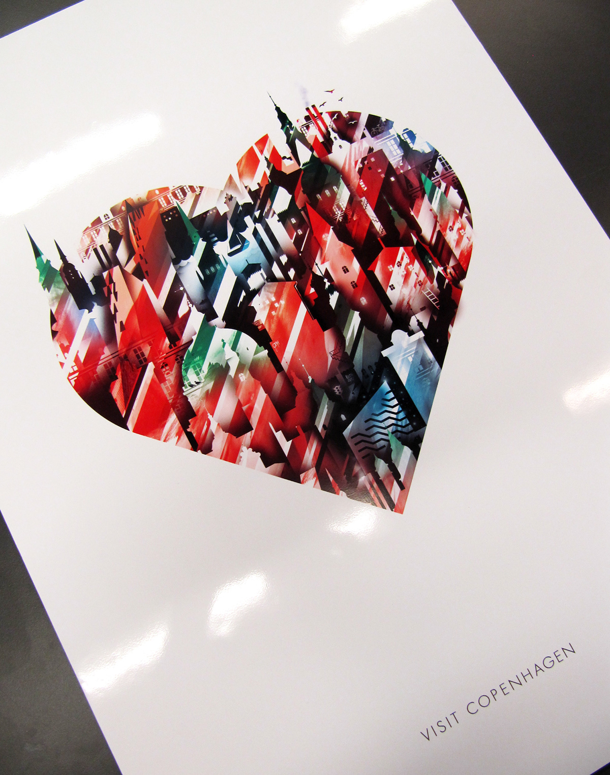
Printed on glossy photo paper, mounted to 3mm foam board.
Poster dimensions: 50 x 70 cm
Poster dimensions: 50 x 70 cm
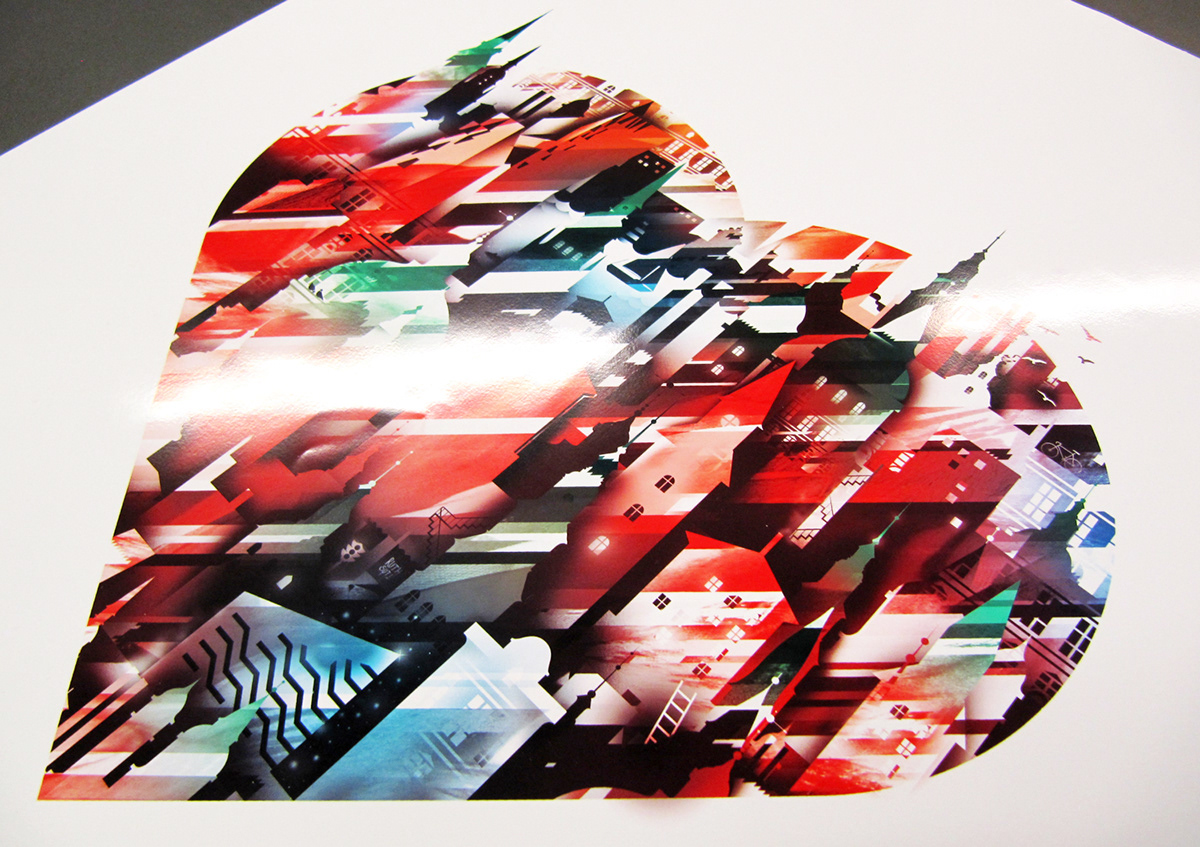
Printed poster viewed from an angle.
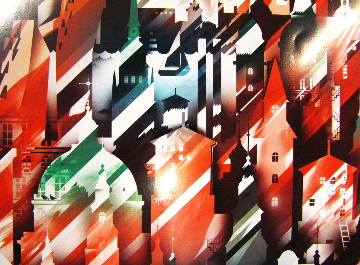
Print close-up


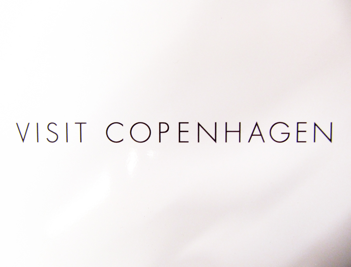
As for the typeface, eventually my choice fell upon the elegant Futura Light - among other nominees with some of the same geometrical qualities such as Avenir, Avant Garde and the more art deco inspired Cassannet typeface.
An animated banner was to be developed from the final design.
Due to the skylines being already built within layer masks in Photoshop, the design was easily translated into animation.
Dimensions: 960 x 180 px
Due to the skylines being already built within layer masks in Photoshop, the design was easily translated into animation.
Dimensions: 960 x 180 px

Early sketches that led to the final development of this poster.
The idea arose from these drafts where I experimented with using glitched / data-bent photos to texturize vector shapes.


