


Packaging with visual flavor
CREÄM SORVETES
SERVICES
PRODUCT
LOCATION
PORTO ALEGRE, BRAZIL
YEAR
2019
-
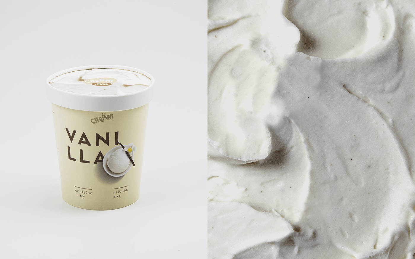
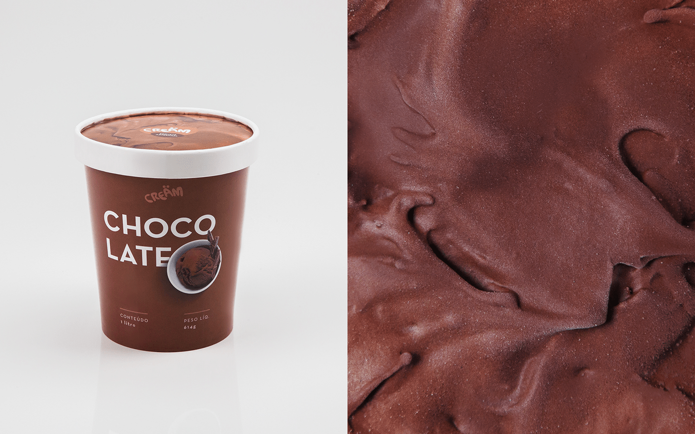
Challenged to create a new line of Premium packaging for Creäm Sorvetes, we worked with a strong visual unity and a minimalist and contemporary concept.
We highlight the colors on the packaging, which refer to the flavors of the products.
The lid of each container acts as a window, where the consumer can view the product through a photo of the ice cream's texture. In addition to the 1L packaging, we also developed 140ml container with the same visual concept, thus forming the Creäm Sorvetes packaging family.


BDS | BREATHE DESIGN & STRATEGY
We breathe design and strategy to transform business and people.
FOLLOW US AND VISIT OUR SITE:


