The project
The Portuguese Red Cross North Health School (Escola Superior de Saúde Norte da Cruz Vermelha Portuguesa), located in Oliveira de Azeméis, is a higher education institution having as its’ instituting entity the Portuguese Red Cross.
The main challenge in this personal project was to create a new brand with its own voice, but at the same time retaining clear links to the Portuguese Red Cross.
The project culminated in a new visual identity and website.
2018
Areas: Rebranding, Visual Identity, UI&UX
2018
Areas: Rebranding, Visual Identity, UI&UX
Lisboa, Portugal


The storytelling behind designing the new icon
The starting point for the proposal was re-design the icon. The icon proposed mirrors the concept of the "infinity symbol", the "snake" (as part of the symbol of the pharmaceutical and healthcare profession in a form of a chalice with a snake twined it), and the "red cross", which is created as an abstraction of all the concepts developed.
The final result, that aimed at creating a bridge between the three symbols by simply crossing the forms, is a vertical minimalist icon. Its final form finds balance between tradition and modernity. The minimalism of its drawing and the curves brings elegance and movement.
The new logo
The new logo is the result of the reunion of three complementary blocks: one composed only by the icon, one by the name of the school — Escola Superior de Saúde Norte — and another by the designation "da Cruz Vermelha Portuguesa".
Searching for a formal cohesive composition between all elements of the (main) logo and with a view to ensuring an unanimity based on the drawing, the icon was integrated in the middle of the two typographical blocks, creating a sense of equilibrium, dynamism and integration, enhancing the design as a whole.
Searching for a formal cohesive composition between all elements of the (main) logo and with a view to ensuring an unanimity based on the drawing, the icon was integrated in the middle of the two typographical blocks, creating a sense of equilibrium, dynamism and integration, enhancing the design as a whole.
Font choice and colours
The typography chosen was Poppins, one of the geometric sans serif typefaces that looks simple as well as stylish, and have been a popular design tool for various needs of communication. Each letterform is nearly monolinear, with optical corrections applied to stroke joints where necessary to maintain an even typographic colour.
The chromatic palette is only composed by the combination of two main colours, red and black, linking to the Portuguese Red Cross Institution.


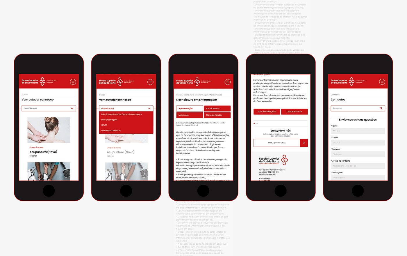
The website
The site map was the first step of the website redesign. It is a big online platform, with a lot of essential content for the student community and outside.
The information architecture of the site allowed a primary study and the organisation of all pages for the next phase, the user experience design and wireframes. Thus, followed by the site map the process was continued through designing visual representation of the user interface. The solution has sought a minimal and simple visual language, ensuring the clarity of all different types of information and easily accessible to all users.
The information architecture of the site allowed a primary study and the organisation of all pages for the next phase, the user experience design and wireframes. Thus, followed by the site map the process was continued through designing visual representation of the user interface. The solution has sought a minimal and simple visual language, ensuring the clarity of all different types of information and easily accessible to all users.