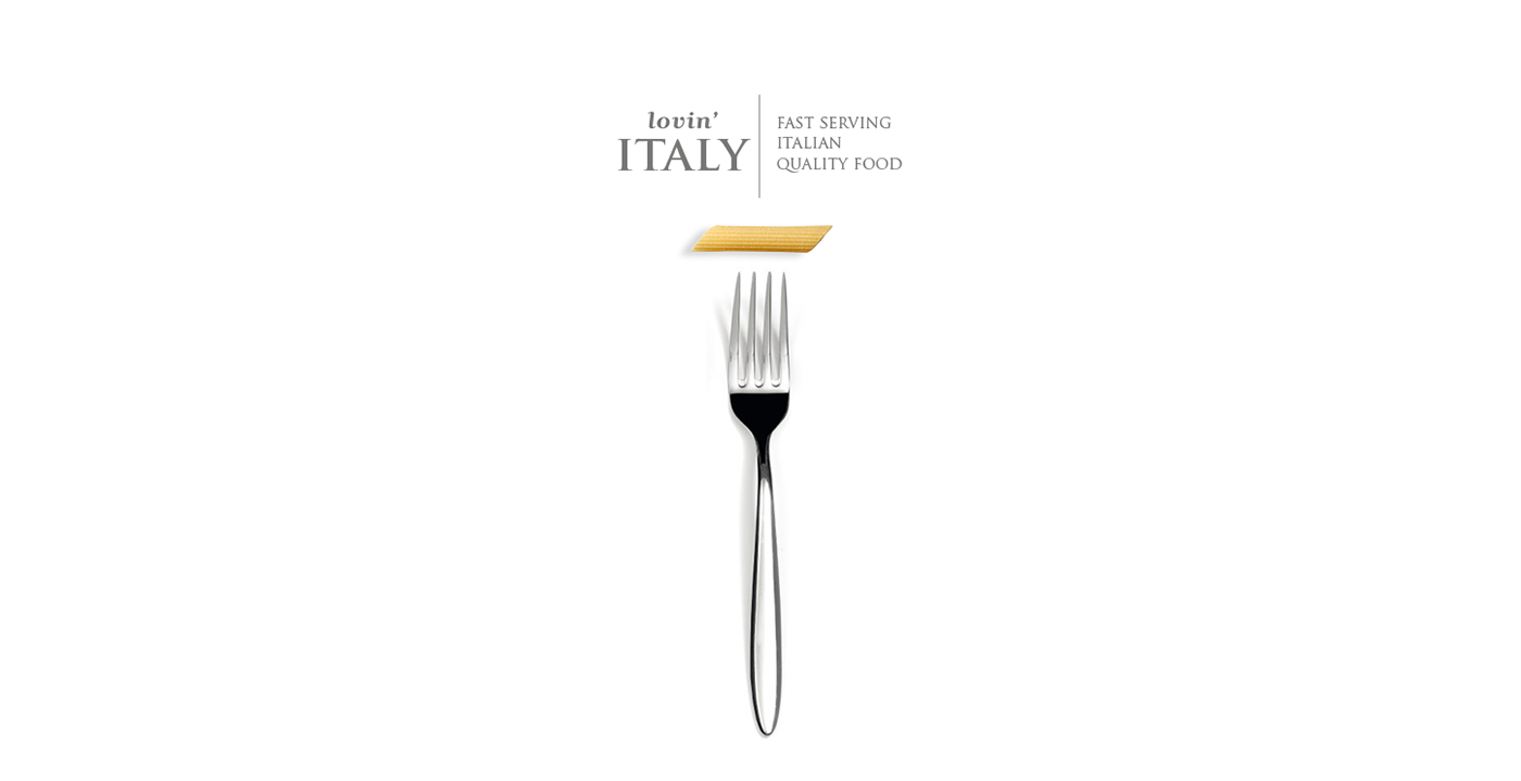
Lovin'Italy - fast serving italian quality food.
|Ita|
Lovin'Italy è un fast food italiano, punto vendita unico dove il cliente può gustare tutti i principali prodotti della tradizione gastronomica italiana celebre in tutto il mondo. Con il menù composto da solo cibo italiano, somministrato con macchinari moderni pur rispettandone qualità e freschezza, Lovin'Italy si delinea come fast food dove il cibo è preparato in pochissimi minuti e può essere consumato sia all'interno del locale dallo stile moderno, sia all'esterno grazie alla linea di prodotti take away. Con un occhio alla tecnologia, Lovin'Italy lancia lo stile italiano tra storia ed eleganza nel mercato asiatico sempre più interessato alla cultura occidentale.
|Eng|
Lovin'Italy is an Italian fast food, one stop shop where customers can enjoy all the main products of traditional Italian cuisine famous all over the world. With the menu consists of only Italian food, administered with modern machinery while respecting quality and freshness, Lovin'Italy is outlined as fast food where the food is prepared in a few minutes and can be eaten inside the room modern style, both outside thanks to the line of take-away products. With an eye to technology, Lovin'Italy launches Italian style and elegance of history in the Asian market more and more interested in Western culture.
Color Mark

Concept
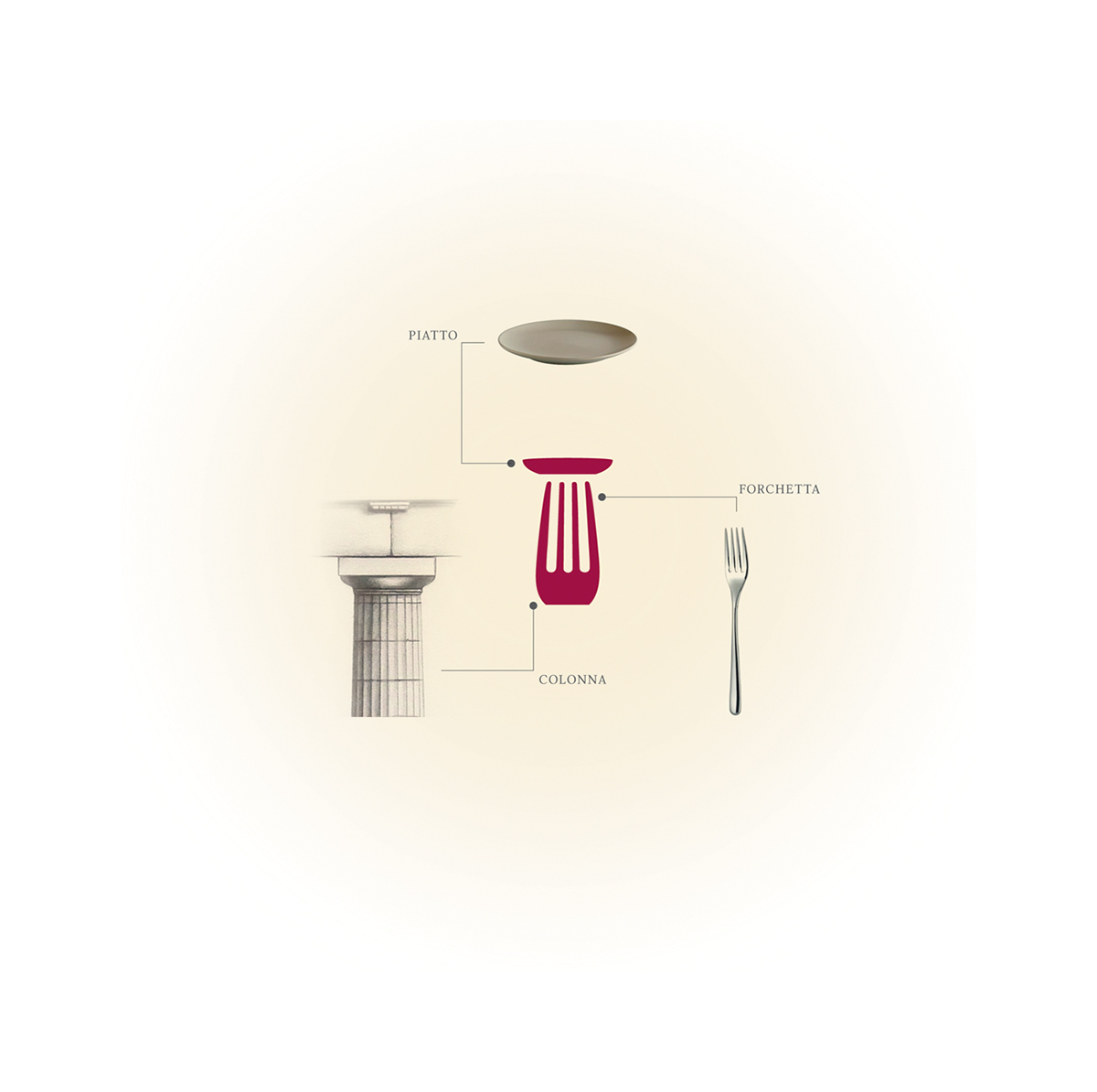
|Ita|
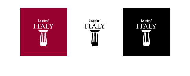
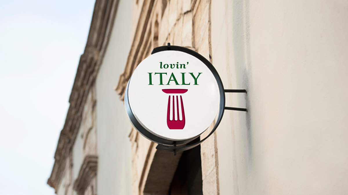
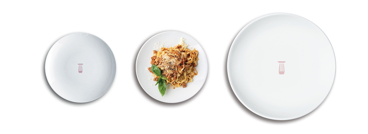
La costruzione del pittogramma si avvale del segno-icona che racchiude in se tre elementi fondamentali a tal scopo: la colonna d’ordine dorico, metafora della cultura e della storia italiana, la forchetta e il piatto, entrambi metafore dell’azione del mangiare. La sua struttura complessiva rettangolare verticale, che ne identifica solidità e ricercatezza, conferisce al marchio personalità che gli permetterebbe di esistere anche ed essere riconoscibile su ogni supporto, mentre il completamento amodale che insiste sulle figure della colonna e della forchetta riportano il marchio verso una dimensione di leggerezza e di modernità.
|Eng|
The construction makes use of the pictogram sign-icon because it combines three key elements for this purpose: the Doric column, a metaphor for the culture and history Italian, fork and plate, both metaphors of the action of eating. Its overall structure of vertical rectangular, which identifies solidity and refinement, gives the brand personality that would allow him to exist and be recognizable in all media while completing amodal who insists on the figures of the column and fork bear the brand into a dimension of lightness and modernity.
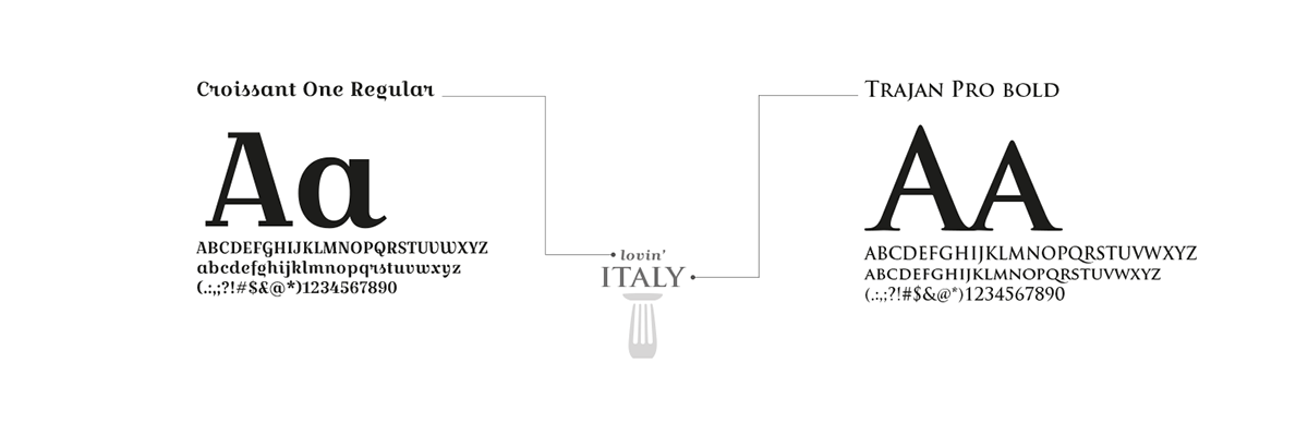
Primary Font
Color Negative, B/W and B/W Nergative Version
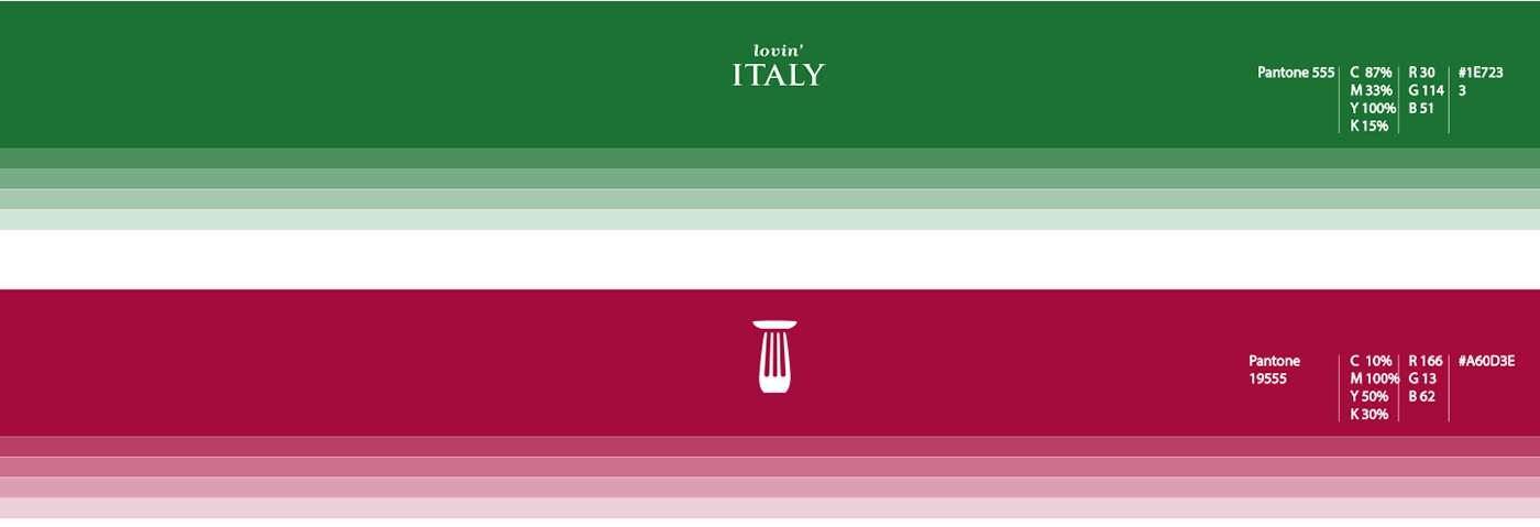
Color Palette
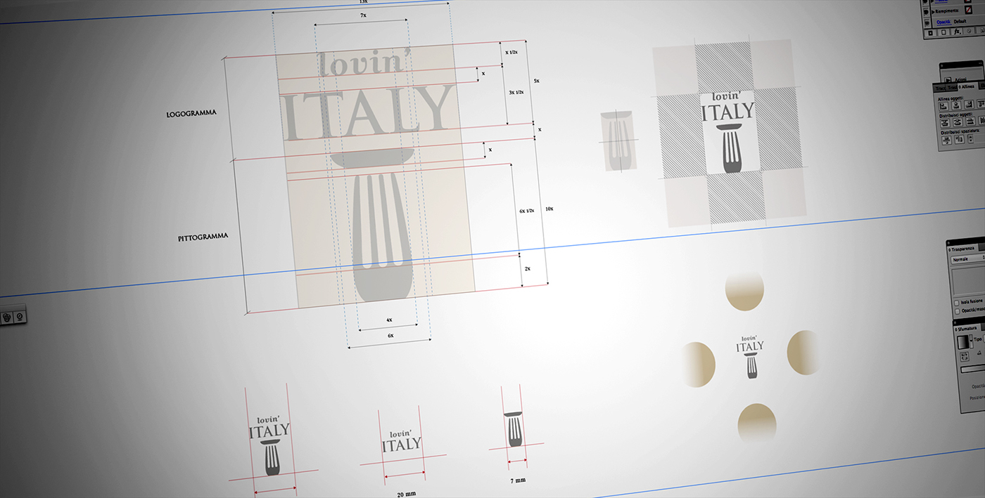
Technical Features

Presentation of Stationery
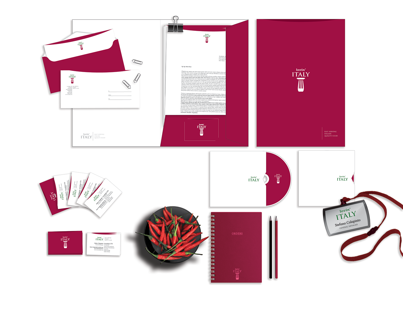
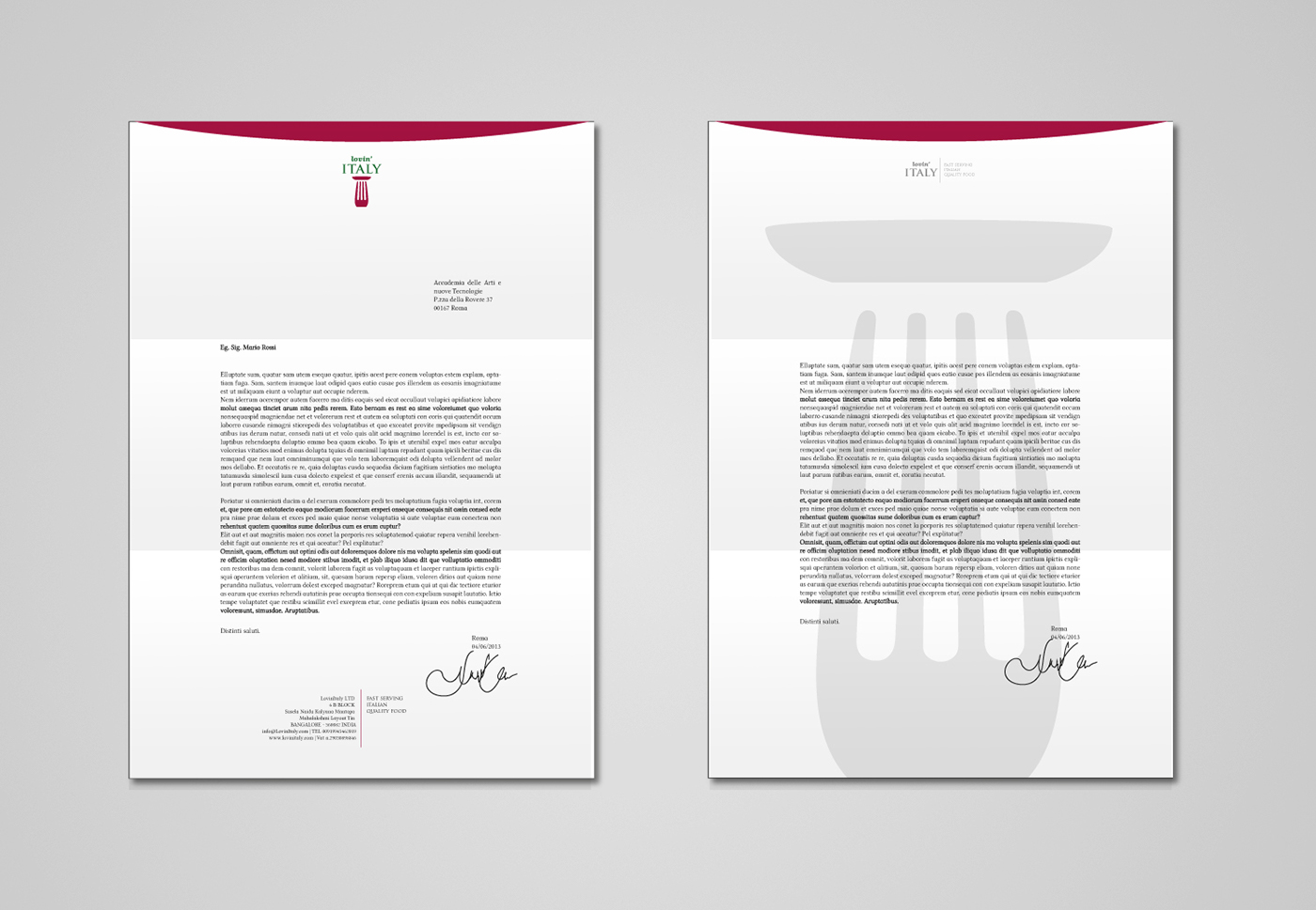
Letterhead
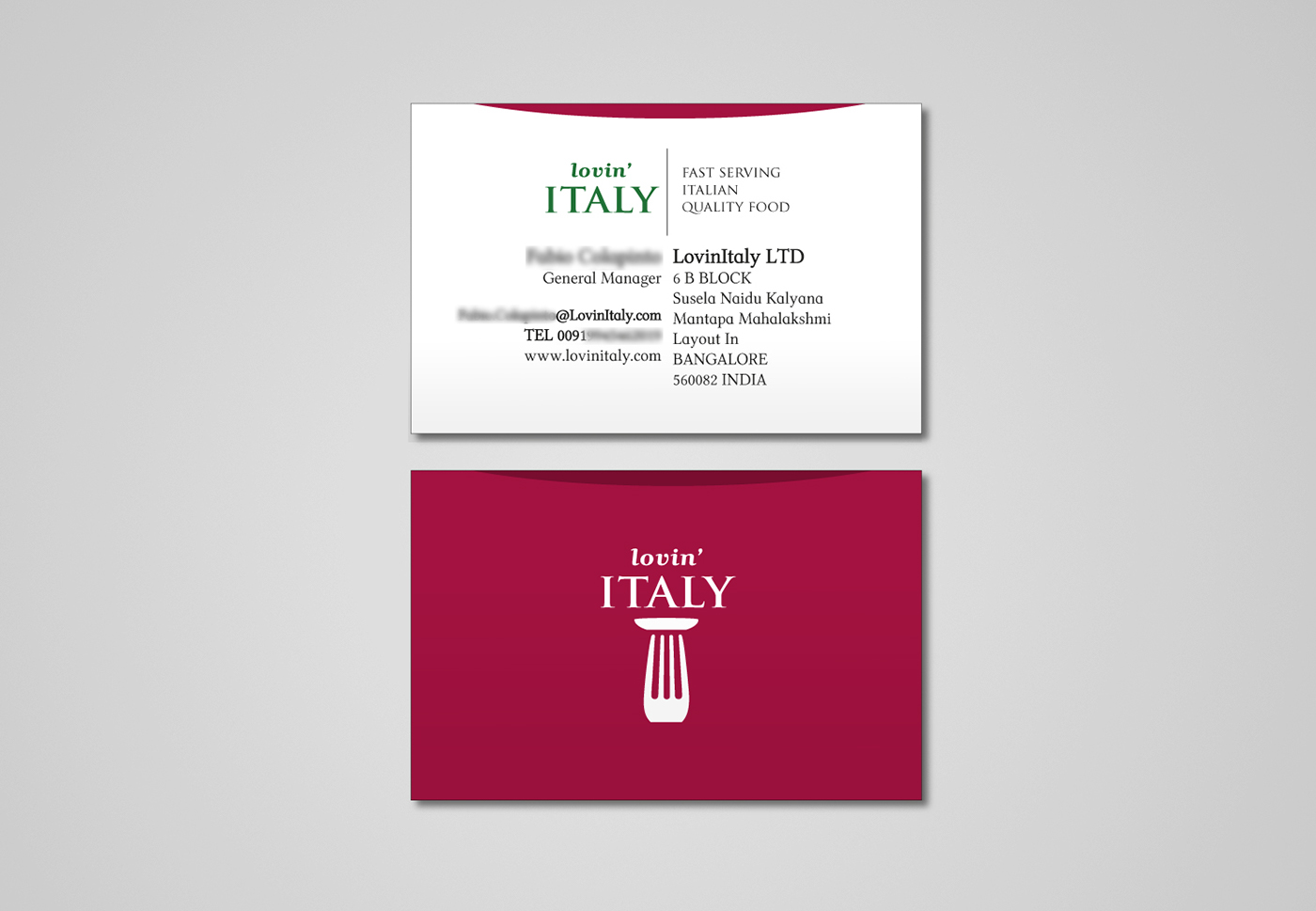
Business card
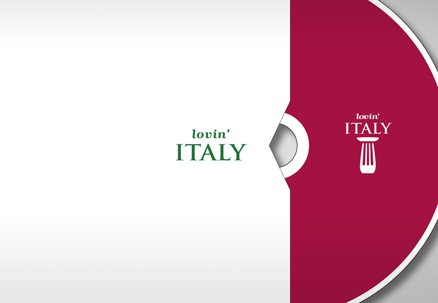
Support CD
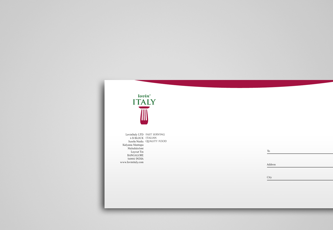
Envelope
Visual Identity
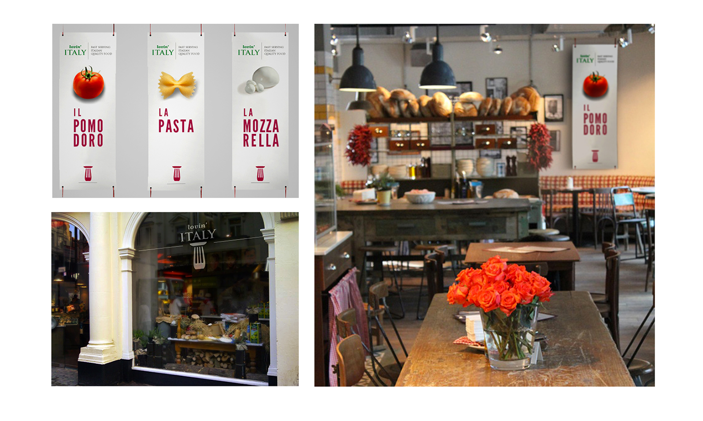
Point of Sale
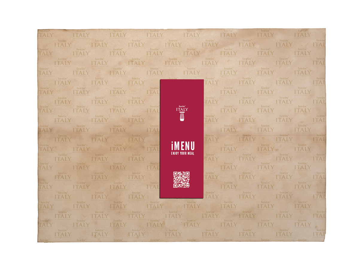
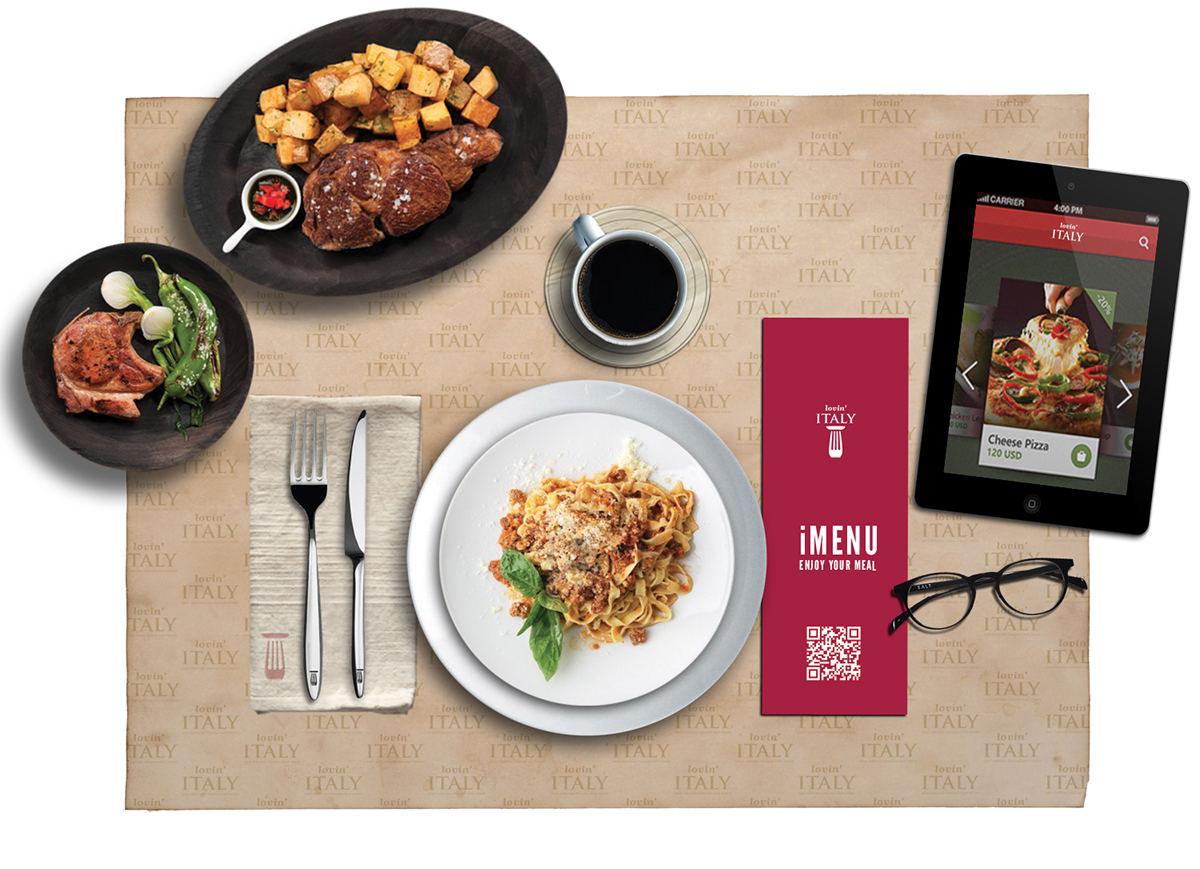
New Technologies
iMenu

Authenticity, Class and Elegance

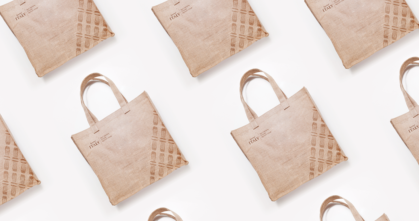
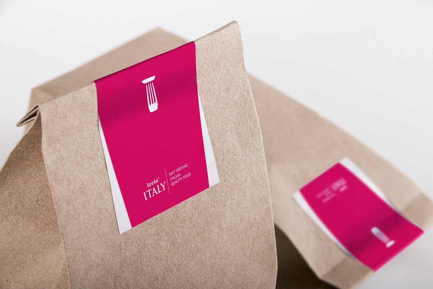
Take Away Line
Shopping Bag
Stickers
Advertising
Ambiental ADV