A branding experiment.
FINCH is an online bookstore that put ‘social’ as the core of its existence. “The Social Bookstore”, as the tagline says, means that the bookstore is also a platform where the customers can have an interaction among each others and do anything over books. They can talks about what book to read, ask questions about book, share interesting informations, and of course they can buy the book they want from the store.
The idea came from a problem among the younger generation where most of the youth don’t really read book because they have no idea what book to read. The habit of reading book cannot be nurtured because they don’t have the information at the first place. But there is few things that the teenagers are interested in such as social connectivity, and the feel of being inspired. Based on this insight, we try to come out with a platform to make information and inspiration sharing flows more fluid and easier.
DESIGN
_______
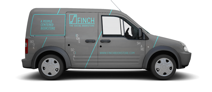
Targeting the younger target market, especially designers and hipsters who are known to be social, trendy and fresh, the overall branding of the company portrays a fresh look and feel through minimalistic design. The brand color is grey and light blue, a combination that creates a unique look and feel that people can’t easily forget. The name of the company, Elements that are used for the branding are mostly typography and lines to suits the simple and minimalistic style but also stylish at the same time.
The choosing of black and white color also suits the brand philosophy that as a platform, the stories should be sparked by people, the customers, so it is the people that should stand out and create the sparks.
But in a way, the aim by using those particular colour and elements is to make the brand easy to remember, so everytime people use hear the name, or see the color combination they will first think of FINCH.
THE ONLINE PLATFORM
_____________________
When people enter the websites, they came to the landing pages, where they can directly register (for first time user), or sign in (for existing member). In this pages, they can browse through and read about the features that is offered by the site such as the bookstore, social feature, and the creative highlights. As the main visual point, black and white images that shows daily life activity and people are chosen to portray the ‘social’ feeling. The images are also used in the other branding merchandise through print and digital media.
The prominent feature of the website is the social feature that enables people to interact with each other be it their friends, family, or even their idol. We want FINCH to be a platform where everyone can contribute by giving comments, suggestions, thoughts, sharing informations, interesting stories that create a connection which will make finding a book to be an interesting experience.
The other feature to accomodate the target markets’ need is the Creative Highlights, a section where every month the site will feature different famous people that is believed to inspire the younger generations. The page will feature a detailed interview of story, experience, sharing, tips, their view on some issues, and anything that can inspire the readers.
The person of the month will also hold a live Q&A session where the readers can ask anything and they will also share good books to read.

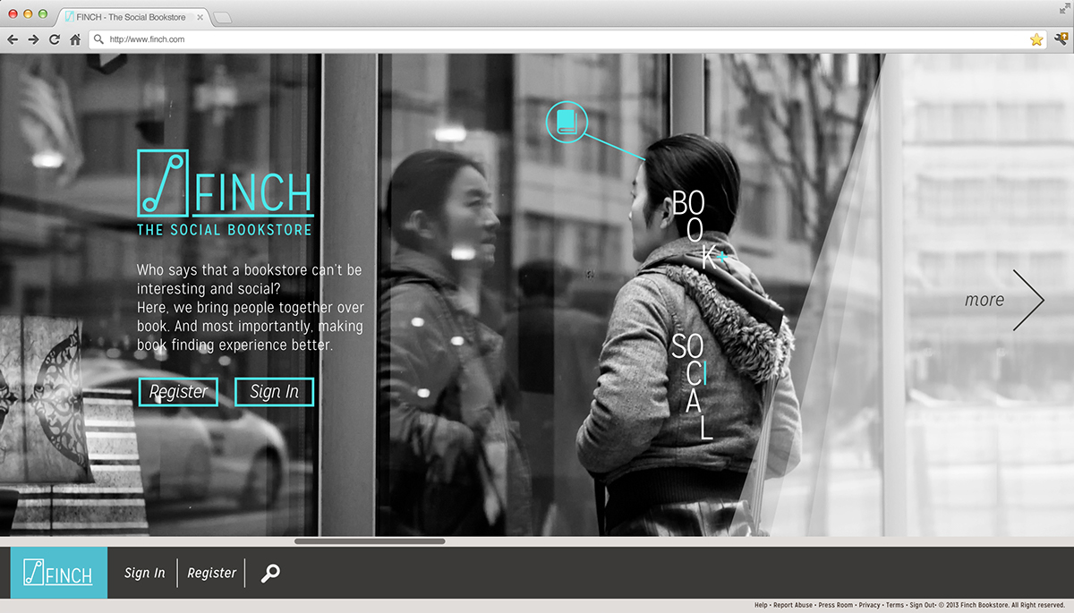
Landing Page 1
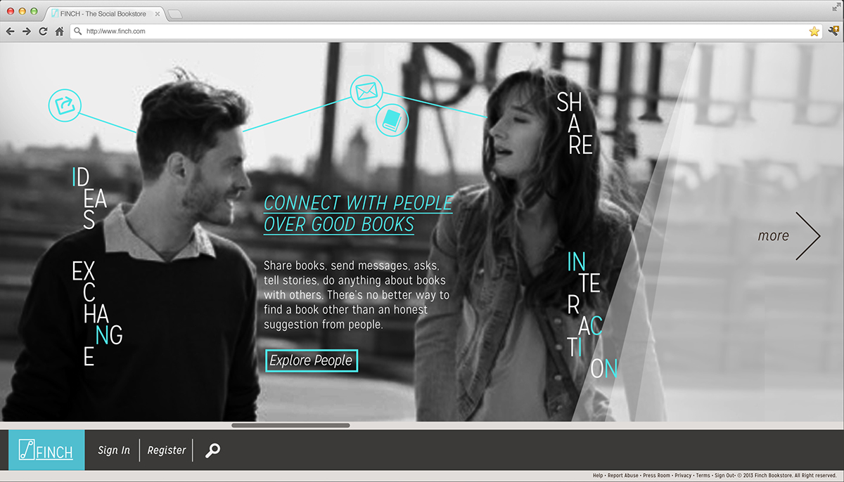
Landing Page 2: Introduction to Social feature
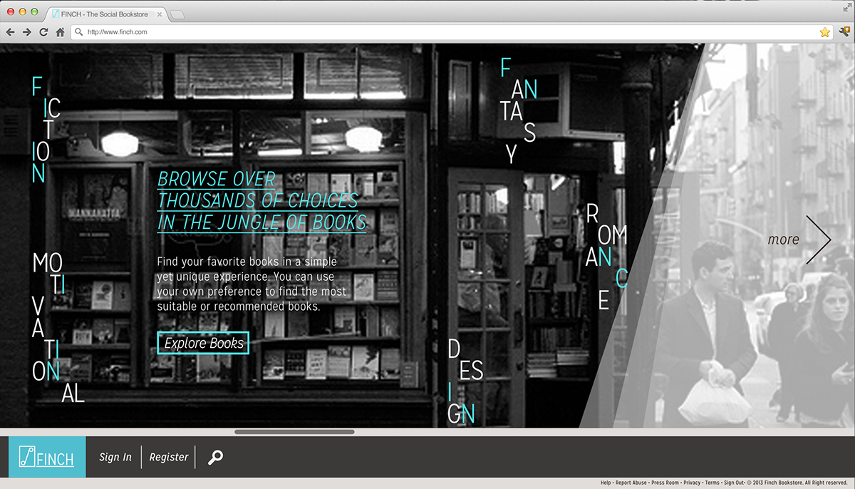
Landing Page 3: Introduction to the Bookstore
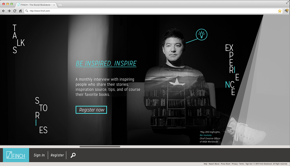
Landing Page 4: Introduction to 'Creative Highlights' feature.
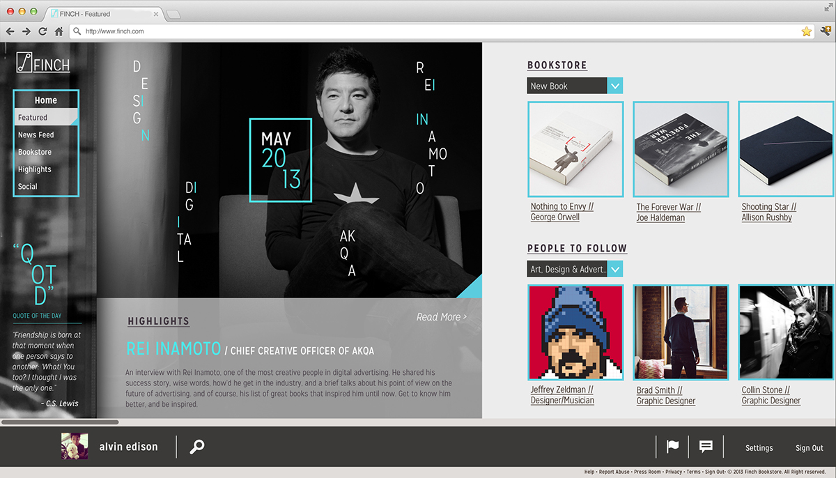
Homepage / Dashboard
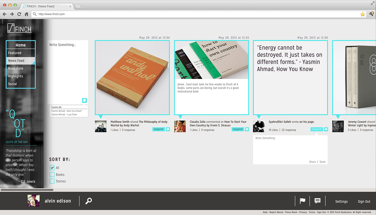
News Feed page
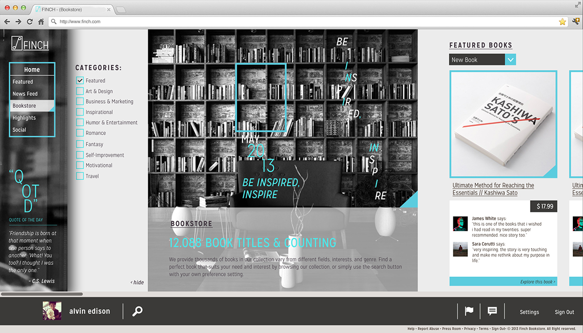
Bookstore page
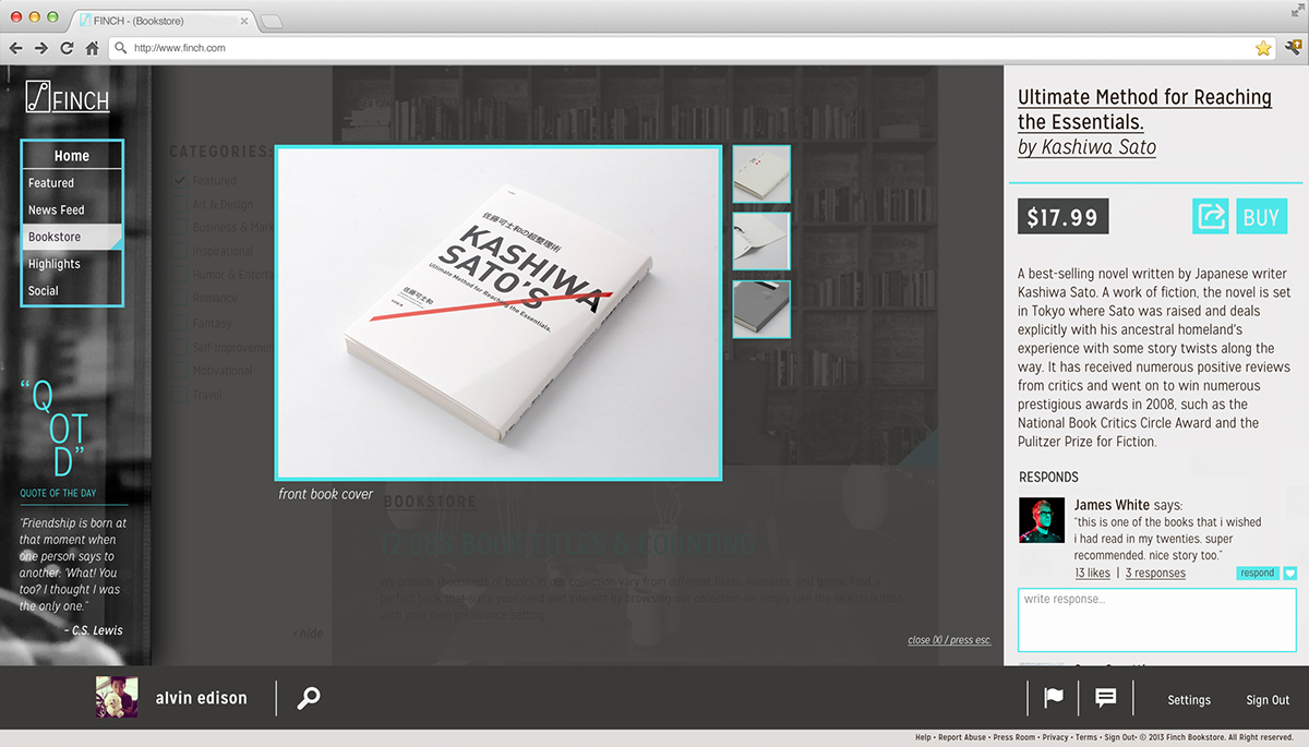
Book details
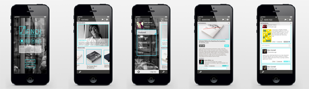
Mobile Phone App

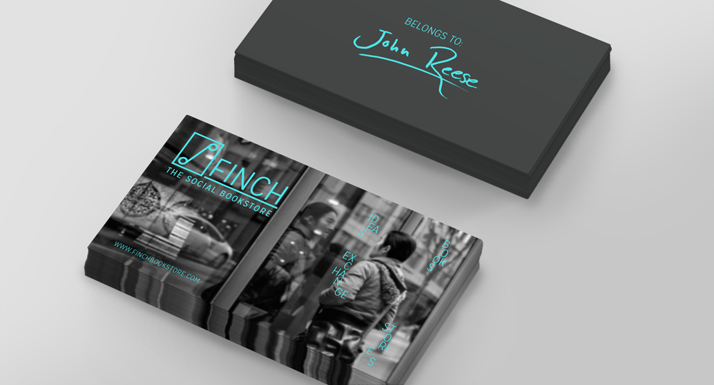
Personalized card for customers with their name written on it.
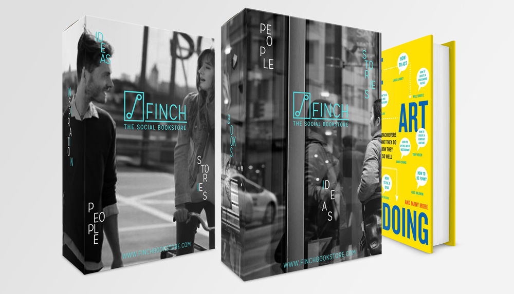
Wrapper box

