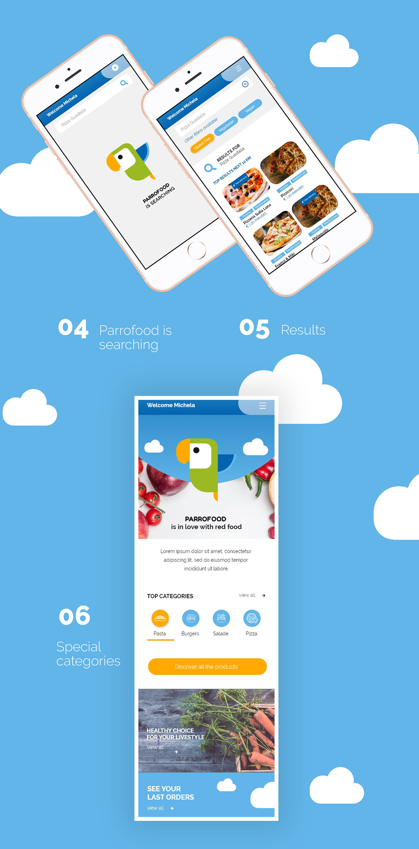
A new way for order food
Parrofood is a food delivery app developed to also give advice on important issues between correct nutrition, eco-sustainable issues ect.
The name "PARROFOOD" comes from the union of the word parrot and food.

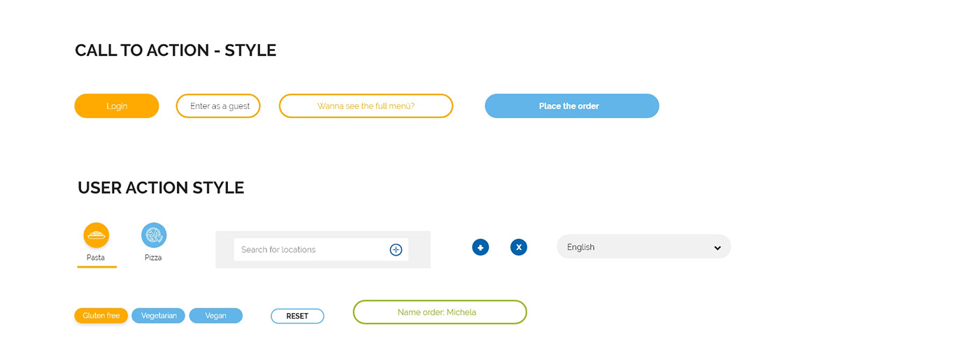
Atomic design
The UI has been designed starting from individual elements such as buttons, arrows and tags.
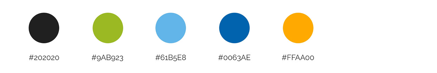
Colours & Font
Bright and vivid colors were chosen to make the user interact and make the actions to be done clear.
The font chosen is a Google Font: Raleway for greater visibility up to small characters and to make the numbers easily readable even on the smallest devices.
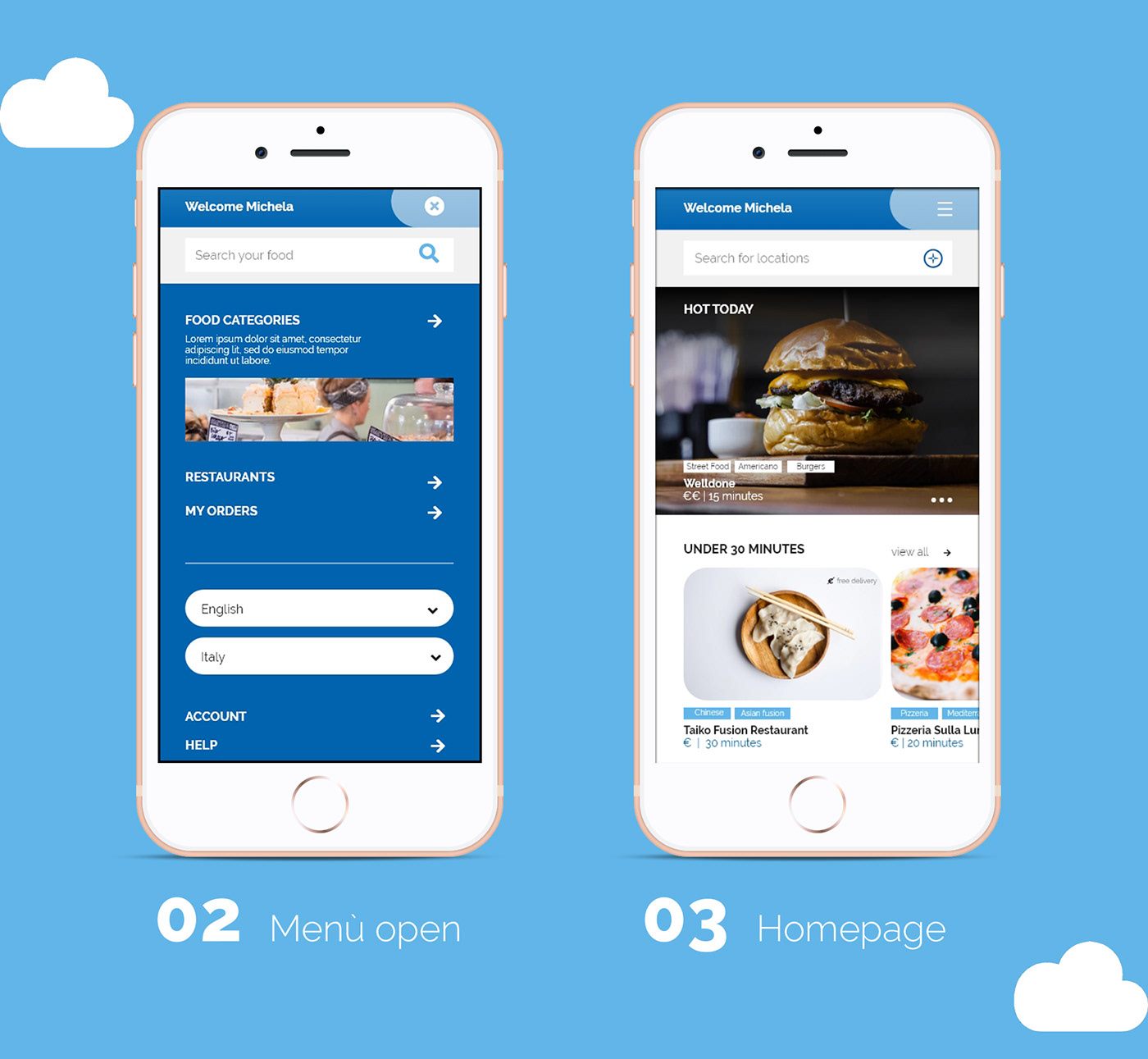
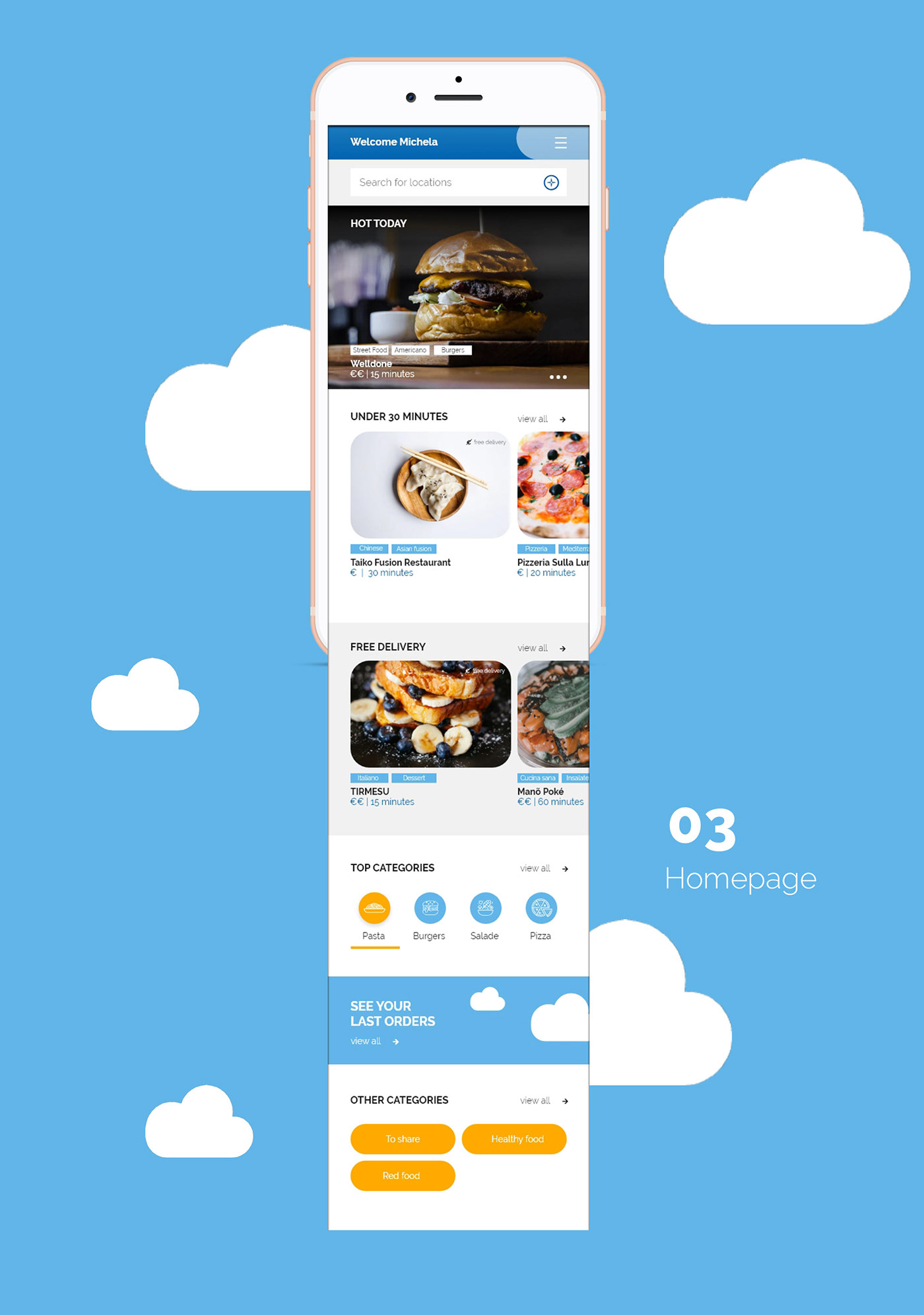
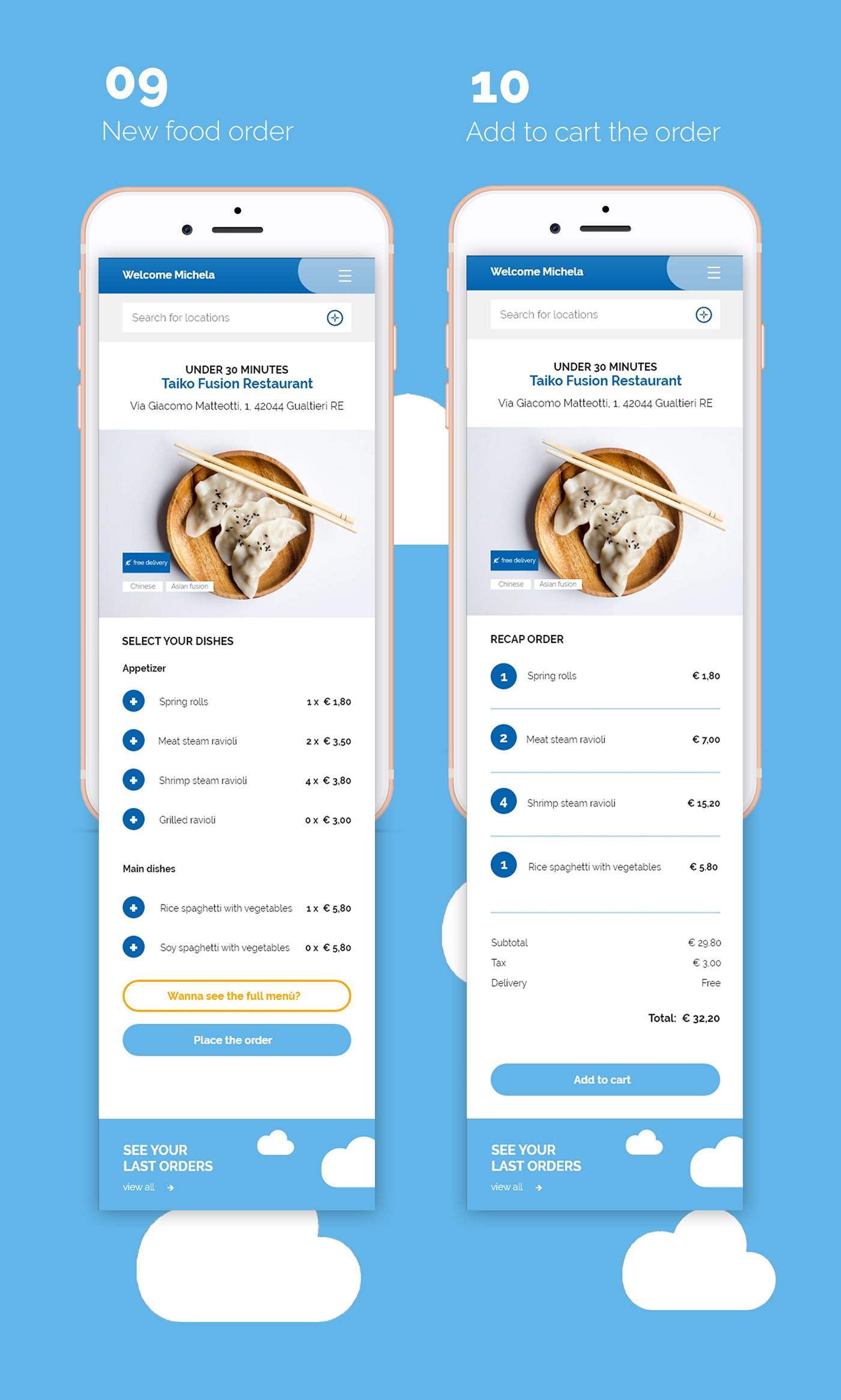
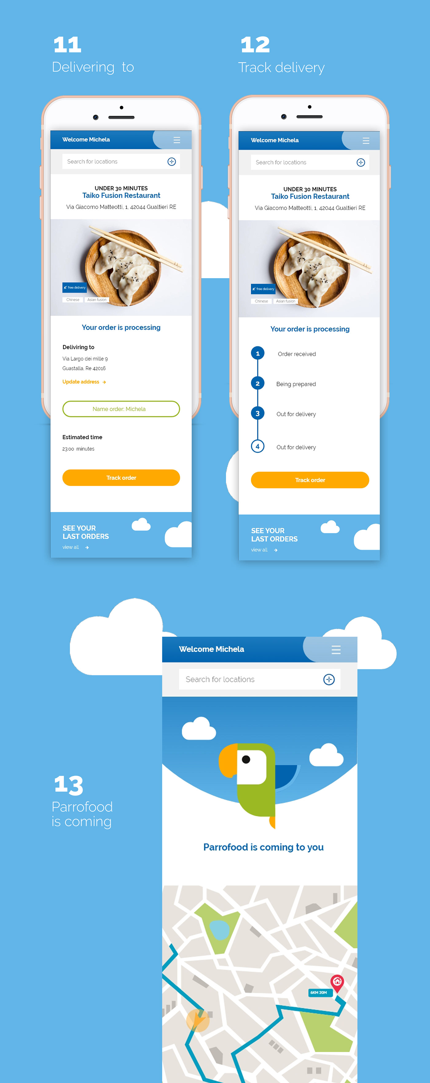
Repetitive elements for a greater user experience
To make the user experience better, cta's have been inserted that always refer to past orders, special categories and the menu with the search band has been designed to be fixed so that the user always has a way to access every single section of the app.