Online donation
The British Heart Foundation online cash donation experience. Where customers donate money to the charity for groundbreaking research.
Development team
UX/UI lead - myself
Front End developer
Back End developer x2
Product Owner
Content Designer
QA
Intro
There are many ways to donate to The British Heart Foundation and donating cash is just one of them. Cash donations generates around £2 million per annum.
Donations made to the British Heart Foundation help fund vital research into the world’s biggest killers. Conditions like stroke, heart diseases, vascular dementia and diabetes.
Planning & Discovery
As a team we were tasked with reviewing and improving the online cash donation experience.
To understand all the different user journeys for cash donation a flow diagram was created. This allowed us to have a holistic overview of the many ways a user can donate cash online and aid us in refining the journeys.
We planned to analyse SessionCam recordings and work closely with our Customer Service Center for user feedback and pain points and the insights team for data on all the different journeys.
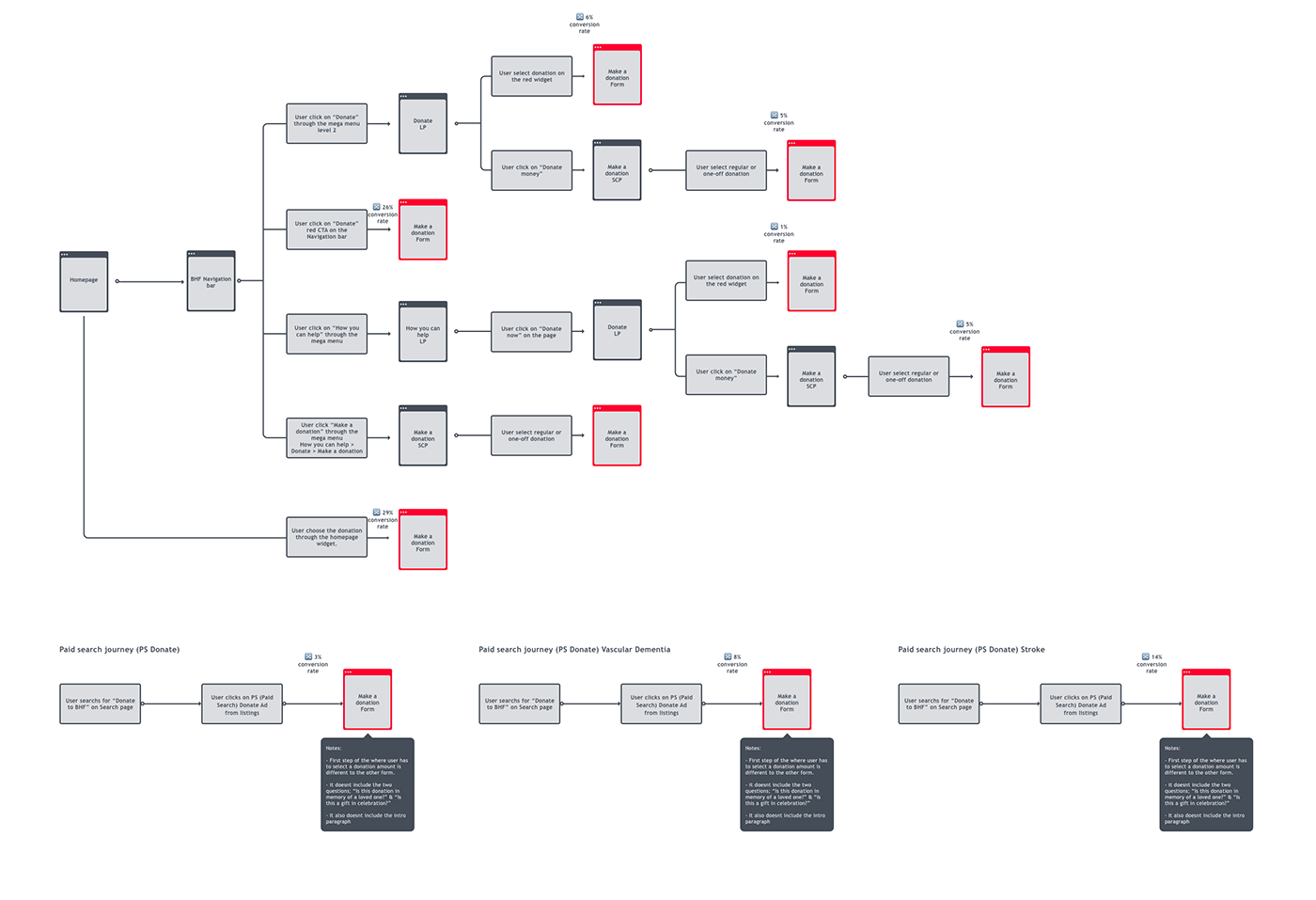
Current donate journeys on the BHF website showing individual conversion rate
Key findings
SessionCam recordings:
- Working closely with the insights team it allowed us to better understand the conversion of each cash donation journey. This helped us make a decision on which journeys we needed to focus on and how we could refine them.
Google Analytics:
- Working closely with the insights team it allowed us to better understand the conversion of each cash donation journey. This helped us make a decision on which journeys we needed to focus on and how we could refine them.
Customer Service Centre feedback:
- Customers where calling up to change their donation from monthly to single and vice versa. We found out that customers where missing the option to select between a monthly and single donation.
Persona

Define
The problem
When a user wants to donate cash through the BHF website there has been evidence that customers are mistakenly making a monthly donation instead of single donation.
The Solution
An improved online donation mechanism where users can clearly see what type of donation they are making (single or monthly).
The Outcome
As a result, users can clearly see the type of online cash donation they are making, reducing the number of calls our customer service receives about customers wanting to change their donation from monthly to single.
Comparative assessment
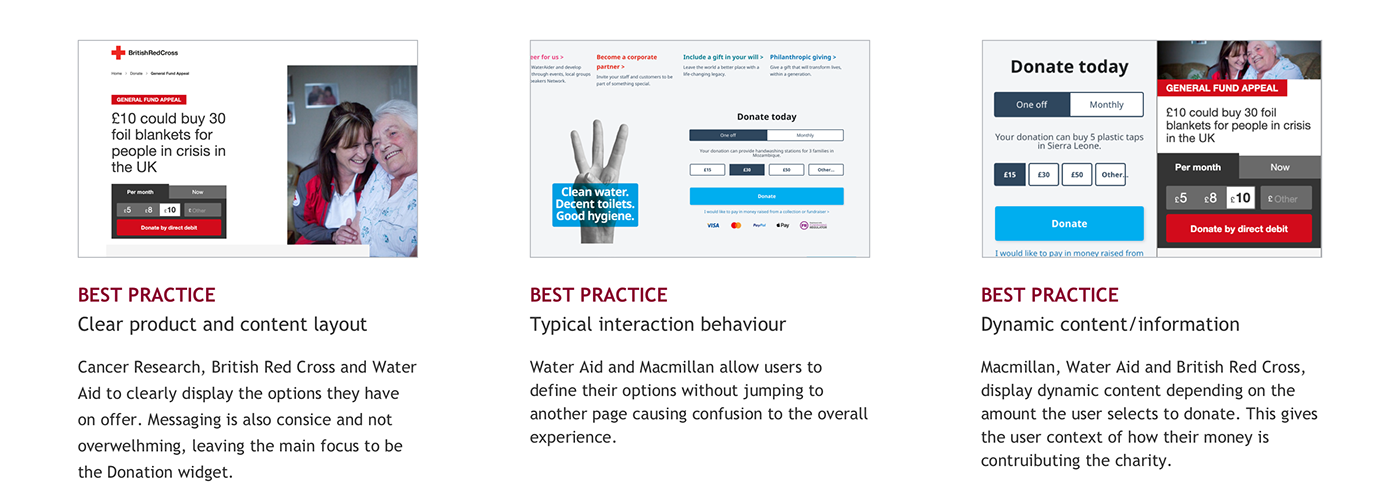
Before any sketching we looked at competitors to understand what they where doing and assess each one based on a set of criteria like; content, design, functionality etc.
This allow us to define some best practises for us to keep in the back of our minds when coming up with new concepts.
Donate widget best practices
A transparent, typical “Donate” experience has become the norm. Donating should be made as simple and frictionless as possible.
An unclear and misleading layout is no longer attractive even if the customers have used it before. Organised and relevant content combined with a typical interactive experience (such as Water Aid or British Red Cross) is what customers are used to and expect.
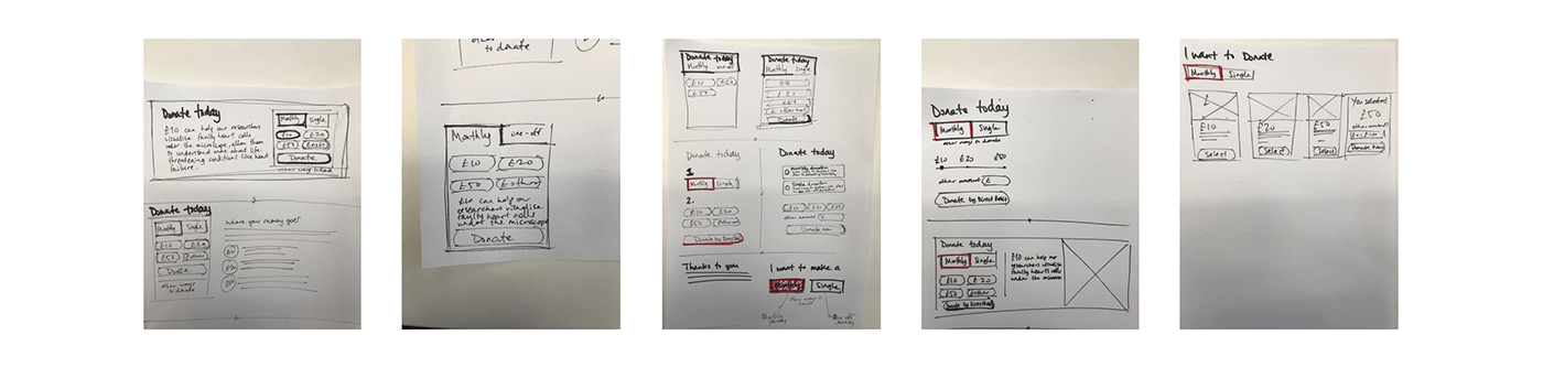
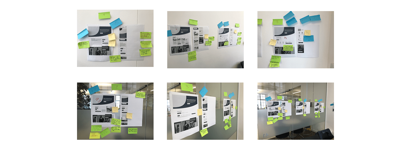
Ideation - Workshop
We met with the stakeholders and scrum team (including developer, product manager, product owner) to talk through the various initial designs.
As facilitator I encouraged everyone to use the post it notes available to write their feedback on each concept, then taking turns on talking through the feedback.
Finally, silent voting using sticky dots took place for the group to vote their preferred concepts, which will then be mocked up for user testing.
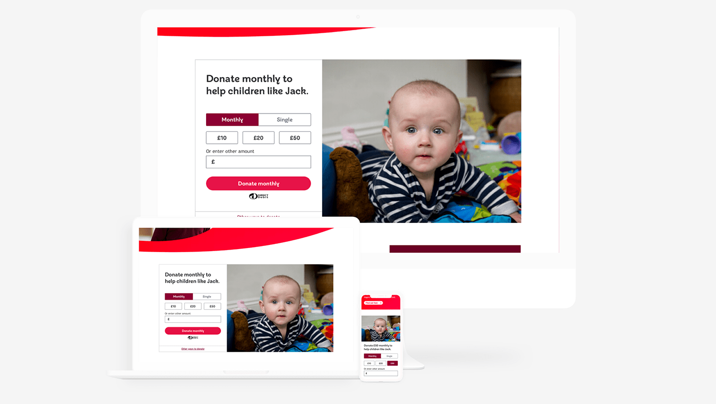
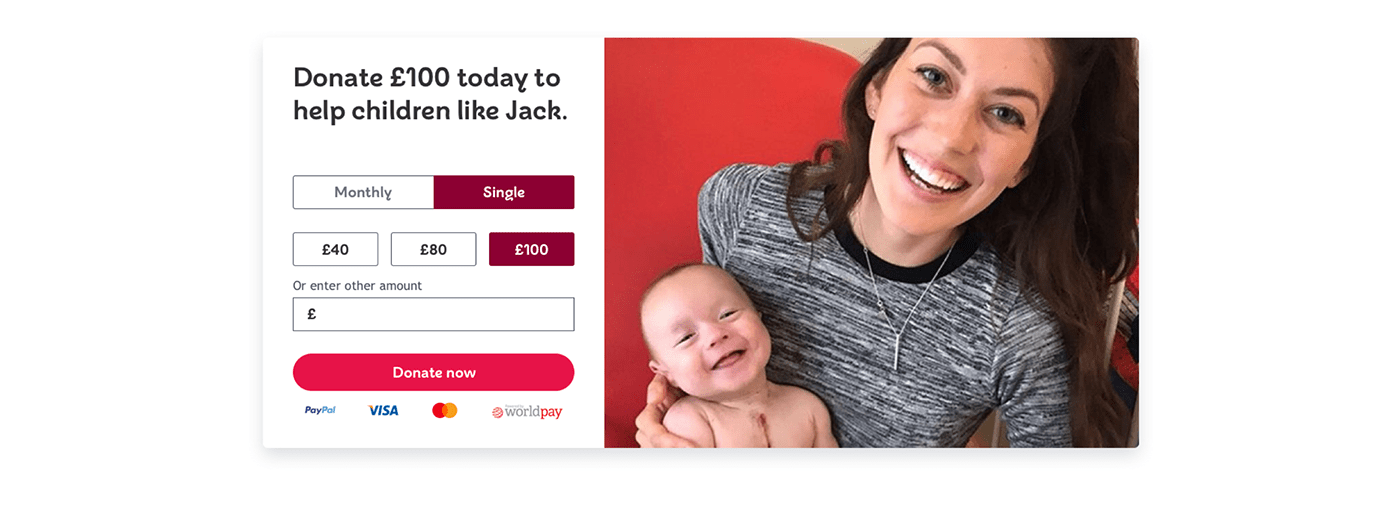
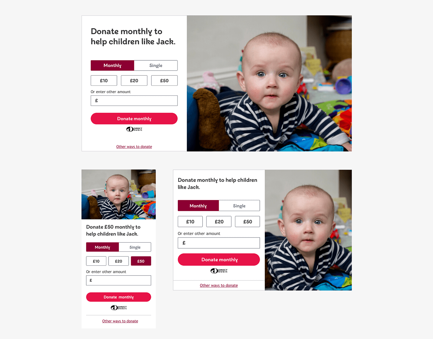
Chosen concept 1
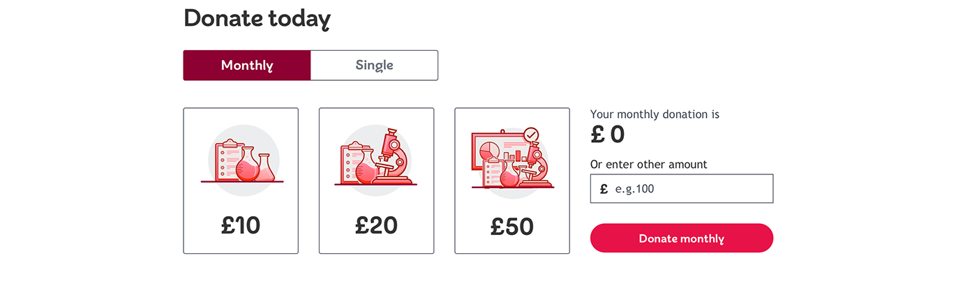
Chosen concept 2
Testing
After the workshop the chosen concepts (see above) where mocked up and prototyped to be user tested using an online platform called Maze.
We also used the survey functionality within maze to ask questions 3 questions about the prototype. Giving us a little bit of extra insight into what they thought of the concepts.
To get people to use the prototypes we set up a Qualaroo pop on a couple of relevant high traffic pages. This was live for 4 weeks.
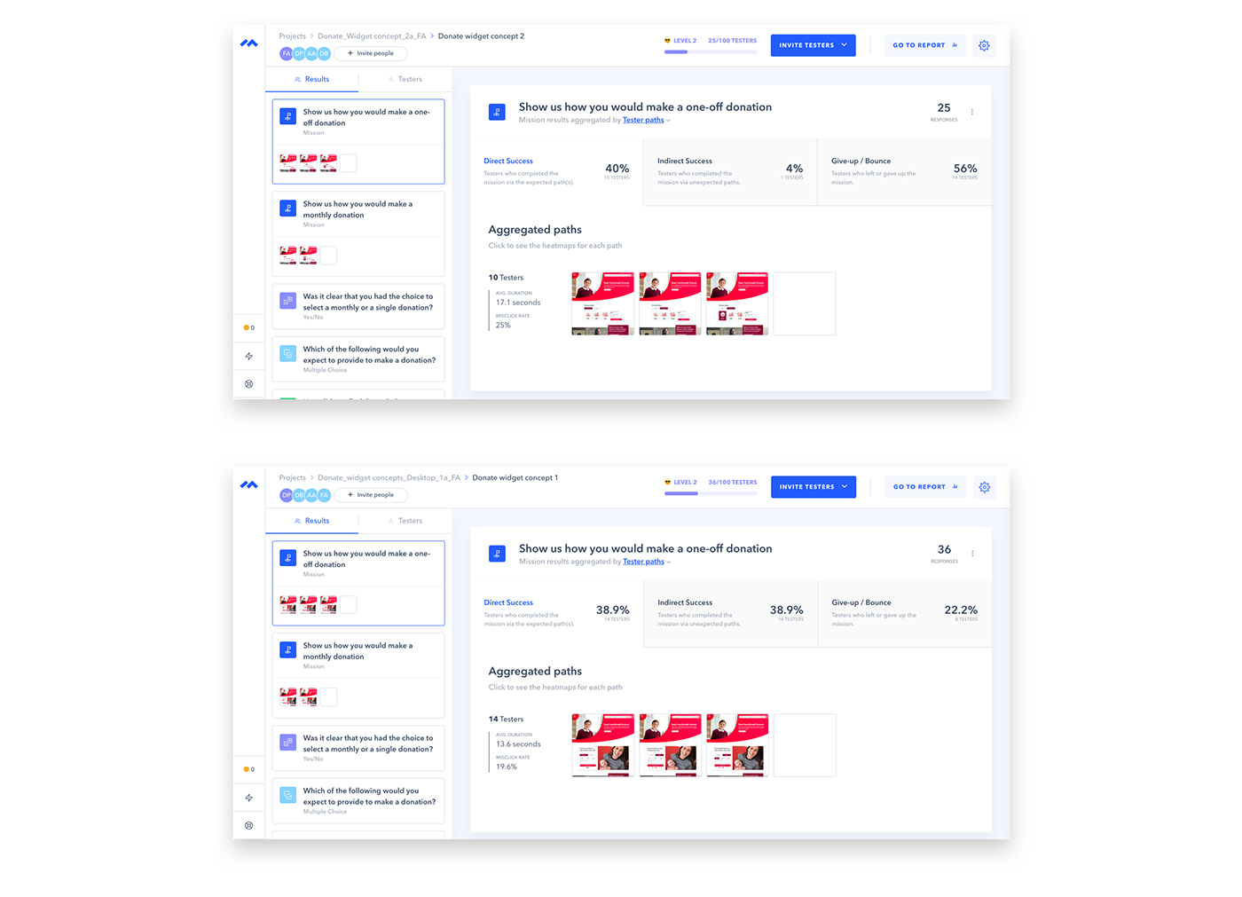
User testing results
After 2 weeks the results from the online user testing indicated that the best design to build was the 'Concept 2'.
Constraints
This new component had to follow the BHF design guidelines, using existing styles and UI elements.
When creating the specification for the component we had to make sure all the necessary elements where editable from a content editors perspective so that different copy and monetary amounts can be tested.
Challenges
Because online donations is linked with various other products and user journey's, multipe stakeholders responsible for those products had to be involved with the work done on this project.
This meant that quite a few stakeholders had to be consulted so that this new component was suitable for their needs.
Deliver
Next steps
The teams next objective is to improve the donation form which follows on from this donation widget/component. This will allow the user to complete their donation transaction.

