Il cliente è una Società di servizi musicali (sale prove, service, impianti acustici etc.)
Il brief prevedeva un restyle del logo e la creazione di una brochure per presentare a diverse tipologie di clienti i vari servizi offerti dalla Società.
The customer is a company of music services (rehearsal rooms, service, sound systems etc.).
The brief included a redesign of the logo and the creation of a brochure to present to different types of customers with various services offered by the Company.
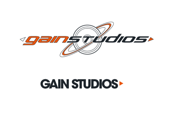
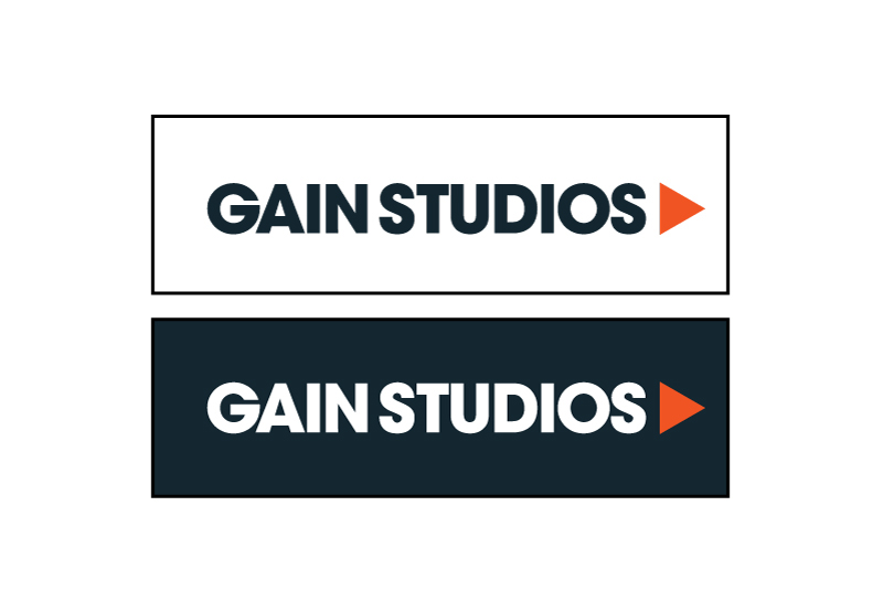
Attualmente vengono utilizzati, nella comunicazione, due loghi molto diversi tra loro.
E' stato suggerito rendere omogenea e coerente l'identity del brand creando un nuovo logo, modificando leggermente uno dei due presenti attualmente.
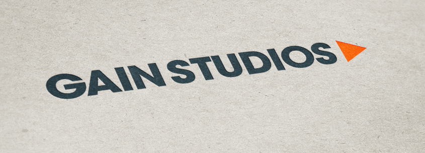
Il restyle si è concretizzato nella modifica del font e della spaziatura tra i caratteri e nell'ingrandimento del triangolo arancione. Questo per migliorare la leggibilità del marchio e per rendere più "importante" l'elemento grafico del triangolo in modo da poterlo utilizzare in maniera più incisiva in tutta la comunicazione.
Currently they use, for the communication, two logos very different.
It was suggested to standardize and make consistent their brand identity by creating a new logo, slightly modifying one of the two currently.
The redesign has led to the modification of the font and spacing between the types and in the enlargement of the orange triangle. This is to improve the readability of the label and to make more "important" the graphic of the triangle in order to use it more vigorously in all communication.

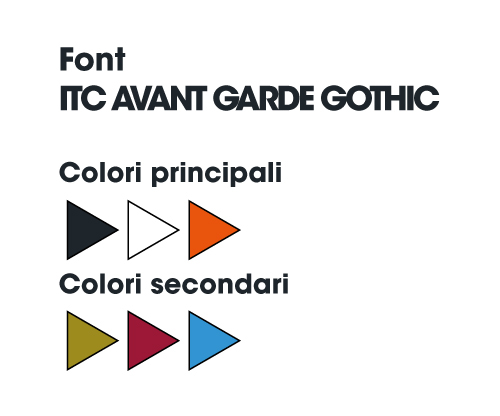
Alla palette colori principale sono stati affiancati altri tre colori.
At the main color palette were joined three other colors.
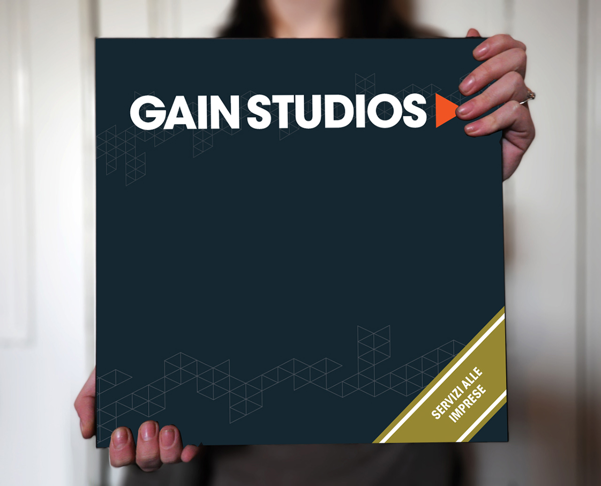
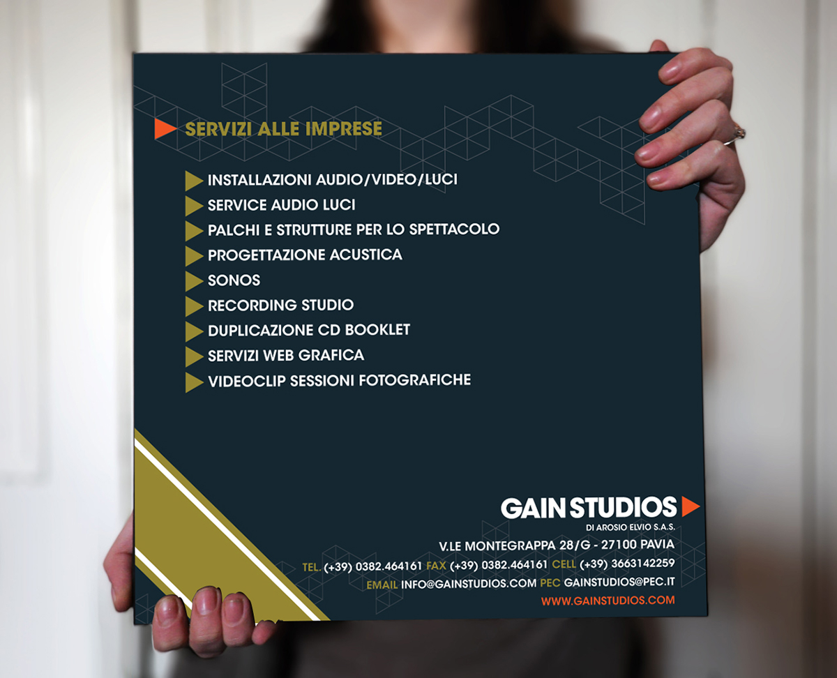
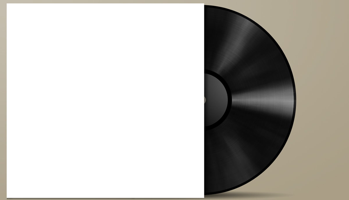
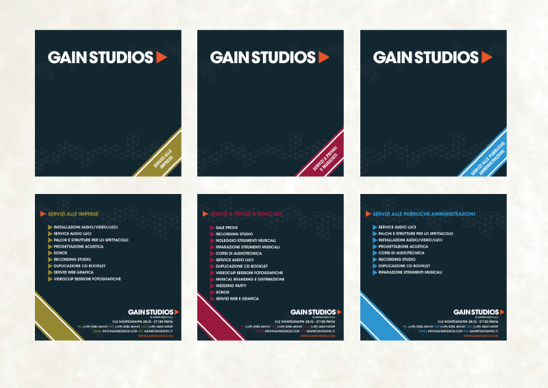
Per quanto riguarda la brochure, il concept è stato quello di utilizzare il tipo di attività della Società per creare una cartelletta contenente il materiale che si presentasse in maniera originale e caratteristica.
L'idea è stata quella di utilizzare la forma della tradizionale custodia dei vinili, creando tre linee diverse, per le diverse tipologie di clienti da raggiungere:
Regarding the brochure, the concept was to use the type of business of the Company to create a folder containing the material for present everything in an original and characteristic way.
The idea was to use the shape of the traditional custody of vinyls, creating three different lines for different types of customers to reach:
The idea was to use the shape of the traditional custody of vinyls, creating three different lines for different types of customers to reach:
Per la grafica è stato utilizzato un design molto flat, con l'aggiunta di un unico elemento decorativo geometrico creato dalla moltiplicazione del triangolino del logo, comunque in trasparenza.
For graphics has been used a very flat design, with the addition of a single decorative element geometric created by the multiplication of the triangle of the logo, however in transparency.

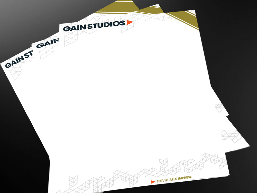
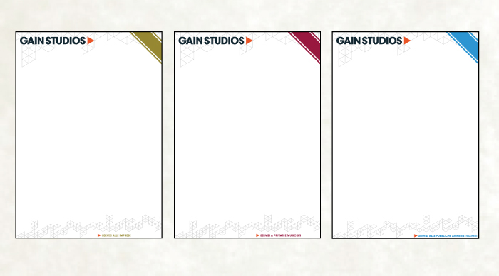
Allo stesso modo, sono state create tre tipologie diverse di carta intestata su cui stampare il materiale da inserire nella cartelletta/custodia:
Similarly, we created three different types of letterhead on which to print the material to be included in the folder / case:
E questo è il risultato finale:
And this is the final result: