
HUBSTRAT
It is the place where new businesses are borning. It is the encounter between creativity and functionality to response to new markets. Has a team of professionals that with communication innovate your company, bringing it to success.
NAMING
- HUB, is uniquely designed spaces that provide a creative environment as well as a professional infrastructure to work, meet, learn and connect
- STRATEGY, is a process that can allow an organization to concentrate its resources on the optimal opportunities with the goals of increasing sales and achieving a sustainable competitive advantage.
- STRATEGY, is a process that can allow an organization to concentrate its resources on the optimal opportunities with the goals of increasing sales and achieving a sustainable competitive advantage.
___________________________________________________________________________________________
CONCEPT FORM
- DNA, is a molecule that encodes the genetic instructions used in the development and functioning of all known living organisms.
- DNA, is a molecule that encodes the genetic instructions used in the development and functioning of all known living organisms.

___________________________________________________________________________________________
LOGO DESIGN PROCESS
The logo is formed by the combination between the structure of DNA and the letter S.

___________________________________________________________________________________________
CHOICE OF COLORS
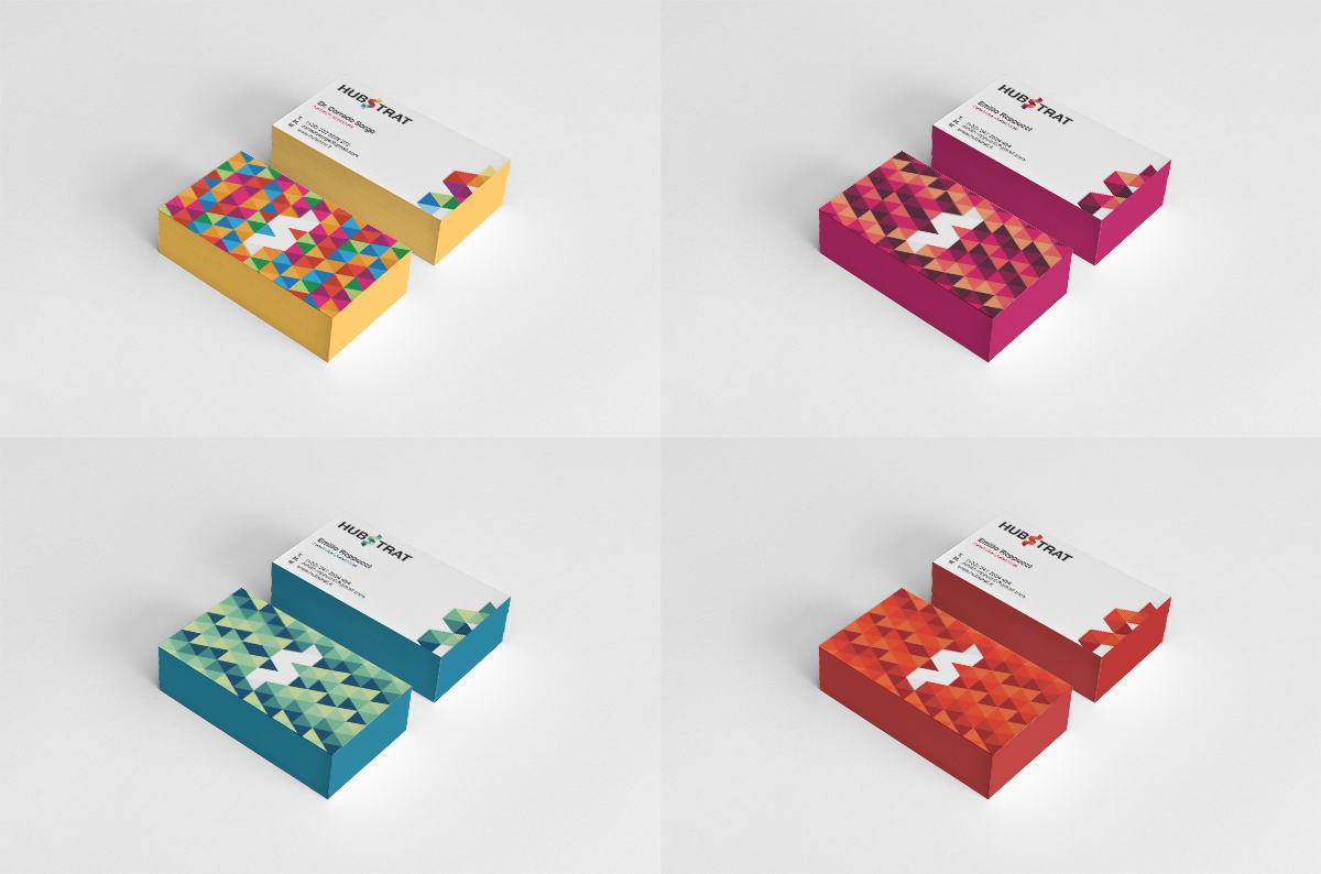
We need three different shades of colors to identify the different departments of the agency.
- ADMINISTRATION, is the department that coordinates and manages all the other, for this reason we chose to use a wide range of colors to symbolize the harmony between all the different people that form the agency.

- DESIGN, is a department made up by passionate and creative people that give at your ideas identity, style and usability.
We chose a different shades of Pink / Purple to symbolize the passion, vitality and creativity.
We chose a different shades of Pink / Purple to symbolize the passion, vitality and creativity.

- DEVELOPMENT, is a department that transform your ideas in to a real product.
We chose a different shades of Blue / Green to symbolize the strenght, solidity and tranquility.
We chose a different shades of Blue / Green to symbolize the strenght, solidity and tranquility.

- MARKETING, is a department that communicates the value of a product or service to customers, for the purpose of selling the product or service.
We cose a different shades of Red to symbolize the energy, power and CocaCola :)
We cose a different shades of Red to symbolize the energy, power and CocaCola :)

___________________________________________________________________________________________
BRAND DEVELOPMENT

___________________________________________________________________________________________
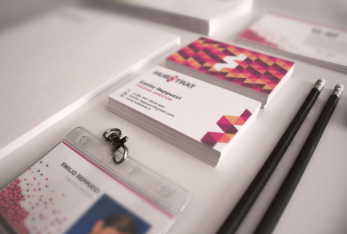
BUSINESS CARDS, Every departments has a different business cards with the main colors that identify it.

DESKTOP WALLPAPERS


MOBILE WALLPAPERS

___________________________________________________________________________________________
WEB DESIGN
THE WEB SITE COMING SOON!
ICONS DESIGN
ICONS DESIGN
We designed a set of icon which represents every services that the agency offers to customers, from developing at communication.

___________________________________________________________________________________________


