


PIECES OF ITALY
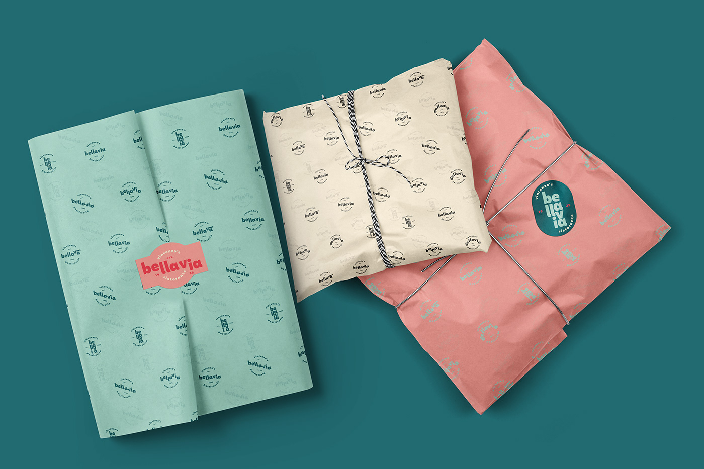
Bellavia is a traditional Italian family owned restaurant and bakery originally from Sicily and Napoli. The family split and Vincenzo Bellavia decided to give the restaurant a complete facelift, rejuvenating its spirit and making it more appealing to a younger more international audience.
Backed up by its family recipes and traditional Italian cuisine, the brand delivers on its promise of a very authentic experience without being cliche.
ITALIAN STAPLES
The memory of Italy is brought across through staples that make up traditional Italian towns. Elements such as arches, stairs, buildings, narrow streets, inclinations, and slopes.
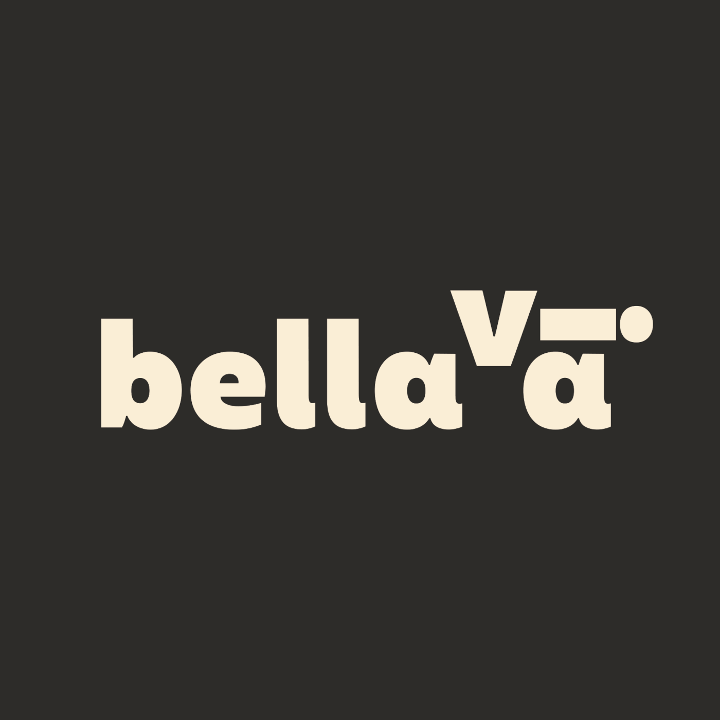
These will be represented through logo variations, each one highlighting a piece of Italy.


SIGNS OF ITALY
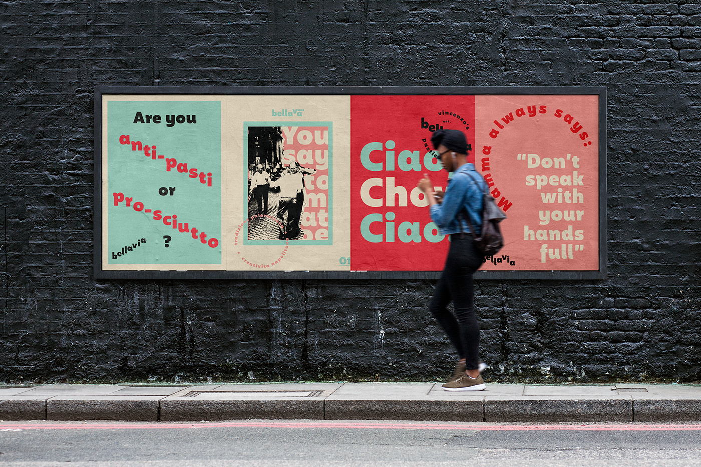
The traditional street signage of small town Italy serves as an inspiration for the visual communication and brand expression. Signage on the street, on windows, over doors. All inspiring a very nostalgic and authentic Italian lifestyle.


AN EXPRESSIVE TONE
The tone of voice also takes on a traditional Italian spin, playing on local expressions, small town whimsical phrases that mamma or nonna would say out of the blue or while strolling to the local bakery. Reminiscent of previous generations. Each one is meant to evoke a smile or transport you to a part of Italia you've yet to explore.


To be continued...


