
I heard about the contest that Santander Totta Bank was about to promote and decided to participate.
The contest aimed to create an image promoting the bank image itself but somehow referring to university students.
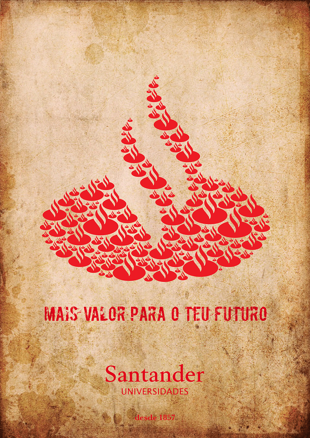
After some brainstorming about the bank, its image, history and values, I decided to create a symbiosis between the principles of the bank and the view of the promising university students.
I played around a bit with the logo, keeping the same colors but using different sizes. I tried to create an interesting and different image, graphically speaking. The amount of logos and diversity of sizes symbolized the variety and multiplicity of students.
I preferred to use a slightly "destroyed" typography in the title in order to communicate more easily with young people. However, to keep the seriousness and strong character of the bank image I used a stronger typeface (with serifs) to make mention to other references.
The antique paper texture served to make a connection between the date the bank was established (1857) and the concerns about students since that date.
At the end you can check the result of the contest.
You can check the whole creative process below,
Enjoy it
TYPOGRAPHY
Boycotte type

SENTENCE

SIZES OF LOGO

1. 2. 3. 4. 5. 6. 7. 8. 9.

COMPOSITION

.
FINAL RESULT
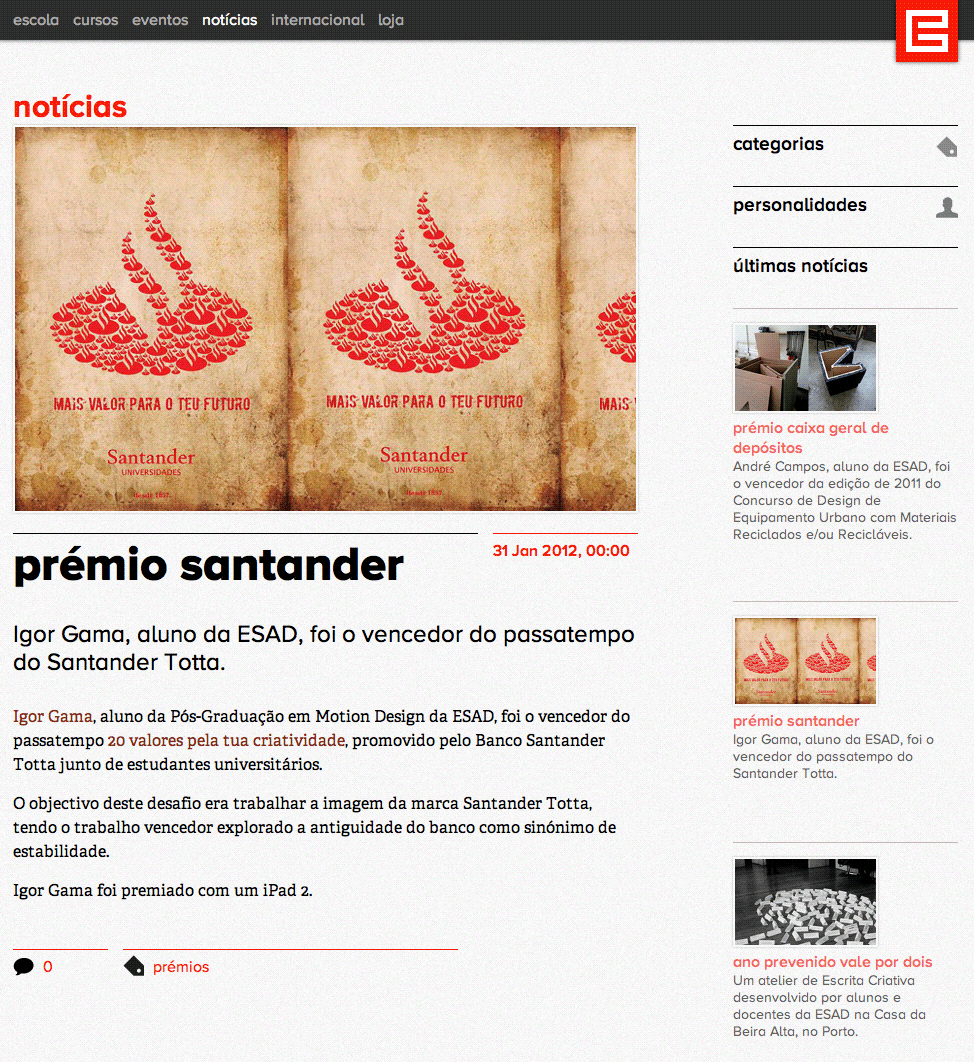
I was one of the best qualified and I was awarded with a ipad 2 16GB WIFI + 3G
Below is an print screen of the school website with the news of the award.
+ info