EPISODE
Personal project - Graphic manual for the vintage store 'episode'.

Logotype
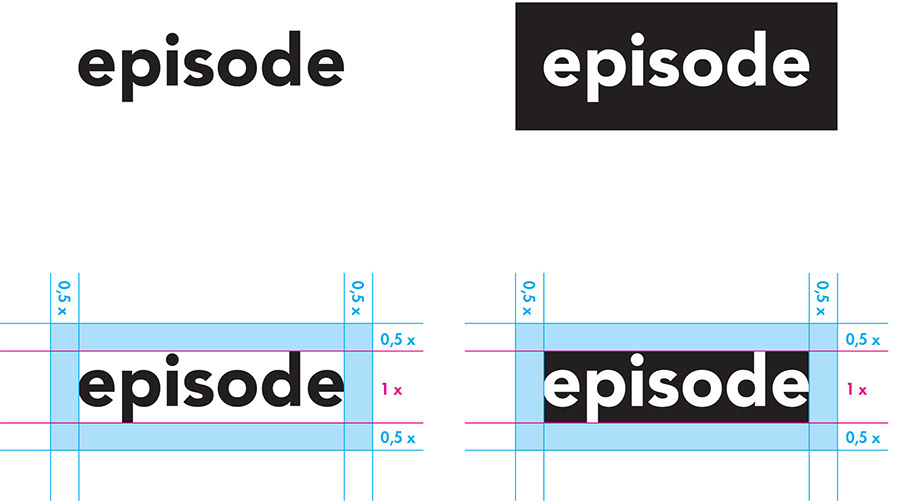
Episodes logo can be used in either black or white. The color that provides maximum contrast should always be used. The logo may be used on all backgrounds and photographs.
Episodes logo can be used in either black or white. The color that provides maximum contrast should always be used. The logo may be used on all backgrounds and photographs.
Respect distance
Episode's logo should always be surrounded by the designated respect distance. The distance is equal to half of the logo's height. The same clearance applies to the side of, above and below the logo.

Typography
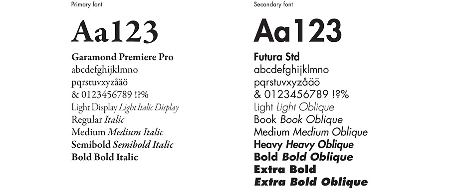
Episode's typography consists of Serif Garamond Premier Pro and sans serif Futura Std. Garamond Premiere Pro is Episode's primary font and is used in the main headings and body text. Futura Std is Episode's secondary font and is used mainly in the subheadings.
Replacement fonts
For everyday use in e-mail and Office programs Times New Roman and Arial are used after the same principles as Premiere Pro Garamond and Futura Std.


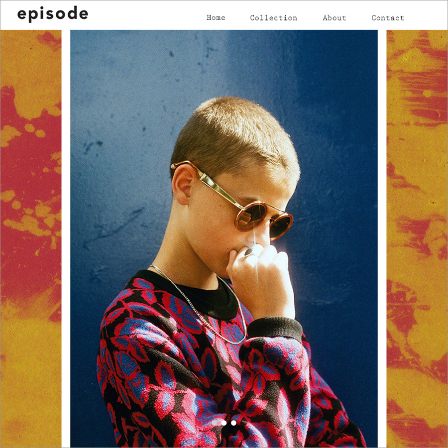
Website


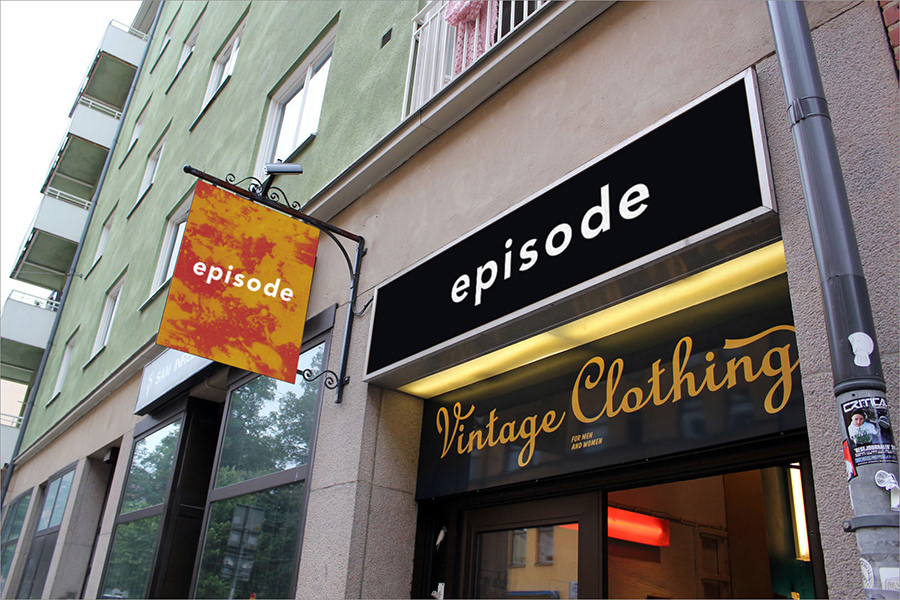
Store display

Price tags


