This is one of the best projects I had the opportunity to work on. As my final diploma project, I spent 7 months on this with Flip Design Pvt. Ltd, a multidisciplinary design firm in Bangalore, Karnataka. My Industry guide was the co-founder of Flip Mr. Arvind Prabhakar and my faculty guide was my H.O.D Prof. Ranjana Dani from MAERR's MIT Institute of Design.
FL!P Design Pvt. Ltd. comprises of a energetic bunch of highly motivated people who provide solutions for
domestic and international clients in the sectors as diverse as healthcare, apparel and entertainment. They take pride in their ability to think for the client be it researching, designing or detailing the perfect solution. At FL!P, we believe in Design driven businesses and in the value that good design thinking can bring to overall Brand experience. Design can facilitate intangible value creation which is crucial in how Brands build market value today. Use of social media, interactive content that can engage users or customers are becoming important areas to address for Design, specially with the changing landscape of information and how its
being accessed. And FL!P aims to exeriment and have fun with the same at all levels.
Work Credentials
FL!P works best with businesses /organisations that believe design thinking is an important stakeholder. Their
clients are typically starting a new business, enterprise, looking to work closely at with Brand being an integral
aspect. Brands that believe that their service or product deserves a strong brand presence / experience to
unlock the market potential, will see value in working with FL!P. Design thinking that can deliver rich
experiences to the brand's customers is fundamentally what clients are looking for.
Brand Ideology
Design has a role to play in every aspect of life. Its a horizontal facilitator of the many verticals in our lives.
Nature of Business
The name came out of the way they approach problem solving, Question first principles and turn things on its
head before you assume the problem at hand. Also, the identity has a young, playful outlook yet a professional,
quality to it which describes the way they function. The " ! " is a punctuation that signifies the insight around
which the solution is derived.
The strategy which Flip Design works with is THINK . DESIGN . EXECUTE.
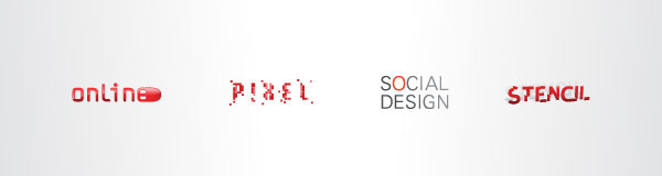
And we work on what we call, ONLINE . PIXEL . STENCIL . SOCIAL DESIGN
Some of their clients are Sanskruti, Clover Business Centre, Corner House Icecreams, Pogo, and Mahi Sports.
Client Brief
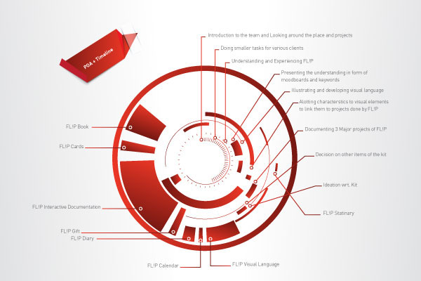
FL!P Design was looking to update and create new communication material of its process, practice and portfolio. This would build on the current identity and take it forward into all the various touch points it has with its customers.The Project would focus on documentation, analysis, creating info-graphics and content and the design of this content into communication material. This will include the following areas.
1. Design of Communication kit & Portfolio
2. FL!P Design - The Book (2012)
3. Electronic communication material ( pdf and interactive portfolio )
4. Studio Consumables
5. Studio Merchandise & Gifts BRAND
Objective
Other than the important objective of documenting it’s projects, FL!P also wanted to reach to it’s customers
and stakeholders in a better, elaborate and interactive way. The idea was to cover various touchpoints it has
with it’s customers and make the experience memorable and interactive. Also, to bring the new year with lot’s of creativity and design, FL!P wanted to revamp their entire experience with their target audience and within themselves too.
FL!P Design appointed me to rejuvenate their existing identity and communication collaterals which will govern their presence and appearance in the market.
Scope of Work
- Identity Rejuvenation
- Visual Language
- Project Documentation
- Office Consumeables
- Interactive media applications
- Gifts and Merchandise
The next step was to start creating a visual language for which we needed keywords and specific description to start sketching.
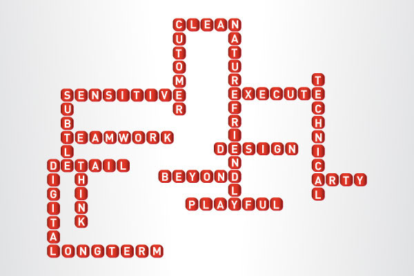
I then created moodboards for the same to help me with the visual language.
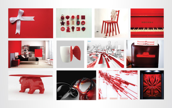
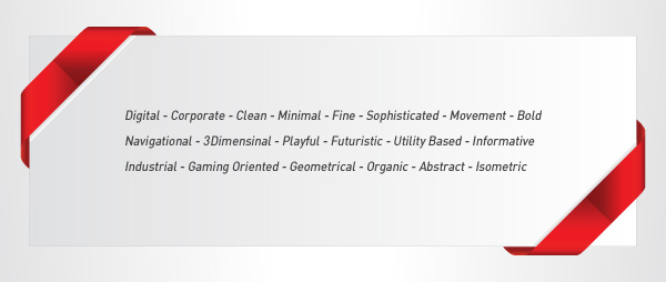
Explorations with the Visual Language
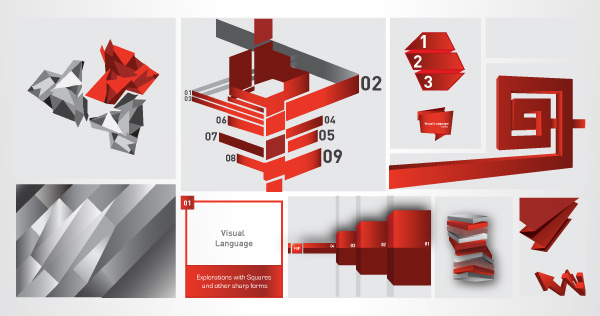
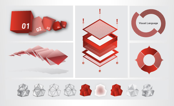
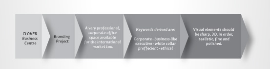
After having substantial explorations with the visual language, the next step was to start applying it on various collaterals needed, of which the first one was the INTERACTIVE PROJECT DOCUMENTATION.
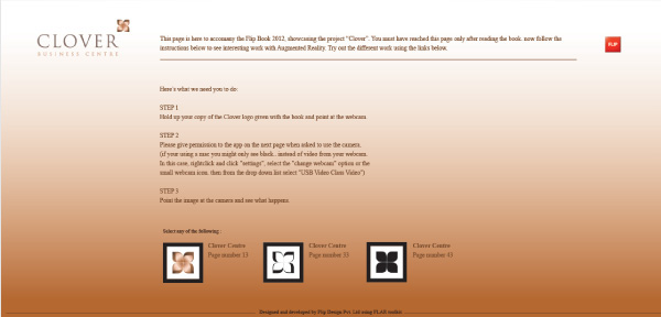
Below you will find the link to the first of them which was Clover Business Centre.

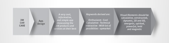
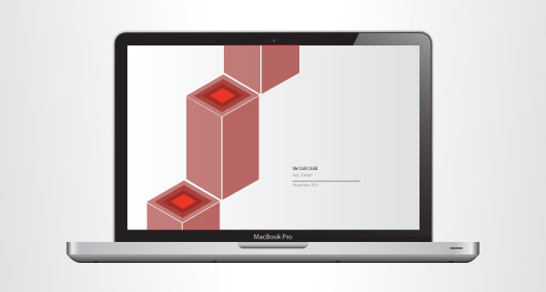
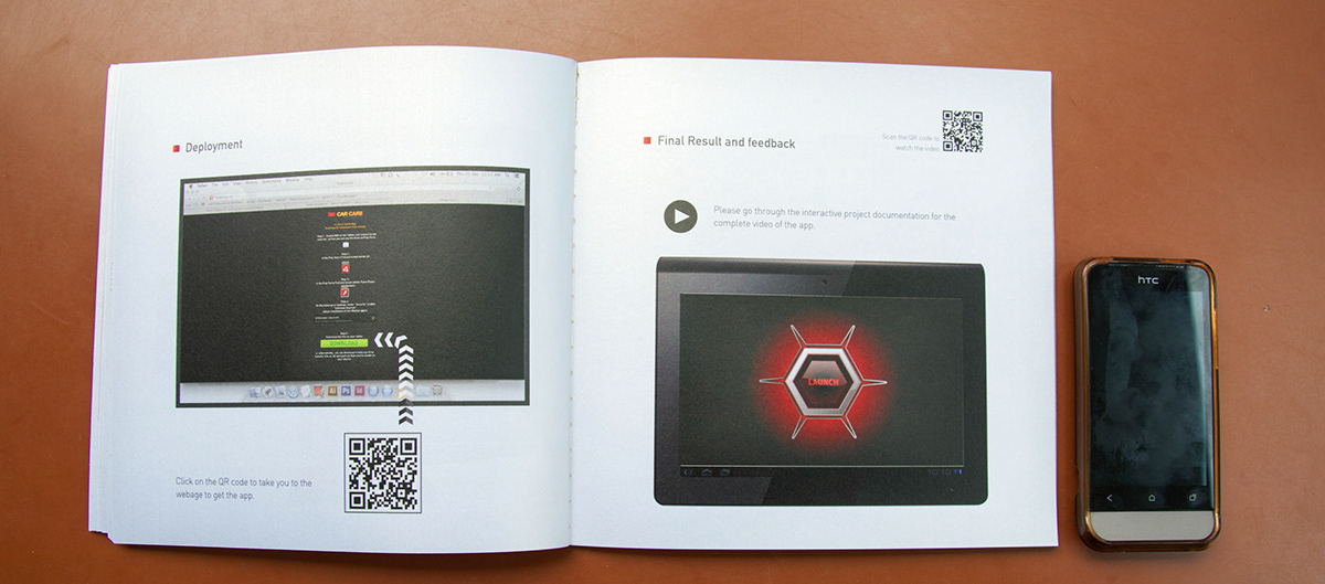
Similarly the app design for 3M.
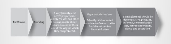
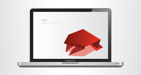
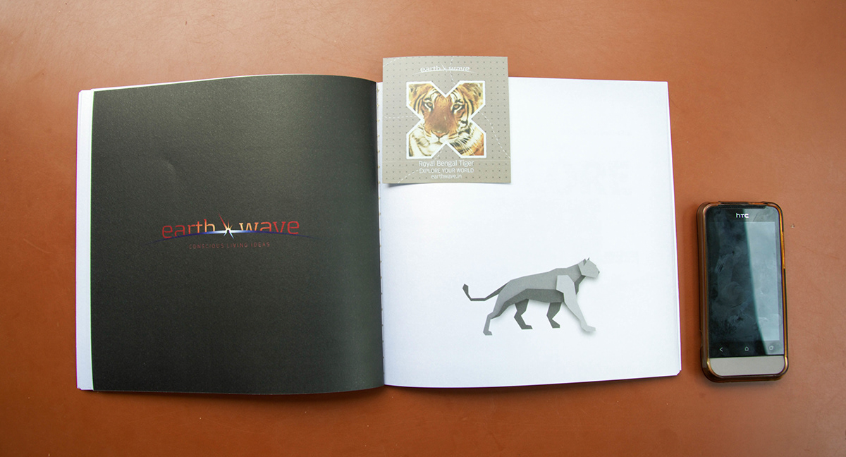
And Similarly, the final project called Earthwave.
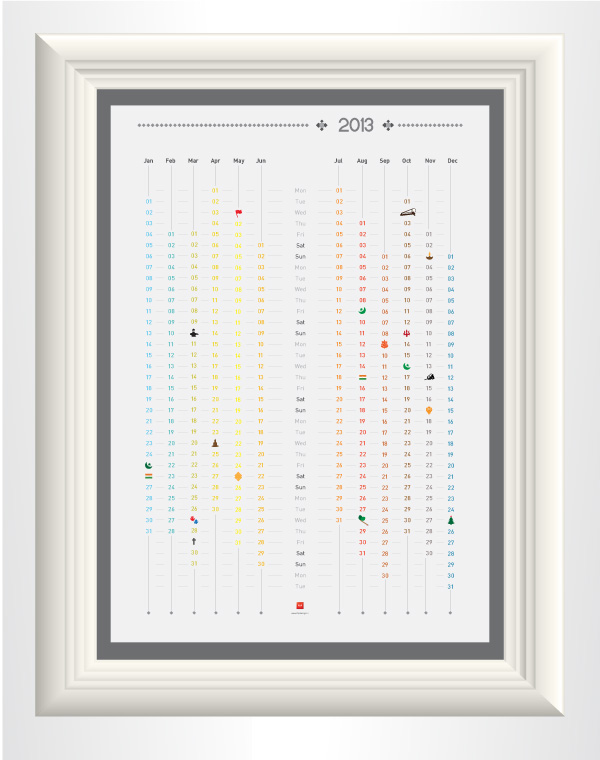
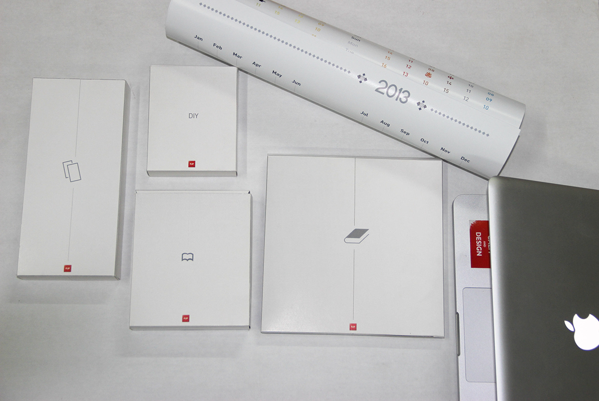
Flip Calendar
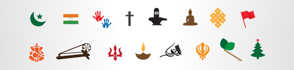
Next on the list was a new calendar 2013. Making a good calendar is by far one of the most difficult tasks I have had to do, because there has been so much already done, that to go one step ahead is tough. FL!P wanted an Interactive Calendar. At the very first thought of it, an idea of a Forever Calendar was on the table and soon off the table considering the production and time. However, it was still critical to have a point of interction. Arvind Prabhakar said just one statement to me, “ Sakhi, the calendar should look and feel like a calendar designed by a design firm.” I got to work with various ideas wrt. the layout. And then I came across the idea of adding color to the calendar considering the fact that different months are like different seasons and temeratures which are visul enough. Plus the important aspect of a calendar are holidays. To represent the holidays, I chose to create symbols and replace the date with it. Coming to the size of the calendar, it had to be on the wall, and so we decided an A2 size which is around 16.5 in * 23.5 in. It is big enough for the symbols to be recognized easily.

Icons for the holidays in 2013

Flip Diary
It was essential to have a doodle diary for the office plus which could be sent to the target audience, which
definetly presents the ideology, work culture of FL!P. According to my experience of around 4 months in that
place, one thing I realized was for sure that the team + the work of FL!P has a practical and calm approach.
And hence, I decided to use one of my favourite inspirational quote “ Keep Calm and Carry On ”.
Later, I had a thought of incorporating, the FL!P philosophy of Think . Design . Execute with the same and
came up with “ KEEP CALM AND THINK ”, “KEEP CALM AND DESIGN” and “KEEP CALM AND EXECUTE”. It all just magically fell into place when the next obstacle of making all this interactive stood in front of me. After a
few hours of thinking, I decided to prototype a concept involving rotation, which refers to a process.
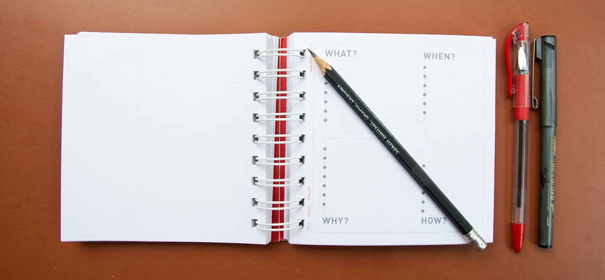
Next chllenge was to have fun yet utility based stuff even inside the diary, something that a user will enjoy using and will inspire design thinking. Hence, I introduced various grids.

The final product looks something like this.
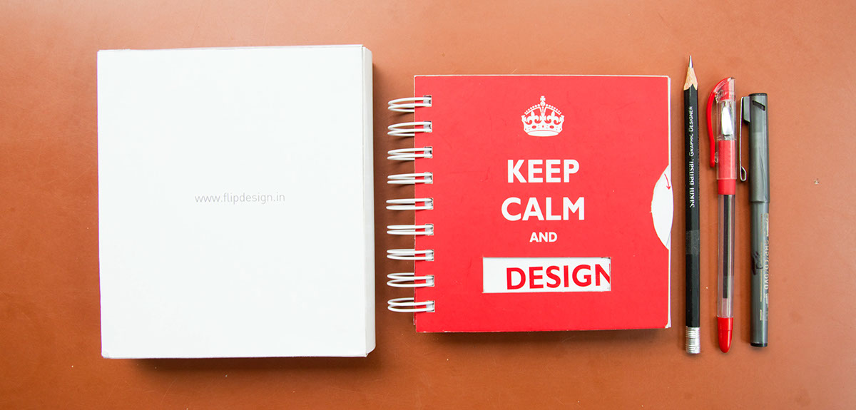
The size of the diary is 5in * 5 in. I wanted to make the diary usefull. So, I though about introducing various grids which a design learner would need while thinking with a pencil, and so, came up with 3 grids +
1 brainstorming sheet.
1. Simple Square Grid with maximum flexibility.
2. Isometric Grid
3. Rotational Grid for fun doodling
4. Brainstorming Sheet for quick design thinking
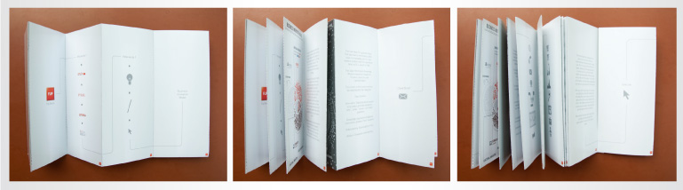
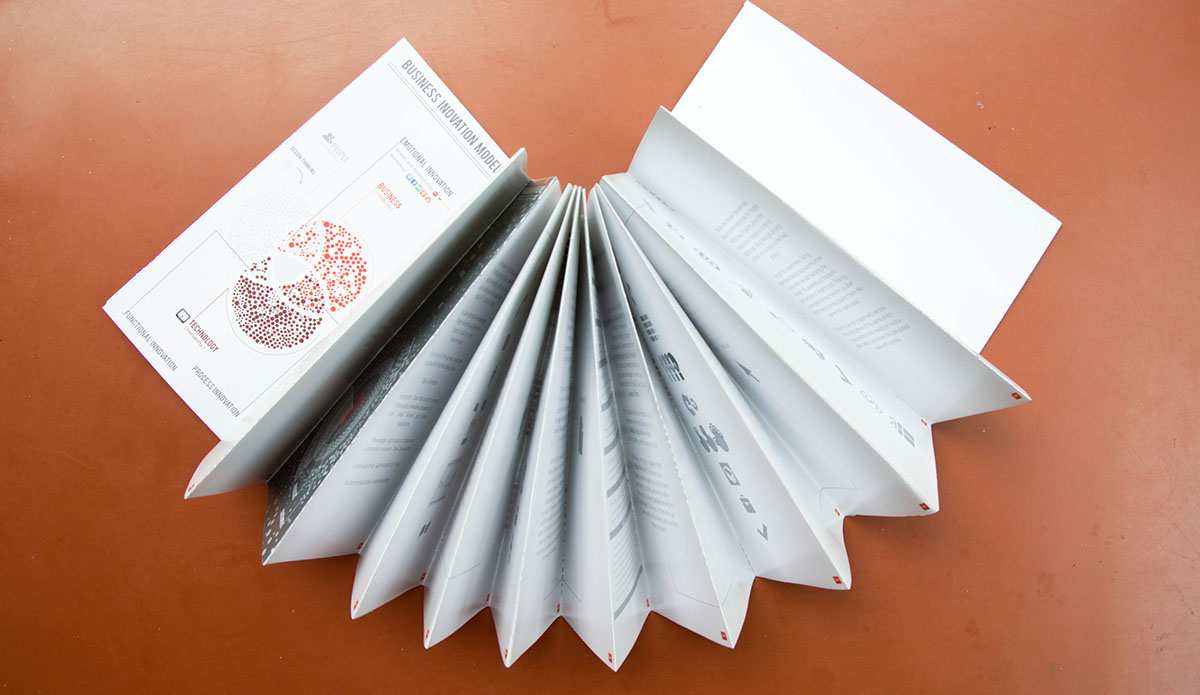
Flip Cards
FL!P mainly belives in a design driven business. FL!P belives that a well thought and experienced stage before
designing is very crucial for an innovative experience and design solution. And to do this, FL!P uses the
“ Business Innovation Model” to scan it’s client. Then, the team works with the “ Data Information Knowledge
Model” to derive wisdom, make scenarios, and brainstorm. Next comes the mission pf FL!P which involves
THINK, DESIGN and EXECUTE or in other words “TDE Model”. TDE is basically like the design process.
Let’s have a closer look at each of the model and how these were made into visuals for presentation.

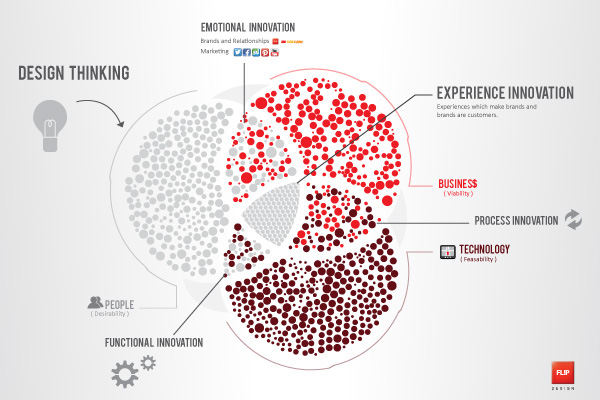
Business Innovation Model
A business model describes the rationale of how an organization creates, delivers, and captures value
(economic, social, cultural, or other forms of value). The process of business model construction is part of business strategy. The essence of a business model is that it defines the manner by which the business enterprise delivers value to customers, entices customers to pay for value, and converts those payments to profit: It thus reflects management’s hypothesis about what customers want, how they want it, and how an enterprise can organize to best meet those needs, get paid for doing so, and make a profit. What we see here is also how the three most important aspects, Business, Technology and the People combined with design thinking leads to emotional, process, and functional innovation.
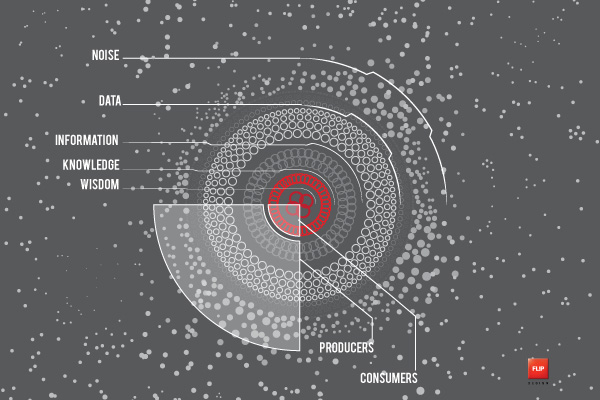
Data Information Knowledge Model
The now taken-for-granted notion that data lead to information, which leads to knowledge, which in turn
leads to wisdom was first specified in detail by R. L. Ackoff in 1988. The Data-Information-Knowledge-Wisdom
hierarchy is based on filtration, reduction, and transformation. The content of the human mind can be classified into five categories:
Noise: Random unwanted particles with no meaning.
Data: Distillation of noise to have some meaning.
Information: Data that are processed to be useful; provides answers to "who", "what", "where", "when" questions
Knowledge: Application of data and information; answers "how" questions
Understanding: Appreciation of "why"
Wisdom: Evaluated understanding.
Client Brief
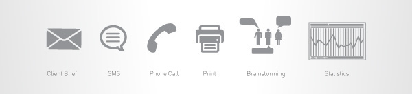
We, at Flip Design Pvt. Ltd. usually recieve a brief through a phone call or an e-mail. Once we receive it, we talk about it. We discuss and brainstorm extensively. What usually comes in a client brief is a brief discription of the task to be done. Instead of following the order blindly, we get into it’s roots to understand, why do we need to do the task? What possible advantages will it lead to ? What else can lead to better outcomes for the client ? How can we as thinkers and designers, lead to more than expected satisfaction from the clients. We come up with a plan, a project timeline, costing and requirements, which lead us to the decision of taking up the project .
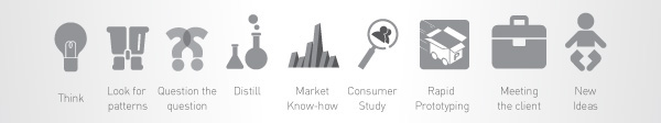
Think
Critical thinking is the intellectually disciplined process of actively and skillfully conceptualizing, applying, analyzing, synthesizing, and/or evaluating information gathered from, or generated by, observation, experience, reflection, reasoning, or communication, as a guide to belief and action. What we do at this stage of problem solving, is looking for patterns. We question the question at every step of the way. We distill data. We study the market. We study the consumer. We study the product. After all the reasoning and logical applications to the data, we try and give demo’s. We rapid Prototype to sense drawbacks. We open our calendars, pick up the phone and schedule interviews . We meet more and more with the client to get their side of vision for their brand / product / service. We dig into anything and everything related and consequently come up with ideas.
Creative Brief
A creative brief is like a road map. It's good for your creative karma. A great brief leads to imaginative and
persuasive designs. And gets you there quickly. A bad brief starts you off in the wrong direction. So you have to stop, figure out where the heck you're going, and start again. Or worse, you follow that brief to Trash Town, a total waste of time. Most creative briefs are simply a list of questions. And most advertising or design shops have one brief. Unfortunately, one size does not fit all. Obviously, one goal is to learn more about the client's products and market. Another goal is to understand the client's culture and personality. We want to reflect that personality in our tasks or designs in the way our clients define the brand and position the company.
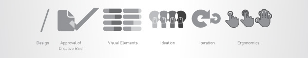
Design
Once we have the creative brief approved, we come down to specifications. We see statitics and use all this to start the overflow of ideas. Ideating / Conceptualization involves a lot on communication within ourselves.We undo and redo and undo and redo again to do more of the same, until we have substantial elements to go ahead with. We iterate. After going through days of innovation, we categorize and start looking into the feasibility and ergonomics and to define the same, we prototype more often. We make samples to show our client and once again, we pick up our phones and schedule meetings. We present concepts and ideas with a confident smile and get them approved for the best of the client’s need.
Execute
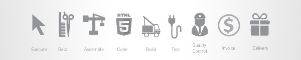
People often mistake the execute phase of problem solving as the happy ending phase forgetting about the
complexities it involves in order to seal the deal. We go through all kind of steps here to reach to the final product. We get into details here. Being attentive to details helps us minimise error when we start building the design. We assemble all the work then and donot forget to test. Testing is an essential step here for us, after which we do serious quality check. We belive that quality pays. Once the design is approved, we look into deployment of the same which finally leads to the reward or invoice after which we deliver the completed task with a smile.
All this information was packaged in form of cards which were packaged as an interactve fun product.
Flip Gift
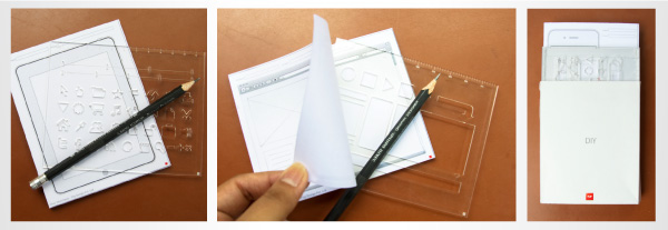
FL!P Gift or FL!P Token came out to be a very interesting task for me. FL!P wanted to give something which could be used by the person receving it for better design thinking. At the same time, the gift should be something representing FL!P. The very first thought was about the paper folding lamps. I thought making miniature lamps in a cube form with a USB based LED. However, we had to drop that idea because the production of the same was a big hassle. Since Interaction Design is one of the major forte of FL!P, I decided to use elements from UI design for the gift. I went back to some real bad memories of wireframing and flowcharting where not having the right elements at hand lead to major delays. So, I came up with the idea of making stencils with UI elements which would help in quick wireframing and flowcharting.
Eventually, 3 stencils were finalized.
1. Quick Framer for fast wireframing.
2. Flowchart Stencil consiting of elements needed to make flowcharts.
3. Website Stencil with web elements, to help create webpages on paper as real as possible.
UI Sketchpads
Giving away stencils is absolutely useless until they can be used on something well enough to serve the purpose. In this case the purpose was UI design. Hence, the idea of UI Sketchpads came in. It was quickly finalized because of the great help they would be for a design learner.
In accordance to the UI stencils, 3 kind of sketchpads were thought of.
1. iPhone Sketchpad
2. iPad Sketchpad
3. Web Browser Sketchpad.
The reason for choosing these 3, was that they provide the user with various size and both landscape and portrait modes for explorations and wireframing, plus the fact that people all across the world are designing or want to design stuff for an iPad or an iPhone.
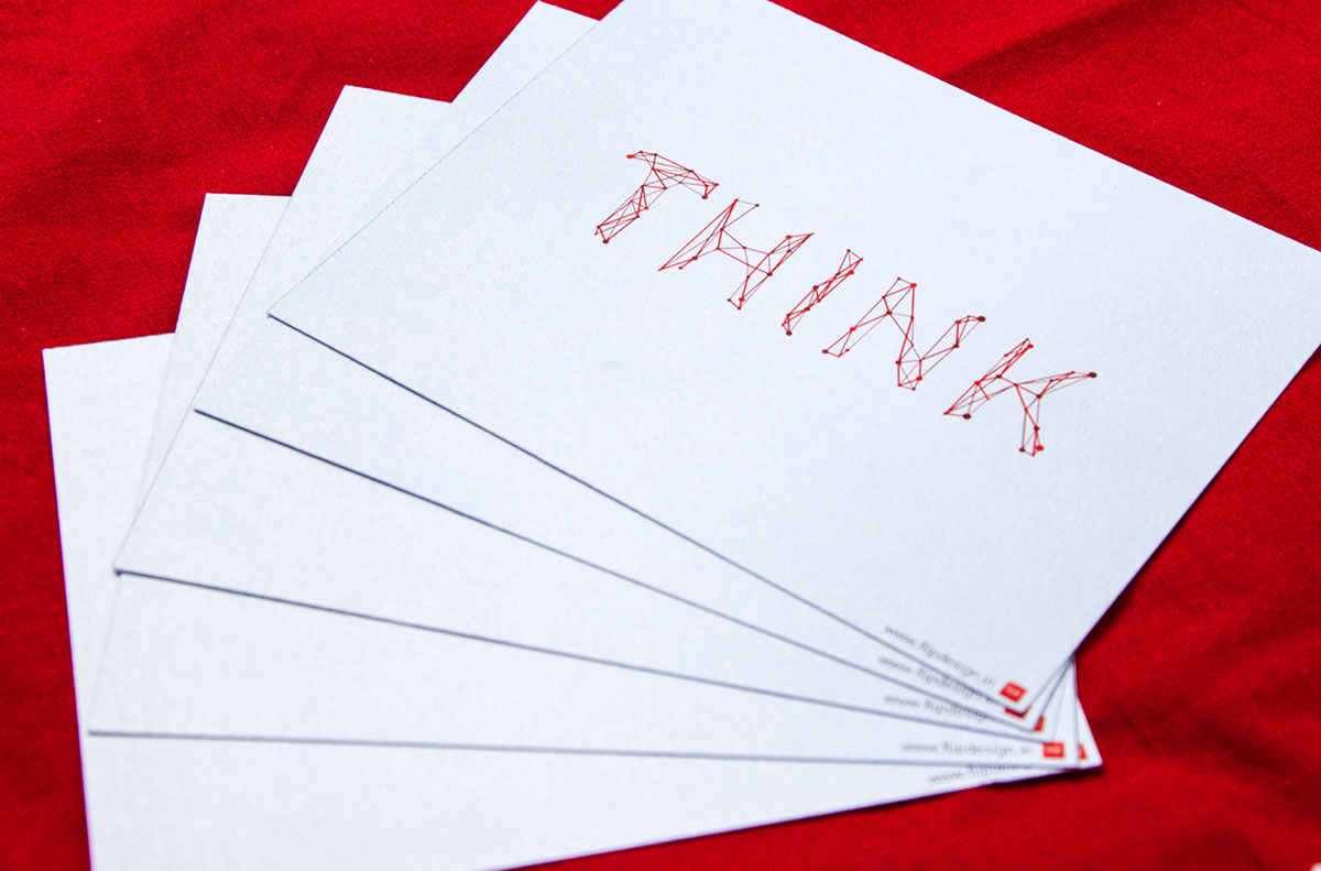
THINK
So, one fine day, I was too bored to work and decidd to THINK about THINK. My thoughts were in line with FL!P and all I could think was THINK GREEN, THINK FUN, THINK HANDMADE, THINK RAW, THINK EARTHWAVE,
THINK KIDS, THINK BEYOND, THINK BIZZARE. I realized that all of these are terms and activities related to FL!P and decided to doodle. I love Typo Expression and decided to say all this via typography. And the result is as you see.
THINK.BIG

THINK.FUN

THINK.ART

THINK.GREEN

THINK.CREATIVE


Flip Stencils + Flip UI Sketchpads for quick wireframing
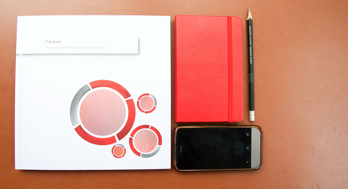
Flip Book
The final task was to combine all the projects which we earlier documented into an interactive pdf, now in print format under the title of Flip Book 2012. To make the book equally interesting and fun for the user, I introduced the concept of Augmented Reality to showcase few features of the project. I have also used QR codes to show videos of the 3M CARCARE app. and given complimentary stickers from the Earthwave project.
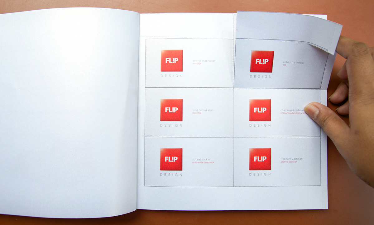
Interactive elements of 'tearing' the visiting cards of the team to be collected.
These are the AR Cards you need to use and here’s what you need to do;
1. Go to www.flipdesign.in/flipbook/clover
2. Chose the version of AR you want to see.
3. Allow the permisiion to use the camera.
3. Hold the same card as the one selected in from the the camera so that none of the corners get blocked by your fingers.
4. You will see magic happen.
5. You can also take a photograph of the icon on your phone or tablet and put in front of the camera to experience the magic of AR.
6. Don’ forget to smile.


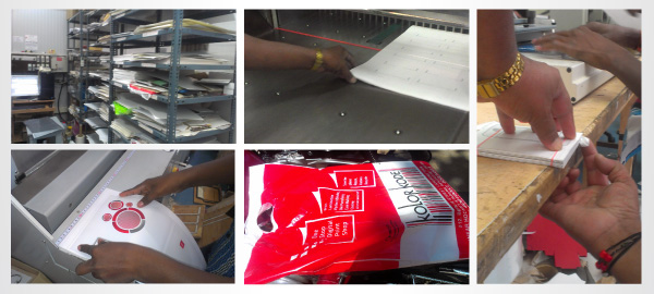
Printing Processes
I love print media and KOLORKODE printing house gave me a perfect experience. KOLORKODE is a one-stop
Printing house in Berlie Street, Langford Town, Bangalore. I would like to thank Mr. Kayu and Mr. Hemant and all their staff for helping me and answering my never-ending questions about the production.
Considering the Brand FL!P as it is, and the amount of detail they look into, selecting the paper for printing was a very important task. After going through various options, I decided to use 280 GSM ICE GOLD Paper for the major part of the products. I also used 120 GSM Dali Modi bright white for the FL!P Diary and 70 GSM Bond Paper for the UI Sketchpads. Since, we only needed a very few copies of the products, we decided to go ahead with Digital Printing. KOLORKODE worked well with artwork file format as a pdf. It is important to however bring a CMYK file and not a RGB. This conversion is required for printing. RGB is a color format for vision only and needs to be converted to CMYK for the layout colors to be printer friendly.
Costing
The costing given here includes the cost for the post printing production too. And because only one copy of the
products were printed, all the post printing production was manual which costed more.
FL!P Book - 1,940 /- including cost for perfect binding - 170 GSM Ice Gold + 300 GSM Ice Gold
FL!P Diary - 320 / including spirl binding - 120 GSM Dali Modi Bright White + Cardboard + Matte Lamination
FL!P Cards - 550 / including 250 GSM Bright white - Large Format Vinyl Printing + Perforations
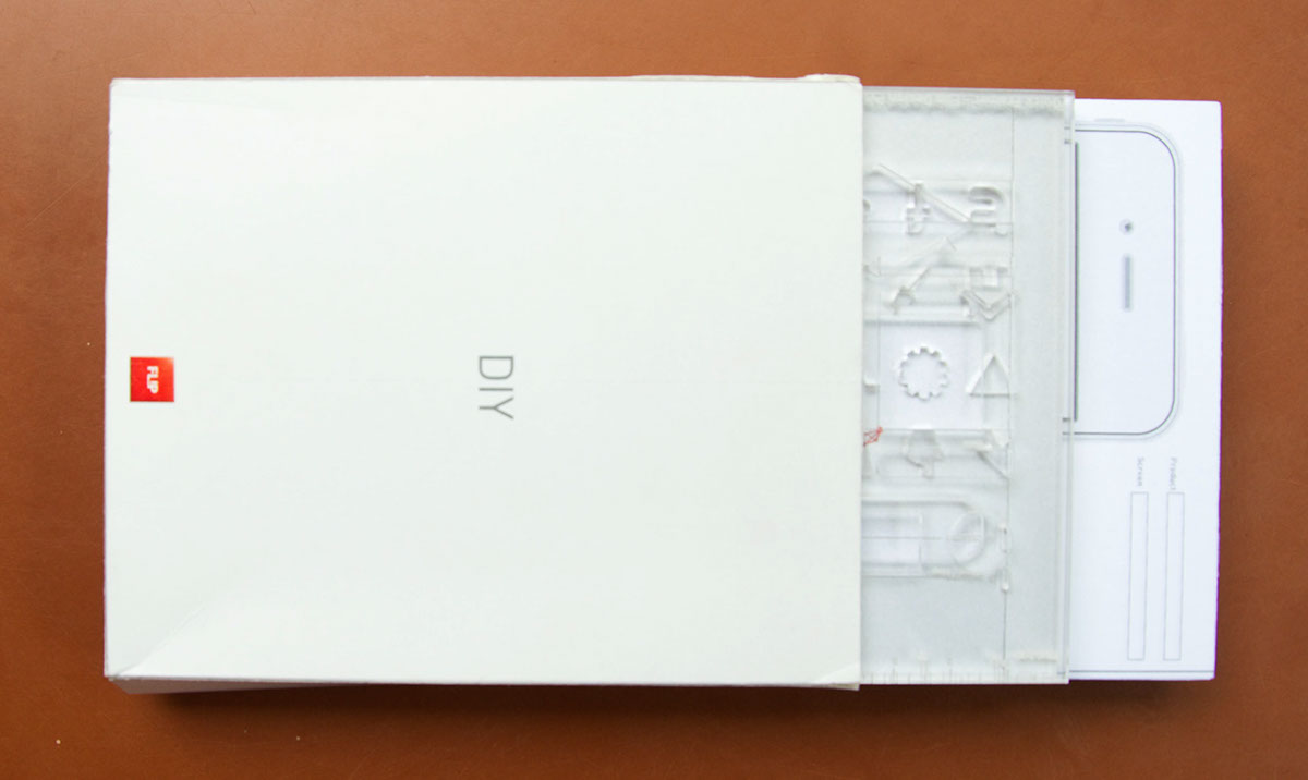
FL!P DIY - 276 /- for stencil with laser cut and etching + 125/- for UI Sketchpads + Gum Binding
FL!P Calendar - 140 /- Large Format Vinyl Pritning
FL!P Brand Communication Products - 3351 /- ONLY
http://www.kolorkode.in
I sincerely thank Mr. Arvind Prabhakar, Mr. Chaitanya Krishnan and the team of Flip Design for their constant support, patience and encouragement. I love and miss all of you.


