I decided that I needed to try and nail down a personal brand for myself. With me finishing University soon, I need something for business cards primarily and something that can easily be transferred to a stationary range. So below is my thought process of what I want as a personal brand. Comments are welcome, after all I need to know if it works well or not.
Thanks for looking!

This is the name of my brand. I wanted something other than my name. Eleven67 is connected to a family member so it seemed fitting to use it. It also runs off the tongue smoothly which is always a good thing too. I wanted to use a clean colour, which naturally brings you to blue, I tweaked it slightly so that it was more of a teal colour, which isnt as cold.
I already had a rough idea of what I wanted to do, which meant using a bold font. I chose Nexa Bold after much deliberation.
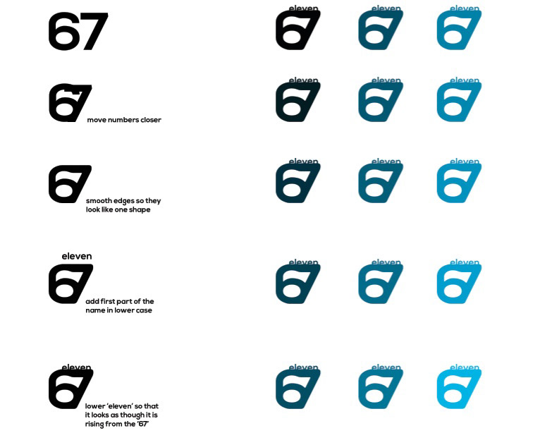
Heres some of my development, shortend slightly. You can see how the to numbers merged together with the lettering. Also how the colours effected the logo. Trying out the colour variations to try and narrow down the selection.

As the logo looked slightly lost, I thought of adding something behind. I vectored this in Illustrator and started to use the colour on the splat instead, which narrowed it down to four.

Here are the splats with the 'eleven67' in the centre. I didnt want the splat to outline the lettering, so I overlaid the white slightly taking out some of the definition of the lettering.
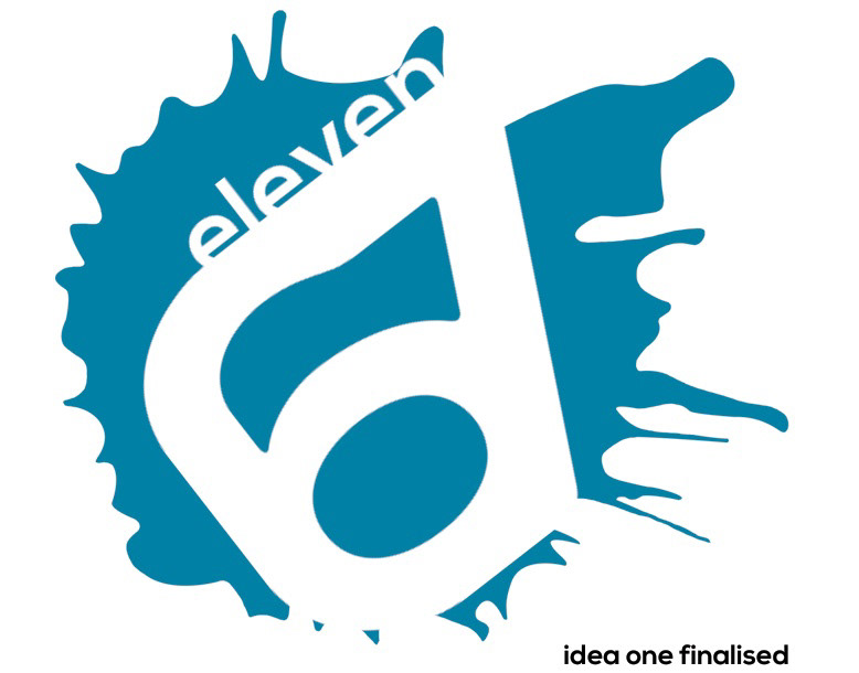
Idea one that I enlarged, final colour chosen.
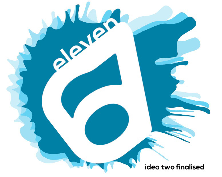
Idea two, layered lighter coloured splats behind the main. Give the feel of more going on.
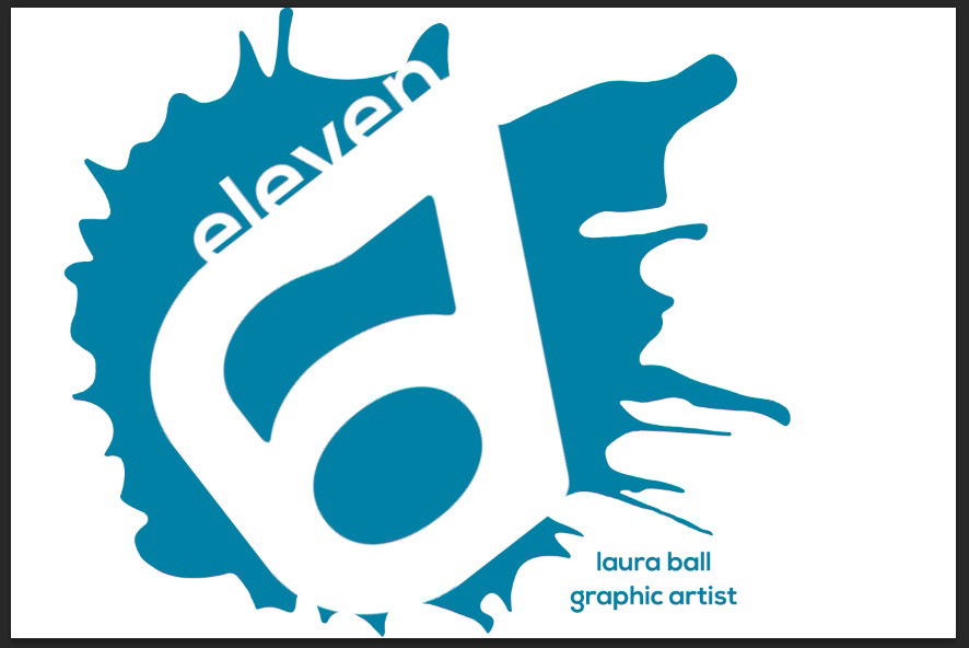
Addition on my name and what I am lower right of the whole logo. Again keeping the lettering lowere case to fit in with the 'eleven'. Using the same colour as the splat to stand out on the white background.

Addition of my name and what I am again to the lower right of the logo.
Heres another version not as messy as the one above.


