

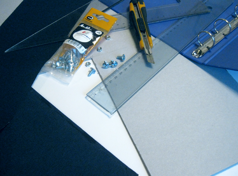
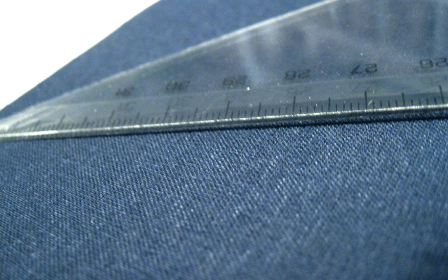
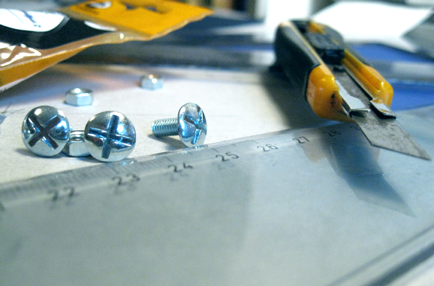
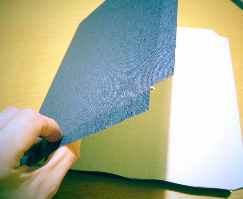
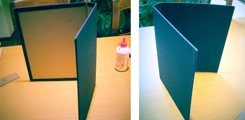
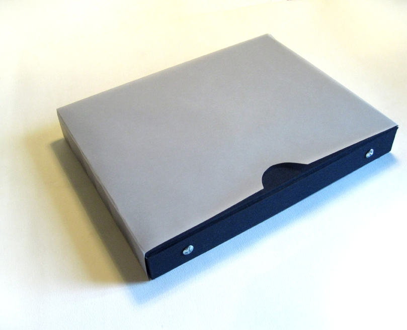
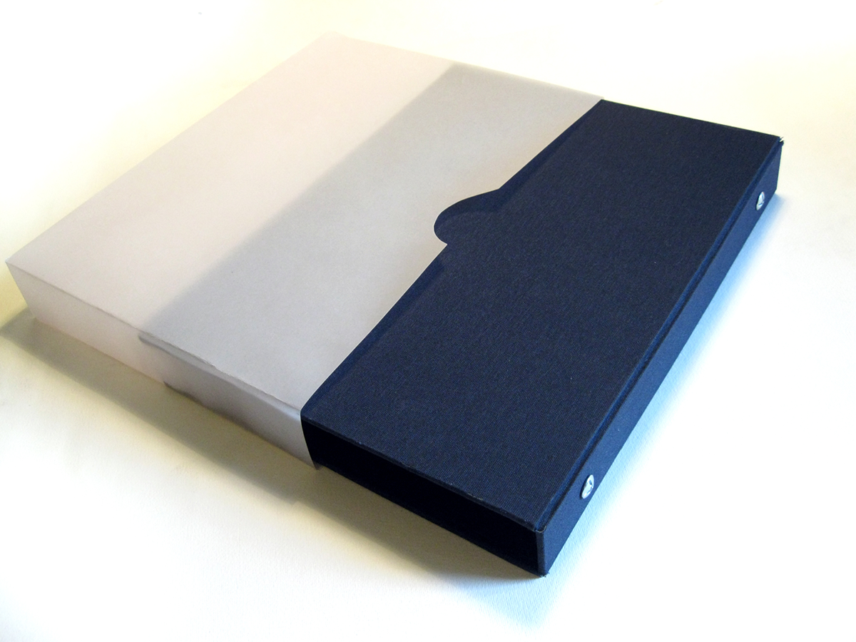
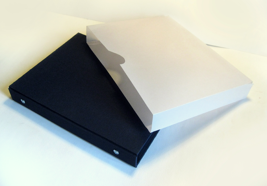
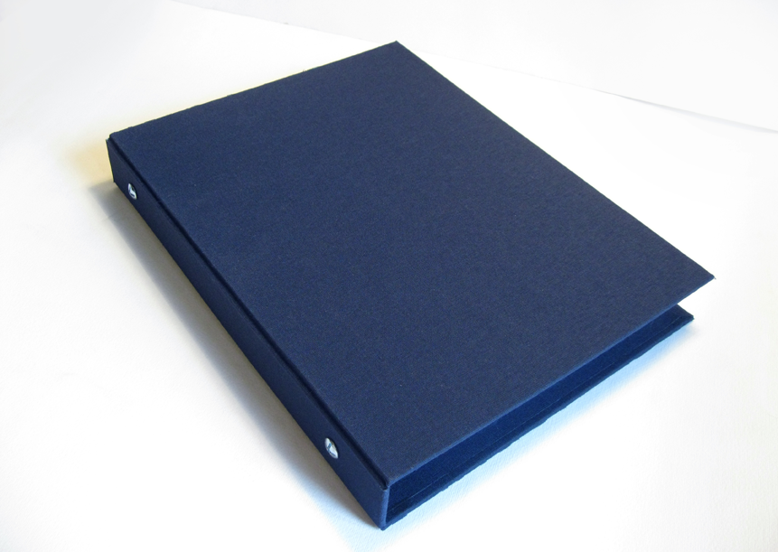
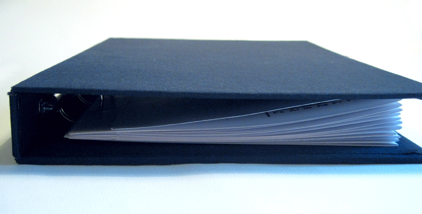
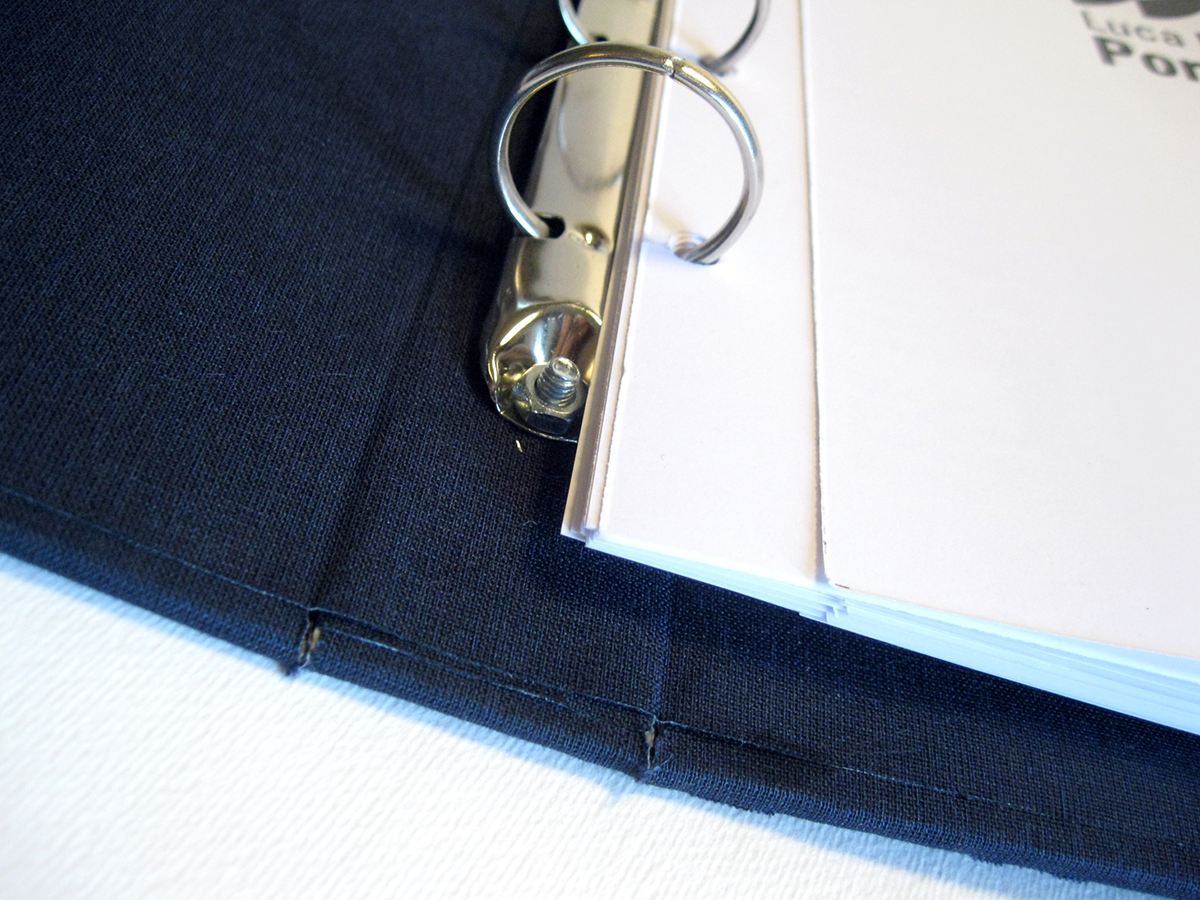
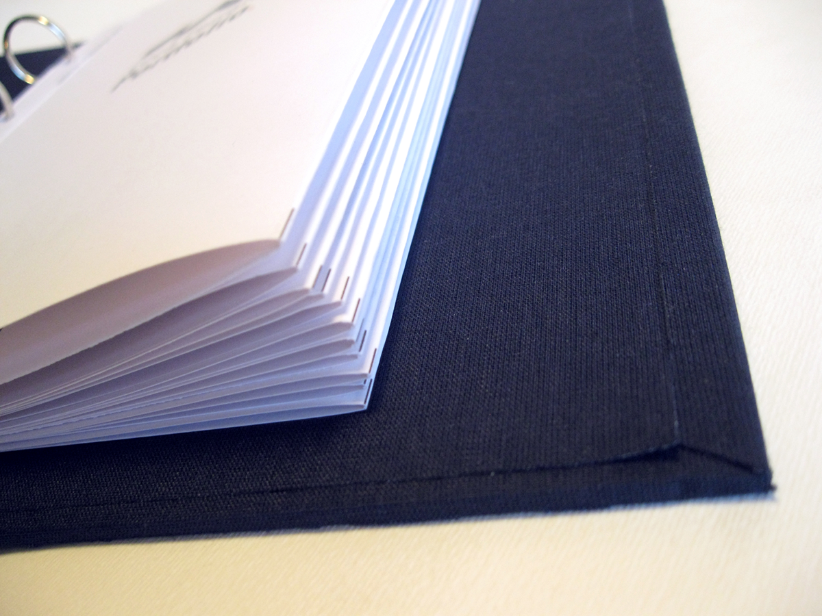
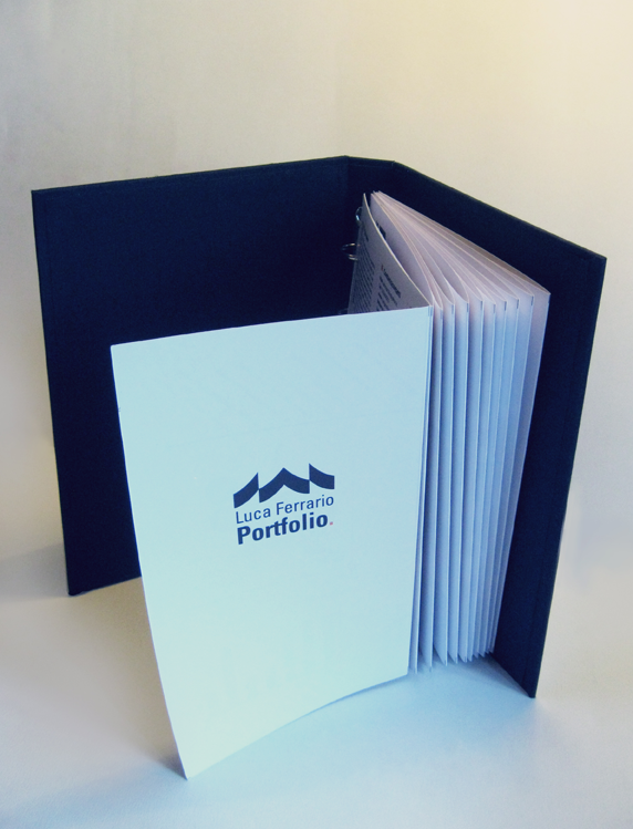
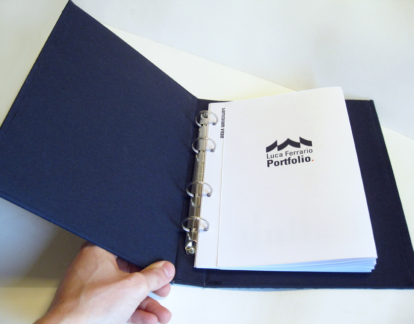
During these months, I've felt the need to project, design, make, build my own portfolio, with my own hands, from "HARDWARE" to "SOFTWARE". I wanted it to be a whole personal project, containing all the other my personal projects. It is meant to be used as a CV, as a personal presentation, as a job tool. So, I bought everything I needed, and I just made it. Obviously, it is an "endless" project: my utopian goal is to create a portfolio page for every project I made during these year... but I'm satisfied with these ten for now.
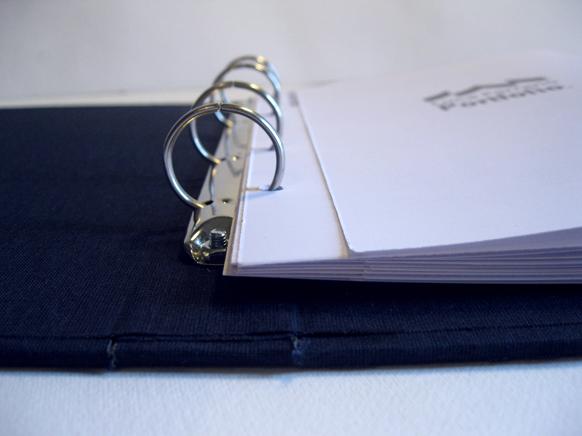
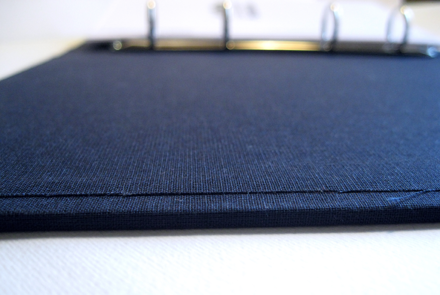
"HARDWARE"
"SOFTWARE"

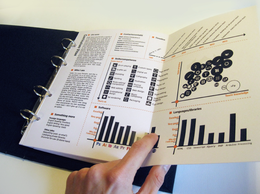
INFOGRAPHIC CURRICULUM VITAE
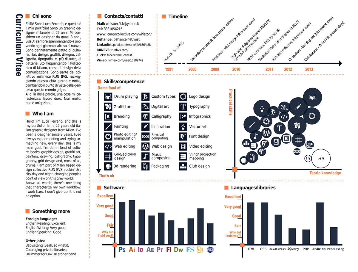
Hello! I’m Luca Ferrario, and this is my portfolio! I’m a 22 years old italian graphic designer from Milan. I’ve been a designer since 8 years, lived always experimenting and trying something new, every day: this is my main goal. I’m damn fond of culture, books, graphic design, graffiti art, painting, drawing, calligraphy, typography, grid design and, most of all, drums. I am part of Milan based design collective RUN BVS, rockin’ this city day and night, changing peoples point of view on this grey world. Above all words, there’s one thing that characterize my own workflow: I work hard. I don’t give up: it is not an option.
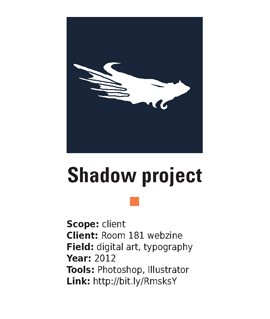

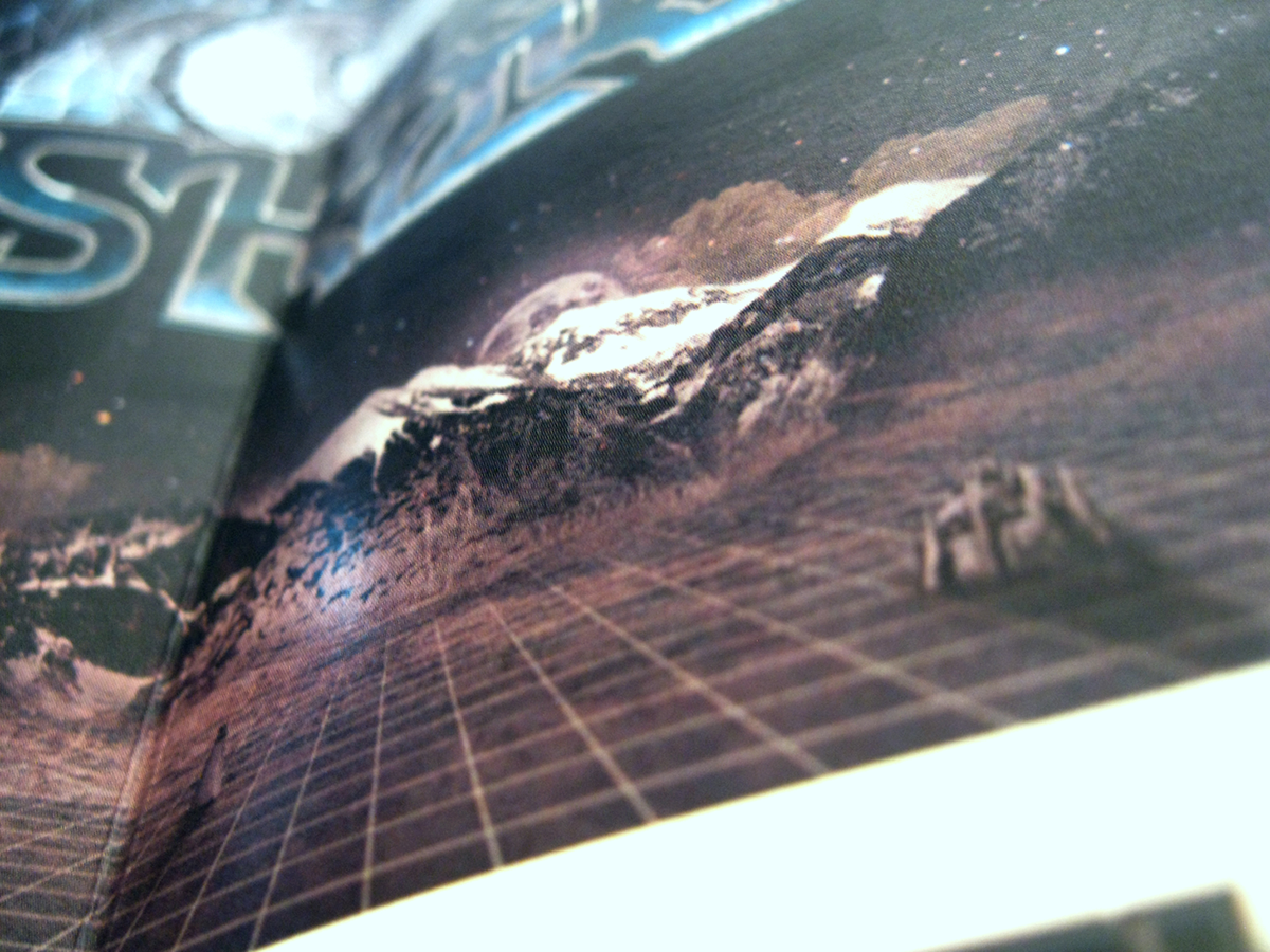
Shadow is a september 2012 project created for the 7th issue call of southamerican design and illustration webzine Room 181, whole centered around the “Shadow” theme. From my concept: “I represented the shadow as a mysterious place, empty, endless, filled with creatures and ethereal ghost towns, where the outlines of alien worlds can be seen.” The “Shadow” is an ambigram. This project is online on Room 181 7th issue, and, when the webzine was out, it was the Room 181 website’s background.
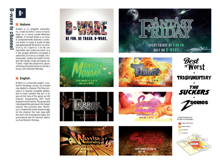
B-Ware is a university project, created for Sociology course, for a brand new digital tv channel. The final concept is a channel completly dedicated to trash content; the aim is to give all the fans of the genre an HD channel, broadcasting 24/7 trash programs and movies. My group and I developed the palimpset, the target reserch, the business plan. Moreover, I created the whole brand image for the channel: the main logo with the claim, the tv programs logos, the promotional ads for themed nights, such as Monster Monday.
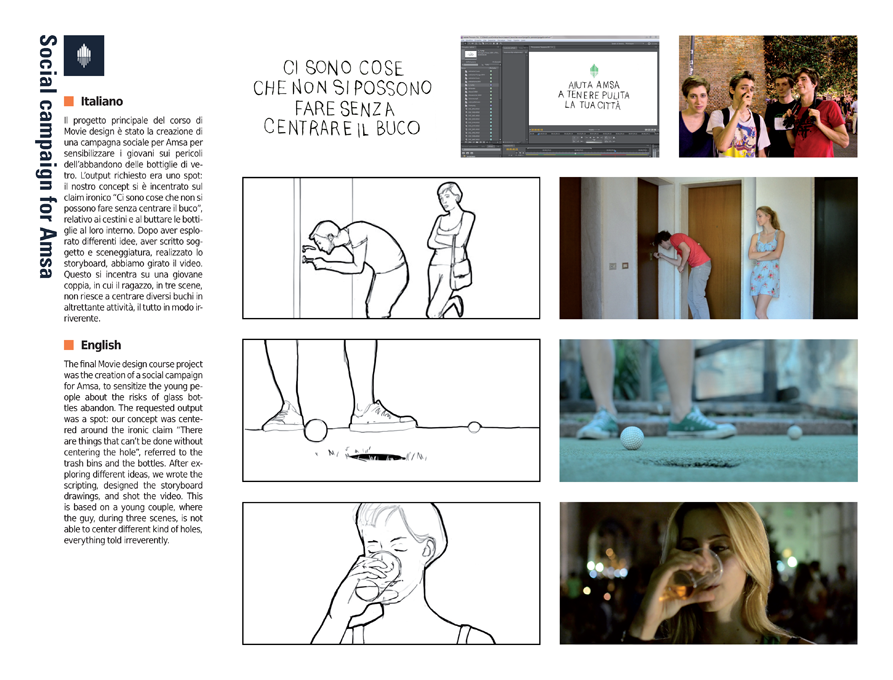
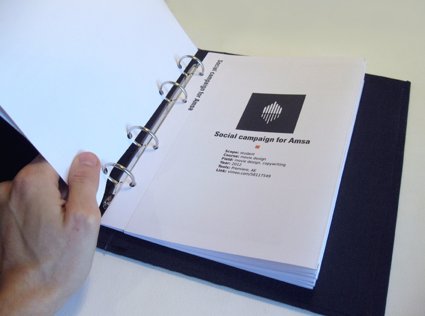
The final Movie design course project was the creation of a social campaign for Amsa, to sensitize the young people about the risks of glass bottles abandon. The requested output was a spot: our concept was centered around the ironic claim “There are things that can’t be done without centering the hole”, referred to the trash bins and the bottles. After exploring different ideas, we wrote the scripting, designed the storyboard drawings, and shot the video. This is based on a young couple, where the guy, during three scenes, is not able to center different kind of holes, everything told irreverently.
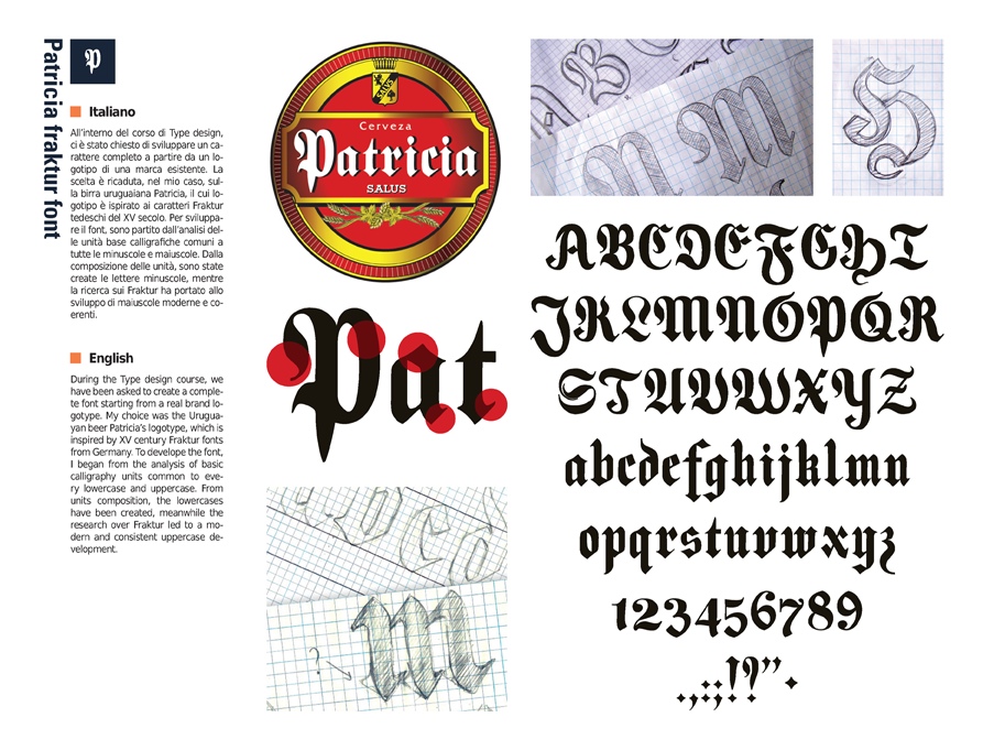
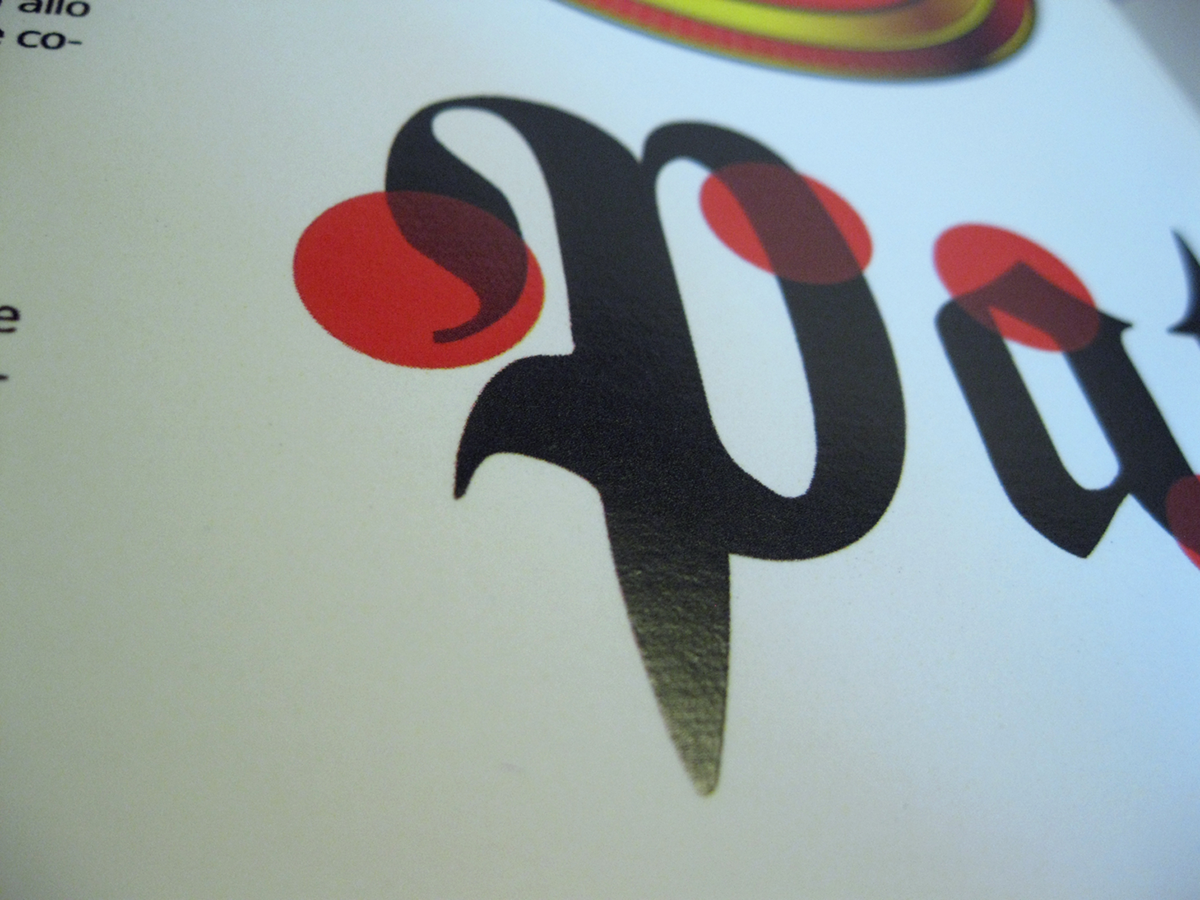
During the Type design course, we have been asked to create a complete font starting from a real brand logotype. My choice was the Uruguayan beer Patricia’s logotype, which is inspired by XV century Fraktur fonts from Germany. To develope the font, I began from the analysis of basic calligraphy units common to every lowercase and uppercase. From units composition, the lowercases have been created, meanwhile the research over Fraktur led to a modern and consistent uppercase development.
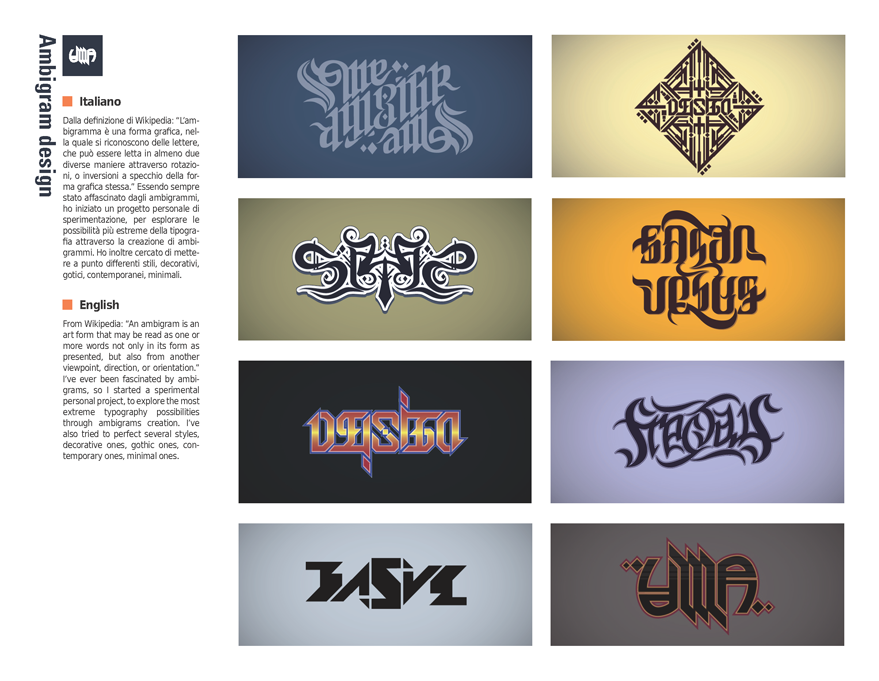
From Wikipedia: “An ambigram is an art form that may be read as one or more words not only in its form as presented, but also from another viewpoint, direction, or orientation.” I’ve ever been fascinated by ambigrams, so I started a sperimental personal project, to explore the most extreme typography possibilities through ambigrams creation. I’ve also tried to perfect several styles, decorative ones, gothic ones, contemporary ones, minimal ones.
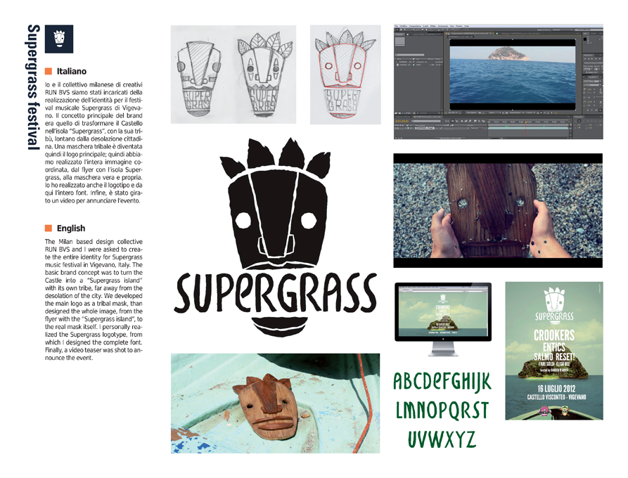
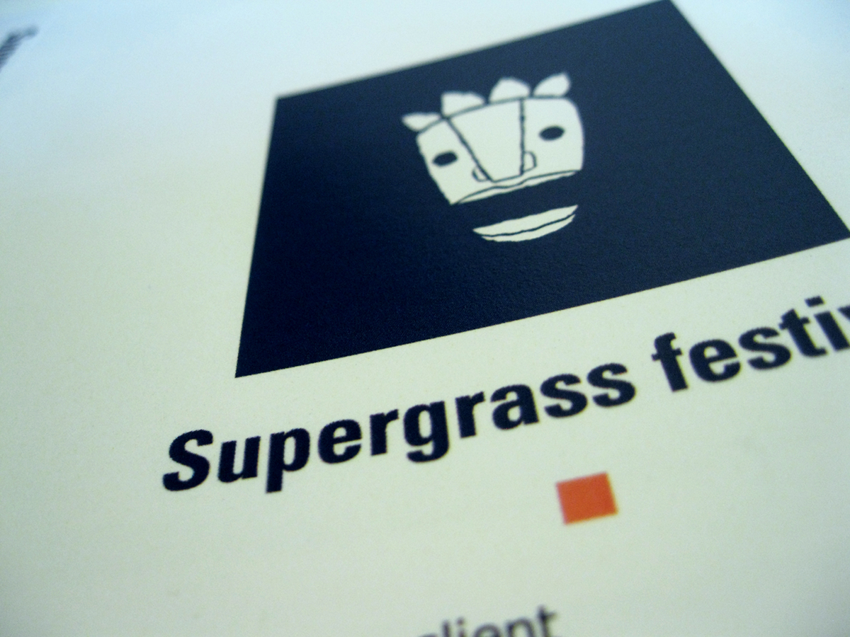
The Milan based design collective RUN BVS and I were asked to create the entire identity for Supergrass music festival in Vigevano, Italy. The basic brand concept was to turn the Castle into a “Supergrass island” with its own tribe, far away from the desolation of the city. We developed the main logo as a tribal mask, than designed the whole image, from the flyer with the “Supergrass island”, to the real mask itself. I personally realized the Supergrass logotype, from which I designed the complete font. Finally, a video teaser was shot to announce the event.

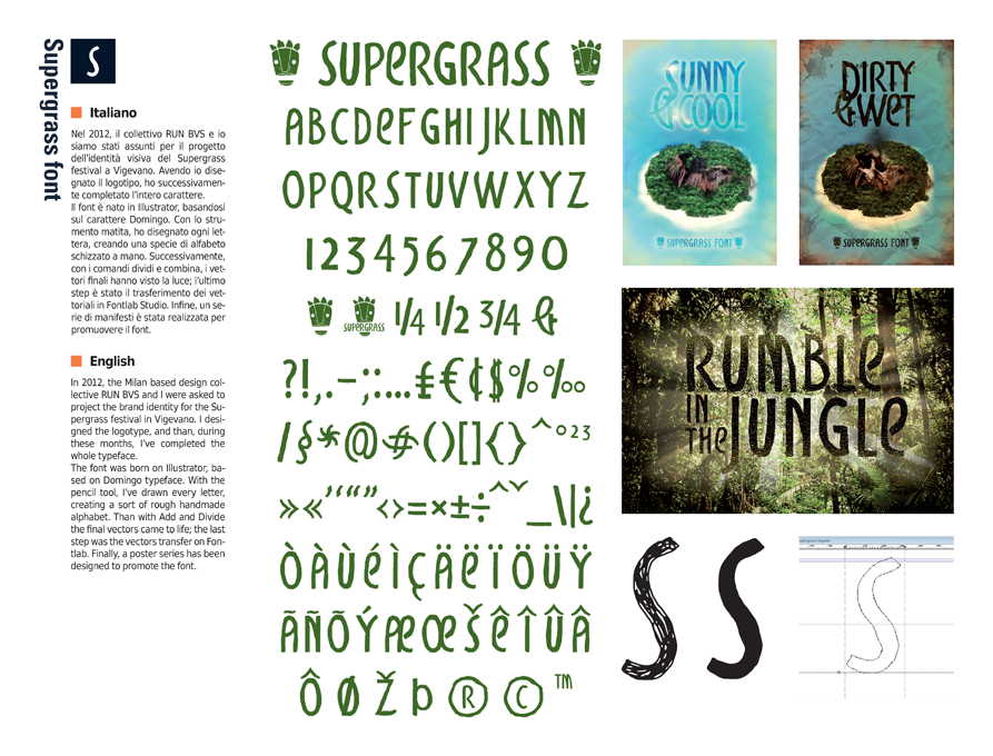
In 2012, the Milan based design collective RUN BVS and I were asked to project the brand identity for the Supergrass festival in Vigevano. I designed the logotype, and than, during these months, I’ve completed the whole typeface.
The font was born on Illustrator, based on Domingo typeface. With the pencil tool, I’ve drawn every letter, creating a sort of rough handmade alphabet. Than with Add and Divide the final vectors came to life; the last step was the vectors transfer on Fontlab. Finally, a poster series has been designed to promote the font.
The font was born on Illustrator, based on Domingo typeface. With the pencil tool, I’ve drawn every letter, creating a sort of rough handmade alphabet. Than with Add and Divide the final vectors came to life; the last step was the vectors transfer on Fontlab. Finally, a poster series has been designed to promote the font.
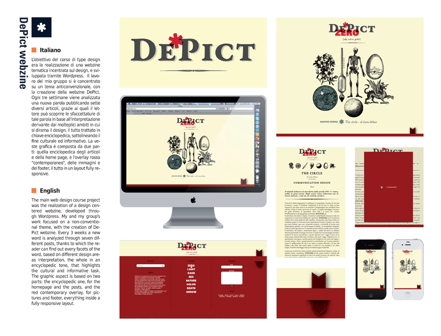
The main web design course project was the realization of a design centered webzine, developed through Wordpress. My and my group’s work focused on a non-conventional theme, with the creation of DePict webzine. Every 3 weeks a new word is analyzed through seven different posts, thanks to which the reader can find out every facets of the word, based on different design areas interpretation, the whole in an encyclopedic tone, that highlights the cultural and informative task. The graphic aspect is based on two parts: the encyclopedic one, for the homepage and the posts, and the red contemporary overlay, for pictures and footer, everything inside a fully responsive layout.

Law 18 is a Milan based stoner-crossover band, active since 2011, of which I’m the drummer and the writer. At our career beginning, I started developing the band’s brand, starting from the main logo. In the meantime of our first EP production, I developed a poster serie inspired by the record songs, quoting, in the pieces, the most significant lines of the lyrics. Every poster consists in a typographic elaboration and a digital art background.
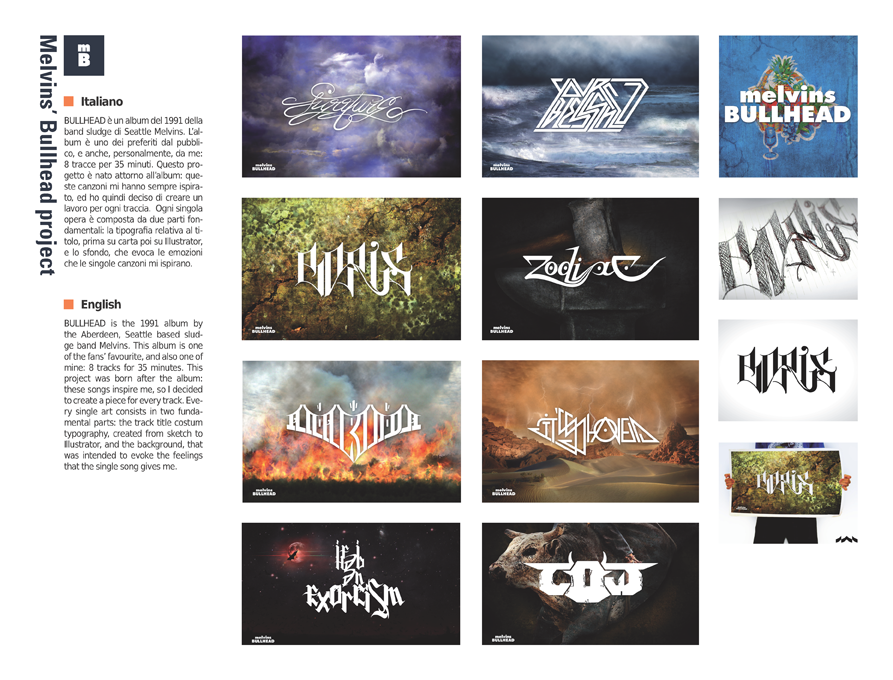
BULLHEAD is the 1991 album by the Aberdeen, Seattle based sludge band Melvins. This album is one of the fans’ favourite, and also one of mine: 8 tracks for 35 minutes. This project was born after the album: these songs inspire me, so I decided to create a piece for every track. Every single art consists in two fundamental parts: the track title costum typography, created from sketch to Illustrator, and the background, that was intended to evoke the feelings that the single song gives me.

And many more still to come...
If you have enjoyed the show, feel free to leave some feedback!!


