


For my brand “Chokoreto” it has a range of chocolate/sweet confectionary products for the four different seasons with the tagline “Colors everyday”.
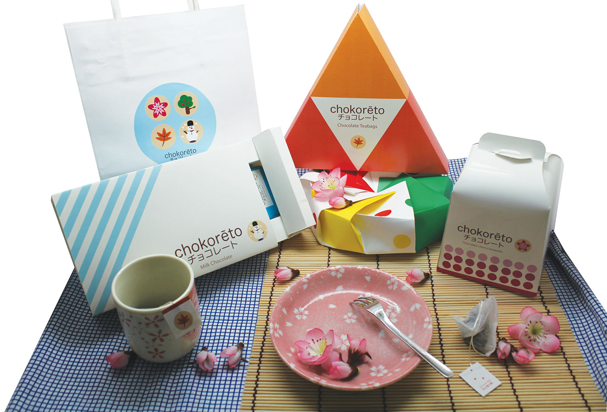
For spring, the product is a brownie/cake with cherry flavor, which the packaging is designed in a mini carry box with the color and tones of pink, which represents spring.
For summer, the product will be macaroon biscuits and the packaging is designed in a form of a box, which has multiple folds like a shape of a flower. When opened, the box will serves as a plate. The colors used for summer is green red and yellow.
For autumn, the product is a teabag (chocolate flavored tea) as the Japanese teabags are often in a triangular shape, I designed it as a triangular box. At the back of the box it will open up easily like a tray, colors used are tones of orange, which represents autumn falling leaves.
Lastly for winter, the product will be white chocolate, and the box is designed like a pull out tray, which will hold the pieces of chocolates. Colors used are shades of blue and grays, which represents winter.

